
I’ve tried to do this before, but at some point, life just gets in the way, nonetheless, I’ve always enjoyed looking at what people produce. It’s a really fun initiative (and a pity it seems largely confined to X these days).
30 day map challenge 2024 is now live, see prompts below. I don’t have time to do much more than some very basic plots, if I manage 15 out of the 30 days I’ll have done very well.

I plan to use QGreenland and perhaps also QAntarctica to produce nice maps in QGIS, which means I won’t be doing anything very innovative, but there will be original data produced and collected by me and (and my team) but hopefully with some nice backgrounds…
Day 1: Points. Here I’ve imported positions collected by GNSS buoys that we put out on on the sea ice in NW Greenland over three years, 2022, 2023, 2024. As the ice has moved so did the buoys, hence the clusters of points. Just for fun I imported an old landsat image from 1976 (almost 50 years ago!) as a background for a second image – just to show how much ice has been lost in this region since then. I suspect the large icebergs at more or less the location of the old ice shelf is telling us something about the bathymetry and a local sill where the glacier could sit quite stably. This shelf broke up in the late 1990s, since when the glaciers have been rapidly retreating.

Day 2: Lines
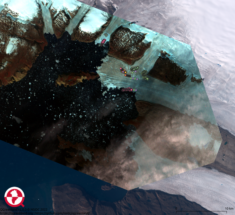
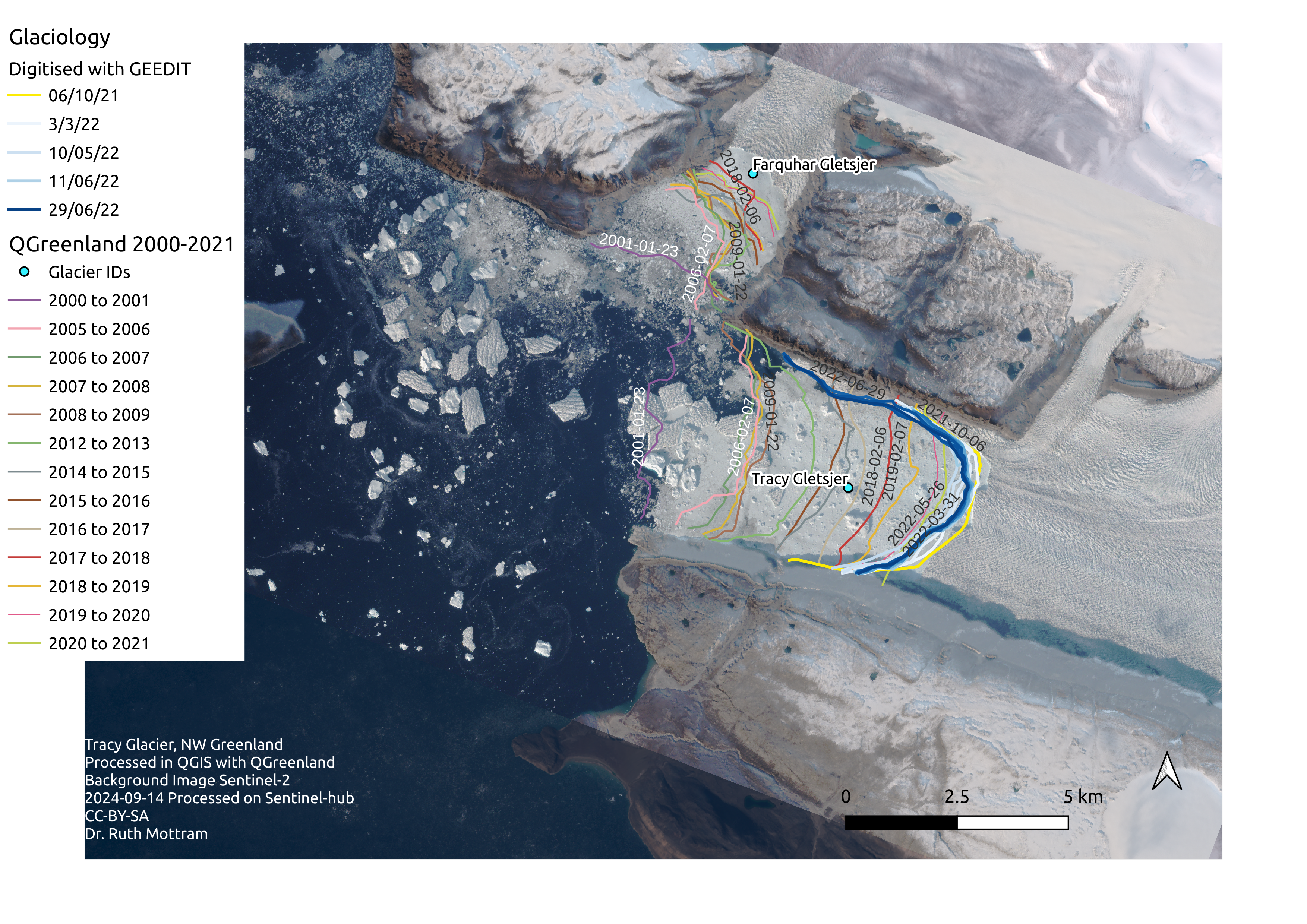
Back to NW Greenland, and here again I’m using the QGreenland package within QGIS. But this time I’ve added a more recent background, a Sentinel 2 image from September this year. I’ve overlaid the glacier termini for the Tracy and Farquhar glaciers (which until the 1990s joined in the floating shelf shown above). These termini positions are part of the QGreenland package but I’ve added some lines hand-digitised by me from a variety of mostly Sentinel 2 satellite images using James Lea’s marvellous GEED-IT tool on the Google Earth Engine. This was part of some work I hope to submit for publication really very soon – though in the end we got the AI (spoiler alert- wait for day 9) to do a finalised version for the paper.
Over the course of the year the glacier often slowly and incrementally advances, only to retreat by big jumps when there are large calving events. It’s this advance and retreat that the digitised lines show. The yellow line is the terminus in Autumn 2021, it slowly advances through winter spring and early summer as shown by the white lines, only to start moving back as the summer calving gets underway.
Day 3: Polygons
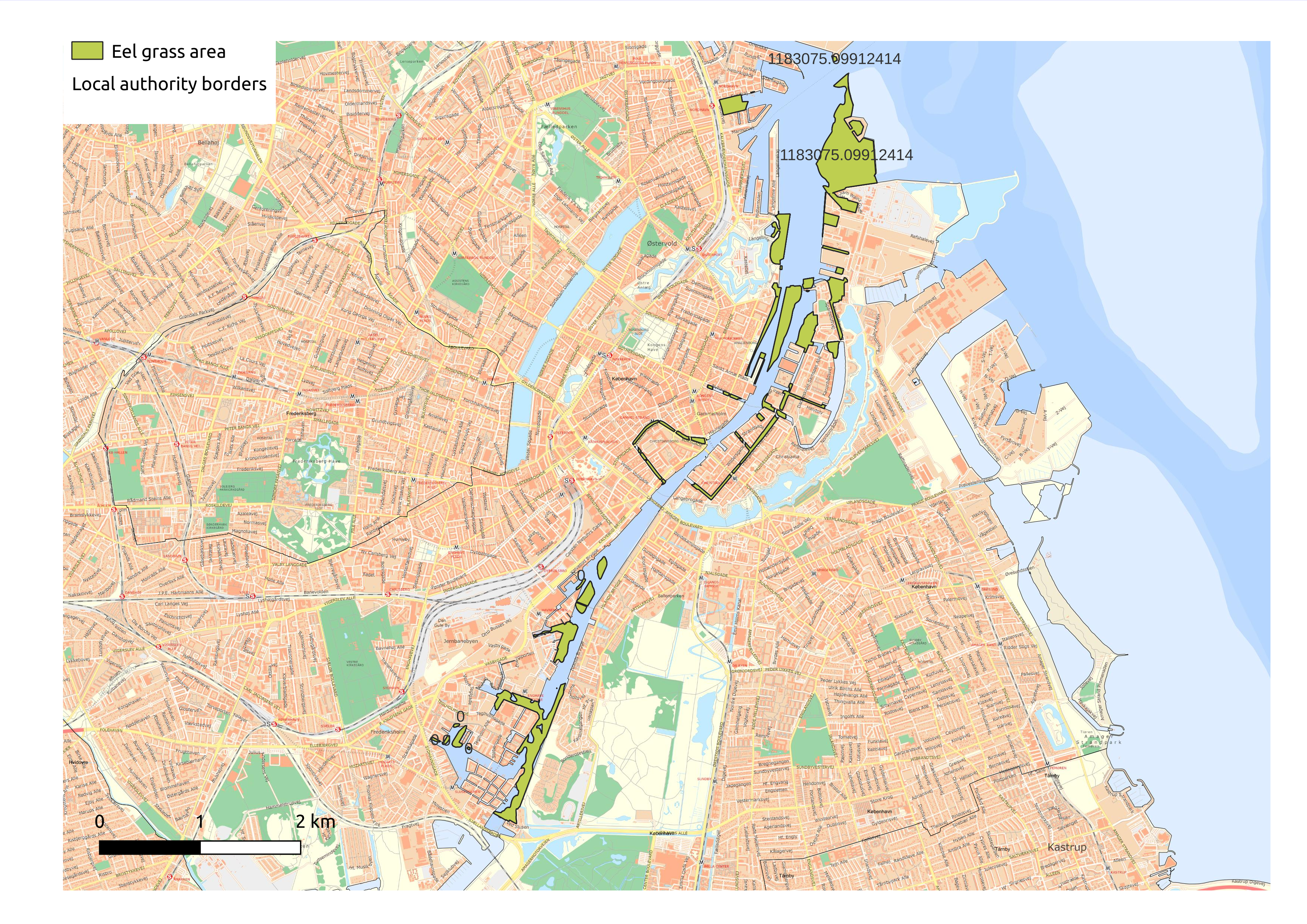
So I *said* I would mostly be doign Greenland and Antarctica this year, and that it would all be my (or my team’s) data, but this morning I changed my mind and started to explore some of the free and openly accessible data there is in Denmark (this is for a personal project, of which more later this month I hope). Mostly, this is an exercise in trying to resurrect my very rusty GIS skills. Anyway, it’s supposed to be fun. So here is a map of eel grass beds in Copenhagen harbour. I spend some of my free time kayaking around the harbour and beaches of Denmark and eel grass is an important habitat for marine species – and much in the news given the parlous state of the Danish coast currently. The data set is from 2012 – would be interesting to see if it was better or worse now – if anyone knows of a more up to date data set do let me know. I downloaded it from this danish open data site. There is not as much there or as up to date as I’d like, but it’s still a nice initiative. I hope it is continued an dupdated more regularly. I could see that e.g. Miljøstyrelsen have a dataset but it doesn’t seem to be open outside of local authorities access.
The basemap is the simple standard produced by what used to be called SDFI (styrelsen for data, forsyning and infrastruktur) and is now (somewhat controversially, given DMI shares a building with them), the klimadatastyrelsen. The old mapping agency in Denmark, they’ve changed their names more times than I can count, but they do have a very nice qgis plug in, accessible with API token and today’s effort was largely driven by an attempt to get to know their plug-in and to see what data can be downloaded easily.
Day 3: Hexagons
I’m quite proud of this one, though again it’s not actually my data, but I’ve never made a hexagon map before so apparently it is possible to help old dogs learn new tricks…
I came across Copenhagen city council’s database of street trees during my explorations of the open data website yesterday and thought it would make a nice test dataset. There is unfortunately a large data gap in the middle where the Frederiksberg local authority area exists. I’d very much like to fill this gap, so if anyone happens to know if/where I can get that data I’d be delighted to hear. I may contact the council in any case to fill in the annoying gap.
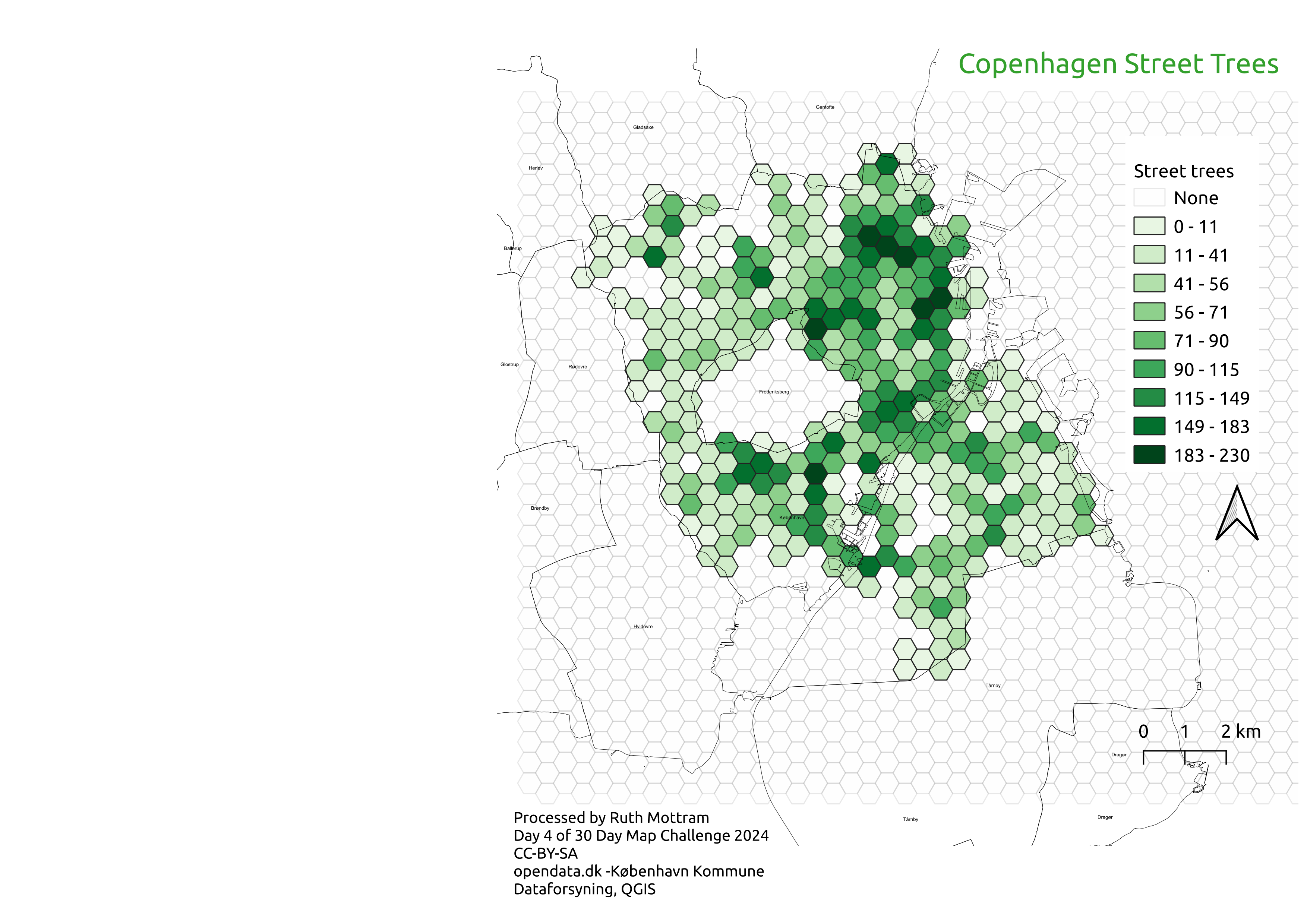
Update: Check out this blog post I wrote on an update that also includes Frederiksberg trees…
Day 5: A journey.
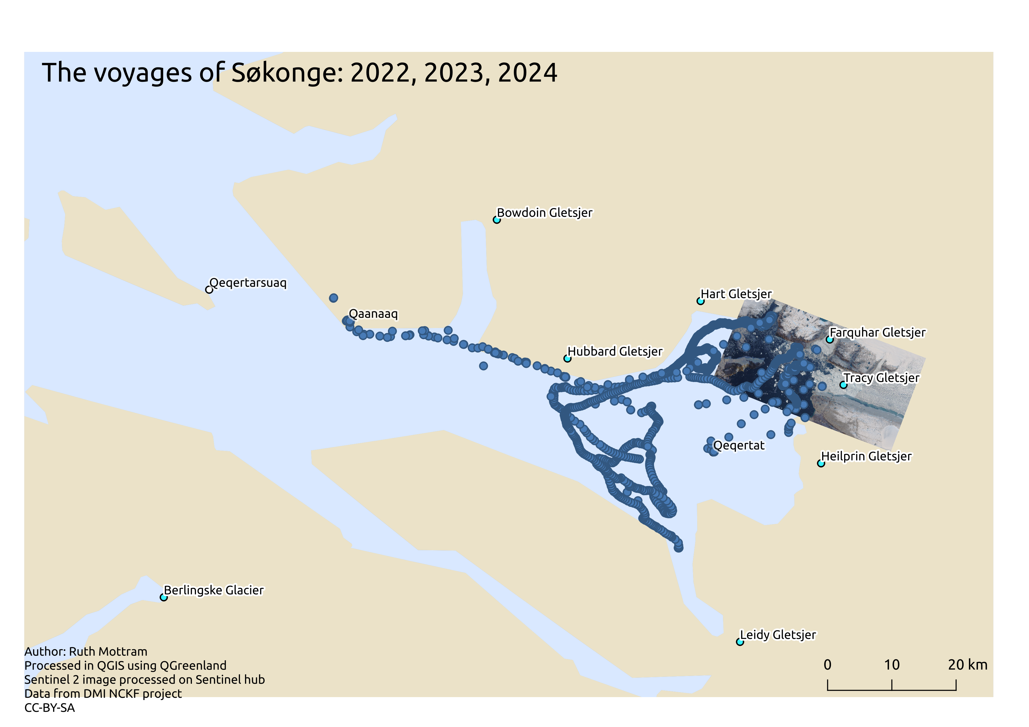
We’re back to Greenland today with a very rough and ready map showing the 3 deployments of one of our trusted GNSS buoys, in this case the one we call Søkonge (Little Auk). All of the buoys have sea bird names, it’s easier to refer to a name than a number when deploying and checking. This is the kind of very basic map we look at when our instruments are deployed in real-time when working out if we need to arrange for them to be collected. I left it deliberately a bit messy, because that’s the kind of data we’re working with and to give that impression. Søkonge has been deployed in three different seasons, the widely spaced dots are when it is being transported by dogsled (in winter on the way to the glacier), or by boat (in summer when it’s been picked up and transported back). The closely spaced dots in the middle of the fjord are from the summer when the sea ice has broken up and the buoy is drifting with the currents. Usually I would only show the current field season on a real-time working map, but this one gives a bit of a sense of just how much data these relatively cheap sensors can collect over only a few years
Day 6: Raster
This is a placeholder – I’ll get back to this one
Day 7: Vintage
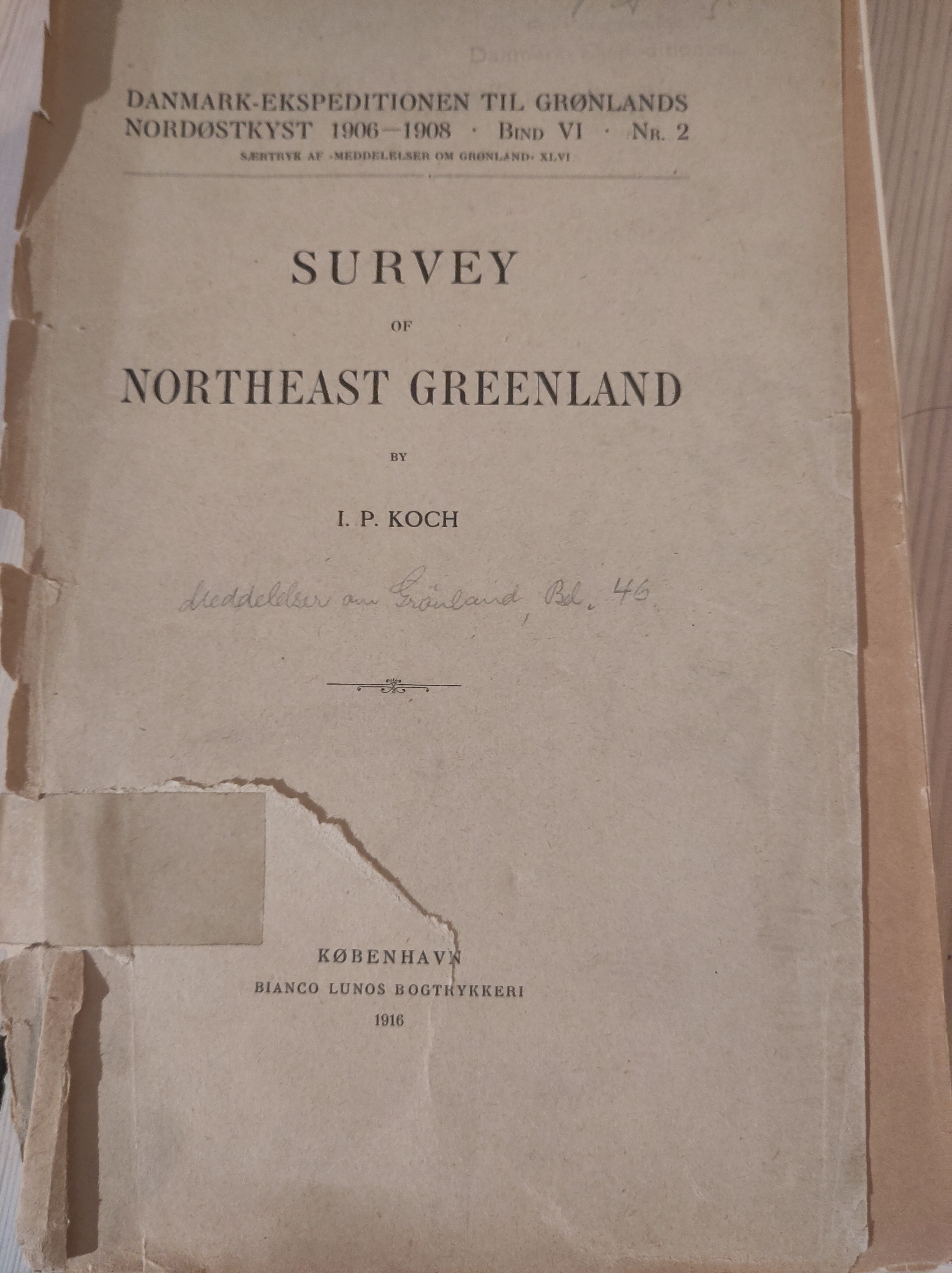
This one is very hurried, but I wanted to post it so even though it’s not quite what I wanted, it’s a fascinating story behind it. I rescued, from an old stack of library books being thrown out, an original 1916 publication, “The Survey of North East Greenland” by I.P. (sic) Koch is a story of the technical findings of the 1906-1908 Denmark expedition. The expedition itself was scientifically successful, and included a young Alfred Wegener among other Greenlandic and Danish scientists and explorers. The original notes from the expedition can be seen on display in the Royal library, but many of the hand drawn sketch maps are also reproduced in this very fragile and falling to pieces book.
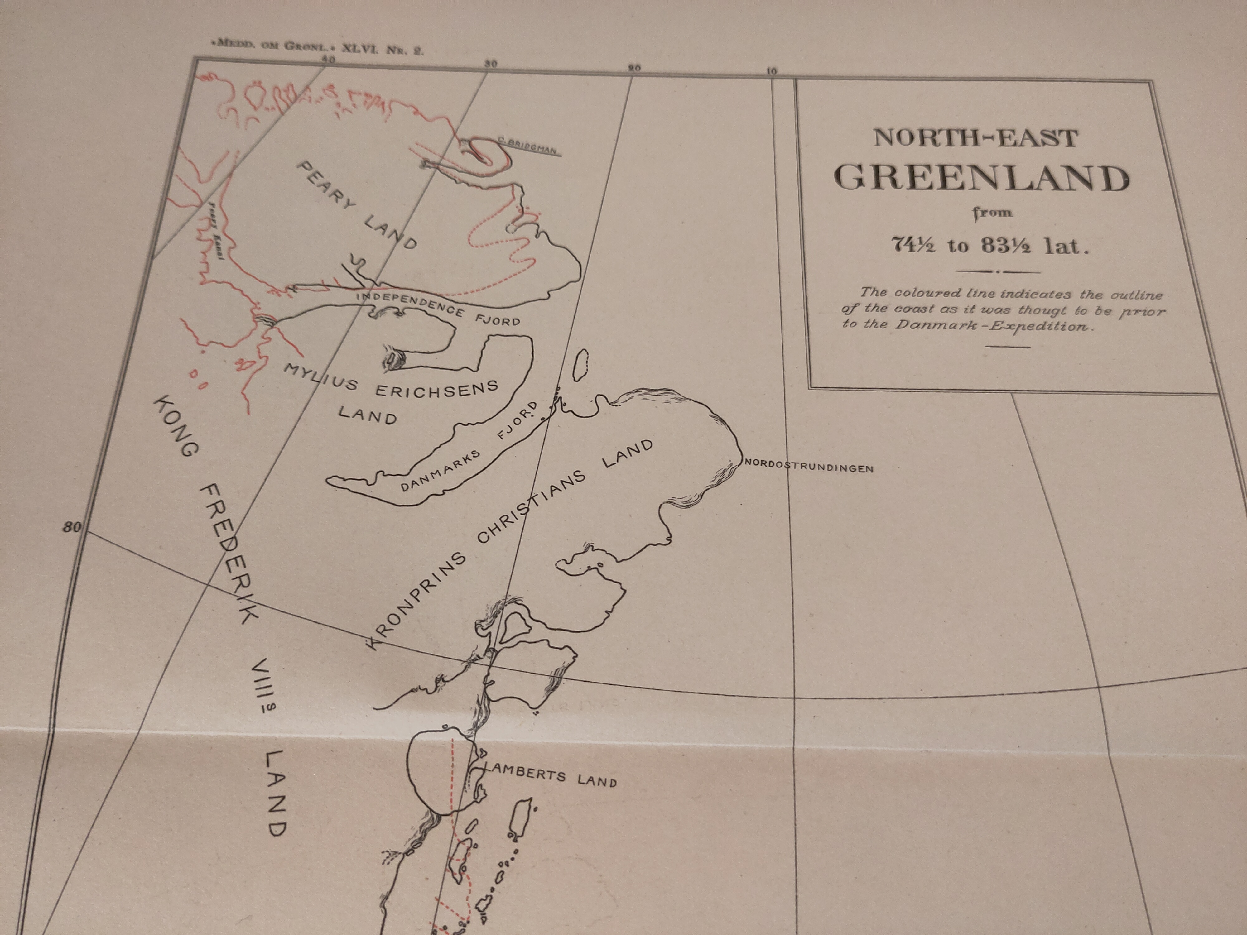
I show a photo here of the sketch map, which includes surveys from the expedition and also shows Robert Peary’s notorious (and fictional) “channel”. I wondered how it would look today plotted up in QGreenland. I found it quite difficult to get the colour of the paper right so I settled for showing white on grey. The red line on this map is the National Park outline, whereas on Koch’s map, it denotes the old coastline as known mostly from Peary’s expedition. The place name’s on Koch’s map somehow give it the illusion that much more was known about this area than actually was at that time. There are additional place names available now, but many of them are simply “hill” or “mountain”, so I opted to show only coast line and the location of the research stations at Zackenberg and Station Nord on the new map.

The Danmark expedition was one of the first in this region, but they found plenty of archaeological evidence of the earlier Dorset and Thule people who had once inhabited the region, as well as a mass of Siberian drift wood, denoting a time thousands of years earlier when NE Greenland had not been hemmed in by sea ice.
It’s hard to imagine this was less than a 120 years ago that the first maps were being made of this region, Mylius Erichsens land is named for the ill-fated leader of the expedition, also lost were Niels Peter Hagen (after whom Hagen glacier is named) and Jørgen Brønlund, now commemorated in Ilulissat where he was born, and whose diary recounted the fate of the other two men. Alas, this is not the time or place to go into such fascinating stories. Perhaps I’ll save it for another post, along the lines of the unicorn and the lamprey.
Day 8: HDX
Another placeholder, I might get back to this one.
Day 9: AI only
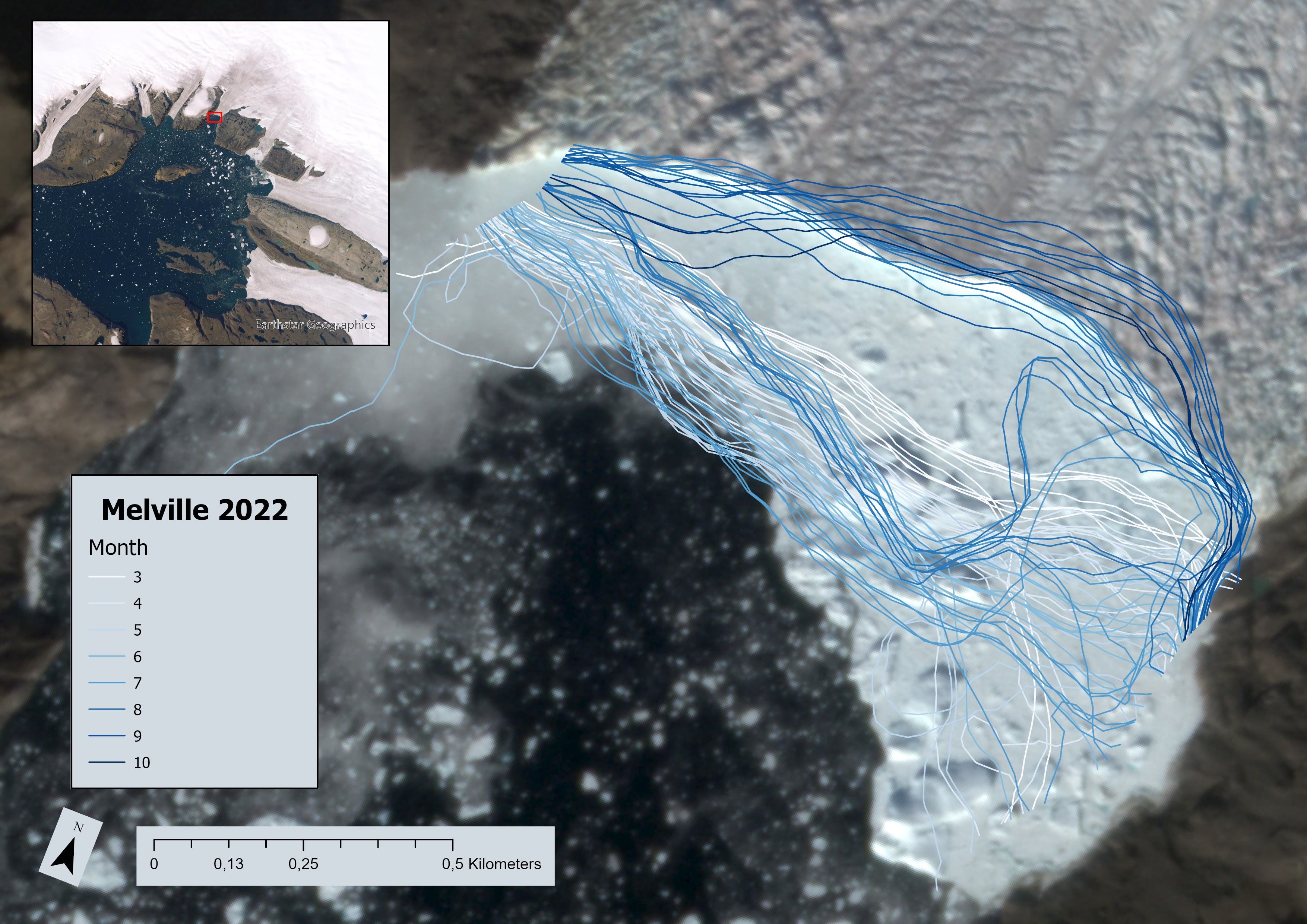
I’m slightly cheating on this one. The prompt on the 30 Day website makes it clear these should be AI generated maps. I’ve chosen to use an “AI” generated dataset. In this case, It’s from the dataset in my parallel #AcWriMo paper and is more or less a return to Day 2’s lines, only this time the lines, calving front positions based on satellite data, were retrieved using a deep learning model, coded up by Erik Loebel at the Dresden Technical University. I first got to see this in early development as part of my role on the ESA climate change initiative for the Greenland ice sheet. I think it’s a really exciting development, we have *so much* data from satellites and climate models, developing these kind of advanced statistical tools promises much faster analysis and deep insight into important processes, like what causes calving retreat and how quickly might these glaciers lose ice to sea level rise. Erik’s original paper showing lots of results for many different glaciers is here. I chose to show only Melville Glacier here, partly because we also had some manually picked calving fronts, but also as a result of this exchange on blue sky, with old friend Tim Bartholomaus, who is co-author with C. Bézu, of a new paper using a similar dataset to Erik’s to classify different types of calving, also based on satellite data.

As I pointed out at the link above, Melville Glacier has a very consistent calving style wiht tabular bergs visble on the centre line on satellite imagery going at least as far back as the 1970s. There’s lots more to say about this, not least how exciting it is that a field where I began my scientific career is now amenable to both big datasets and big data tools, and maybe we’ll start to see some new advances soon. But this post is already too long, so let me leave you with Day 9 AI only capture of Melville glacier front over a single year from 2022 (note the method uses optical imagery, so doesn’t work in the polar night from late October to early March).
Day 10: Paper and Pencil
Because I’m slightly behind, today is a twofer – and I’ve gone back to my PhD thesis for this one. Sometimes, a schematic map is better than a detailed map. This was my field glacier – I worked here in 2004 and 2005, gathering data on crevasse depths and glacier strain rates. It was not unhazardous work but we got a very interesting dataset, and there are few like it, for obvious reasons. I sketched this map out based on some previous maps made by Evans and Twigg, but added some additional labels.
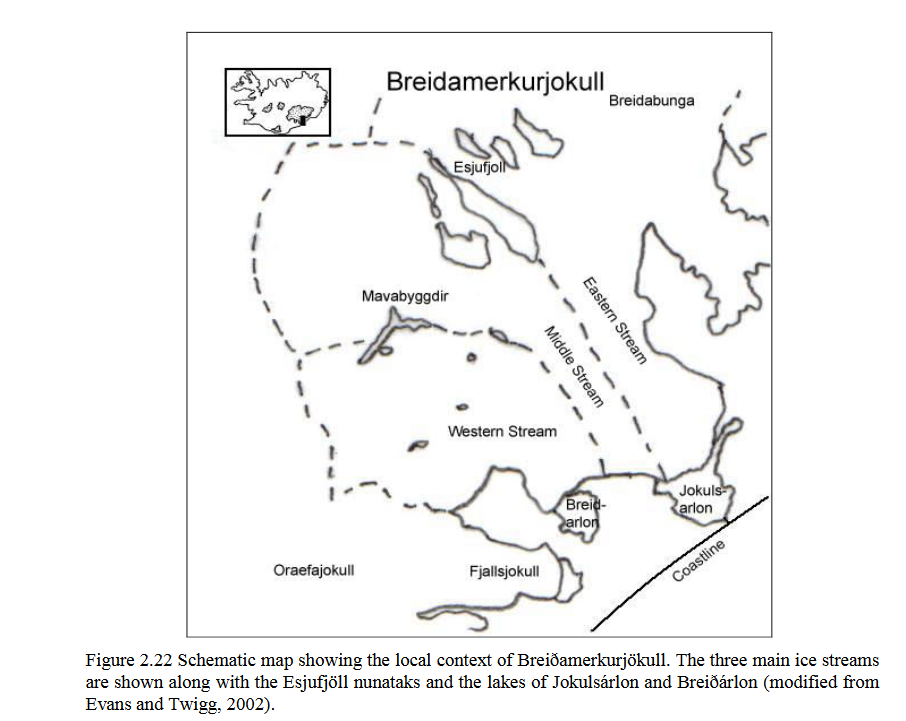
Calving Glaciers: A Study at Breiðamerkurjökull, PhD thesis
And because this is now pretty old, here’s a satellite image from Sentinel-2 (processed, of course, on Sentinel Hub’s EO browser) from August this year for comparison. Note how the glaciers have retreated and the lakes have grown. Breiðamerkurjökull and the Jokulsarlon lake in front of it are now major tourist attractions in south east Iceland.

