More publication news! This month I’ve actually had 3 co-authored publications come out and hot on the heels of the mélange paper, a rather different piece of work I’ve contributed to has just come out: the latest assessment from the Ice Sheet Mass Balance Inter-comparison Exercise known as IMBIE to its friends, has just been published in Scientific Data. The paper is open access here: Otosaka et al., 2026. It’s the third (at least) in a series of articles monitoring the health of the ice sheets.
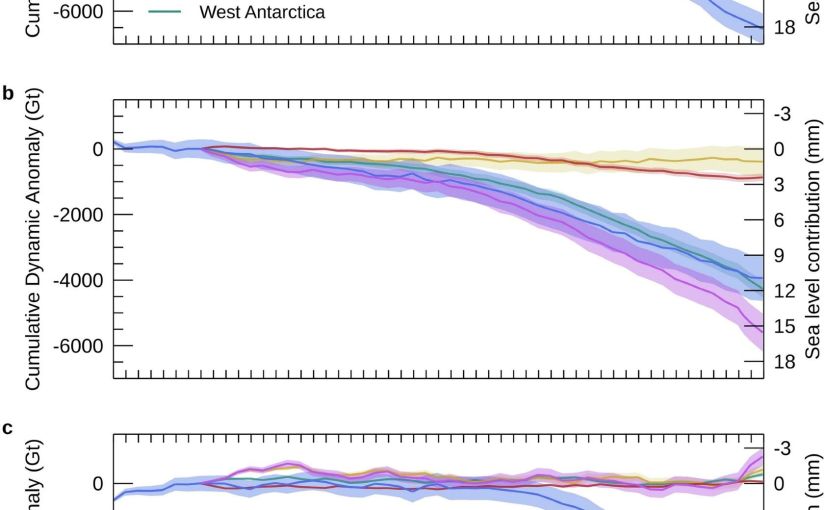
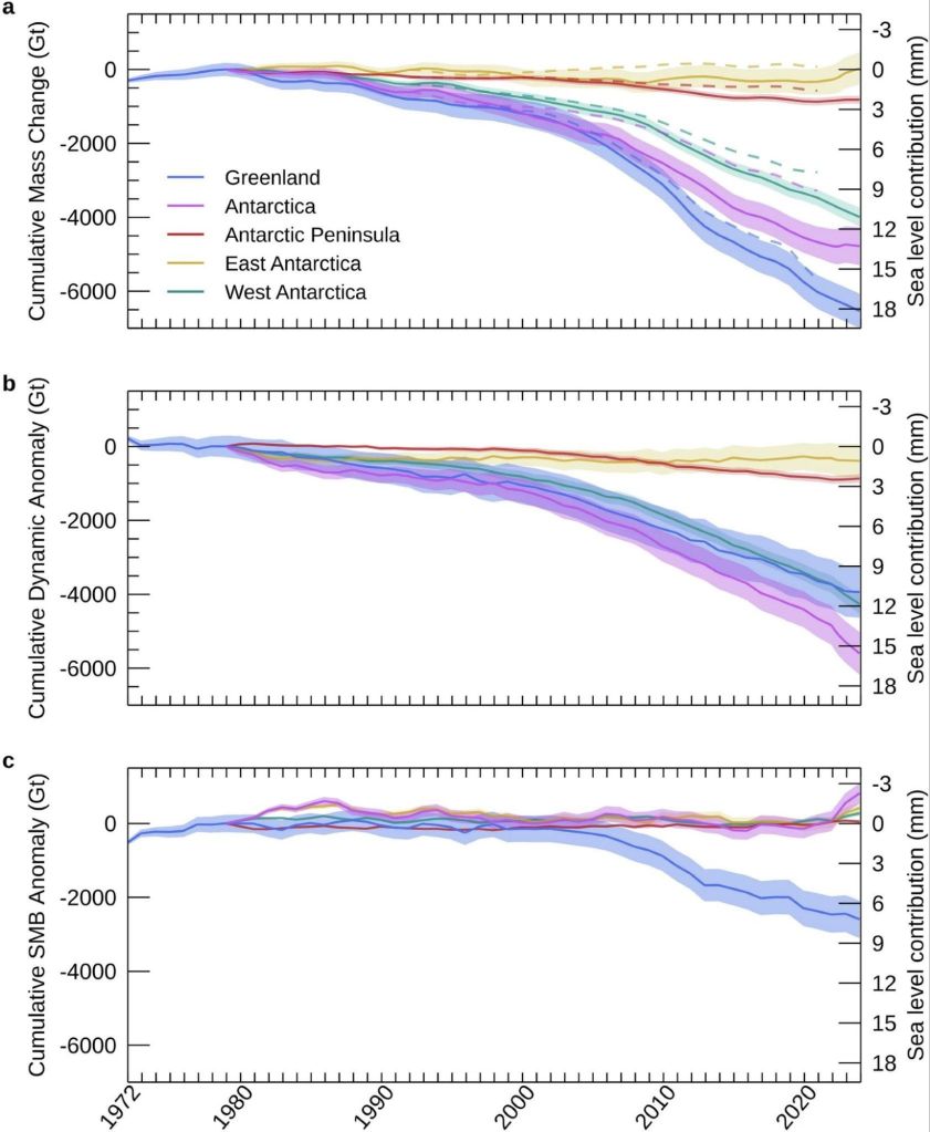
Figure 2 from the IMBIE paper is the money shot, as it were. The changes in ice sheet mass budget since the 1970s…
This one is a bit different from my usual, as it’s a data paper — the whole point is the dataset itself, which is freely available for anyone to download and use. But the numbers in it are rather striking and here is already a bit of misinformation spreading, so I thought it worth a short post.
What is IMBIE?
For readers who haven’t come across it before: IMBIE is a big international collaboration, supported by ESA and NASA, that tries to answer a seemingly simple question: how much ice are Greenland and Antarctica actually losing?
The problem is that measuring the mass of an ice sheet from space is really hard, and there are several different ways to do it — satellites that measure changes in ice sheet height (altimetry), satellites that measure changes in Earth’s gravity field (gravimetry), and the input-output method, where you compare how much snow falls on the ice sheet with how much ice flows out to sea at the glacier fronts. Each method has its strengths and weaknesses, and no single one gives the whole picture, specific choices in analysing satellite datasets can also give quite different results, not to mention model estimates of SMB can have a wide divergence.
IMBIE’s remit is to bring all the different groups together, get everyone to compute their estimates in a common framework, and then combine them. When many independent measurements agree, we can be much more confident in the answer, and that answer feeds directly into things like the IPCC reports and projections of future sea level rise. It’s community science at its best, even if it probably feels like herding cats to the fantastic coordinator Ones Otosaka, and I’ve been proud to contribute estimates from our HIRHAM5 surface mass balance modelling for both ice sheets to several of the IMBIE assessments over the years.
What’s new this time?
This latest assessment is the most comprehensive yet. The team combined 42 independent satellite surveys from 27 satellite missions — and extended the record further back than ever before, all the way to 1972 for Greenland and 1979 for Antarctica, using the early Landsat archive. That gives us a half-century view of how the ice sheets have changed. Though admittedly the recent years are much better covered than the earlier ones.
So what does half a century of satellite data tell us? (Note: just me who finds it hard to understand the 1970s as half a century ago?)
The two ice sheets have lost 11,300 billion tonnes of ice since 1979, raising global sea level by 31.4 mm — about three centimetres. Greenland accounts for the larger share, with Antarctica contributing 13.3 mm. The ice sheets are now responsible for roughly a quarter of all global sea level rise. The remainder is mostly due to thermal expansion as the oceans warms..
Three centimetres may not sound like much, but as Andrew Shepherd put it in the press release, that puts another six to nine million people at risk of coastal flooding and erosion. And the trend is very much in the wrong direction. In low-lying Denmark this gives us more extreme storm surges and coastal flooding as even a few centimetres
A headline and a nuance: it’s the ice dynamics, not the surface melt, or is it?
There’s an important part of the paper which partitions the mass budget between dynamical losses and SMB changes. This is highlighted and the reasoning seemed obvious to me but in conversation with others is perhaps less obvious, so I want to discuss it here.
Of all that ice loss, 84% came from ice dynamics, that is outlet glaciers speeding up and discharging more ice into the ocean, from both calving icebergs and submarine melt, but “only” 16% from enhanced surface melting.
Now, I have spent a large part of my career working on surface mass balance, how much snow falls on the ice sheet and how much melts off it. We track it in near real-time on the Polar Portal, I write annual updates about it, and it’s genuinely important as it is the only way an ice sheet can maintain itself, no snowfall, no ice sheet.
Melt is also an important driver of ice dynamics, especially for Greenland. So it maybe should be with some professional humility that I report that the long-term mass loss story is apparently mostly a dynamics story: the ice sheets are responding to a warming ocean by flowing faster into the sea. Greenland’s rate of loss went from around 60 billion tonnes per year in the 1980s to 264 billion tonnes per year in the 2010s; Antarctica’s went from 48 to 202 billion tonnes per year over the same period, driven overwhelmingly by ocean melting at the outlet glaciers — with West Antarctica’s Pine Island and Thwaites glaciers leading the charge.
But there’s an important nuance in that 84/16 split, and it’s worth being clear about what it does and doesn’t mean. Surface mass balance is a two-way term: it’s positive when snow accumulates and negative when ice melts and runs off. And a warming climate pushes on both sides of the equation, more melt, certainly, but also more precipitation, at first as snow and increasingly we can measure over Greenland at least, as rain. Dynamic mass loss, by contrast, can only ever be negative: glaciers can only discharge ice into the ocean, they can’t drag it back up again. So we honestly wouldn’t expect SMB to be the biggest term in the loss budget, both sides of the SMB equation are increasing, it is in a race with itself. The genuinely worrying scenario is the one where melt and runoff together becomes bigger than snowfall. We are a very long way from that scenario fortunately, particularly in Antarctica but we’ll be in big trouble if, or perhaps when, that happens.
(Calving glaciology colleagues will note this whole discussion connects rather nicely to the question of what controls calving rates, which was the subject of my last post on melange…)
And now for a note of caution on the recent slowdown
You might have seen headlines suggesting ice loss has slowed down recently. It’s true that the most recent years in the record (2020–2023) show a temporary slowdown. A run of milder Greenland summers roughly halved its surface melting, and record snowfall over East Antarctica has offset some of the glacier losses there.
In fact we as a community have been on it as that East Antarctic snowfall is a story in itself. In a paper led by Marlen Kolbe earlier this year (Kolbe et al., 2026), (that I didn’t quite get around to talking about then, but I will rectify that), we showed that the extra snow is being delivered by atmospheric rivers — those great corridors of moisture streaming from a much warmer ocean towards the continent. Since 2020 they’ve become more frequent and more intense, dumping enough snow over East Antarctica to tip the whole ice sheet’s mass budget briefly into positive territory.
Is that reversal in mass budget temporary or permanent? Honestly, we don’t know yet but it matters because atmospheric rivers are double-edged. They bring massive snowfall, but they’re also often accompanied by a lot of melt — warm, wet air is rather good at melting ice as well as adding it. So the balance between accumulated snowfall and melt becomes more critical to understand here too, and the existing balance may well tip in the future.
The long-term picture remains one of accelerating loss, and as the climate continues to warm, we expect the losses to pick up again, especially in Greenland which is much further south than Antarctica is north, if that makes sense?
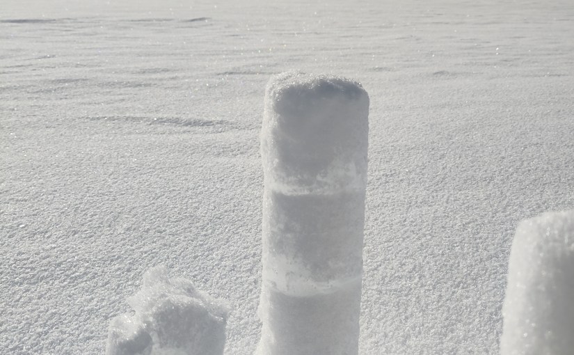
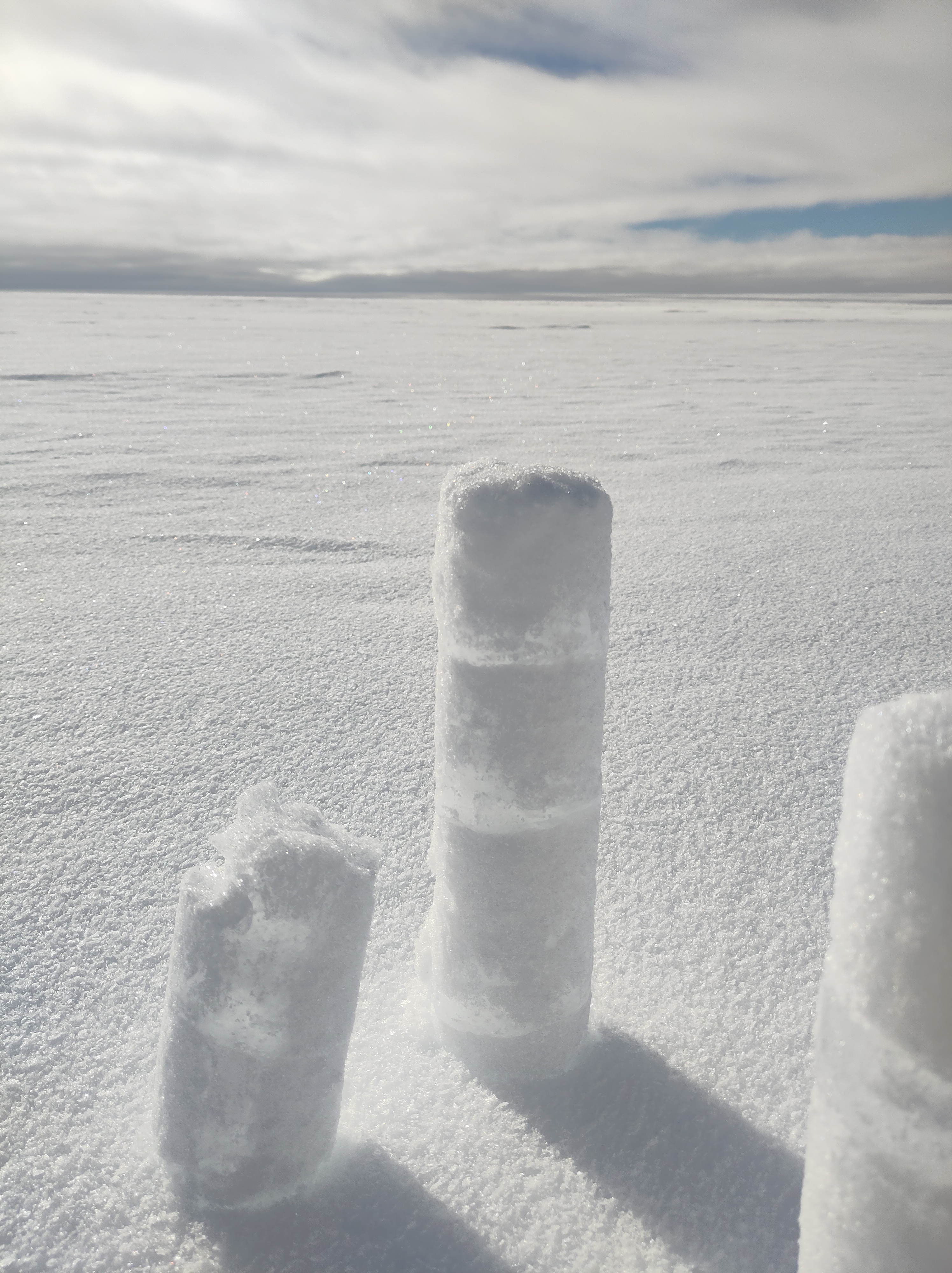
Refrozen melt layers in an Antarctic shallow ice core. We found a lot more of these than we expected based on satellites. Our all-seeing eyes in the sky don’t always see everything..
The response of the ice sheets to a warming climate is the single largest source of uncertainty in projections of future sea level rise. High-end estimates of global sea level rise by 2150 increase by a factor of 2.6 once the risk of ice sheet instability is accounted for. A continuous, half-century record of what the ice sheets are actually doing is exactly what we need to test the models and narrow those uncertainties, which is precisely why this dataset is such a valuable community resource, and why sustaining the satellite missions (CryoSat-2 and the Sentinels among them) that make it possible matters so much.
The full dataset is freely available from the UK Polar Data Centre, and you can read more about the IMBIE project at imbie.org. My thanks to Inès, Andrew, Tyler and the whole IMBIE team for pulling it all together — these assessments are an enormous amount of work, and the credit for this one belongs firmly with them.
As always, comments and questions welcome, here or on mastodon or blue sky.
Otosaka, I. N., Shepherd, A., Amory, C., et al. (2026). Mass balance of the Greenland and Antarctic ice sheets from the 1970s to 2023. Scientific Data, 13, 1301. https://doi.org/10.1038/s41597-026-08088-0
Publication day! Our new paper has just come out in The Cryosphere, and after what feels like rather a long gestation, I’m delighted to finally be able to share it – The full paper is open access and available here: Hedetoft, Bang Brinck and Mottram et al. (2026).
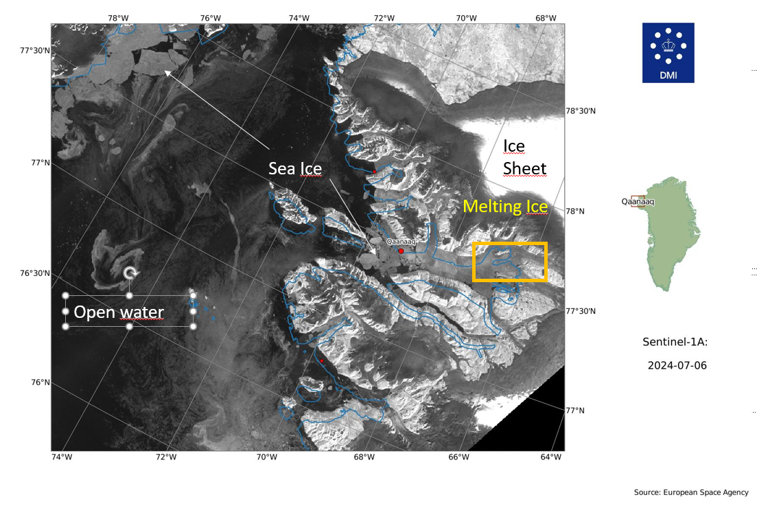
As I wrote back in one of my several Qaanaaq posts, my colleague Steffen Malskær Olsen has been running a long-term observation programme in the fjord near Qaanaaq for 15 years now. That programme, and the field laboratory DMI maintains there, gave us an extraordinary opportunity to study something that glaciologists have been arguing about for years: what role does ice mélange actually play in controlling calving?
Ice mélange — sometimes known as sikussaq in Greenlandic — is that chaotic jumble of icebergs, bergy bits and sea water that sits in front of marine-terminating glaciers. It’s been described as the world’s largest granular material, and it’s a characteristic feature of pretty much every calving glacier in Greenland. In winter, landfast sea ice forms and acts as a kind of seasonal glue, sticking the whole mass together. The question is: does this frozen-together mass actually hold the glacier back, like a tiny ice shelf? Or is it more like a pile of rubble that the glacier shoves ahead of it with barely any resistance?
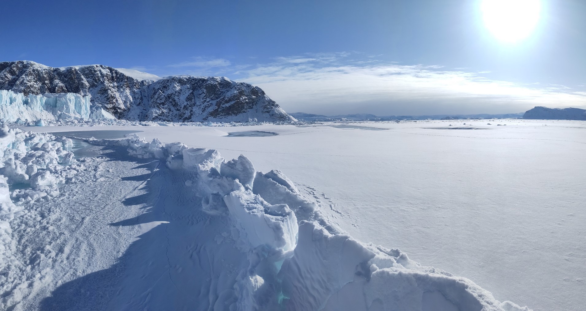
Iceberg melange in front of Melville glacier, with ridges and fractures in the sea ice forming as the glacier pushes through the winter.
The scientific community has been somewhat split on this. Some studies point to mélange as a mechanical inhibitor of calving — the idea being that calving only really kicks off once the mélange weakens or disappears. Others find the buttressing effect is limited, or depends heavily on whether landfast sea ice is present to bond the icebergs together. Most of the attention has been on the big, famous glaciers like Jakobshavn Isbræ and Helheim, which are enormous, fast-flowing, and in long narrow fjords. But what about the smaller, more typical glaciers that make up the majority of Greenland’s calving outlets?
That’s where Inglefield Fjord comes in.
The study site
We focused on three neighbouring glaciers at the head of Inglefield Bredning (Kangerlussuaq) in Northwest Greenland, at about 77.6°N: Tracy, Farquhar, and Melville glaciers. They’re a nice set because they’re different sizes — Tracy is the biggest at about 223 km², Melville is 119 km², and Farquhar is the smallest at 54 km² — and they’ve all been retreating at different rates over the last few decades. Tracy has been the fastest, retreating at about 200 m per year since the 1980s, twice as fast as Farquhar. Melville has been the slowest.
The area is also, crucially, accessible. The nearby town of Qaanaaq and the DMI field station there meant we could get out onto the sea ice by dog sled in late winter, working with local hunters and fishers who know the ice and the fjord far better than we ever will. This is something I want to emphasise, as I have before: this kind of science is a team sport, and the local community in Qaanaaq are absolutely essential to it.
What we did
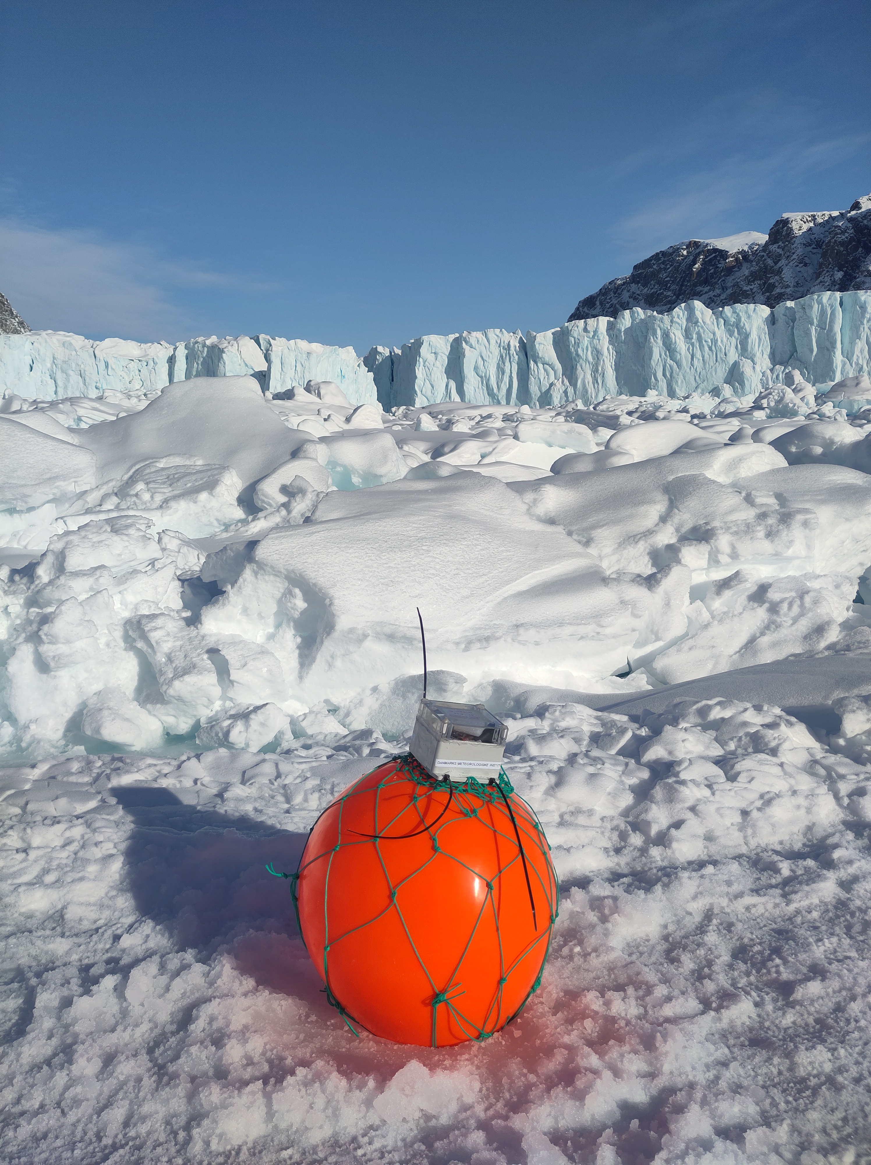
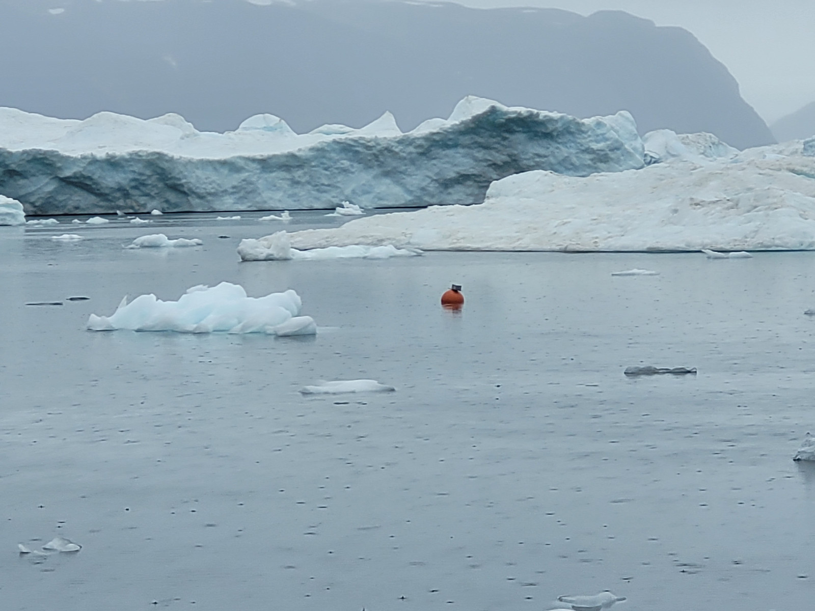
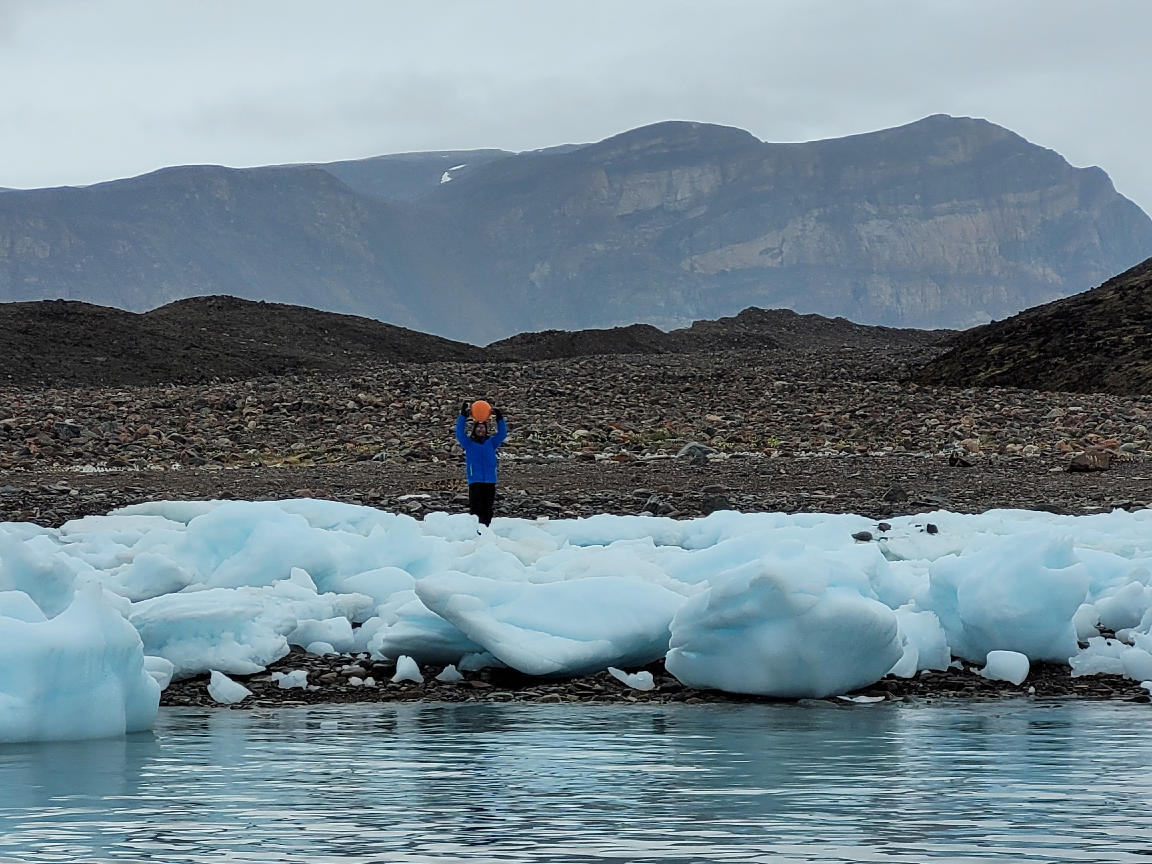
The core of the study is a set of GNSS-tracking buoys that we deployed directly into the mélange zone, drilling holes in the sea ice and dropping them in. They recorded their position every 10 to 30 minutes and transmitted it back to us via the Iridium satellite network. When the sea ice broke up in July, the buoys floated free and were recovered by boat — again, thanks to our friends in Qaanaaq — and redeployed the following year.
We used two types of buoy: the TRUSTED buoys, which are a proprietary system from a Danish company (very robust as demonstrated by the incredible twists the metal stakes had from being over ridden by icebergs, a long battery life, but unfortunately rather limited position precision), and the OMB buoys, which are open-source instruments that we could customise to record more frequently, though they unfortunately proved a bit more vulnerable in this environment. Both have their strengths, and using both gave us a nice combination of reliability and detail. Not in the paper but deployed this year was even a third type – so watch out for more coming from this programme…
In March 2022 we deployed 6 buoys at Tracy and Farquhar. In March 2023 we deployed 8 buoys (6 TRUSTED and 2 OMB) across all three glaciers. The buoys tracked the mélange from late winter through to the break-up in mid-July, giving us a continuous, high-resolution record of how the mélange was moving — something that satellites alone can’t provide at this temporal frequency.
On top of the buoy data, we used quite a few other techniques to build a story.
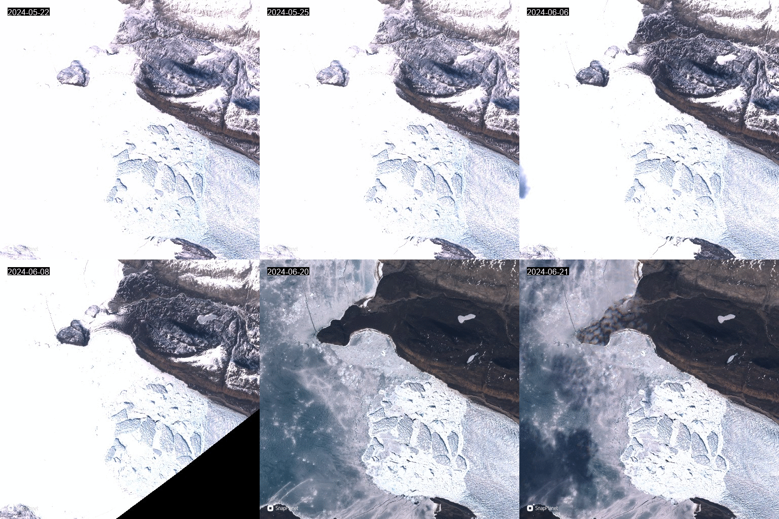
Satellite imagery from ESA’s Sentinel-1 (radar, works in the dark and through clouds) and Sentinel-2 and Landsat (optical) to track calving front positions and identify calving events. We used a deep learning dataset from our co-author Erik Loebel to automatically extract calving front positions, but we also spent a lot of time manually checking satellite images because, frankly, the automated method sometimes confused the mélange edge with the glacier front, on the other hand our results independently confirmed that on a seasonal scale, the machine learning calving front detection actually works quite well!
Ice velocity data from our colleagues at PROMICE, again using ESA’s Sentinel-1 product, which (handily for us) isn’t masked to the ice sheet only, so it includes velocities from the mélange zone too.
Climate data from CARRA (the Copernicus Arctic Regional Reanalysis, a very cool 2.5 km resolution climate reanalysis for the Arctic) for winds, and our trusty HIRHAM5 regional climate model for surface melt and runoff timing.
The idea was to bring all these different datasets together and see how calving, mélange movement, glacier velocity, sea ice, and surface mass budget all interact over the course of a season.
What we found
I’ll try to keep this readable, but there’s quite a lot of detail in the paper for those who want it, so here are our key findings
1. The mélange moves steadily — with sudden jumps
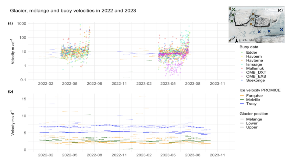
The buoys showed the mélange creeping slowly but continuously away from the glacier fronts, at speeds of roughly 2–11 metres per day, punctuated by occasional abrupt jumps. These jumps were larger and more frequent closer to the glacier fronts, and the larger Tracy glacier had more influence on mélange velocity than the other two. This fits with the idea of the glacier pushing the mélange down-fjord, like a slow-motion conveyor belt but with the rigid land fast ice causing resistance that abruptly fractures.
Velocity from the GNSS buoys at the top, compared with the satellite data at the bottom. The overpass and processing frequency of the satellite data smooths the velocities measured by the GNSS buoys.
2. Calving happens even in deep winter
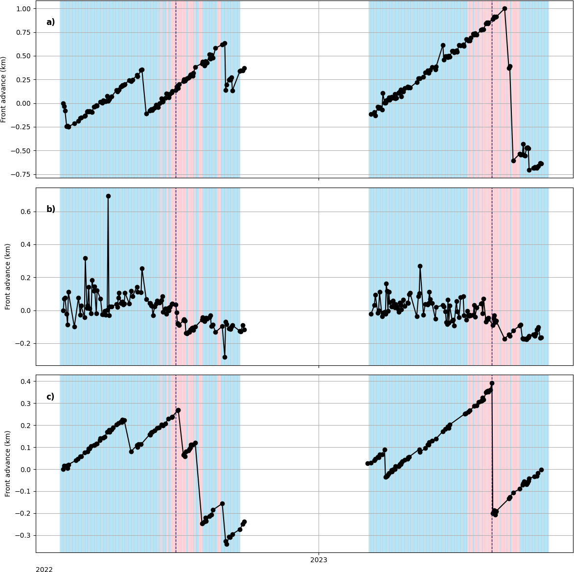
This was perhaps the most striking result. We observed large calving events at the peak of the fast ice season — in other words, when the landfast sea ice was at its thickest and most extensive, and the mélange was fully frozen together. Neither the landfast ice nor the mélange fully suppressed calving. This challenges the idea that mélange acts as a simple mechanical brake.
Calving front time series at the central flow line at (a) Tracy glacier, (b) Farquhar glacier and (c) Melville glacier for 2022 and 2023. Calving front positions are marked with black dots, and solid gray lines connect entries for each year. Red and blue backgrounds symbolise positive and negative temperatures, respectively, based on 2m air temperature data from CARRA at 12:00UTC and the dashed vertical lines represent sea ice break-up dates for the two years in question, 16 July 2022 and 25 July 2023, identified from changes in buoy movements and examination of optical satellite imagery. (Loebel et al., 2023).
3. No tidal signal in the mélange
Inspired by this paper, we did a spectral analysis of the high-resolution OMB buoy data to look for tidal or diurnal cycles in the mélange movement. We found none. In fact we found something even a bit more interesting that – we had one buoy that seemed to show some kind of diurnal periodicity, but very complete spectral analysis found no tidal signal at all. We concluded the periodicity relates to the GNSS signal itself – a warning to analyse full all your data and consider other hypotheses as well as the favourite one!
The mélange during the fast ice season appears to be driven almost entirely by the glacier pushing from behind and perhaps by wind forcing, not by tides. This is interesting because tides are sometimes invoked as a driver of calving events via the melange, but at least at these glaciers during the fast ice season, we see no evidence of it.
4. Unbonded mélange doesn’t do much — it’s the landfast ice that matters – but only in winter
This is probably the key finding. When the mélange is just a loose jumble of icebergs (as it is in summer, after the sea ice has broken up), it has very little influence on glacier velocity or calving rates. It’s only when the individual ice blocks are frozen into a matrix of land fast sea ice — losing their “granular material” properties and becoming more like a rigid, multi-year sea ice cover — that they appear to exert any kind of braking effect. And even then, that effect is limited.
5. It’s a combination of factors
Putting it all together, our conclusion is that at these representative small and medium-sized Greenland outlet glaciers, seasonal calving behaviour is modulated by a combination of surface melt, glacier velocity, and the presence of landfast sea ice that bonds the mélange. It’s not one thing — it’s the interplay of several, and the landfast ice acts more to delay the removal of mélange than to prevent calving outright.
Why does this matter?
Calving processes account for roughly half of the total mass loss from the Greenland ice sheet, yet they remain poorly represented in ice sheet models. It’s something I’ve been working on since my PhD. If we can’t model calving properly, we can’t project future sea level rise properly — and for a country like Denmark, that’s a rather existential question.
Most previous mélange studies have focused on the big, dramatic glaciers. Our study suggests that at the more typical, smaller glaciers that make up the bulk of Greenland’s calving outlets, the story is more nuanced. Mélange buttressing isn’t a simple on/off switch. It depends on whether the icebergs are bonded together by landfast sea ice, and even then, the effect is modest. Surface melt and glacier dynamics seem to matter more and these are all inter-realted processes, typically the air temperature gets warmer, the ice surface starts to melt, the glacier starts to accelerate and the sea ice gets weaker and thinner all at the same time. We have confounding variables which makes the picture difficult to disentangle.
We also hope the dataset we’ve collected — the in-situ buoy tracks, the satellite-derived calving fronts, the velocity comparisons — will be useful for other groups working on modelling mélange processes. There’s very little in situ data across seasons with this kind of temporal resolution, and we’d be delighted if others can use it to test and improve their models.
Some Criticisms… and what’s next?
We had a very excellent editor and really good reviewers who gave the paper a through filleting. You can see these online as the Cryosphere has open review. I thank them all for their good comments which certainly clarified the paper. The main criticism that may still be levelled is what about the melange thickness? Maybe these glaciers don’t see an effect because the melange is thin and weak? Well we do go into that in the paper. These are pretty representative glaciers for Greenland by any measure and perhaps the glaciologists view of melange processes is slightly skewed by all the studies at Jakobshavn/Sermeq Kujalleq and Helheim? However, when you stand in the melange zone, it becomes very clear just how heterogenous it is. The large icebergs make up a relatively small portion of the total area, so current models, using “melange thickness” as a tuning parameter are missing some subtlty, which probably turns out to be important in this subject area.
And there’ll definitely be more on melange dimensions and how that relates to buttressing, coming very soon!
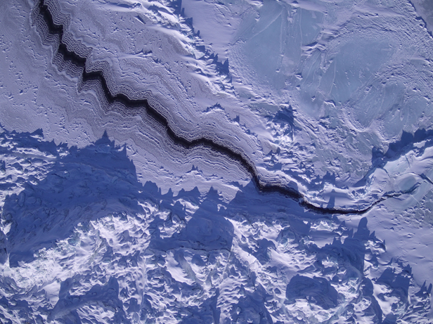
UAV shot of a sea ice lead in the melange zone of Tracy glacier, 2023
Acknowledgements
This paper was led by Sofie Hedetoft and Olivia Bang Brinck, who share first authorship with me and who did the lion’s share of the analysis and making of the figures. It’s been a real pleasure working with them and we would certainly not have got very far the rest of the team: Andrea Gierisch and Steffen Malskær Olsen, who were fantastic field work colleagues and a great inspiration for the ideas in this paper, Martin Olesen and Nicolaj Hansen for climate and SMB insights, Anders Anker Bjørk for finding our marvellous students and offering great advice on ice velocioty products, Erik Loebel for the automated calving front analysis, Anne Solgaard for the satellite data processing and assistance in interpretation and Peter Thejll whose expertise in statistics and spectral analysis is unrivalled.
As ever, none of this would have been possible without the local community in Qaanaaq — the hunters and fishers who guided us, transported us by dog sled, helped install instruments and recovered our buoys by boat when the ice broke up. Our DMI colleague Aksel Ascanius, who lives and works in Qaanaaq, has been an essential part of the programme throughout.
The work was carried out under the auspices of the Danish National Centre for Climate Research (NCKF), funded by the Danish Government, with additional contributions from EU Horizon Europe frameworks and ESA’s Climate Change Initiative for the Greenland ice sheet.
The full paper is open access — please go and read it, and do get in touch if you have questions or comments. I’m always happy to hear from people, whether on here, on mastodon, or by email.
Hedetoft, S., Bang Brinck, O., Mottram, R., et al. (2026). Mélange, landfast sea ice, ice velocities: What controls seasonal calving rates in North West Greenland? The Cryosphere, 20, 5071–5098.https://doi.org/10.5194/tc-20-5071-2026
I’m in Antarctica and yet I have been getting contact from journalists because Greenland is all over the press at the moment for all the wrong reasons. It’s reasonable I think to worry about what the various deranged threats towards Greenland will mean for us all also outside of Greenland. But I also think about (and yes, worry) about the friends I’ve made in Greenland over the years. Let’s hope common sense prevails and we can step back from the brink, and concentrate on the really long term problems that we are still rapidly storing up for ourselves.
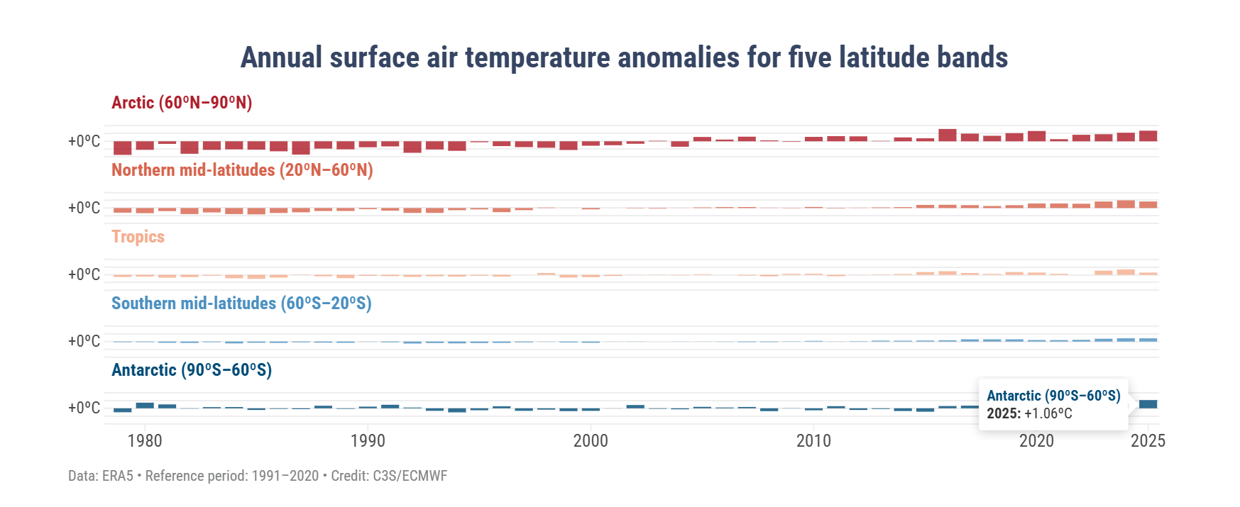
Greenland is also on my mind, not just because of geopolitics, but also because the Copernicus Climate service has just put out their annual global climate highlights* for 2025 report with some disturbing results from Antarctica.
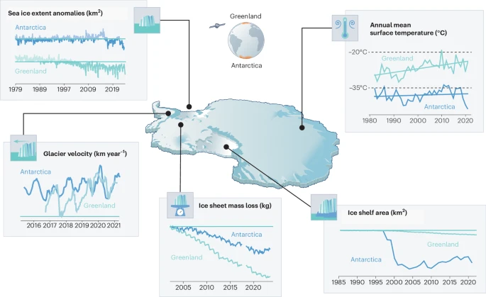
A few months ago we had a paper published called the Greenlandification of Antarctica, in which we argue that the changes in the Antarctic cryosphere increasingly resemble those we have previously observed in Greenland and the Arctic. To see the future of Antarctica, look at Greenland.
It’s been a busy time preparing for fieldwork and I didn’t manage to write anything here about it at the time, but this few eye-opening figure rather supports some of our arguments.
In this graphic, the 2025 temperature over the Antarctic region was 1.06°C higher than the average between 1991 and 2020 (a temperature anomaly). This is actually higher than any other region except the Arctic, where the temperature anomaly was reported to be 1.37°C above the 30 year average (bear in mind also that between 1991 and 2020, the temperature was also much increasing, so we’re not comparing with a pre-industrial climate here). Polar amplification was predicted long ago and as those first experiments found, it also is seen more in the Arctic than the Antarctic – but these results are a first hint of the amplification that is perhaps appearing now and may come to stay in the Antarctic.
In our paper we show the figure below (many thanks to illustrator Jagoba Malumbres-Olarta for the fine work), which shows five different cryosphere properties that are changing: 1) shrinking sea ice, 2) glacier velocities that show a seasonal cycle (mostly detected on the peninsula so far, though there are indications that Totten glacier for example has some kind of seasonal cycle, possibly modulated by sea ice), 3) total ice sheet mass loss, 4) ice shelf area and 5) annual mean surface temperature. In virtually all, the changes look very similar between Greenland and Antarctica, but with the crucial difference that the speed of changes is so far faster and more advanced in Greenland.
From Mottram et al., 2025: The Greenlandification of Antarctica. Original caption: a, Commonalities include decline in sea ice extent from 1980 to 20232, with notable step-like changes in both poles. b, Seasonal glacier velocities are shown for two representative marine terminating glaciers, Kangilernata Sermia in Greenland13 and Hotine Glacier on the AP9, both now displaying similar seasonal dynamics. c, Both ice sheets show an accelerating total mass loss measured by GRACE satellites8. d, Multi-sensor records of ice shelf area loss in Antarctica11 show a steeper decline than Greenland7 as Arctic ice shelves were largely lost in the pre-satellite era. e, Satellite records of annual mean ice sheet surface (skin) temperature for 1982 to 2021 from radiation data in the CLARA-A2.1 record processed by OSISAF2 over both ice sheets. Earth observation data allows us to generalize over the vast size and spatially varying trends of the ice sheets, where there is generally poor coverage of in situ data. Individual weather stations indicate warming trends in air temperatures over both ice sheets of ~0.61 °C per decade at the South Pole and ~1.7 °C per decade at Greenland coastal stations. Illustration by Jagoba Malumbres-Olarte
The latter surface temperature plot is not the same as the Copernicus 2m air temperature which is based on the ERA5 reanalysis (so a blending of computer model with observations from satellites, weather stations, balloons, ships, planes etc). In our paper we wanted to focus on the contribution that satellite data has brought as we simply have so few direct in situ observations, so we used skin or surface temperature which is measured from satellites. It’s a somewhat theoretical construct, imagine a very thin surface (hence skin) layer, where incoming and outgoing energy are summed up to give a temperature. This is calculated over both ice sheets and sea surface by our colleagues in the satellite group at DMI and this is the dataset we used here. Their results which stretch back to the 1980s show a slow upward trend in Antarctica and a steeper change in Greenland, the record stopped in 2021 in our paper but it actually shows an upward increase since and that’s also borne out by the Copernicus results. In climate and weather models we in fact first calculate the skin temperature and then back interpolate to 2m temperature, so the two are very closely related.
To check that the satellite skin temperature record was accurate, I also looked at some of the longer in situ records, the South pole station for example has a long record and shows a small increasing trend over the last 30 years or so (which also may be attributable to natural causes, it is hard to pick out the global warming trend). Analysis of the record also shows that it is largely due to decreasing cold extremes rather than necessarily higher warm extremes. Again, a pattern we also observe in the Arctic.
Shallow snow cores drilled near Wasa, the clear layers are refrozen surface melt that has percolated into the snow below the surface. I was genuinely not expecting to see these, and it’s not always captured in the satellite record either, so we clearly have work to do to explain some of these findings.
The analogy is not exact. As a continent, Antarctica is much further south than Greenland is to the north and it is much more insulated from warming by the circumpolar ocean than the Greenland ice sheet, sticking out in the middle of the Atlantic is. In a very real sense then, geography is destiny. Surface melt, which is also not nearly as common here in Antarctica mostly refreezes in the snowpack, whereas in the lower parts of Greenland it generally runs off and contributes directly to sea level rise. That has not yet become a major process in Antarctica, it’s still colder here and there is less surface melt for now, although from our own observations in the field, much more than I’d expected. Surface melt is definitely something we need to keep an eye on and some of our observations show how tricky that is, especially given disagreements between satellite sensors on this point .
But these are all details, the point is that Antarctica is also part of the global climate system and the same processes we’ve been observing for more than three decades in Greenland are now also starting to become apparent here too.
In one other respect Antarctica is becoming more similar to Greenland – it is becoming more contested. The Treaty that has governed Antarctica is vulnerable and subject to the same weakening of the global order that is now playing out in the North.
Let’s hope that geopolitics can settle down soon so that we can start to tackle the more serious and longer term crises coming down the line.
*I’m not sure “highlights” is quite the right word either – maybe “lowlights” would be better, but then it also starts to sound like a report on hairstyles…
It’s always nice to kick off a week with notification that a paper you have co-authored has been published.
In this case, and due to a magnificent effort by lead author Gavin Schmidt (who heaven knows must have many other things on his plate at NASA GISS right now), the” Datasets and protocols for including anomalous freshwater from melting ice sheets in climate simulations ” is now out in Geoscientific Model Development.
If that sounds a bit clunky, well it is. The idea is that the paper is a technical guidance, to help climate models (specifically for CMIP7), to include the effects of ice sheets into the earth system, without having to actually include a full ice sheet model, which turns out to be quite hard, particularly in Antarctica.
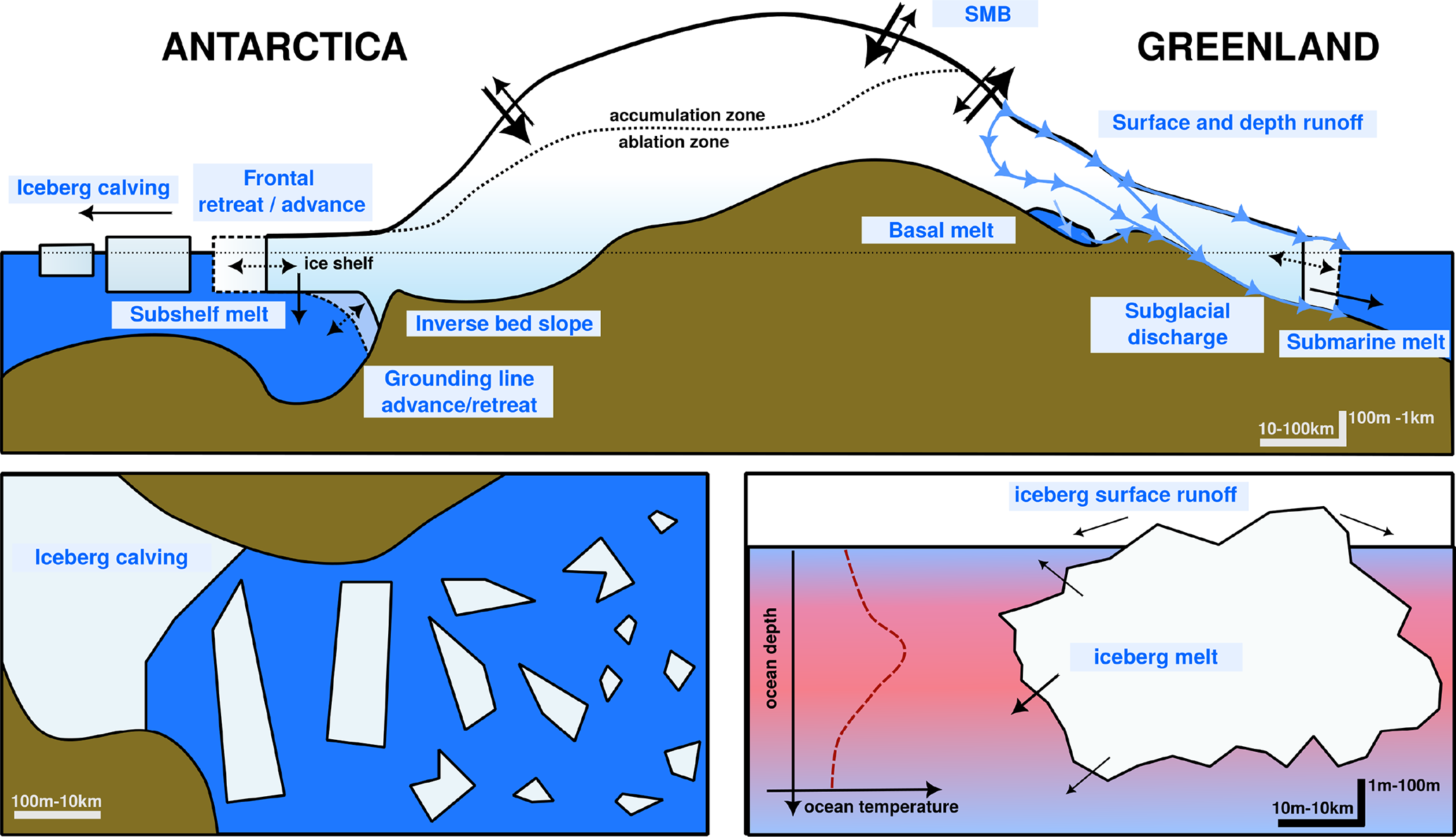
Even so there’s a lot of general interest in the paper, including how this is usually done now (there are a range of different approaches, each with their quirks). And then a particularly nice and clear section is given on all the many different ways that ice sheets lose ice. The figure below from the paper shows some of these and as they all have different downstream effects on ocean circulation, sea ice and of course sea level rise, it’s important to work out how to include them efficiently. The paper as it stands is a really nice introduction to the subject.
Figure 1 from Schmidt et al., 2025 showing a schematic of how ice sheets lose ice.
Icebergs are particularly interesting as a source, as the meltwater from these can take years to be added to the ocean, in which time, they will have drifted hundreds or thousands of kilometres. We have some suggestions on those too.
In any case, we hope this paper, which grew out of a technical online workshop on the subject, partly organised by our Ocean Ice project, will turn out to be a useful source for the groups that actually run the global climate models for CMIP and the IPCC. Many of these models are still in development or being initialised now, so time is already short for those of us involved in the technical parts of the exercise. The publishing process is slow, but this is also why preprints are so valuable. This paper in its submitted form has been up for months, it’s only now the final version is ready, but it hasn’t changed much. While it feels hard enough keeping up with published papers that preprints feel like a distraction, science is moving so fast, it’s probably essential. Maybe I’ll write more about that later. Of course preprints (and indeed published papers) can lead you astray, especially in fields you don’t know much about (as COVID was a helpful reminder), so perhaps sensibly the IPCC insists on acceptance of manuscripts before including them in their reports. Nonetheless, keeping up with preprints is now probably almost as important for scientists as keeping up with the published literature.
On the subject of the IPCC, I was reminded this weekend that it’s now less than 500 days until the submission deadline for the working group 1 part of the next IPCC report (AR7), so it’s time to start thinking about what are the priorities to get into the scientific literature to inform this effort. IPCC can only report published work, and doesn’t do its own, so now is the moment to pull out that unfinished but crucial piece of evidence of something or other relevant and get it submitted.
Not coincidentally, it’s time to talk about Academic Writing Month (AcWriMo). I actually try to write all through the year but November is time for a final push to try and meet my (usually far too ambitious) annual goals.
I had intended to start AcWriMo again this year, I’ve a huge backlog of papers to get done and it seemed a good way to start. However, a big proposal writing effort (more on here if the funding comes through) and a Hackathon (of which more also anon), both extremely rewarding and in fact also involving a lot of writing, somewhat derailed the first 10 days of my effort…
Now however it is time to focus on the remaining almost 3 weeks of November. The plan is one hour per day, except weekends, just focused on papers. I’ve put it in my calendar already. Let’s see if I can stretch more than that. Also non- negotiable is daily exercise. The fresh air and time away from the computer is almost as important as sitting down to do the work.
I’ve got an almost done experimental protocol to write for the PolarRES project (which finishes his month, so there’d be a nice symmetry to getting that done). And then there’s the much delayed reply to reviewers on our ice mélange study in NW Greenland as my main foci, but I also want to help my Hackathon group get their project knocked into shape, so some time will be spent there.
I’ve also got various diverse co-authored papers I need to contribute to, read,edit and give my options on. I hate to become a roadblock for colleagues so that also needs some attention but I’m for sure already out of time.
So if you want to see all stages of the sausage being made, follow along with the hashtag (#AcWriMo25) on socials, but hopefully you won’t see me there much because I #amwriting.
I very rarely have time to write a proper field diary, our time in the field is usually extremely hectic and filled with 12-18 hour working days that blend seamlessly together. I suspect this week is also going to be busy, but Nature has offered an olive branch in the shape of an early break-up of the sea ice, so I’m taking a moment to write a few things down. Updates will be posted at the top so scroll down to read the first day.
And finally…
I’m writing this on the metro home, I’ll spare you the flight delays, the packing up dramas, the last minute, “just one more snow pit”…
Melville Bugt from the air
It was a good tour. Enormous amount of work done, perhaps more importantly, it has also been foundational work, on both data and field site management, it will be much easier for colleagues to help us maintain this and to build up a long term data set of all the observations (and more that I haven’t written about here) in future. That should reduce costs and field time in the future but also give others the opportunity to visit and do their own research up here.
The traditional hunters gloves turn out to be by far the best thing to work in when programming outside. You can put your hands in and out very fast and they are super warm.
I think streamlining the storage of data is extremely important. There is far too much data in the world on hard drives and in field notebooks, doing no good to anyone. This system will be much easier for other colleagues to use what we have collected and we will be able to publish them outside of DMI soon too. I remain committed to FAIR publishing, but I often feel the barriers are practical rather than psychological.
I’ve also introduced my new(ish) colleague Abraham to the Arctic. Given he grew up in a place without snow it has been a delight to watch him discover the processes and problems that I’ve been working on the last 20 years and that we’ve been discussing together the last 18 months. I believe it’s extremely important for climate modellers to understand and see the system they’re trying to model. This trip has definitely confirmed me in that. This was not just a field campaign but also a pedagogical field trip in some ways too. We have also had the opportunity to brainstorm a lot of new research ideas along the way, there is rarely such time in the office, so plenty more to work on in coming years..
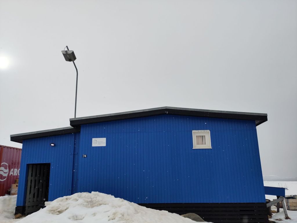
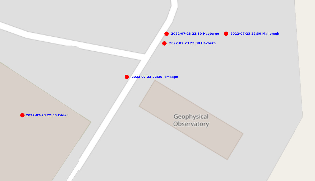
The DMI geophysical facility, newly painted!
As ever massive thanks to many colleagues, especially Aksel our DMI station manager without whom this work would be close to impossible given he is both interpreter and collaborator on the practical observations; Qillaq Danielsen for taking us out on to the sea ice with his sled. Steffen for running an extremely valuable long-term programme, Andrea for helpful and practical discussions and of course Abraham for making it a very good week. Glad we got to do this.
I should also say a large thankyou to my husband for keeping the home front running smoothly along whilst I am travelling. None of this would work otherwise.
Tak for denne gang Qaanaaq!
Day 6: Last day
It’s amazing how fast the tine goes, our last full day in the field (we’d originally planned for 9 days, but that was partly because last year we planned a week and it got cut to 3 days due to flight weather problems, I learned and left a safety margin this year). Nonetheless, a busy day. As we’re really interested in lots of different processes that combine in what we call the Arctic Earth System our focus for today was twofold, looking at the atmosphere and the subsurface, both of which are partly other scientists projects, but giving data we really want to use with our climate model, both for evaluation and development.
Aksel and Abraham giving the site a few last tweaks
The main aim was to finalise the snow site ready for observations over the next year. We finally reinstalled the remaining FC4 and new logger, this has been ticking over and being tested in our station kitchen for the last couple of days. I’m rather pleased with myself in managing to get these 2 talking to each other, I was envisaging a bigger struggle, but the Campbell Scientific software is very easy to use with good user guides.
The installation was the last element for the snow site and after Aksel and Abraham’s sterling work in building our new logger station, it was trivially easy.
Et voilá! We have a fully functional snow site…
The experience with the new Campbell system proved invaluable in the next task, downloading a whole bunch of data from colleagues’ weather stations for shipping back to Denmark. Normally, we would have been a bigger crew to handle work on the sea ice as well as at the station, but as the sea ice broke up so early (see Day 1), our local hunter friends had taken them down and brought them in to Qaanaaq for us. They needed a bit of repacking, data downloads and checks and we set up a skin temperature calibration station for the satellite group, which I think will also be quite interesting for us in polar regional climate modelling to use. This we left overnight for longest possible calibration.
As we have many collaborations we also spent an hour trying to collect some data from the subsurface permafrost sensors installed by our colleagues at the University of Copenhagen. Unfortunately, it appears they need rather more maintenance than we can provide, so that will need a full team. I am extremely keen to see the data though, ten years + of permafrost and temperature measurements is a seldom dataset and will be super interesting to use in the further development of our surface scheme. Qaanaaq is somewhat vulnerable to permafrost disturbance as it is built on sediments, so monitoring this in a warming climate is pretty important.
A long day, but made even longer by the excitement of narwhals in the bay! We headed out to the ice edge at 11pm, (the polar day plays havoc with your body clock), where quite a few hunters had gathered and were busy slicing up a freshly caught narwhal, eagerly filmed by at least one of the several film crews and photographers there appear to be in the town right now. We have noticed increasing numbers of film crews visiting this part of the world. It can be surprisingly busy.
Greenland does have a strictly regulated quota on narwhals, it’s an important part of the culture, but it is a bit brutal to watch if you’re not used to seeing animals sliced up. Personally, I think everyone should see where the meat they eat comes from. It would make us all more honest about agriculture. But I digress, I was actually more excited to see live ones out in the bay. We’re immensely fortunate to see them, this is only the 2nd time in 5 years I have seen live narwhal here, and it’s only really because the ice has shrunk so early allowing them in. I have immense respect for the hunters who go out in flimsy lightweight kayaks to harpoon them. That must take some courage.
It’s such a peaceful scene, hard to imagine the life and death struggle implied here.
UPDATE: And as an aside, our ace colleagues and collaborators at the Greenland Institute of Natural Resources have a wonderful series of videos exploring all kinds of research in Greenland, including this brilliant one featuring Malene Simon Hegelund and my DMI colleague Steffen Olsen, together with Qillaq Danielsen who we were also out with this year, which really gives a flavour of fieldwork in Qaanaaq and just how important our collaborations with the local community and Greenlandic scientists are.
Day 5: Glacier Day!
As an unrepentant glaciologist, I always look forward to glacier day, when we get up onto the land ice. In this case it’s only a tiny outlet glacier from a rather small local ice cap (well I say small, in the Alps it’d be considered quite large, but by Greenland standards it’s small but well studied). It’s easily accessible and the point about today was to take surface snow measurements and density profiles, so accessible is good.
The deep soft snow that has been a bit of a bane everywhere this year was also a problem. It was very heavy going, there isn’t really a path, just very loose rocks in a (at this time of year dry) riverbed, which is bad enough in summer but when covered in 30cm of snow was quite heavy going. Nonetheless we made a decent pace and got quite high up. By the time we came down again, the outwash river was starting to show signs of life again. It was a cold day, between -3 and -5C but the blazing sunshine alone is enough to start to generate melt and we saw plenty of signs of radiation driven melt going on under the surface snow crust, especially where there were dust layers to accelerate the process.
The snow pits proved indeed how cold the snow has been, typically around -10C at the bottom of the pits, but in one we also found signs of refrozen melt water, perhaps from the brief March warm period?
Ice layers in the snow, surprisingly difficult to photograph, you’re going to have to trust us on this one!
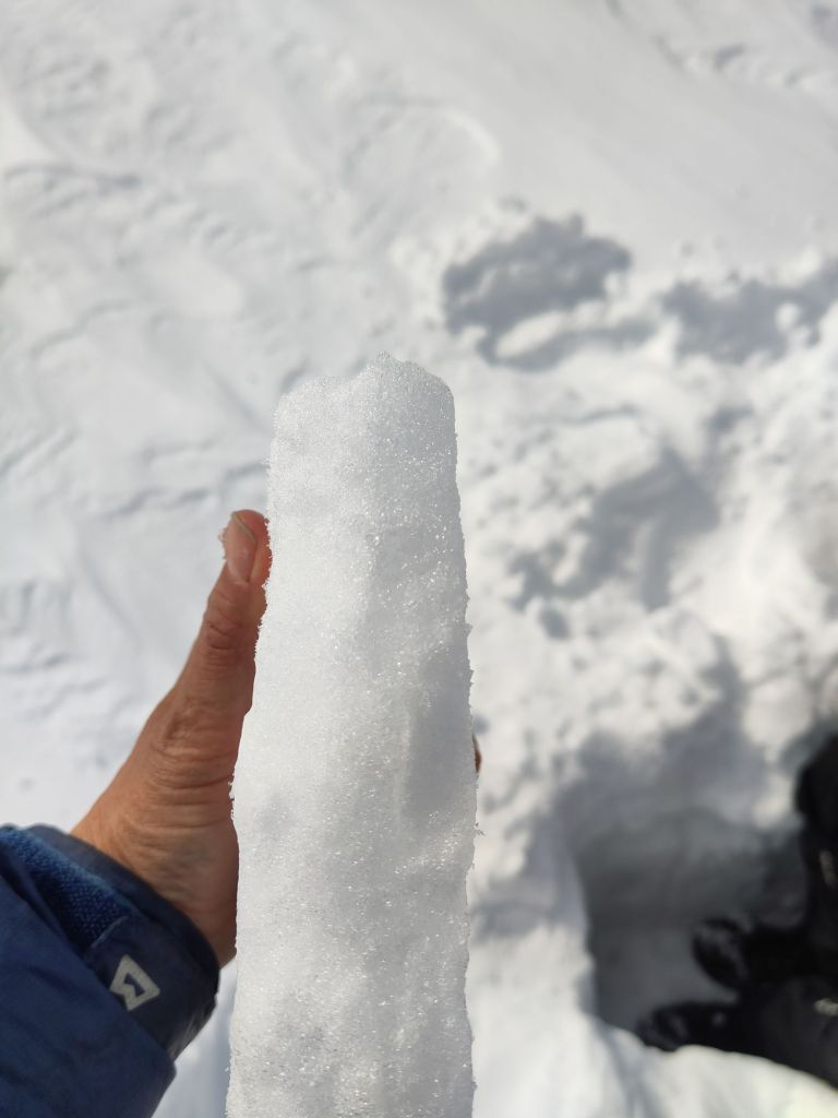
We did a transect down with our borrowed infrasnow, made several density profiles and had quite an efficient time. The idea is to repeat this transect at different times of the year so we can see how the snow properties change. In particular, I’m interested in surface albedo (how much incoming light is reflected by a surface). The reflectivity of the snow and ice surface is extremely important for the energy budget, which in turn controls how fast the snow (and ice) melt as well as being important for satellite data retrievals of surface temperature.
The Infrasnow is a very neat device that measures density and specific surface area. It’s not quite the same thing as albedo but it will help us to develop our albedo scheme in the model as it is based on grain size. Unfortunately it does not work on glacier ice, which is some places we also saw peeking out the top where wind has scoured the surface snow away. The movement of snow by wind is the subject of our final full day in the field.
We continued the observations off the glacier all the way to the road so we have a nice base transect that can be repeated to assess how conditions change through the year.
Although we only hiked 10km, it was quite tough, so next year we’ll bring snow shoes…
Tomorrow is our final full day. Lots more to do.
Day 4
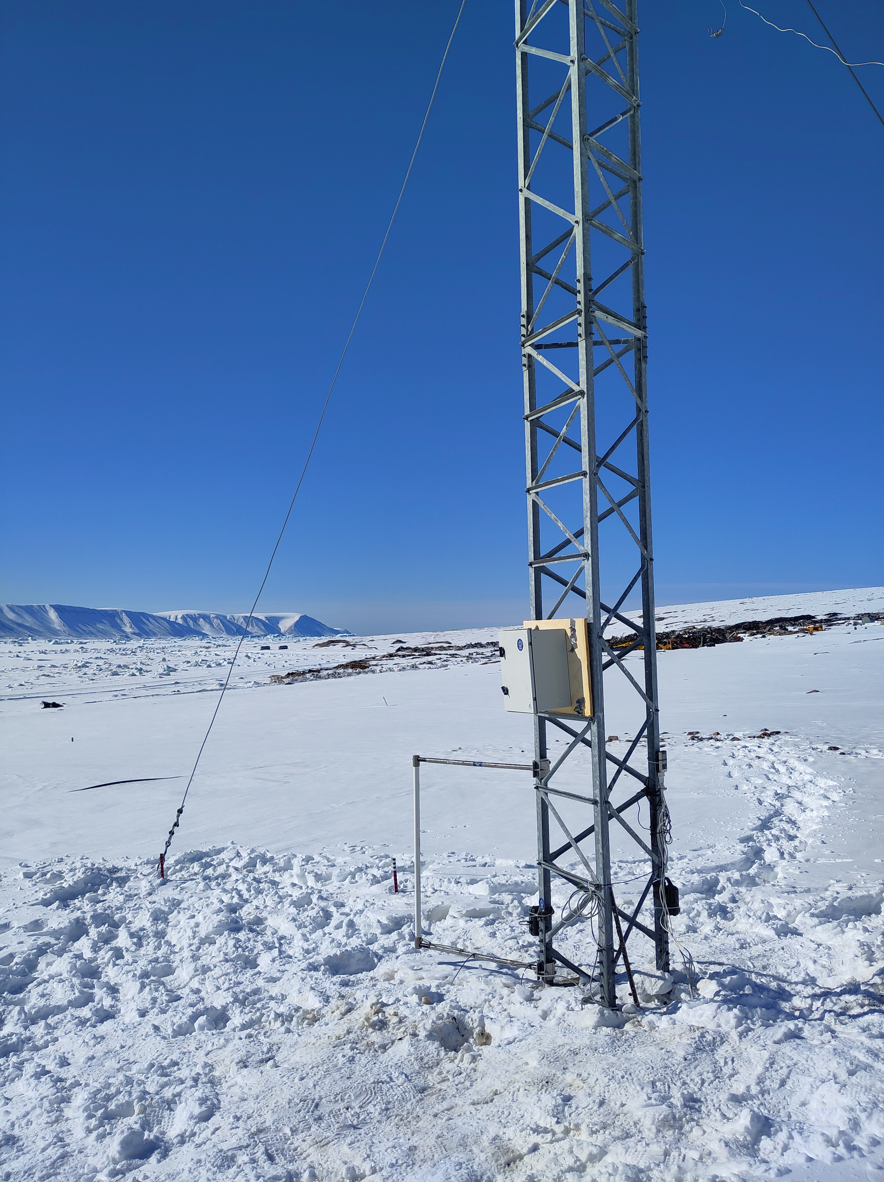
Day 4 was pretty typical of the highs and lows of fieldwork. We finished (or I should say my colleagues finished) a new mounting for the snow site logger box so hopefully the icing problem will be reduced, we (re-)installed all the instruments except for the new loggers and generally tidied up. It’s looking pretty nice now. This was a high.
Part way through the reinstallation at the snow site
Then, I struggled and failed for about 4 hours to try and get the snow drift sensors to talk to the new logger. That was frustrating low. low. However, a walk around on the fast ice in the bay to try and take a new sea ice core was some valuable breathing space – a little bit of rewiring later and the first numbers started ticking in as planned…. Hurray! That was a high!
It’s immensely satisfying solving these kind of problems. And it was the first time I’ve programmed one of these loggers – new skills are also always rewarding to learn, even if the process is frustrating. I’ve learnt a lot about SDI-12 interfaces and how the instruments actually work too. I need to remember to give myself more deep work time back in the office too. It’s much more personally rewarding and advances the science much more than endless emails and meetings.
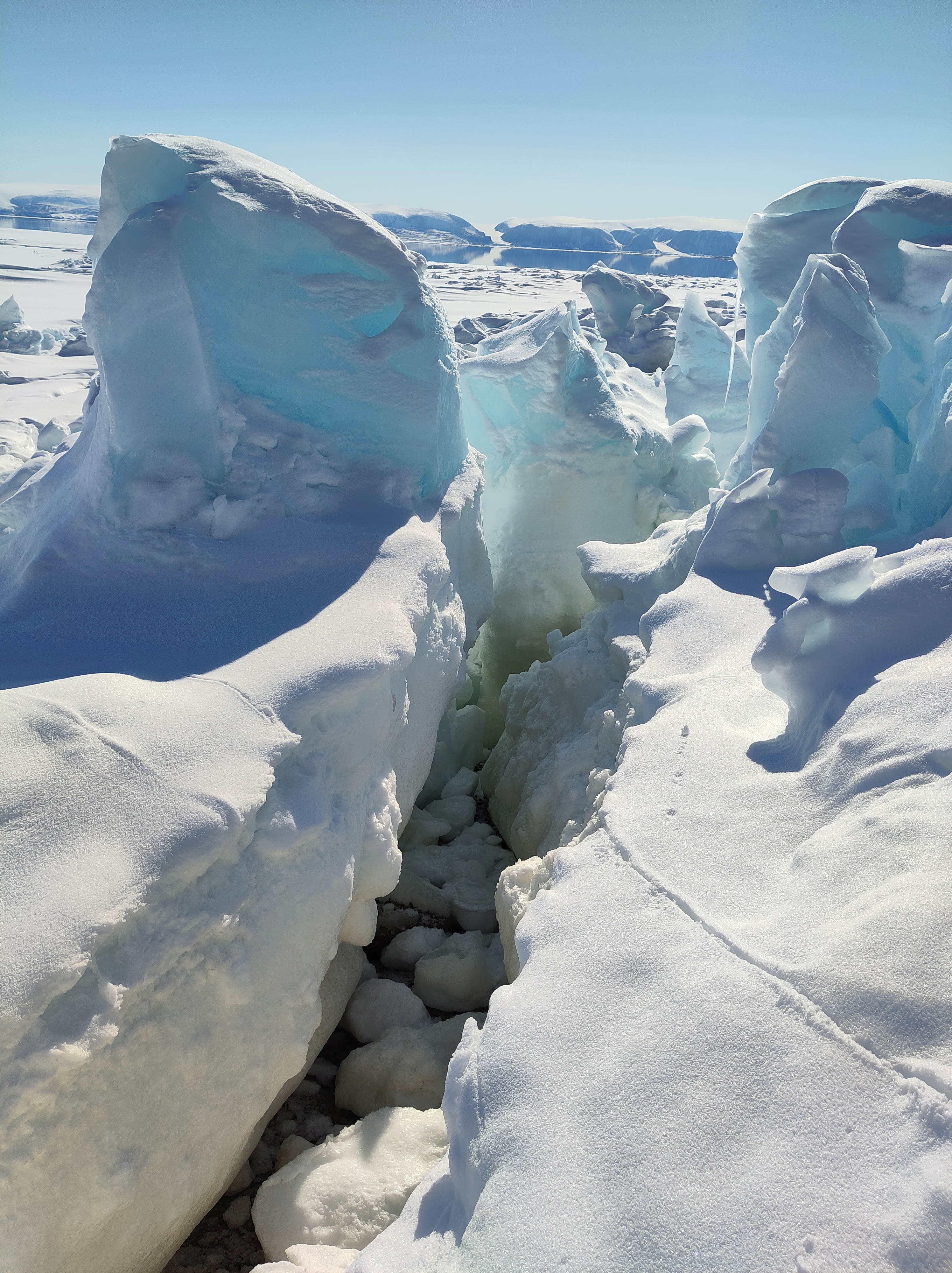
While the attempt to get an ice core was interesting, ultimately we failed due to very broken and uneven ice that made access to the part of the sea ice we wanted to get to with our kit too difficult – that was a low. I am simply counting the attempt as my evening walk, in which case maybe it counts as a high? I’ve often thought of Caspar David Friedrich’s famous Arctic painting The Sea of Ice in the coastal part of the fast ice. It’s spectacularly fractured and churned up, though FReidrich’s ice blocks are a little too angular – the real sea ice flakes are a bit more rounded.
Where the fast ice meets the land…
We also did lots of preparation for day 5’s trip to the local glacier, planned a final UAV structure-from-motion mapping campaign on land and got software working to download data on permafrost from sub-surface loggers for colleagues at the University of Copenhagen – that will all however have to wait until tomorrow, our last full day in the field. Today, we have a date with a tiny local glacier.
Day 3
I’d originally assigned only one day in the fieldwork plan for the snow site work, but given we missed our prep day to go directly into the field, we have missed a few crucial steps, so we have been busy today trying to catch up, but mostly in the workshop here at the DMI geophysical facility in Qaanaaq with a couple of visits out to the snow site.
I realised I haven’t introduced the snow site.
View over towards the south west from the old ionospheric research station on the edge of Qaanaaq. Our snow site in the foreground. It has a great view, if you ignore the town dump at the coast!
It is a small area on the edge of the village (unfortunately near the town dump, but otherwise perfect) where we are conducting a long-term (hopefully) series of observations – we’re currently only at the end of the first year so there are a few teething troubles to sort out. We’re installing a new logger for our snow drift sensors, adding a new snow cam and downloading data from the current one. We also have a standardised set of measurements of snow properties (density, temperature, reflectivity) that we carry out whenever time and opportunity permits, that we will hopefully use to better understand how the snowpack evolves through time. The land based side is a kind of complement to a longer set of observations I have from throughout the region – all point measurements made at rather random times and locations, so the constant monitoring site will hopefully help us to understand the wider context in space and time of those point data. In fact I have a student workign on digitising that data now, so I hope to soon make available the whoel dataset for research purposes.
Snow is incredibly important in the Arctic: it forms an insulating layer over sea ice that prevents futher formation in the winter, but also helps to stop or delay surface melt in the spring and summer. On land, the insulating properties of snow also help to preserve vegetation, insects and mammals through the winter, with specific vegetation assemblages being very much determined by the local snow patterns. And that’s without even discussing the importance of snow to glaciers and ice sheets.
Do you want to do a snow pit? (I asked) Yes! said my colleague. It’s always good to get the modellers to understand just how hard observations can be.
However, it turns out to be difficult to measure when it falls, difficult to work out how much blows around, challenging to model when it melts and when it refreezes and generally a larger than we’d hope uncertainty in weather and climate models. Much of the work developing parameterisations that describe snow properties has been done at lower latitudes too. High Arctic snow is certainly different in many respects to more southerly locations and that needs to be accounted for.
Hence the establishment of our snow programme. Which sounds rather big and impressive, but we’re hoping to set it up sufficiently smoothly this year that it will almost run itself with minimal input from us and assistance from colleagues. Let’s see, there are still some teething troubles to sort out.
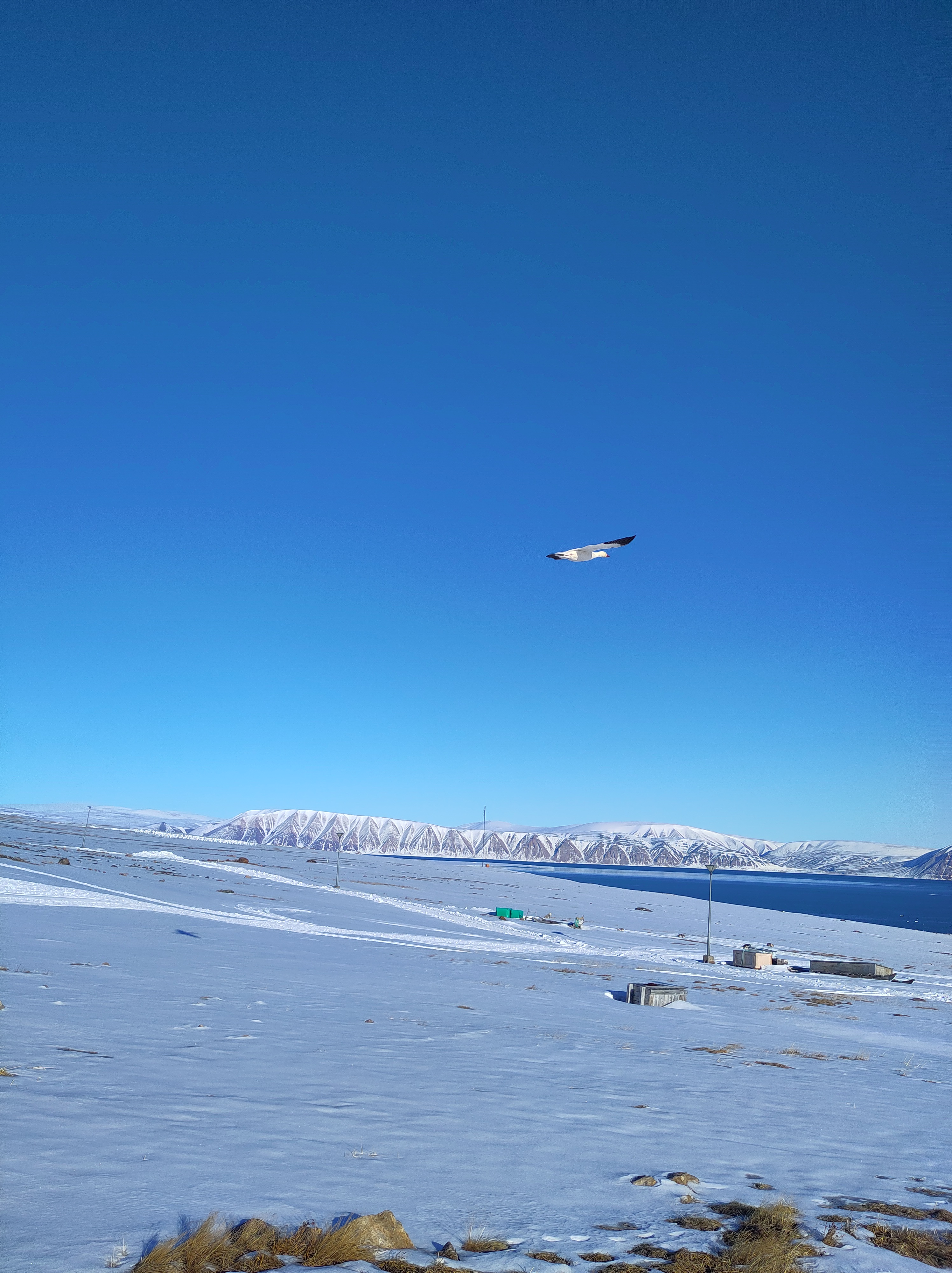
The sea ice has now cleared out of a huge part of the bay in front of Qaanaaq and the hunters have been busy taking boats out from the edge of the ice so there are clearly narwhals expected soon. Although, we’ve spent most of the last two days indoors, I keep looking outside, hoping to see some of the marine mammals that visit here. There are already masses of sea birds arriving. Yesterday managed to spot a rather handsome snow goose couple on my evening walk at 11pm.
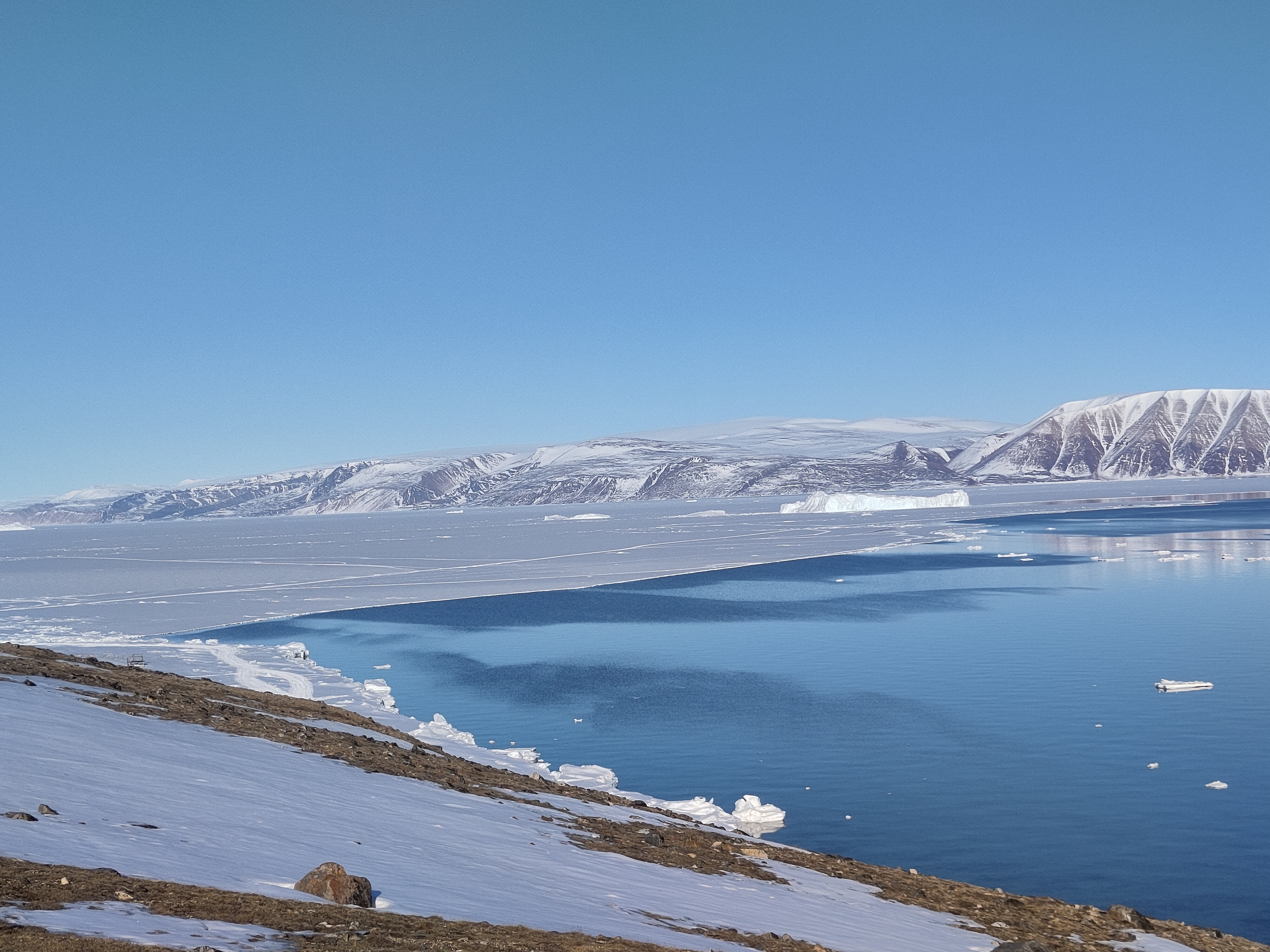
On my evening walk today I went to the very eastern edge of the town to get a look at the sea ice in the fjord – it’s quite clearly retreating rapidly now; much of the area we travelled over on Friday has gone.
View down Inglefield Fjord with the sea ice breaking up in the distance
Day 2
After Day 1’s rather hectic and busy time, Day 2 was assigned post-processing status. We had a slightly later than the 6am start yesterday, and put some serious effort into assessing our results from the previous day. That means downloading data, clearing up wet kit to dry it off properly, repacking stuff we don’t need further. Then there is the computer work, doing some initial processing, backing up files, writing field notes and doing some measurements (of salinity) on the sea ice cores we collected.
Conductivity/salinity measurements of a melted sea ice core in the workshop, fieldwork is very diverse. And fun.
We also made time to visit our snow site to download data from the instruments there. Unfortunately, it was clear that we need to somewhat reorganise the site, the logger box was completely snowed in, and I was a bit sceptical there would be any data at all. So we collected in some of the instruments for testing and further data downloads in the workshop instead of trying it out in the field. In fact, fieldwork means a lot of tidying up and computer work! I used the opportunity to reorganise and standardise the way we archive all our data, including the UAV images as well as the meteorology instruments, which will also hopefully mean we have an easier time to find and use it in the future.
It wasn’t all laptop work though, we did a few snow pits and some further testing of the Infrasnow system we have borrowed. I’m actually quite impressed with it – very straightforward to use and very consistent data produced.
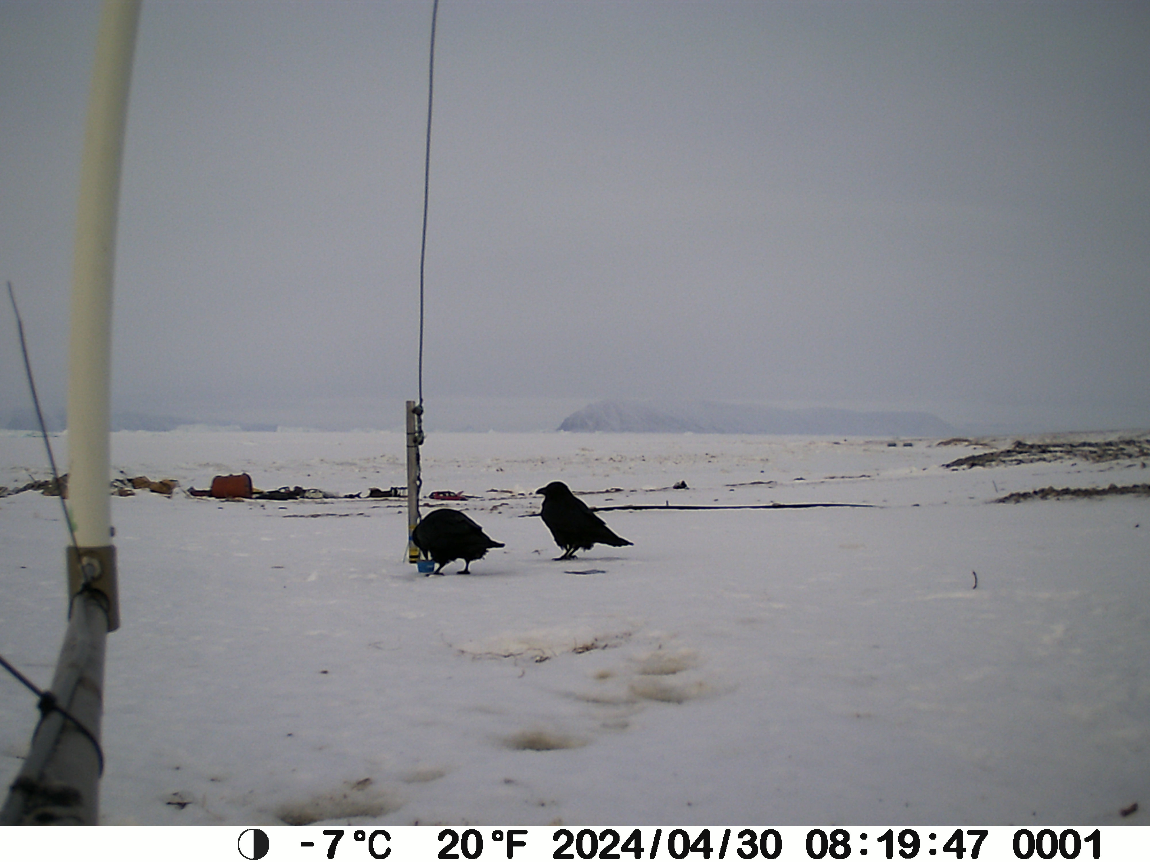
It’s also always fun to check our snowcam – this takes a photo of a stake every 3 hours to monitor the depth of the snow pack, and quite often we get beautiful views and some cheeky ravens hopping past too – I live in hope for an Arctic fox, or even a bear.
Two ravens in the snow, exploring some leftovers apparently.
On the subject of bears, I had heard there were rumours of one near the snow site, but sure enough there were the footprints – rather small and filled in with snow but quite distinctive and heading up towards the ice cap. We shall be extra careful when we go up on to the glacier later this week.
Day 1
We had originally planned terrestrial, glacier and sea ice work, primarily focused on snow processes. The sea ice part though was altered and expanded when the rapid break up in April and again this month was observed. Normally, we’d have a preparation day between arrival and going into the field, but the threat of winds and high temperatures meant we decided not to risk it and we went out straight away on the first full day. Our instincts to just go yesterday turned out to be correct, we had perfect weather and with the help of Qillaq, one of the local hunters we still made it out on to the sea ice. So all is not lost. I woke up this morning to see a wide blue sea just off the last pieces of fast ice on Qaanaaq, so I’m very happy with that decision. Sentinel-2 captured this yesterday while we were out in fact.
It probably looks more dangerous than it is. We were working on the stable fast ice to the east of the big flake, that stretches right into the fjord. The local topography make it very stable and our measurements yesterday confirmed it’s pretty typical for the time of year in thickness, though there was a surprising amount of snow on top, which can actually help to protect the ice from melt at this time of year.
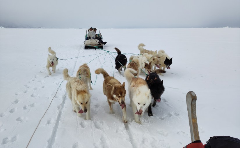
Getting around the coast was surprisingly straightforward, the fast ice has a very stable platform, though some large churned up part of the ice with cracks made for some slightly bumpy manoeuvres to get on and off the stable parts.
Manoeuvring the sled through the coastal zone
The dogs were I think happy when it was over. But in fact it was much more straightforward than I’d feared. The large crack we noticed earlier in the week that opened into a wide lead further extended while we were out, see below, and I woke up this morning to a wide open lagoon. It’s an extraordinarily beautiful place to work and I feel so privileged, especially on days like today when the weather is also being extra nice.
Happy dogs on the way home. Note the large area of open water behind that opened up while we were out.
Work wise it was a successful day, we managed 2 stations, where we did very extensive work. I’d have liked a third but the deep snow made it very heavy and slow going to travel on and in spite of the early start we basically ran out of time and had to return home.
Qillaq and Abraham taking a manual measurement of snow depth and ice thickness next to target for the UAV calibration flights.
We flew the UAV for surface properties, did a lot of snow pits and snow surface properties work, drilled some ice cores (which I will be working on this morning) and even got our loaned EM31 working to do automated ice thickness mapping. We will hopefully start to look at the data later on today to make sure it makes sense before we leave on Thursday.
Our first sea ice core of the season
The reduction in ice means we can actually concentrate on the terrestrial part of the work plan for the rest of the week. And there’s a lot to do!
Last year I set up a semi-permanent snow site to monitor conditions on land through the year. It is going to get a bit of an upgrade this week with some new instruments and of course we need to get the rest of the data downloaded and processed from here too.
I’m writing this from a hotel room in Ilulissat, rather than Qaanaaq where I had intended to be arriving shortly, because our plane has been cancelled due to bad weather (at time of writing the airport was measuring gusts of 14 m/s, so I’m actually quite glad it was cancelled).
Weather and flight cancellations are an eternal hazard when doing fieldwork in Greenland, but in this case it also means an impact on our planned fieldwork, because the sea ice is falling apart. And rather earlier than usual (though we have not yet done a systematic review to prove this). In fact, part of the reason for coming here in May (instead of my usual March trip) was to investigate an interesting event that happened earlier this spring. In the animation of satellite pictures below you can see the sea ice rather dramatically falling apart in mid-April and then again at the end of April.
The March to May sea ice season from Sentinel 2 in NW Greenland
To understand what is happening and why it’s unusual, first a bit of background. As I have written before, my DMI colleagues have been working up in NW Greenland for about 15 years on a programme of ocean measurements in the fjord (see map below). I joined about 5 years ago, working in the melange zone of the glaciers at the head of Inglefield Bredning (PSA: a paper we recently submitted about this programme will hopefully be online soon). We use the sea ice as highway and stable platform for observations, so it’s pretty important for us and came to the conclusion it wa squite important for some parts of the glaciers too. The local community, with whom we work closely use it also for travelling, hunting and fishing from. It’s extremely important for them.
The region of North West Greenland we’re talking about
Normally there’s pretty thick (~1m) sea ice covering the whole of Inglefield Bredning (Gulf of Inglefield, also known as Kangerlussuaq, but not that one) out to the islands of Qeqertarsuaq and Kiatak. You can seen an example of what this looks like normally in the satellite animation from 2020, which happens to be when my first trip out on to the sea ice in Qaanaaq took place at the end of May and beginning of June. We were actually very lucky, we had great weather, got very close to the ice edge and watched narwhals swimming out in the North Water polynya. (Yes, sometimes I wonder how I managed to get this job too). The animation below is Sentinel-2 images as cloud free as I could find them from that first field season. As you can see, the sea ice already in March was much much more extensive than this year at the same time. And perhaps that is part of the answer.
It’s probably worth pointing out at this stage that although there were some pretty warm (unusually so) spikes in March and April, the sea ice breakup in April was probably largely driven by ocean swell, and perhaps some winds which were strong, though not excessively so as far as we can see in the observations. The latest break-up seems to be driven also by high winds.
Back to our current field season. We had in fact planned a brief trip up here already – I am currently setting up a project looking at snow processes with the team and we had planned to install and test some new instruments and protocol that we hope to use in Antarctica later this year (more on all of that later hopefully). However, as the soon to be published preprint shows, I and the team have developed pretty extensive sea ice interests recently, so this unusual behaviour rather piqued our curiosity.
We have a lot of questions:
Why did it happen this year? Is it really the earliest in the satellite record? What makes the ice vulnerable? Composition, thickness, temperature? Is the ocean driving it or the atmosphere or both (it’s usually both), and what makes this year so unusual? Further down the line, can we model it and use those simulations to understand if this is a single aberration or likely to be more common in the future? And what impact will the earlier breakups have on the ecosystem, the adjacent glaciers and the local community?
Or fieldtrip thus appeared an excellent opportunity to grab some real data on all of these points. Our colleague Henriette Skourup at DTU-Space was kind enough to lend us one of her instruments, which we shipped up last minute to allow us to do an add-on. It is all currently sitting there waiting for us.
Unfortunately the sea ice is not waiting for us, if the photos from my colleague in Qaanaaq, Aksel are anything to go by.
A large and widening crack in the sea ice in front of Qaanaaq. The small objects on the sea ice (fishing gear?) suggest we were not the only ones surprised). Credit: Aksel Ascanius, DMI
The high winds which grounded our plane have also been busy on the sea ice, which is falling apart in the bay with surprising speed as far as I can see. We are still waiting for today’s optical imagery but the quick look from radar based Sentinel-1 suggests cracks widening rapidly as the photo above confirms.
Temperature observations from Qaanaaq airport
With a bit of luck we will get to Qaanaaq on Thursday (immaqa) to see if our sea ice research plan can go ahead. At this stage I rather doubt it. But it will very much depend on the next few hours. The wind speeds are quite high still but the temperature which was well above freezing has now dropped down to just below.
Wind observations from Qaanaaq airport
We are fortunate that we work with local hunters on the sea ice who are immensely experienced. The first rule is always safety first. We do have *a lot* of other work to do and rather fewer days to do it all in, so either way we’ll be busy. Ffor now, it’s keep checking in with the weather, the satellite images and our friends in Qaanaaq and use the time in Ilulissat wisely – in our case, it’s time to write some papers. And one of them is all about sea ice.
To be continued…
All satellite imagery on this page is from the European Space Agency Sentinel-2 mission, processed on the Copernicus EO Browser – a FREE!! and easy to use entry point to use ESA data. Weather observations are from Qaanaaq airport, operated by Mittarfeqarfiit A/S – Grønlands Lufthavne (Greenland Airports) and processed by DMI. It’s actually pretty nice how much high quality data we have access to these days…
There is currently some discussion in the Danish media about sea level rise hazards and the risk of rapid changes that may or may not be on the horizon. Some of the discussion is about IPCC estimates. That’s a little unfortunate and in fact a bit unfair as the IPCC report has not been updated since 2021, nor was it intended to have been. In the mean time there has been a lot of additional science to clear up some of the ambiguities and questions left from the last report.
I’ve been working quite a bit on the cryosphere part of the sea level question of late, so thought I’d share some insights from the latest research into the debate at this point. And I have a pretty specific viewpoint here, because I’ve been working with the datasets, models, climate outputs etc that will likely go into the next IPCC report as part of a couple of EU funded projects. As part of that, we have prepared a policy briefing that will be presented to the European Parliament in June this year, but it’s already online now and will no doubt cross your socials later this week. I’m going to put in some highlights into this post too.
Now, I want to be really clear that everything I say in this post can be backed up with peer reviewed science, most of which has been published in the last 2 to 3 years. Let’s start with the summary:.:
The sea is rising. And the rate of rise is currently accelerating.
The sea will continue to rise long into the future. The rate of that sea level rise is largely in our society’s hands, given that it is strongly related to greenhouse gas emissions.
We have already committed to at least 2m of sea level rise by 2300.
By the end of 2100 most small glaciers and ice caps will be gone, mountain glaciers will contribute 20-24% of total sea-level rise under varying emission scenarios.
Antarctic and Greenland ice sheet mass loss will contribute significantly to sea-level rise for centuries, even under low emissions scenarios
Abrupt sea level rise on the order of metres in a few decades is not credible given new understanding of key ice fracture and iceberg calving processes.
By the end of this century we expect on the order of a half to one metre of sea level rise around Denmark, depending on emissions pathway. (If you want to get really specific: the low-likelihood high impact sea level rise scenario corresponds to about 0.9 m (on average), or at the 83rd percentile, about 1.6 m of sea level rise).
Your local sea level rise is not the same as the global average and some areas, primarily those at lower latitudes will experience higher total sea level rise and earlier than in regions at higher latitudes.
Sea level rise now is ~5mm per year averaged over the last 5 years, 10 years ago it was about 3 mm per year). Much of that sea level rise comes from melting ice, particularly the small glaciers and ice caps that are melting very fast indeed right now. Even under lower levels of emissions, those losses will increase. There won’t be many left by the end of this century.
Greenland is the largest single contributor and adds just less than a millimetre of sea level rise per year, with Antarctica contributing around a third of Greenland, primarily from the Amundsen Sea sector. The remaining sea level rise comes from thermal expansion of the oceans. Our work shows very clearly that the emissions pathway we follow as a human society will determine the ultimate sea level rise, but also how fast that will be achieved. The less we burn, the lower and slower the rise. But even under a low-end Paris scenario, we expect around 1 metre of sea level by 2300.
The long tail of sea level rise will come from Antarctica, where the ocean is accelerating melt of, in particular, West Antarctica. However, our recent work and that of other ice sheet groups shows that the risk of multi-metre sea level rise within a few decades is unrealistic. Again, to be very clear: We can’t rule out multiple metres of sea level rise, but it will happen on a timescale of centuries rather than years. High emissions pathways make multiple metres of sea level rise more likely. In fact, our results show that even under low emissions pathways, we may still be committed to losing some parts of especially West Antarctica, but it will still take a long-time for the Antarctic ice sheet to disintegrate. We have time to prepare our coastlines.
There’s so much more I could write, but that’s supposed to be the high level summary. Feel free to shoot me questions in the comment feeds. I’ll do my best to answer them.
Five years ago, a small group of European scientists got together to do something really ambitious: work out how quickly and how far the sea will rise, both locally and on average worldwide, from the melting of glaciers and ice sheets. The PROTECT project was the first EU funded project in 10 years to really grapple with the state-of-the-art in ice sheet and glacier melt and the implications for sea level rise and to really seek to understand what is the problem, what are the uncertainties, what can we do about it.
We were and are a group of climate scientists, glaciologists, remote sensors, ice sheet modellers, atmospheric and ocean physicists, professors, statisticians, students, coastal adaptation specialists, social scientists and geodesists, stakeholders and policymakers. We’ve produced more than 155 scientific papers in the last 5 years (with more on the way) and now our findings are summarised in our new policy briefing for the European Parliament.
It’s been a formative, exhilarating and occasionally tough experience doing big science in the Horizon 2020 framework, but we’ve genuinely made some big steps forward, including new estimates of rates of ice sheet and glacier loss, a better understanding of some key processes, particularly calving and the influence of the ocean on the loss of ice shelves. More importantly for human societies, by integrating the social scientists into the project, we have had a very clear focus on how to consider sea level rise, not just as a scientific ice sheet process problem, but also how to integrate the findings into usable and workable information. In Denmark, we will start to use these inputs already in updating the Danish Climate Atlas. If you are elsewhere in the world, you may want to check out our sea level rise tool, that shows how the emissions pathway we follow, will affect your local sea level rise.
Our final recommendations?
Accelerate emission reductions to follow the lower emission scenario to limit cryosphere loss and associated sea-level rise
Enhance monitoring of glaciers and ice sheets to refine models and predictions
Support the long-term development of ice sheet models, their integration into climate models, and the coupling of glacier models with hydrological models, while promoting education and training to build expertise in these areas
Invest in flexible and localized coastal management that incorporates uncertainty and long-term projections
Foster international collaboration to share knowledge, resources, and strategies for mitigating and adapting to global impacts
This is the first in a two-parter. At this time of year, posts making bold statements about what happened last year and what we plan to do this year start to become prominent. The last few years I have spent a few hours in the first week of January reviewing what worked, what was fun and what was cool, what was awful and what definitely was a waste of time. I’m not honestly sure that any of this is of interest to anyone except me, so read on, but you have been warned..
2024: Themes of this year: Greenland, Machine Learning, people, and big data…
Working with scientists from the Greenland natural resources institute and local hunters on the sea ice.
The final trip was in October for a workshop with scientists in Greenland about climate change impacts in Greenland, the subpolar gyre and AMOC for the UN Ocean decade. It was a memorable meeting for the sheer range and quality of science presented as well as for being stranded in Nuuk by a broken aeroplane in quite ridiculously beautiful weather (I mostly stayed in my hotel room to write the aforementioned paper, sadly. In 2025 I will work on my priorities) .
Apart from fieldwork I have really tried hard on publications this year. I have (like many scientists I suspect), far more data sitting around on hard drives than I have published. It’s a waste and it’s also fun to work on actual data instead of endless emails. This is something I intend to continue focusing on the next few years as well. There is gold in them thar computers…
We had a couple of writing retreats were very successful. These I plan to continue also and the PRECISE project grant is happily flexible enough to do this. I probably achieve as much in terms of data processing and paper writing in 3 focused days as I would in 3 months in the office. It paid off too. I managed to co-author 8 papers published this year (including my first 1st-author paper in ages – a workshop report, but nevertheless it counts.). Some of these are still preprints, so will change, and there are a couple more that have been submitted but are not yet available as preprints. I will submit two more papers in the next 3 weeks as well (1 first author), so January 2025 is going to be the 13th month of 2024 in my mind.
Bootcamps have been a theme the last 3 years, I organised the first in 2022 and so far there have been 4 publications from that first effort. There was another this year in June, ( I have attended them in 2023 and 2024 but was not organising) where we really got going on a project for ESA that I have had my eye on for a while – I hope the publication from that will be ready in the Spring this coming year.
Machine Learning: This was the year I really got machine learning. I’ve been following a graduate course online, and learning from my colleagues and students about implementations. I understand a lot more about the architecture and how to in practice apply neural networks and other techniques like random forests now. This is not before time, as we intend to implement these to contribute to CMIP7 and the next IPCC report. We still have a lot of work to do, but the foundation is laid. And it’s been fun to learn something that, if not exactly new, is a new application of something. In fact the biggest barrier has really been learning new terminology. We have also been fortunate that Eumetsat and the ECMWF have been very helpful in providing us with ML-optimised computer resources to test much of these new models out on. We’re actually running out of resources a bit though, so it’s time to start investigating Lumi, Leonardo and the new Danish centre Gefion to see what we can get out of these.
People: This year our research group has grown with another 2 PhD students, and at the end of the year we also employed a new post-doc. I think it’s large enough now. I’m very aware that if I don’t do my job properly, then not only the research but the people will suffer, so developing people management skills is really important. In any case it’s extremely stimulating to work with such talented young people and I’m really excited to see where the science will take us, given the skills in the team. I hope I have been good enough at managing such a large and young team, but I have my doubts. A focus for 2025 for sure.
Data: This has been the year of big data, not necessarily just for ML purposes but also in the PolarRES project the production and management of an enormous set of future climate projections at very high resolution. More on this anon. Suffice to say, it has taken a lot of my time and mental energy and it’s probably not the most exciting thing to talk about, but we now have 800 Tb of climate simulation data to dig into. I suspect that rewards of this will be coming for years. There has also been a lot of digging into satellite datasets and the bringing together of the two has been very rewarding already. It’s a rich seam, to continue the metaphor, that will be producing scientific gold for many years.
Projects: we have gone in the final year of two projects, PROTECT and PolarRES, both of which will finally end in 2025. We also arrived at the half way point of OCEAN:ICE. So rather than being a year of starts, it has been a year where we have started to prepare for endings – actually this is a fun part of many projects where a lot of the grunt work is out the way and we can start to see what we have actually found out. It can also be a slog of confusing data, writing and editing papers and dealing with h co-author comments. I’ve definitely been in that process this year, hopefully with some of the outputs to come next year…
Proposals: I started 2024 writing a proposal. Colleagues were in 3 different consortia for the same call, alas ours didn’t get funded, but 2 of the others did and will start this year. That is a good result for DMI and our group. I wrote another proposal in the Autumn and contributed to a 4th and finally at the end of the year I heard that both will *likely* be funded (but are currently embargoed and in negotiation, so no more will be said now). It sometimes feels that spending so much time and energy on proposal writing is putting the cart before the horse, but in fact I find proposal writing something akin to brainstorming. It’s essential of course to ensure we can continue to do the science we want, but it can also help us to clarify our ideas and make sure we’re not on the wrong track. It’s also a good way to keep track of what the funders are actually wanting to know and to help us focus on policy relevance.
There was also an incredible number of meetings, reports, milestones and deliverables, but you probably don’t want to hear about that…
Also missing from this summary is personal life, and, well that is not for sharing publically, but suffice to say, I learnt about raising teenagers, I also had some very good times with friends and family, to all of whom I immensely grateful for being a part of my voyages around the sun.
Anyway, reading all that back, I’m not surprised I ended the year exhausted! I am not planning on quite such a slog in future. I should probably pace myself a bit more this year, the plans for which will be the subject of next week’s post.
I’m a co-author on a new paper that has just come out in GRL. It’s based on simulations we did with our collaborators in the PROTECT project on sea level contributions from the cryosphere. What Glaude et al shows is that, to quote the first of the 3 key points:
“With identical forcing, Greenland Ice Sheet surface mass balance from 3 regional climate models shows a two-fold difference by 2100”
In perhaps more familiar terms, if you run 3 regional climate models (that is a climate model run only over a small part of the world, in this case Greenland) with identical data feeding in from the same global climate model around the edges, you will get 3 quite different futures. Below you can see how the 3 different models think the ice sheet will look on average between 2080 and 2100. The model on the right, HIRHAM5 is our old and now retired RCM. It has a much smaller accumulation area left by the end of the century than the other two, which have much more intense melt going on in the margins.
Greenland Ice Sheet annual surface mass balance (a, b, c, 2080–2099 average) and annual surface mass balance anomaly (d, e, f, 2080–2099 average relative to 1980–1999) [mm WE/yr]. From left to right, RACMO (a and d), MAR (b and e), and HIRHAM (c and f). The equilibrium line (SMB = 0) is displayed as a solid black line in (d-f). Glaude et al., 2024, GRL.
In fact, by the end of the century, although the maps above seem to show HIRHAM having much more melt, there is in fact more runoff from the MAR model, because of this intense melt.
Spatially aggregated annual GrIS SMB anomalies (a), total precipitation (PP, b), and runoff (RU, c) [Gt/yr]. The solid lines represent the anomalies using a 5-year moving average, while the transparent lines display the unfiltered model output.
The surface mass balance (SMB) at the present day is in fact positive. This often surprises people, but SMB as the name suggests, only describes surface processes. Ice sheets can (and do) also lose a lot of ice by calving and subglacial and submarine melt. As SMB should balance everything if a glacier is to remain stable or even grow, present day SMB is usually 300 to 400 GT positive at the end of each year, and even so the Greenland ice sheet loses, net around 270Gt per year.
Our work here shows that, at least under this pathway, not only does SMB become net negative in itself by the middle of this century, there are significant differences in SMB projections between the estimates of how negative it will be, between the three RCMs. The global model we used, CESM2 under the high-end SSP5-8.5 scenario, is famously a warm scenario, but our estimated end of the century SMBs are extraordinary : (−964, −1735, and −1698 Gt per year, respectively, for 2080–2099). As I’ve discussed previously, one gigatonne is a cubic kilometre of water, 360Gt is roughly 1mm global mean sea level rise. (Though note your local sea level rise is *definitely* not the same as global average!) Even the lowest estimate here the is giving around 3 mm of global average sea level rise from surface melt and runoff *alone* by the end of this century each year. That’s pretty close to the modern day observed sea level rise from all sources.
And this is in spite of the fact that at the present day, the 3 models are rather similar in their estimates of SMB. The Devil is as usual in the details.
We attribute these startling divergences in the end of the century results to small differences in 1) the way melt water is generated, due to the albedo scheme (that is how the ice sheet surface reflects incoming energy); 2) but also due to the cloud parameters that control long-wave radiation at the surface, which again can promote or suppress melting. (We really need to know how much liquid water or ice there are in clouds, as this paper also emphasises in Antarctica); and 3) mainly down to the way liquid water that percolates down from the surface is handled in the snow pack. That is, how much air there is in the snowpack, how warm the snow is and how much refreezing can occur to buffer that melt.
The problem is that all of these processes happen at very small scales, from the mm (snow grains and air content), to the micron scale (cloud microphysics). That means that even in high (~5km) resolution regional models, we need to use parameterisations (approximations that generalise small scale processes over larger spatial and/or time scales). Small differences between these parameterisations add up over many decades. Essentially, much like the famous butterfly flapping its wings in Panama and causing a hurricane in Florida, the way mixed phase clouds produce a mix of water vapour and ice over an ice surface might ultimately determine how fast Miami will sink beneath the waves.
More data would certainly help to refine these parameterisations. The main scheme to work out how much liquid can percolate into snow was originally based on work by the US Army engineers in the 1970s. More field data with different types of snow would surely help refine these. Satellite data will be massively helpful, if we can smoothe out some wrinkles in how clouds (there they are again) affect surface reflectivity.
These 3 different types of processes also interact with each other in quite complex ways and ultimately affect how much runoff is generated as well as the size of the runoff zone in each model. So integration of many different types of observations is crucial.
“Different runoff projections stem from substantial discrepancies in projected ablation zone expansion, and reciprocally” as we put it in Glaude et al., 2024.
The timing and magnitude of the expansion of the runoff zone is quite different between the models, but all of them show a very consistent increase in melt and runoff over the next 80 years.
It’s probably also important to understand a couple of key points:
Firstly we ran a very high emissions pathway: SSP5-85 is probably not representative of the path we will follow in emissions (at least I hope not), but in this study we wanted to address the spread on different model estimates. And this is a way to get a good check on the sensitivity.
Secondly, the ice sheet mask and topography in these runs is kept fixed all the way through the century. This means we do not account for any elevation feedbacks (as the ice sheet gets lower because of melt, a larger area becomes vulnerable to melt because it’s lower and thus warmer), but we also don’t account for ice that has basically melted away no longer contributing to calculated runoff later in the century. Ice sheet dynamics are also not factored in.
Finally, we ran different resolution models, and that can have an impact particularly on precipitation and is one of the reasons why the new models we developed and have run in PolarRES (and which are now being analysed), have used a much more consistent set-up.
The 3 models we used, MAR, RACMO and HIRHAM have all been used in many different studies over both Greenland and Antarctica, but we haven’t really done a systematic comparison of future projections before. I think this work shows we need to get better at doing this to capture the uncertainty in the spread, especially when you consider that we’re now looking at using these models as training datasets for AI applications: training on each one of these models would give quite different results long-term. We need to think about how to both improve numerical models and capture that spread better. But ultimately, it’s how fast we can reduce greenhouse gas emissions and bend the carbon dioxide curve down that will determine how much of Greenland we will lose, and how quickly.
All data and model output from these simulations is available to download on our servers (we’re transitioning to a new one download.dmi.dk, not everything has been moved there yet). We also of course have data over land points and the surrounding seas, and we’ve run many more global climate models through the regional system to get high resolution (5km!) climate data also looking at different emissions pathways, if you’re interested in looking at, analysing or using any of this data – get in touch!
My warmest thanks to Quentin Glaude who led this analysis and special thanks to our colleagues in the Netherlands, France and Belgium for running these models and contributing to the paper analysis. Clearly, we have much work to do to get better at this ahead of CMIP7.
Group field trip the Greenland ice sheet: it’s important to see what you’re modelling actually looks like….
Way back in the mists of time, that is, early April, I and colleagues deployed some instruments on the sea ice in front of a number of glaciers in Northern Greenland, which I wrote a little bit about here.
Trusted global GPS tracker buoy
Open met buoy
Since then I’ve mostly been letting them get on with reporting their data back and occasionally checking on the satellite imagery to see how it’s looking in their surroundings.
It was about -30C and very cold when I left them out, so it’s sometimes quite hard to visualise just how much things will change over only a few months and to remember that at some point, they’ll need collecting
After a fairly melty start (yes, that is actually a technical term) to July, particularly in the northern part of the ice sheet (which you can see on the polarportal, see also below right) it’s time to start anticipating their collection.
We have a lot of advantages when it comes to coordinating this kind of project now, compared to the bad old days when imagery and communication were both scarce and expensive
For starters, there is Sentinel Hub’s EO browser, a course in which should be a requirement for every earth science adjacent subject in my opinion. EO Browser produces superb pre-processed imagery for free, such as this one, from the European Space Agency’s Sentinel-2 satellite yesterday
As you can see, the sea ice is still there but fracturing and patches of open water (in blue green) are now becoming visible.
Sentinel 2 satellite image processed on EO browser showing sea ice and ice bergs in front of Tracy and Farquhar glaciers.
If you’re out and about and only have your phone, there is also the excellent snapplanet.io app on your smartphone, with which you can create instagram ready snapshots of the planet or even animated gifs, with high resolution imagery a link away…
Now that’s what I call a fun social media* application…
Animated gif of satellite images showing the front of Heilprin glacier with icebergs and landfast sea ice.
Anyway, back to the break up. Every year, the sea ice forms in the fjord from October/November onwards, by December it’s often thick enough to travel on and then from April it starts to thin and melt and by late June large cracks are starting to form, allowing the surface meltwater to drain through. For a look at what happens if you get a large amount of melt from, say, a foehn wind, before the cracks start to open up, see this iconic photo taken by my colleague Steffen Olsen in 2019.
An extremely rare event, that nevertheless went viral
The other advantage we have working in this fjord is our collaboration with the local hunters and fishers. In winter they use dog sleds for hunting and accessing fishing sites, and to take us and our equipment out on to the ice. In summer, they are primarily using boats for fishing, hunting narwhal and, hopefully, collecting our equipment! Our brilliant DMI colleague Aksel who lives and works in the local settlement is also a huge help in assisting with communication and generally being able to get hold of things and people when asked.
Winter travel
We offer a reward for each buoy that is found and brought back to our base in Qaanaaq, so many of them in fact make their own way home. But we also work with our friends on a kind of remote treasure hunt, challenge Anneka style, with someone at home watching their positions come in via the satellite transmissions and sending updated information via sms to an iridium phone to the hunters on the boat…
I’m told it’s tremendous fun, with sharp eyes required, as even a bright orange plastic globe can be challenging to spot.
A floating trusted buoy in 2022.
I’ve never participated in this treasure hunt myself sadly, on land we generally see something like a spaghetti of arrows and spots via the Trusted global web api:
GPS positions from a trusted buoy.
We then have to try and superimpose these movements on the latest satellite images to work out if the buoy is floating or not, and then check to see if there is sufficient open water for a collection. Naturally working with local knowledge for this part is also absolutely vital.
One of our buoys is found…
The latest satellite images look like the ice has already broken up into large flakes close to Qaanaaq. I’ve annotated the Sentinel-1 image below as it is from a radar satellite that can see through clouds and the images can be a bit confusing if you’re not used to looking at them.
The scale of the massive melt on the ice sheet from the last few days is clearly visible in the dark grey rim on the glaciers. The open sea water is black and the sea ice shows up as geometric greys. This one is downloaded from the automatic archive my colleagues at DMI maintain around the whole coast of Greenland. It can be a handy quick check too.
Annotated satellite image of Kangerlussuaq/Inglefield Bredning (Gulf of Inglefield) fjord. The orange box shows where our study glaciers are located.
So, although the ice is starting to break up it’s at the tricky stage where it’s far from navigable by dog sled and certainly too difficult for boats, so it’s not quite the time to send out hunting parties for GNSS buoys.
It also means that when I go on holiday next week, I will not be quite leaving all this behind. I and my colleague in this project will be monitoring the movements of the buoys and the satellite pictures, as well as relying on our friends in the local community to let us know how the ice is looking and if they can get out to rescue our brave little sensors.
In the mean time I have plenty of data to start analysing and writing up. As ever massive thanks to the people of Qaanaaq and my cool colleagues for putting up with me and our GPS buoys. We hope to submit our first paper pretty soon..
Hopefully I’ll soon be able to look at a map like this one to see where they are (note that the precision on these buoy positions isn’t great, probabaly because they were thenbeing stored in a metal container).
*Yes, I’m probably a nerd. I’m a lot of fun** at parties too though.