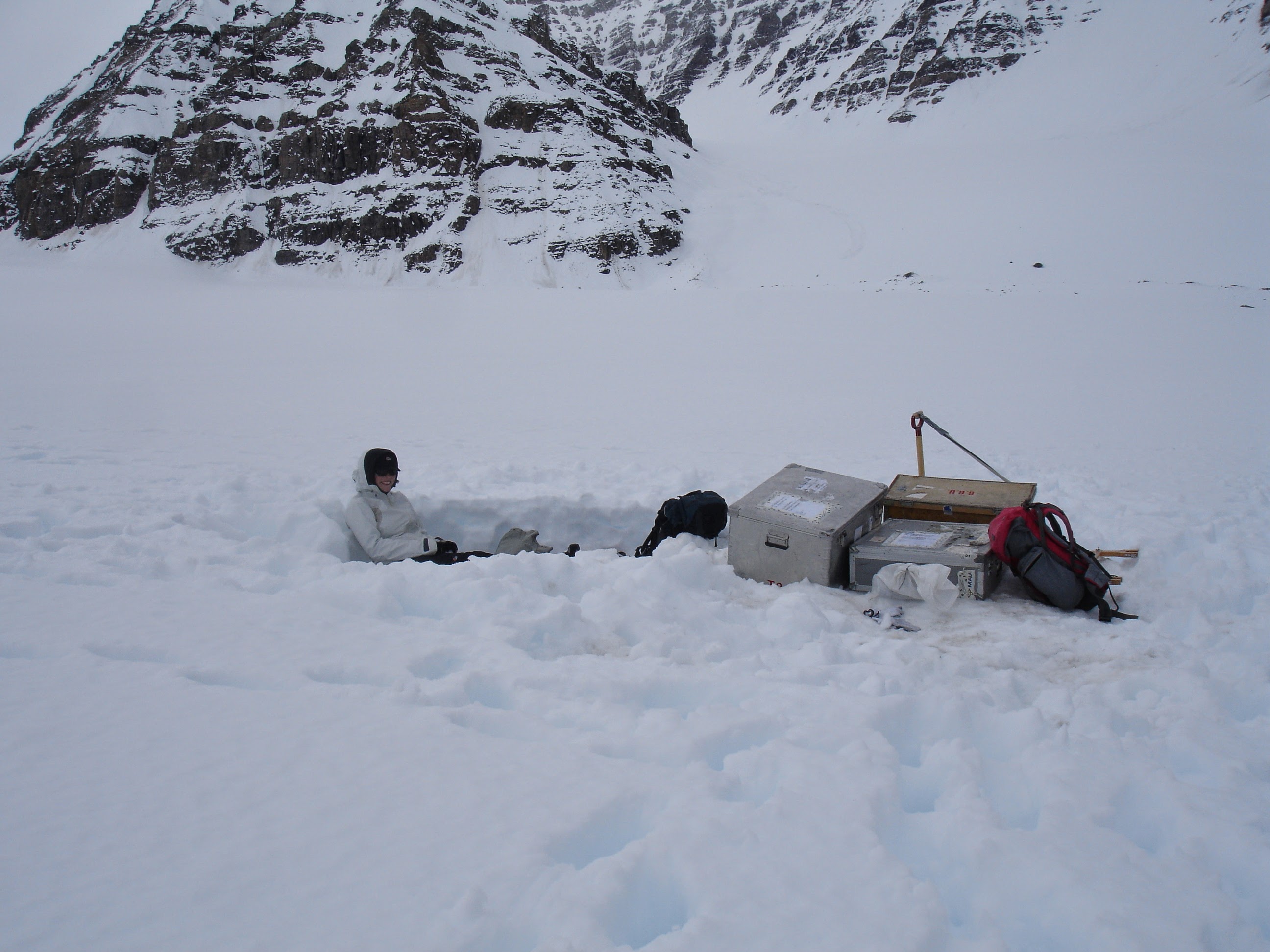
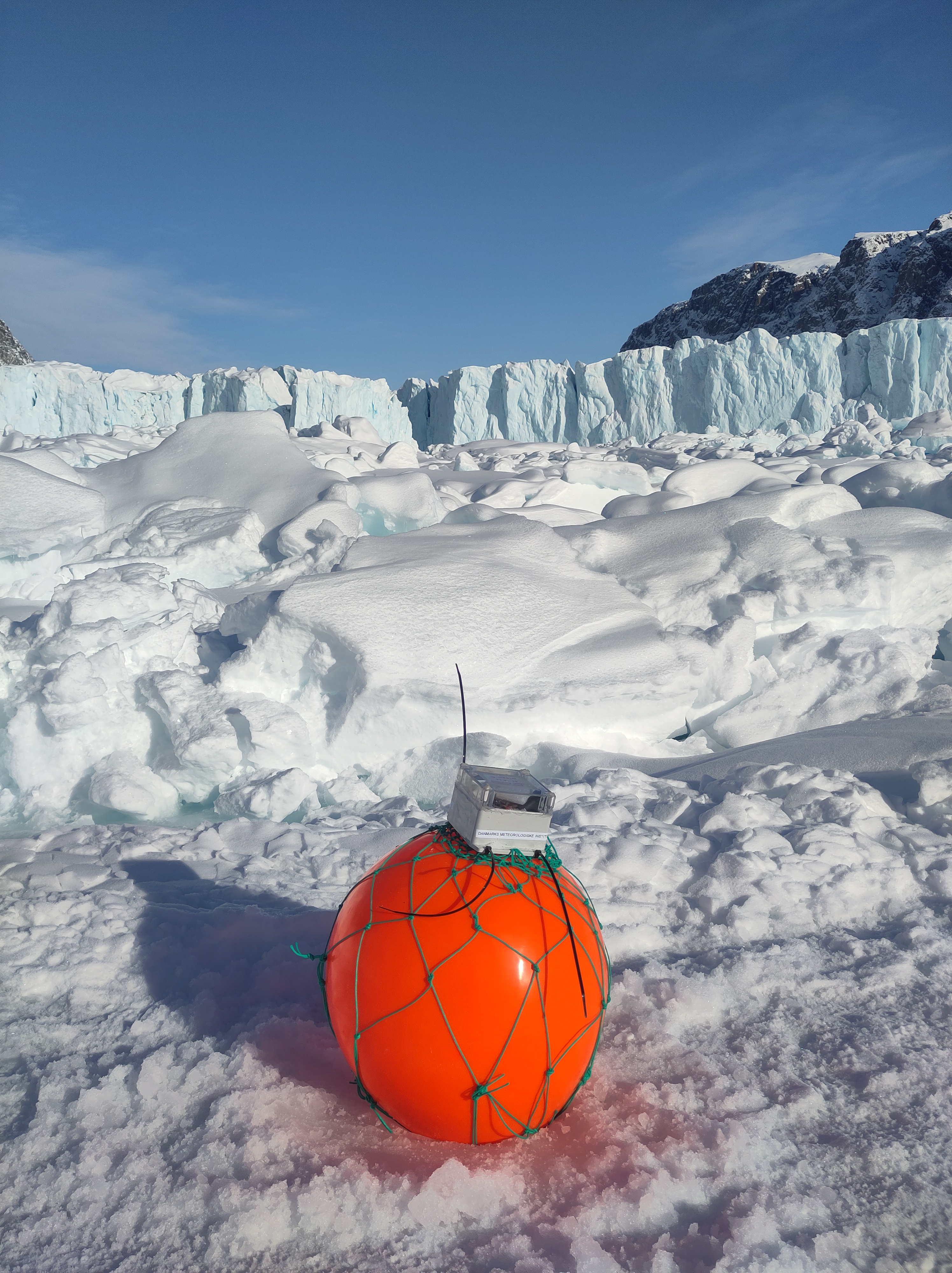
I’m in Antarctica and yet I have been getting contact from journalists because Greenland is all over the press at the moment for all the wrong reasons. It’s reasonable I think to worry about what the various deranged threats towards Greenland will mean for us all also outside of Greenland. But I also think about (and yes, worry) about the friends I’ve made in Greenland over the years. Let’s hope common sense prevails and we can step back from the brink, and concentrate on the really long term problems that we are still rapidly storing up for ourselves.
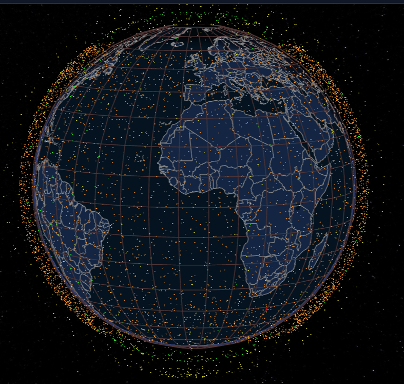
Greenland is also on my mind, not just because of geopolitics, but also because the Copernicus Climate service has just put out their annual global climate highlights* for 2025 report with some disturbing results from Antarctica.
A few months ago we had a paper published called the Greenlandification of Antarctica, in which we argue that the changes in the Antarctic cryosphere increasingly resemble those we have previously observed in Greenland and the Arctic. To see the future of Antarctica, look at Greenland.
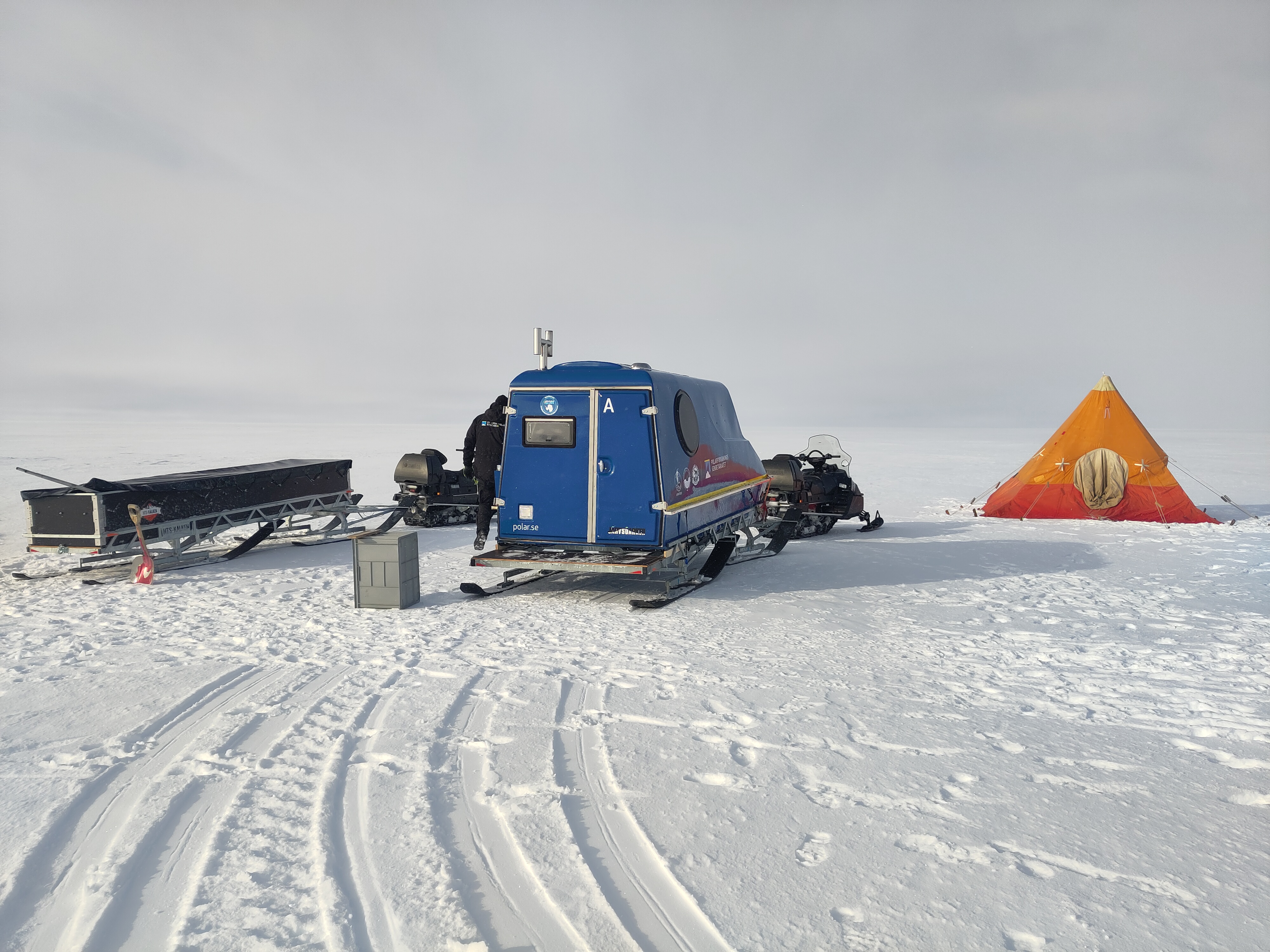
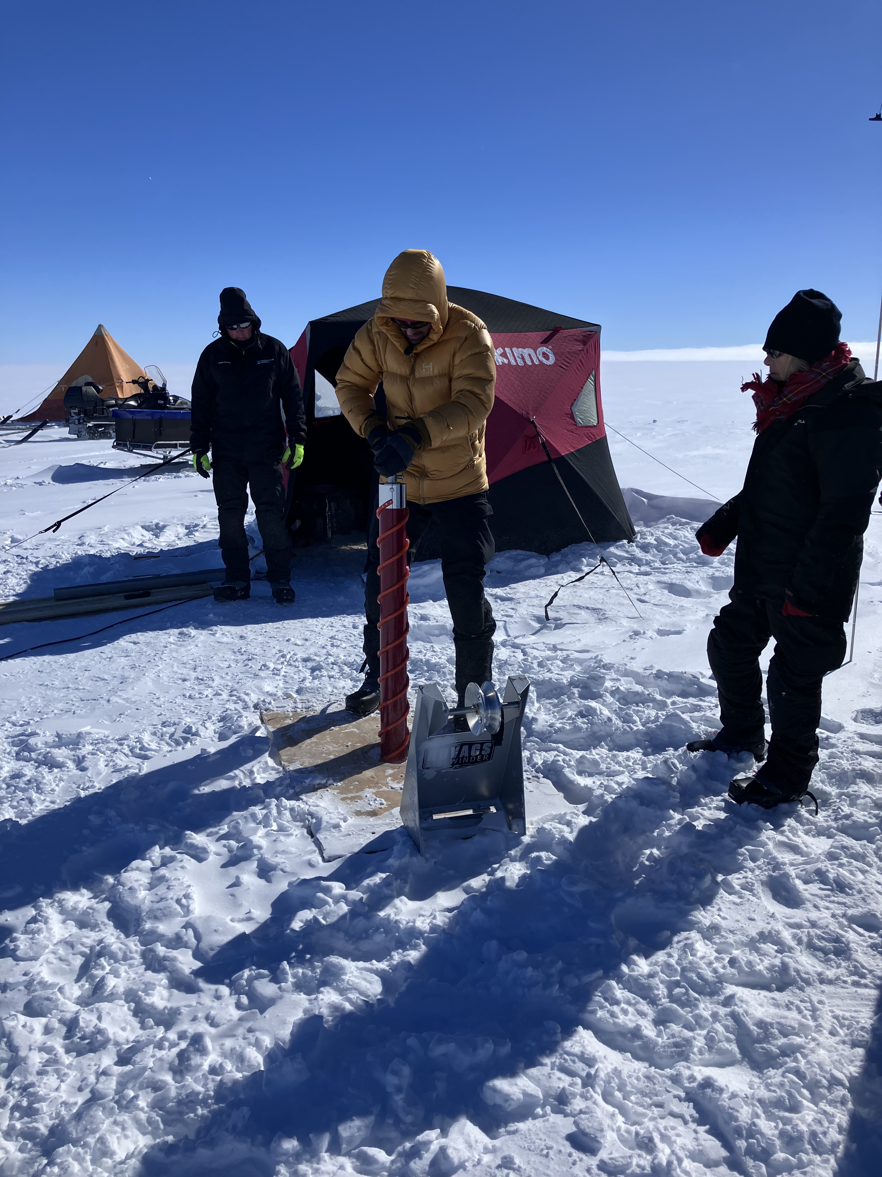
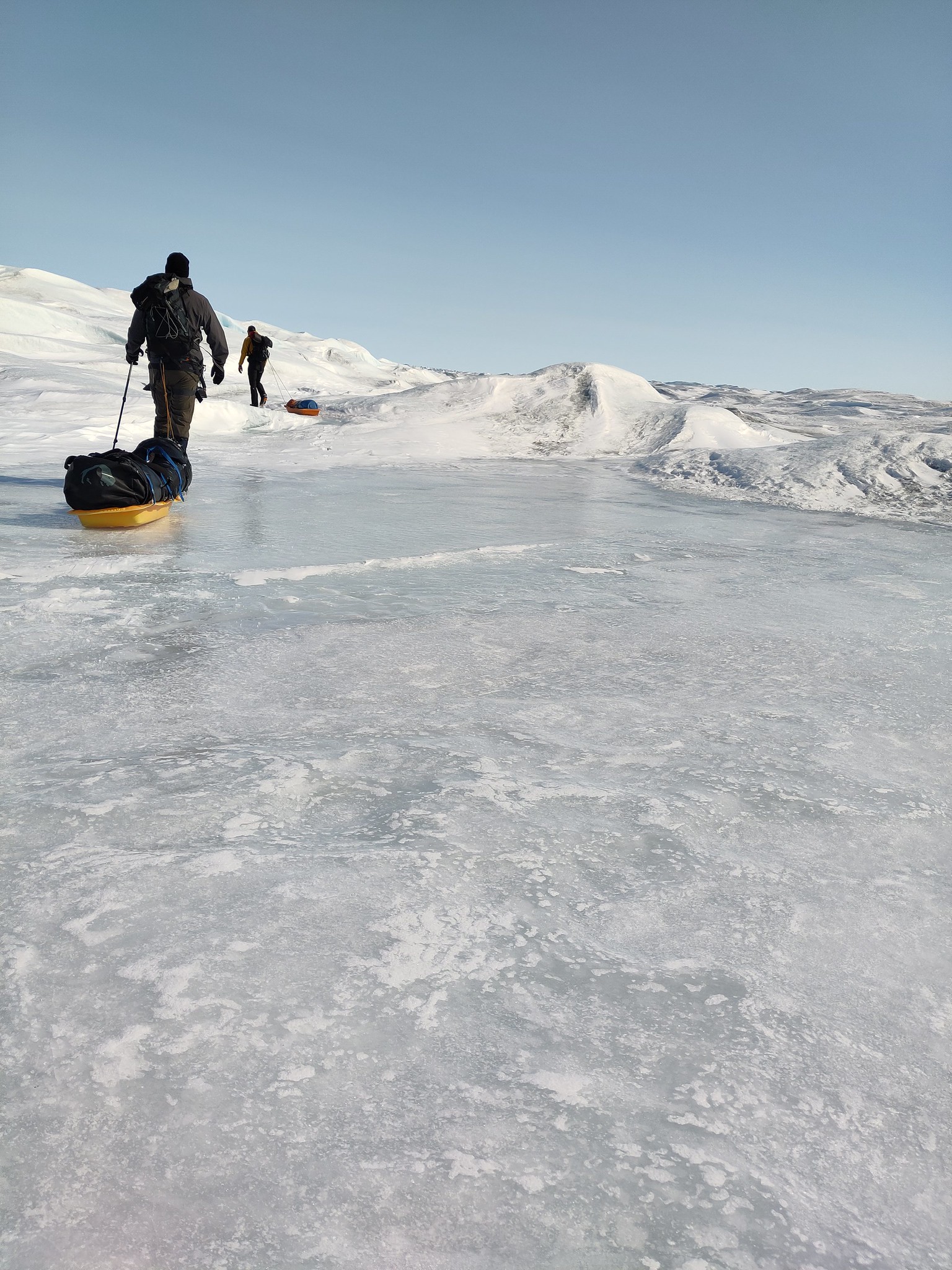
It’s been a busy time preparing for fieldwork and I didn’t manage to write anything here about it at the time, but this few eye-opening figure rather supports some of our arguments.
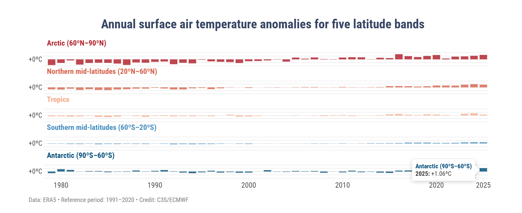
In this graphic, the 2025 temperature over the Antarctic region was 1.06°C higher than the average between 1991 and 2020 (a temperature anomaly). This is actually higher than any other region except the Arctic, where the temperature anomaly was reported to be 1.37°C above the 30 year average (bear in mind also that between 1991 and 2020, the temperature was also much increasing, so we’re not comparing with a pre-industrial climate here). Polar amplification was predicted long ago and as those first experiments found, it also is seen more in the Arctic than the Antarctic – but these results are a first hint of the amplification that is perhaps appearing now and may come to stay in the Antarctic.
In our paper we show the figure below (many thanks to illustrator Jagoba Malumbres-Olarta for the fine work), which shows five different cryosphere properties that are changing: 1) shrinking sea ice, 2) glacier velocities that show a seasonal cycle (mostly detected on the peninsula so far, though there are indications that Totten glacier for example has some kind of seasonal cycle, possibly modulated by sea ice), 3) total ice sheet mass loss, 4) ice shelf area and 5) annual mean surface temperature. In virtually all, the changes look very similar between Greenland and Antarctica, but with the crucial difference that the speed of changes is so far faster and more advanced in Greenland.
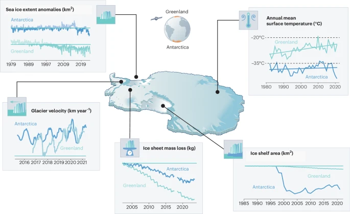
a, Commonalities include decline in sea ice extent from 1980 to 20232, with notable step-like changes in both poles. b, Seasonal glacier velocities are shown for two representative marine terminating glaciers, Kangilernata Sermia in Greenland13 and Hotine Glacier on the AP9, both now displaying similar seasonal dynamics. c, Both ice sheets show an accelerating total mass loss measured by GRACE satellites8. d, Multi-sensor records of ice shelf area loss in Antarctica11 show a steeper decline than Greenland7 as Arctic ice shelves were largely lost in the pre-satellite era. e, Satellite records of annual mean ice sheet surface (skin) temperature for 1982 to 2021 from radiation data in the CLARA-A2.1 record processed by OSISAF2 over both ice sheets. Earth observation data allows us to generalize over the vast size and spatially varying trends of the ice sheets, where there is generally poor coverage of in situ data. Individual weather stations indicate warming trends in air temperatures over both ice sheets of ~0.61 °C per decade at the South Pole and ~1.7 °C per decade at Greenland coastal stations. Illustration by Jagoba Malumbres-Olarte
The latter surface temperature plot is not the same as the Copernicus 2m air temperature which is based on the ERA5 reanalysis (so a blending of computer model with observations from satellites, weather stations, balloons, ships, planes etc). In our paper we wanted to focus on the contribution that satellite data has brought as we simply have so few direct in situ observations, so we used skin or surface temperature which is measured from satellites. It’s a somewhat theoretical construct, imagine a very thin surface (hence skin) layer, where incoming and outgoing energy are summed up to give a temperature. This is calculated over both ice sheets and sea surface by our colleagues in the satellite group at DMI and this is the dataset we used here. Their results which stretch back to the 1980s show a slow upward trend in Antarctica and a steeper change in Greenland, the record stopped in 2021 in our paper but it actually shows an upward increase since and that’s also borne out by the Copernicus results. In climate and weather models we in fact first calculate the skin temperature and then back interpolate to 2m temperature, so the two are very closely related.
To check that the satellite skin temperature record was accurate, I also looked at some of the longer in situ records, the South pole station for example has a long record and shows a small increasing trend over the last 30 years or so (which also may be attributable to natural causes, it is hard to pick out the global warming trend). Analysis of the record also shows that it is largely due to decreasing cold extremes rather than necessarily higher warm extremes. Again, a pattern we also observe in the Arctic.
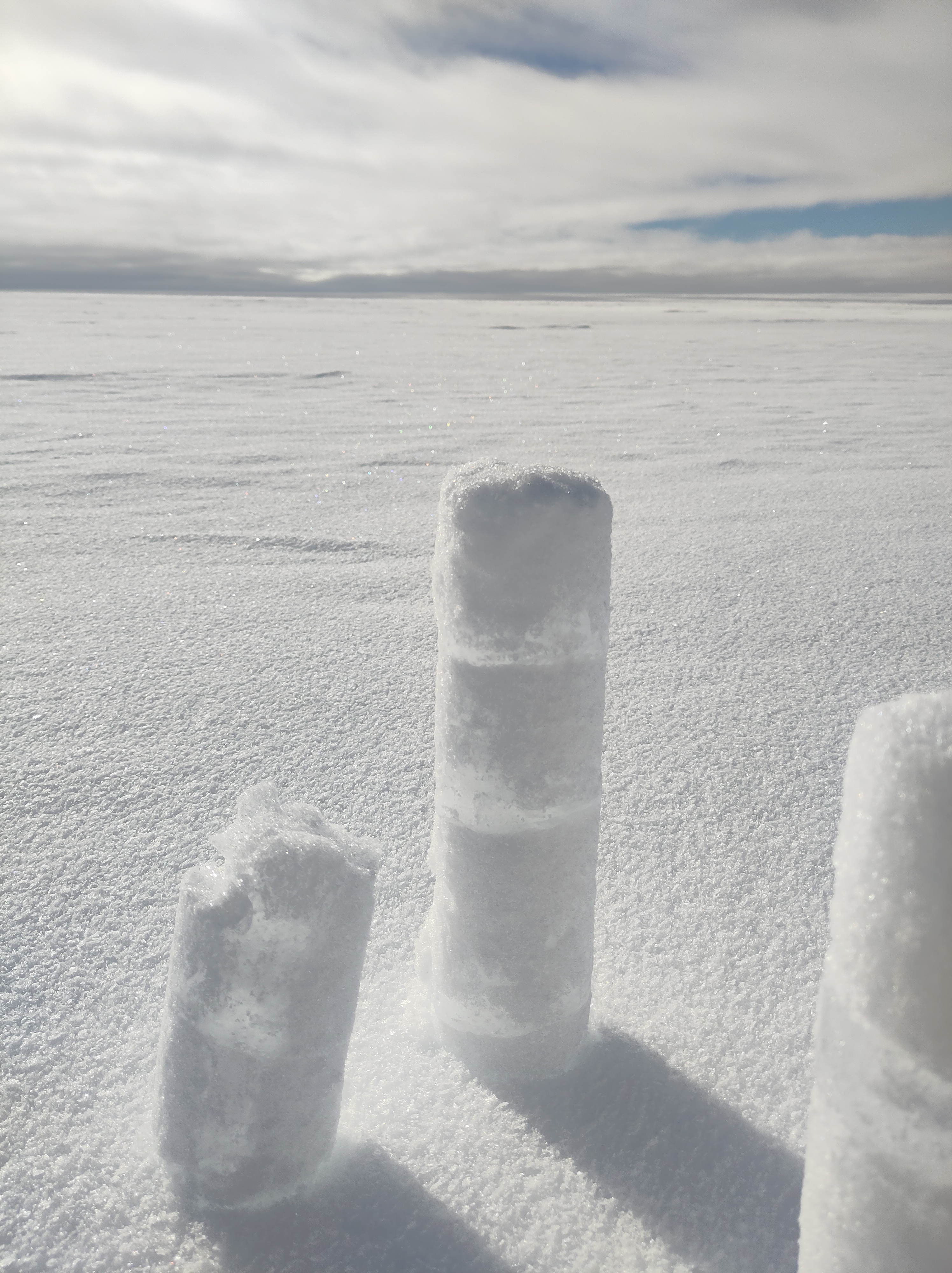
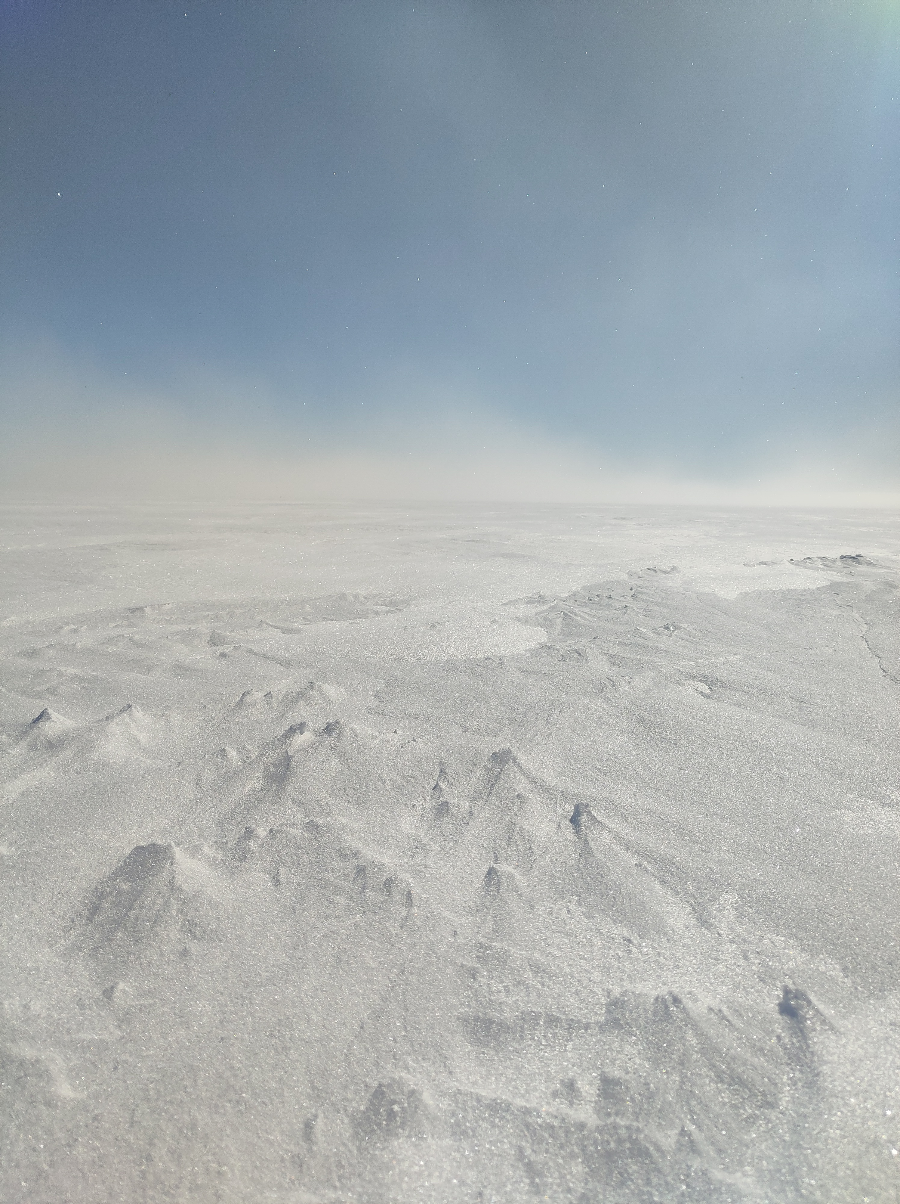
The analogy is not exact. As a continent, Antarctica is much further south than Greenland is to the north and it is much more insulated from warming by the circumpolar ocean than the Greenland ice sheet, sticking out in the middle of the Atlantic is. In a very real sense then, geography is destiny. Surface melt, which is also not nearly as common here in Antarctica mostly refreezes in the snowpack, whereas in the lower parts of Greenland it generally runs off and contributes directly to sea level rise. That has not yet become a major process in Antarctica, it’s still colder here and there is less surface melt for now, although from our own observations in the field, much more than I’d expected. Surface melt is definitely something we need to keep an eye on and some of our observations show how tricky that is, especially given disagreements between satellite sensors on this point .
But these are all details, the point is that Antarctica is also part of the global climate system and the same processes we’ve been observing for more than three decades in Greenland are now also starting to become apparent here too.
In one other respect Antarctica is becoming more similar to Greenland – it is becoming more contested. The Treaty that has governed Antarctica is vulnerable and subject to the same weakening of the global order that is now playing out in the North.
Let’s hope that geopolitics can settle down soon so that we can start to tackle the more serious and longer term crises coming down the line.
*I’m not sure “highlights” is quite the right word either – maybe “lowlights” would be better, but then it also starts to sound like a report on hairstyles…