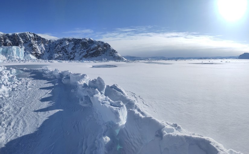
A jumble of broken ice, and what it means for Greenland’s calving glaciers.

Publication day! Our new paper has just come out in The Cryosphere, and after what feels like rather a long gestation, I’m delighted to finally be able to share it – The full paper is open access and available here: Hedetoft, Bang Brinck and Mottram et al. (2026).

This is the paper I was working on while I was in Ilulissat back in May 2024, watching icebergs drift around the bay and setting up time lapse cameras from my guest house window. At the time I wrote that “one of the papers I’m working on this week analyses those iceberg related datasets” — well, this is that paper, and it’s been quite a journey to get it into print.

The back story

As I wrote back in one of my several Qaanaaq posts, my colleague Steffen Malskær Olsen has been running a long-term observation programme in the fjord near Qaanaaq for 15 years now. That programme, and the field laboratory DMI maintains there, gave us an extraordinary opportunity to study something that glaciologists have been arguing about for years: what role does ice mélange actually play in controlling calving?

Ice mélange — sometimes known as sikussaq in Greenlandic — is that chaotic jumble of icebergs, bergy bits and sea water that sits in front of marine-terminating glaciers. It’s been described as the world’s largest granular material, and it’s a characteristic feature of pretty much every calving glacier in Greenland. In winter, landfast sea ice forms and acts as a kind of seasonal glue, sticking the whole mass together. The question is: does this frozen-together mass actually hold the glacier back, like a tiny ice shelf? Or is it more like a pile of rubble that the glacier shoves ahead of it with barely any resistance?
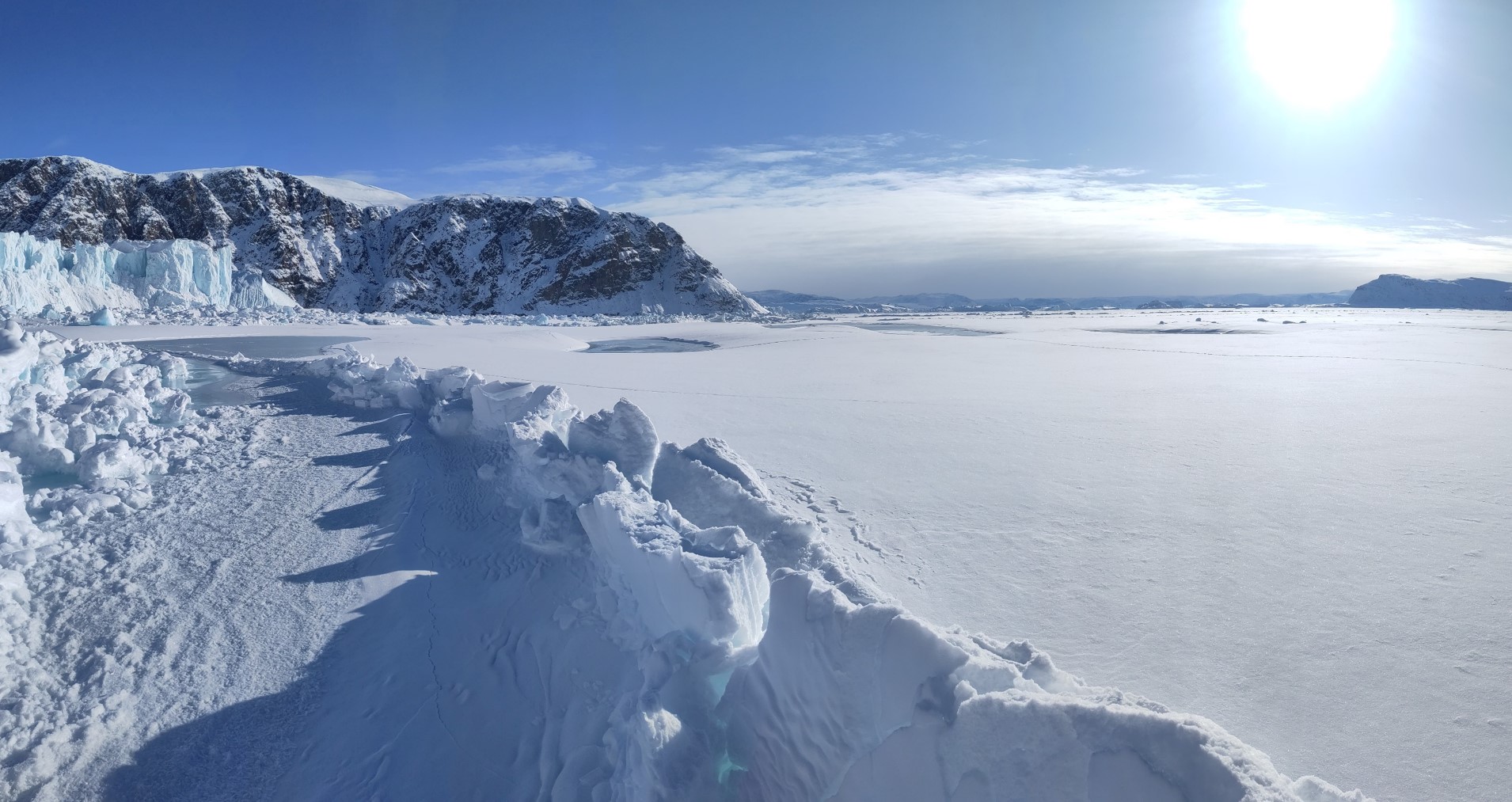
Iceberg melange in front of Melville glacier, with ridges and fractures in the sea ice forming as the glacier pushes through the winter.

The scientific community has been somewhat split on this. Some studies point to mélange as a mechanical inhibitor of calving — the idea being that calving only really kicks off once the mélange weakens or disappears. Others find the buttressing effect is limited, or depends heavily on whether landfast sea ice is present to bond the icebergs together. Most of the attention has been on the big, famous glaciers like Jakobshavn Isbræ and Helheim, which are enormous, fast-flowing, and in long narrow fjords. But what about the smaller, more typical glaciers that make up the majority of Greenland’s calving outlets?

That’s where Inglefield Fjord comes in.

The study site

We focused on three neighbouring glaciers at the head of Inglefield Bredning (Kangerlussuaq) in Northwest Greenland, at about 77.6°N: Tracy, Farquhar, and Melville glaciers. They’re a nice set because they’re different sizes — Tracy is the biggest at about 223 km², Melville is 119 km², and Farquhar is the smallest at 54 km² — and they’ve all been retreating at different rates over the last few decades. Tracy has been the fastest, retreating at about 200 m per year since the 1980s, twice as fast as Farquhar. Melville has been the slowest.

The area is also, crucially, accessible. The nearby town of Qaanaaq and the DMI field station there meant we could get out onto the sea ice by dog sled in late winter, working with local hunters and fishers who know the ice and the fjord far better than we ever will. This is something I want to emphasise, as I have before: this kind of science is a team sport, and the local community in Qaanaaq are absolutely essential to it.

What we did

The core of the study is a set of GNSS-tracking buoys that we deployed directly into the mélange zone, drilling holes in the sea ice and dropping them in. They recorded their position every 10 to 30 minutes and transmitted it back to us via the Iridium satellite network. When the sea ice broke up in July, the buoys floated free and were recovered by boat — again, thanks to our friends in Qaanaaq — and redeployed the following year.

We used two types of buoy: the TRUSTED buoys, which are a proprietary system from a Danish company (very robust as demonstrated by the incredible twists the metal stakes had from being over ridden by icebergs, a long battery life, but unfortunately rather limited position precision), and the OMB buoys, which are open-source instruments that we could customise to record more frequently, though they unfortunately proved a bit more vulnerable in this environment. Both have their strengths, and using both gave us a nice combination of reliability and detail. Not in the paper but deployed this year was even a third type – so watch out for more coming from this programme…

In March 2022 we deployed 6 buoys at Tracy and Farquhar. In March 2023 we deployed 8 buoys (6 TRUSTED and 2 OMB) across all three glaciers. The buoys tracked the mélange from late winter through to the break-up in mid-July, giving us a continuous, high-resolution record of how the mélange was moving — something that satellites alone can’t provide at this temporal frequency.

On top of the buoy data, we used quite a few other techniques to build a story.

  • Satellite imagery from ESA’s Sentinel-1 (radar, works in the dark and through clouds) and Sentinel-2 and Landsat (optical) to track calving front positions and identify calving events. We used a deep learning dataset from our co-author Erik Loebel to automatically extract calving front positions, but we also spent a lot of time manually checking satellite images because, frankly, the automated method sometimes confused the mélange edge with the glacier front, on the other hand our results independently confirmed that on a seasonal scale, the machine learning calving front detection actually works quite well!
  • Ice velocity data from our colleagues at PROMICE, again using ESA’s Sentinel-1 product, which (handily for us) isn’t masked to the ice sheet only, so it includes velocities from the mélange zone too.
  • Climate data from CARRA (the Copernicus Arctic Regional Reanalysis, a very cool 2.5 km resolution climate reanalysis for the Arctic) for winds, and our trusty HIRHAM5 regional climate model for surface melt and runoff timing.

The idea was to bring all these different datasets together and see how calving, mélange movement, glacier velocity, sea ice, and surface mass budget all interact over the course of a season.

What we found

I’ll try to keep this readable, but there’s quite a lot of detail in the paper for those who want it, so here are our key findings

1. The mélange moves steadily — with sudden jumps

The buoys showed the mélange creeping slowly but continuously away from the glacier fronts, at speeds of roughly 2–11 metres per day, punctuated by occasional abrupt jumps. These jumps were larger and more frequent closer to the glacier fronts, and the larger Tracy glacier had more influence on mélange velocity than the other two. This fits with the idea of the glacier pushing the mélange down-fjord, like a slow-motion conveyor belt but with the rigid land fast ice causing resistance that abruptly fractures.
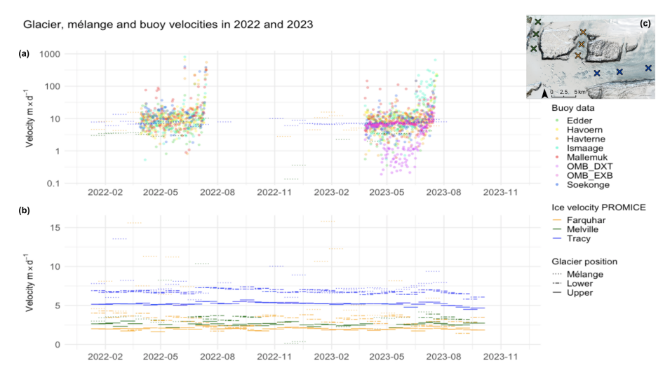
Velocity from the GNSS buoys at the top, compared with the satellite data at the bottom. The overpass and processing frequency of the satellite data smooths the velocities measured by the GNSS buoys.

2. Calving happens even in deep winter

This was perhaps the most striking result. We observed large calving events at the peak of the fast ice season — in other words, when the landfast sea ice was at its thickest and most extensive, and the mélange was fully frozen together. Neither the landfast ice nor the mélange fully suppressed calving. This challenges the idea that mélange acts as a simple mechanical brake.
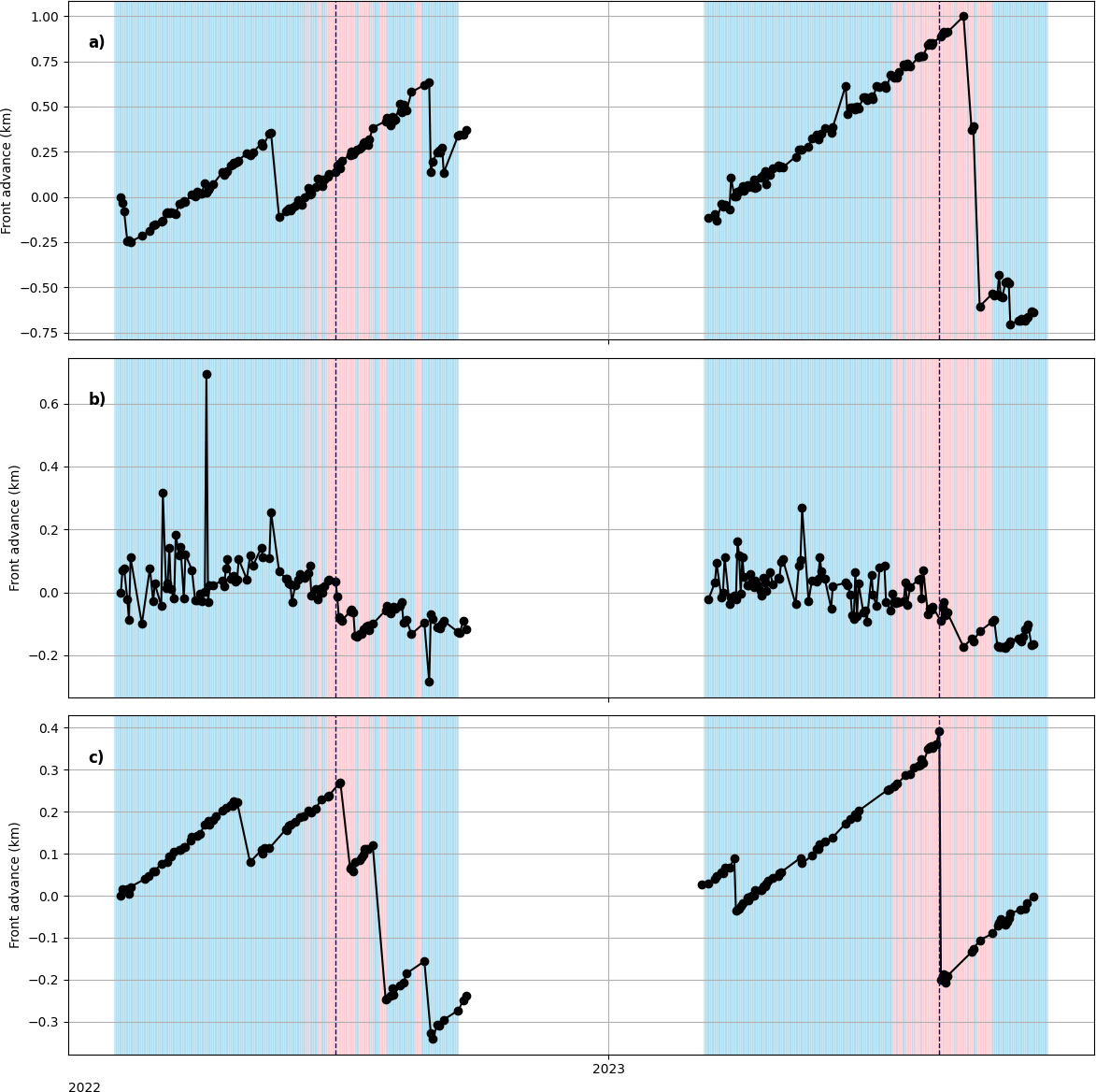
Calving front time series at the central flow line at (a) Tracy glacier, (b) Farquhar glacier and (c) Melville glacier for 2022 and
2023. Calving front positions are marked with black dots, and solid gray lines connect entries for each year. Red and blue backgrounds
symbolise positive and negative temperatures, respectively, based on 2m air temperature data from CARRA at 12:00UTC and the dashed
vertical lines represent sea ice break-up dates for the two years in question, 16 July 2022 and 25 July 2023, identified from changes in buoy
movements and examination of optical satellite imagery. (Loebel et al., 2023).

3. No tidal signal in the mélange

Inspired by this paper, we did a spectral analysis of the high-resolution OMB buoy data to look for tidal or diurnal cycles in the mélange movement. We found none. In fact we found something even a bit more interesting that – we had one buoy that seemed to show some kind of diurnal periodicity, but very complete spectral analysis found no tidal signal at all. We concluded the periodicity relates to the GNSS signal itself – a warning to analyse full all your data and consider other hypotheses as well as the favourite one!

The mélange during the fast ice season appears to be driven almost entirely by the glacier pushing from behind and perhaps by wind forcing, not by tides. This is interesting because tides are sometimes invoked as a driver of calving events via the melange, but at least at these glaciers during the fast ice season, we see no evidence of it.

4. Unbonded mélange doesn’t do much — it’s the landfast ice that matters – but only in winter

This is probably the key finding. When the mélange is just a loose jumble of icebergs (as it is in summer, after the sea ice has broken up), it has very little influence on glacier velocity or calving rates. It’s only when the individual ice blocks are frozen into a matrix of land fast sea ice — losing their “granular material” properties and becoming more like a rigid, multi-year sea ice cover — that they appear to exert any kind of braking effect. And even then, that effect is limited.

5. It’s a combination of factors

Putting it all together, our conclusion is that at these representative small and medium-sized Greenland outlet glaciers, seasonal calving behaviour is modulated by a combination of surface melt, glacier velocity, and the presence of landfast sea ice that bonds the mélange. It’s not one thing — it’s the interplay of several, and the landfast ice acts more to delay the removal of mélange than to prevent calving outright.

Why does this matter?

Calving processes account for roughly half of the total mass loss from the Greenland ice sheet, yet they remain poorly represented in ice sheet models. It’s something I’ve been working on since my PhD. If we can’t model calving properly, we can’t project future sea level rise properly — and for a country like Denmark, that’s a rather existential question.

Most previous mélange studies have focused on the big, dramatic glaciers. Our study suggests that at the more typical, smaller glaciers that make up the bulk of Greenland’s calving outlets, the story is more nuanced. Mélange buttressing isn’t a simple on/off switch. It depends on whether the icebergs are bonded together by landfast sea ice, and even then, the effect is modest. Surface melt and glacier dynamics seem to matter more and these are all inter-realted processes, typically the air temperature gets warmer, the ice surface starts to melt, the glacier starts to accelerate and the sea ice gets weaker and thinner all at the same time. We have confounding variables which makes the picture difficult to disentangle.

We also hope the dataset we’ve collected — the in-situ buoy tracks, the satellite-derived calving fronts, the velocity comparisons — will be useful for other groups working on modelling mélange processes. There’s very little in situ data across seasons with this kind of temporal resolution, and we’d be delighted if others can use it to test and improve their models.

Some Criticisms… and what’s next?

We had a very excellent editor and really good reviewers who gave the paper a through filleting. You can see these online as the Cryosphere has open review. I thank them all for their good comments which certainly clarified the paper. The main criticism that may still be levelled is what about the melange thickness? Maybe these glaciers don’t see an effect because the melange is thin and weak? Well we do go into that in the paper. These are pretty representative glaciers for Greenland by any measure and perhaps the glaciologists view of melange processes is slightly skewed by all the studies at Jakobshavn/Sermeq Kujalleq and Helheim? However, when you stand in the melange zone, it becomes very clear just how heterogenous it is. The large icebergs make up a relatively small portion of the total area, so current models, using “melange thickness” as a tuning parameter are missing some subtlty, which probably turns out to be important in this subject area.

And there’ll definitely be more on melange dimensions and how that relates to buttressing, coming very soon!
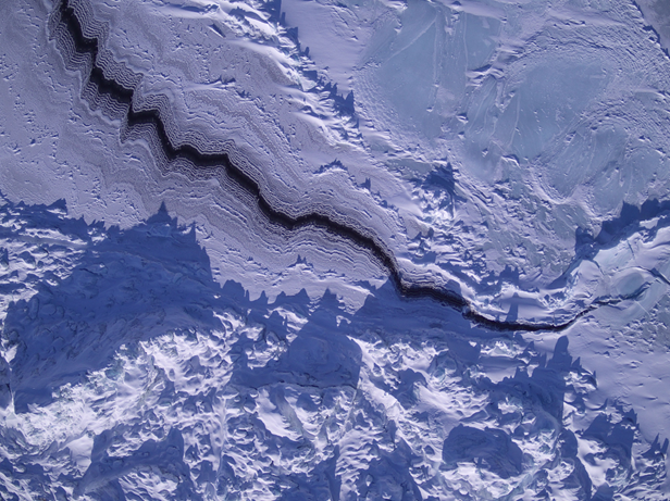
UAV shot of a sea ice lead in the melange zone of Tracy glacier, 2023

Acknowledgements

This paper was led by Sofie Hedetoft and Olivia Bang Brinck, who share first authorship with me and who did the lion’s share of the analysis and making of the figures. It’s been a real pleasure working with them and we would certainly not have got very far the rest of the team: Andrea Gierisch and Steffen Malskær Olsen, who were fantastic field work colleagues and a great inspiration for the ideas in this paper, Martin Olesen and Nicolaj Hansen for climate and SMB insights, Anders Anker Bjørk for finding our marvellous students and offering great advice on ice velocioty products, Erik Loebel for the automated calving front analysis, Anne Solgaard for the satellite data processing and assistance in interpretation and Peter Thejll whose expertise in statistics and spectral analysis is unrivalled.

As ever, none of this would have been possible without the local community in Qaanaaq — the hunters and fishers who guided us, transported us by dog sled, helped install instruments and recovered our buoys by boat when the ice broke up. Our DMI colleague Aksel Ascanius, who lives and works in Qaanaaq, has been an essential part of the programme throughout.

The work was carried out under the auspices of the Danish National Centre for Climate Research (NCKF), funded by the Danish Government, with additional contributions from EU Horizon Europe frameworks and ESA’s Climate Change Initiative for the Greenland ice sheet.

The full paper is open access — please go and read it, and do get in touch if you have questions or comments. I’m always happy to hear from people, whether on here, on mastodon, or by email.

Hedetoft, S., Bang Brinck, O., Mottram, R., et al. (2026). Mélange, landfast sea ice, ice velocities: What controls seasonal calving rates in North West Greenland? The Cryosphere, 20, 5071–5098. https://doi.org/10.5194/tc-20-5071-2026
Greenland thoughts from Antarctica..

I’m in Antarctica and yet I have been getting contact from journalists because Greenland is all over the press at the moment for all the wrong reasons. It’s reasonable I think to worry about what the various deranged threats towards Greenland will mean for us all also outside of Greenland. But I also think about (and yes, worry) about the friends I’ve made in Greenland over the years. Let’s hope common sense prevails and we can step back from the brink, and concentrate on the really long term problems that we are still rapidly storing up for ourselves.

Greenland is also on my mind, not just because of geopolitics, but also because the Copernicus Climate service has just put out their annual global climate highlights* for 2025 report with some disturbing results from Antarctica.

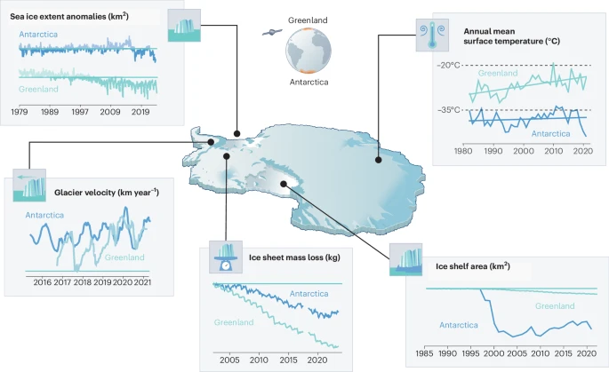
A few months ago we had a paper published called the Greenlandification of Antarctica, in which we argue that the changes in the Antarctic cryosphere increasingly resemble those we have previously observed in Greenland and the Arctic. To see the future of Antarctica, look at Greenland.

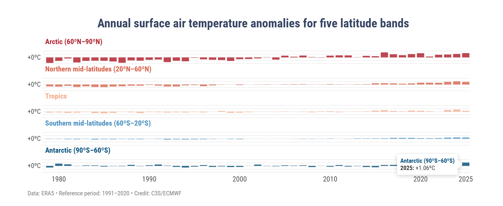
It’s been a busy time preparing for fieldwork and I didn’t manage to write anything here about it at the time, but this few eye-opening figure rather supports some of our arguments.

In this graphic, the 2025 temperature over the Antarctic region was 1.06°C higher than the average between 1991 and 2020 (a temperature anomaly). This is actually higher than any other region except the Arctic, where the temperature anomaly was reported to be 1.37°C above the 30 year average (bear in mind also that between 1991 and 2020, the temperature was also much increasing, so we’re not comparing with a pre-industrial climate here). Polar amplification was predicted long ago and as those first experiments found, it also is seen more in the Arctic than the Antarctic – but these results are a first hint of the amplification that is perhaps appearing now and may come to stay in the Antarctic.

In our paper we show the figure below (many thanks to illustrator Jagoba Malumbres-Olarta for the fine work), which shows five different cryosphere properties that are changing: 1) shrinking sea ice, 2) glacier velocities that show a seasonal cycle (mostly detected on the peninsula so far, though there are indications that Totten glacier for example has some kind of seasonal cycle, possibly modulated by sea ice), 3) total ice sheet mass loss, 4) ice shelf area and 5) annual mean surface temperature. In virtually all, the changes look very similar between Greenland and Antarctica, but with the crucial difference that the speed of changes is so far faster and more advanced in Greenland.

From Mottram et al., 2025: The Greenlandification of Antarctica. Original caption:
a, Commonalities include decline in sea ice extent from 1980 to 20232, with notable step-like changes in both poles. b, Seasonal glacier velocities are shown for two representative marine terminating glaciers, Kangilernata Sermia in Greenland13 and Hotine Glacier on the AP9, both now displaying similar seasonal dynamics. c, Both ice sheets show an accelerating total mass loss measured by GRACE satellites8d, Multi-sensor records of ice shelf area loss in Antarctica11 show a steeper decline than Greenland7 as Arctic ice shelves were largely lost in the pre-satellite era. e, Satellite records of annual mean ice sheet surface (skin) temperature for 1982 to 2021 from radiation data in the CLARA-A2.1 record processed by OSISAF2 over both ice sheets. Earth observation data allows us to generalize over the vast size and spatially varying trends of the ice sheets, where there is generally poor coverage of in situ data. Individual weather stations indicate warming trends in air temperatures over both ice sheets of ~0.61 °C per decade at the South Pole and ~1.7 °C per decade at Greenland coastal stations. Illustration by Jagoba Malumbres-Olarte

The latter surface temperature plot is not the same as the Copernicus 2m air temperature which is based on the ERA5 reanalysis (so a blending of computer model with observations from satellites, weather stations, balloons, ships, planes etc). In our paper we wanted to focus on the contribution that satellite data has brought as we simply have so few direct in situ observations, so we used skin or surface temperature which is measured from satellites. It’s a somewhat theoretical construct, imagine a very thin surface (hence skin) layer, where incoming and outgoing energy are summed up to give a temperature. This is calculated over both ice sheets and sea surface by our colleagues in the satellite group at DMI and this is the dataset we used here. Their results which stretch back to the 1980s show a slow upward trend in Antarctica and a steeper change in Greenland, the record stopped in 2021 in our paper but it actually shows an upward increase since and that’s also borne out by the Copernicus results. In climate and weather models we in fact first calculate the skin temperature and then back interpolate to 2m temperature, so the two are very closely related.

To check that the satellite skin temperature record was accurate, I also looked at some of the longer in situ records, the South pole station for example has a long record and shows a small increasing trend over the last 30 years or so (which also may be attributable to natural causes, it is hard to pick out the global warming trend). Analysis of the record also shows that it is largely due to decreasing cold extremes rather than necessarily higher warm extremes. Again, a pattern we also observe in the Arctic.

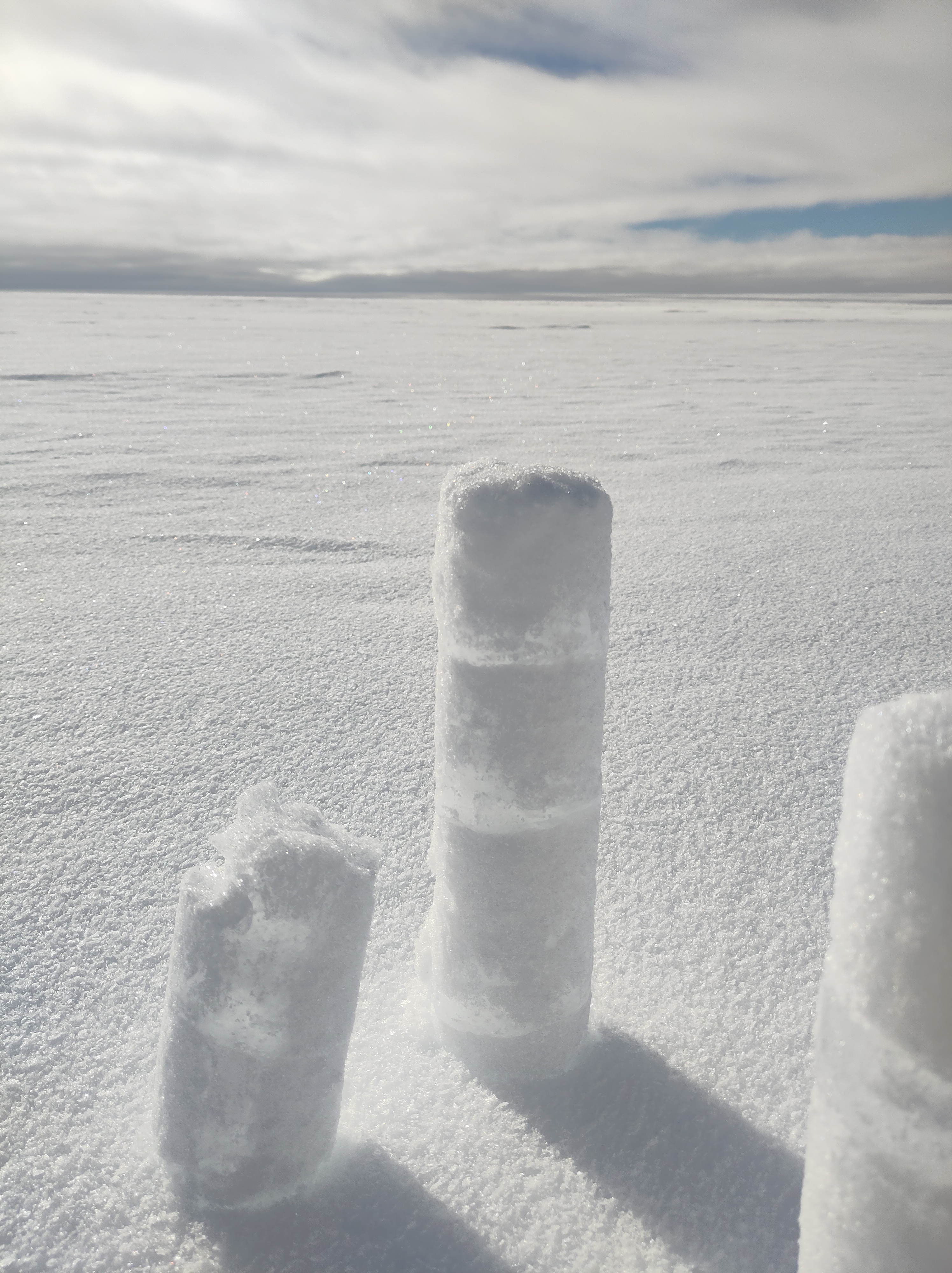
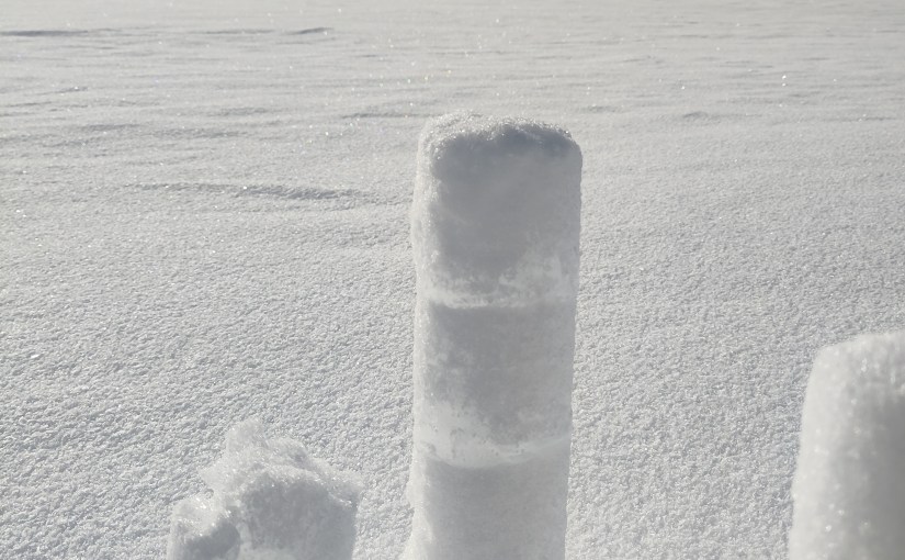
Shallow snow cores drilled near Wasa, the clear layers are refrozen surface melt that has percolated into the snow below the surface. I was genuinely not expecting to see these, and it’s not always captured in the satellite record either, so we clearly have work to do to explain some of these findings.

The analogy is not exact. As a continent, Antarctica is much further south than Greenland is to the north and it is much more insulated from warming by the circumpolar ocean than the Greenland ice sheet, sticking out in the middle of the Atlantic is. In a very real sense then, geography is destiny. Surface melt, which is also not nearly as common here in Antarctica mostly refreezes in the snowpack, whereas in the lower parts of Greenland it generally runs off and contributes directly to sea level rise. That has not yet become a major process in Antarctica, it’s still colder here and there is less surface melt for now, although from our own observations in the field, much more than I’d expected. Surface melt is definitely something we need to keep an eye on and some of our observations show how tricky that is, especially given disagreements between satellite sensors on this point .

But these are all details, the point is that Antarctica is also part of the global climate system and the same processes we’ve been observing for more than three decades in Greenland are now also starting to become apparent here too.

In one other respect Antarctica is becoming more similar to Greenland – it is becoming more contested. The Treaty that has governed Antarctica is vulnerable and subject to the same weakening of the global order that is now playing out in the North.

Let’s hope that geopolitics can settle down soon so that we can start to tackle the more serious and longer term crises coming down the line.

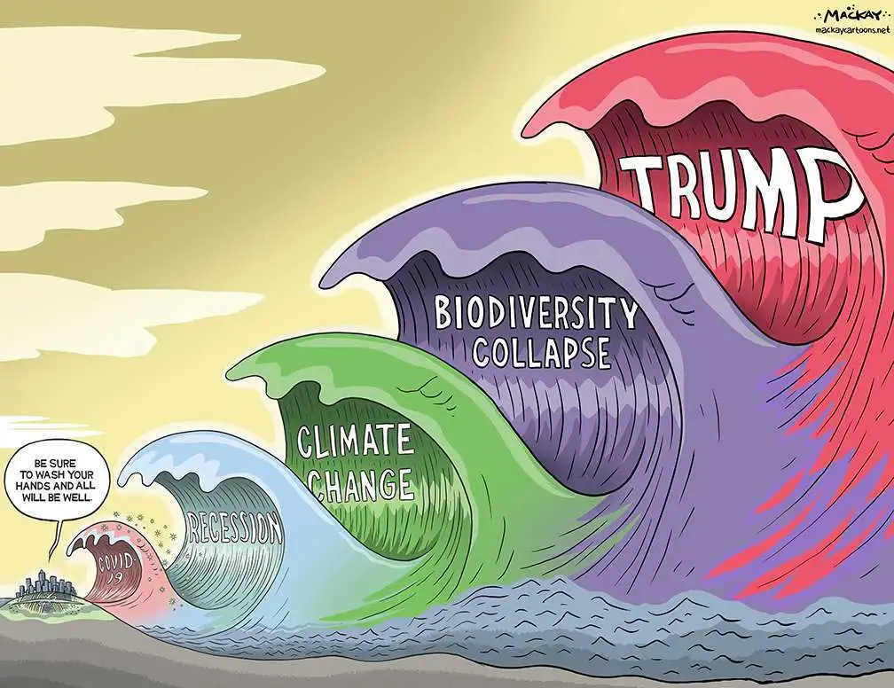
Lifted with thanks from Mackay Cartoons

*I’m not sure “highlights” is quite the right word either – maybe “lowlights” would be better, but then it also starts to sound like a report on hairstyles…

PROTECT: The Sea Level Rise Question

There is currently some discussion in the Danish media about sea level rise hazards and the risk of rapid changes that may or may not be on the horizon. Some of the discussion is about IPCC estimates. That’s a little unfortunate and in fact a bit unfair as the IPCC report has not been updated since 2021, nor was it intended to have been. In the mean time there has been a lot of additional science to clear up some of the ambiguities and questions left from the last report.

I’ve been working quite a bit on the cryosphere part of the sea level question of late, so thought I’d share some insights from the latest research into the debate at this point. And I have a pretty specific viewpoint here, because I’ve been working with the datasets, models, climate outputs etc that will likely go into the next IPCC report as part of a couple of EU funded projects. As part of that, we have prepared a policy briefing that will be presented to the European Parliament in June this year, but it’s already online now and will no doubt cross your socials later this week. I’m going to put in some highlights into this post too.

Now, I want to be really clear that everything I say in this post can be backed up with peer reviewed science, most of which has been published in the last 2 to 3 years. Let’s start with the summary:.:

  • The sea is rising. And the rate of rise is currently accelerating.
  • The sea will continue to rise long into the future. The rate of that sea level rise is largely in our society’s hands, given that it is strongly related to greenhouse gas emissions.
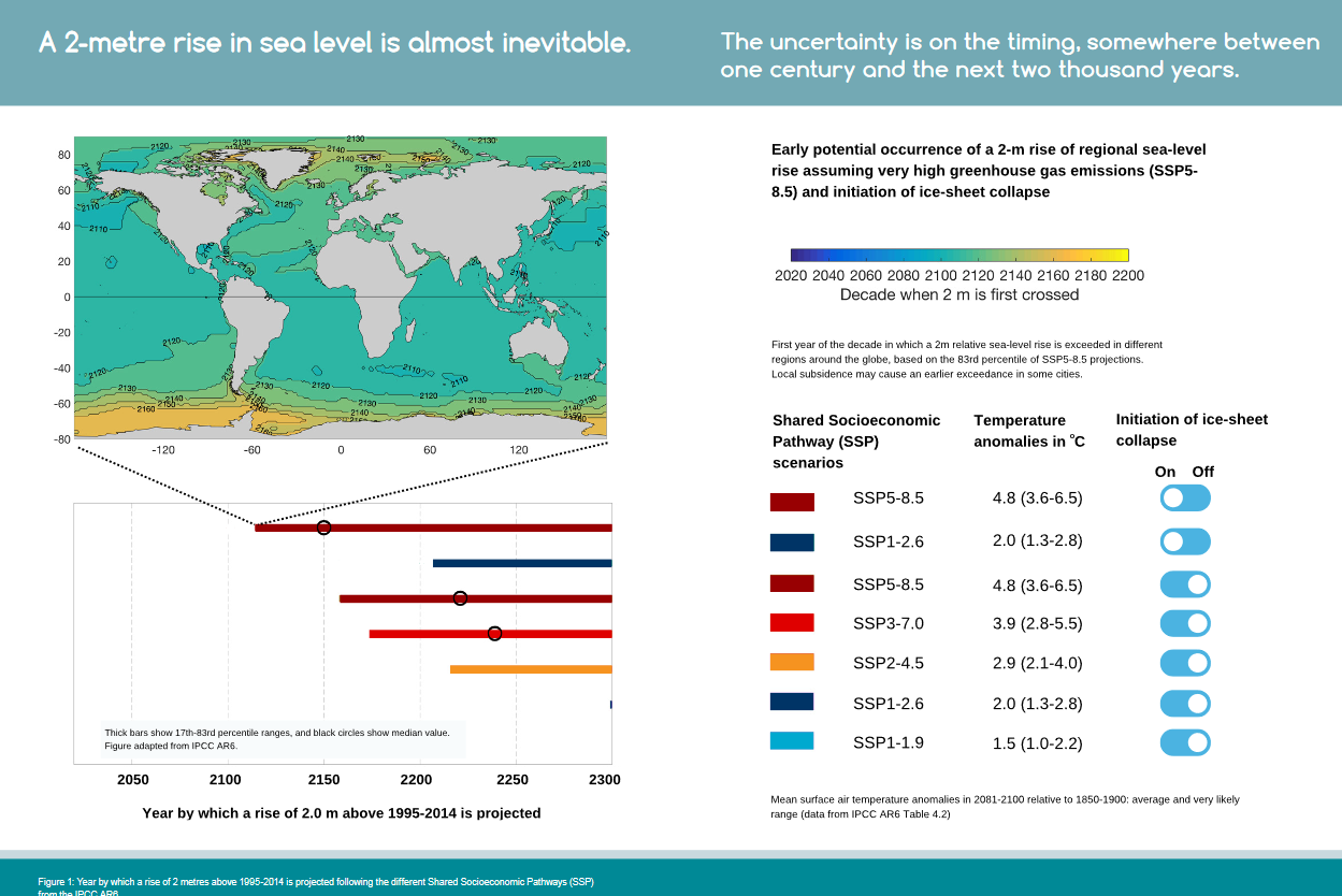
  • We have already committed to at least 2m of sea level rise by 2300.
  • By the end of 2100 most small glaciers and ice caps will be gone, mountain glaciers will contribute 20-24% of total sea-level rise under varying emission scenarios.
  • Antarctic and Greenland ice sheet mass loss will contribute significantly to sea-level rise for centuries, even under low emissions scenarios
  • Abrupt sea level rise on the order of metres in a few decades is not credible given new understanding of key ice fracture and iceberg calving processes.
  • By the end of this century we expect on the order of a half to one metre of sea level rise around Denmark, depending on emissions pathway. (If you want to get really specific: the low-likelihood high impact sea level rise scenario corresponds to about 0.9 m (on average), or at the 83rd percentile, about 1.6 m of sea level rise).
  • Your local sea level rise is not the same as the global average and some areas, primarily those at lower latitudes will experience higher total sea level rise and earlier than in regions at higher latitudes.
  • We have created a local sea level rise tool. You should still check your local coastal services provider, they will certainly have something tailor made for your local coastline (or they *should*!), but for something more updated than the IPCC, with latest SLR data, this is the one to check.

Sea level rise now is ~5mm per year averaged over the last 5 years, 10 years ago it was about 3 mm per year). Much of that sea level rise comes from melting ice, particularly the small glaciers and ice caps that are melting very fast indeed right now. Even under lower levels of emissions, those losses will increase. There won’t be many left by the end of this century.

Greenland is the largest single contributor and adds just less than a millimetre of sea level rise per year, with Antarctica contributing around a third of Greenland, primarily from the Amundsen Sea sector. The remaining sea level rise comes from thermal expansion of the oceans. Our work shows very clearly that the emissions pathway we follow as a human society will determine the ultimate sea level rise, but also how fast that will be achieved. The less we burn, the lower and slower the rise. But even under a low-end Paris scenario, we expect around 1 metre of sea level by 2300.

The long tail of sea level rise will come from Antarctica, where the ocean is accelerating melt of, in particular, West Antarctica. However, our recent work and that of other ice sheet groups shows that the risk of multi-metre sea level rise within a few decades is unrealistic. Again, to be very clear: We can’t rule out multiple metres of sea level rise, but it will happen on a timescale of centuries rather than years. High emissions pathways make multiple metres of sea level rise more likely. In fact, our results show that even under low emissions pathways, we may still be committed to losing some parts of especially West Antarctica, but it will still take a long-time for the Antarctic ice sheet to disintegrate. We have time to prepare our coastlines.

Greenland is losing ice much faster than Antarctica, and here atmospheric processes and firn and snow are more important than the ocean and these are also where the læarge uncertainties are. As I’ve written about before, that protective layer of compressed snow and ice will determine how quickly Greenland melts, as it is lost, the ice sheet will accelerate it’s contribution to sea level. This is a process that is included in our estimates.

There’s so much more I could write, but that’s supposed to be the high level summary. Feel free to shoot me questions in the comment feeds. I’ll do my best to answer them.

Five years ago, a small group of European scientists got together to do something really ambitious: work out how quickly and how far the sea will rise, both locally and on average worldwide, from the melting of glaciers and ice sheets. The PROTECT project was the first EU funded project in 10 years to really grapple with the state-of-the-art in ice sheet and glacier melt and the implications for sea level rise and to really seek to understand what is the problem, what are the uncertainties, what can we do about it.

We were and are a group of climate scientists, glaciologists, remote sensors, ice sheet modellers, atmospheric and ocean physicists, professors, statisticians, students, coastal adaptation specialists, social scientists and geodesists, stakeholders and policymakers. We’ve produced more than 155 scientific papers in the last 5 years (with more on the way) and now our findings are summarised in our new policy briefing for the European Parliament.

It’s been a formative, exhilarating and occasionally tough experience doing big science in the Horizon 2020 framework, but we’ve genuinely made some big steps forward, including new estimates of rates of ice sheet and glacier loss, a better understanding of some key processes, particularly calving and the influence of the ocean on the loss of ice shelves. More importantly for human societies, by integrating the social scientists into the project, we have had a very clear focus on how to consider sea level rise, not just as a scientific ice sheet process problem, but also how to integrate the findings into usable and workable information. In Denmark, we will start to use these inputs already in updating the Danish Climate Atlas. If you are elsewhere in the world, you may want to check out our sea level rise tool, that shows how the emissions pathway we follow, will affect your local sea level rise.

Our final recommendations?

  1. Accelerate emission reductions to follow the lower emission scenario to limit
    cryosphere loss and associated sea-level rise
  2. Enhance monitoring of glaciers and ice sheets to refine models and predictions
  3. Support the long-term development of ice sheet models, their integration into
    climate models, and the coupling of glacier models with hydrological models, while
    promoting education and training to build expertise in these areas
  4. Invest in flexible and localized coastal management that incorporates
    uncertainty and long-term projections
  5. Foster international collaboration to share knowledge, resources, and strategies
    for mitigating and adapting to global impacts

Building the Next Generation…

Hands-up who is looking for a new and very cool job in ice sheet and climate modelling and developing new machine learning tools?

REMINDER: 4 days left to apply for this PhD position with me at DMI looking at Antarctic Ice Sheet mass budget processes and developing new Machine Learning models and processes.

UPDATE 2: The PhD position on Antarctica is now live here. Deadline for Applications 18th February!

UPDATE: It’s not technically a PRECISE job, but if you’re a student in Copenhagen and are looking for a part-time study job (Note that this is a specific limited hours job-type for students in higher education in Dnmark) , DMI have got 2 positions open right now, at least one of which will be dedicated to very related work – namely working out how well climate and ice sheet models work when compared with satellite data. It’s part of a European Space Agency funded project that I and my ace colleague Shuting Yang, PI on the new TipESM project, are running. Apply. Apply. Apply…

I’ve written about the PRECISE project before, our new Novo Nordisk funded project looking at ice sheets and sea level rise.

This is a quick post to announce that our recruitment drive is now open. We’re split across three institutes. We are two in Copenhagen, ourselves at DMI and the Niels Bohr Institute at the University of Copenhagen, and then the University of Northumbria in Newcastle, UK.

The PI at the Niels Bohr Institute is the supremely talented Professor Christine Hvidberg, aided by material scientist and head of the institute, Joachim Mathiesen. I am leading for DMI, and the Northumbria work is led by Professor Hilmar Gudmundsson. We are also very fortunate to have the talents of Aslak Grindsted, Helle Schmidt, Nicolas Rathmann and Nicolaj Hansen already on board.

The project is already very cohesive between institutes, we’ve been working together for some time already and know each other well.

We have a good budget for travel and exchanges between groups, workshops, symposia, summer schools and the like, but perhaps more importantly, all the positions are focused at the very cutting edge (apologies for the cliche) of climate and ice sheet modelling. We are developing not just existing models and new ways to parameterise physical processes, but we also want to focus on machine learning to incorporate new processes, speed-up the production of projections for sea level rise, not forgetting an active interface with the primary stakeholders who will need to use the outcomes of the project to prepare society for the coming changes.

There’s also a healthy fieldwork component (particularly in Greenland, I don’t rule out Antarctica either), and if you’re that way inclined, some ice core isotope work too. So, if you’re looking for a new direction, feel free to give me a shout. I’m happy to talk further.

Links to all the openings, will be updated as they come out, these are currently open and have deadlines at the end of January:

Newcastle: A three-year postdoctoral research position in machine learning emulators of ice-ocean processes

Newcastle: A two-year postdoctoral researcher (PDRA) position in subglacial modeling of the Antarctic Ice Sheet

Copenhagen (NBI) PhD Project in Greenland ice sheet climate and precipitation variability

Copenhagen (DMI) PhD Project in Antarctic ice sheet surface mass budget (also keep an eye here, where there are also some other interesting jobs announced)

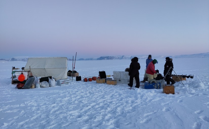
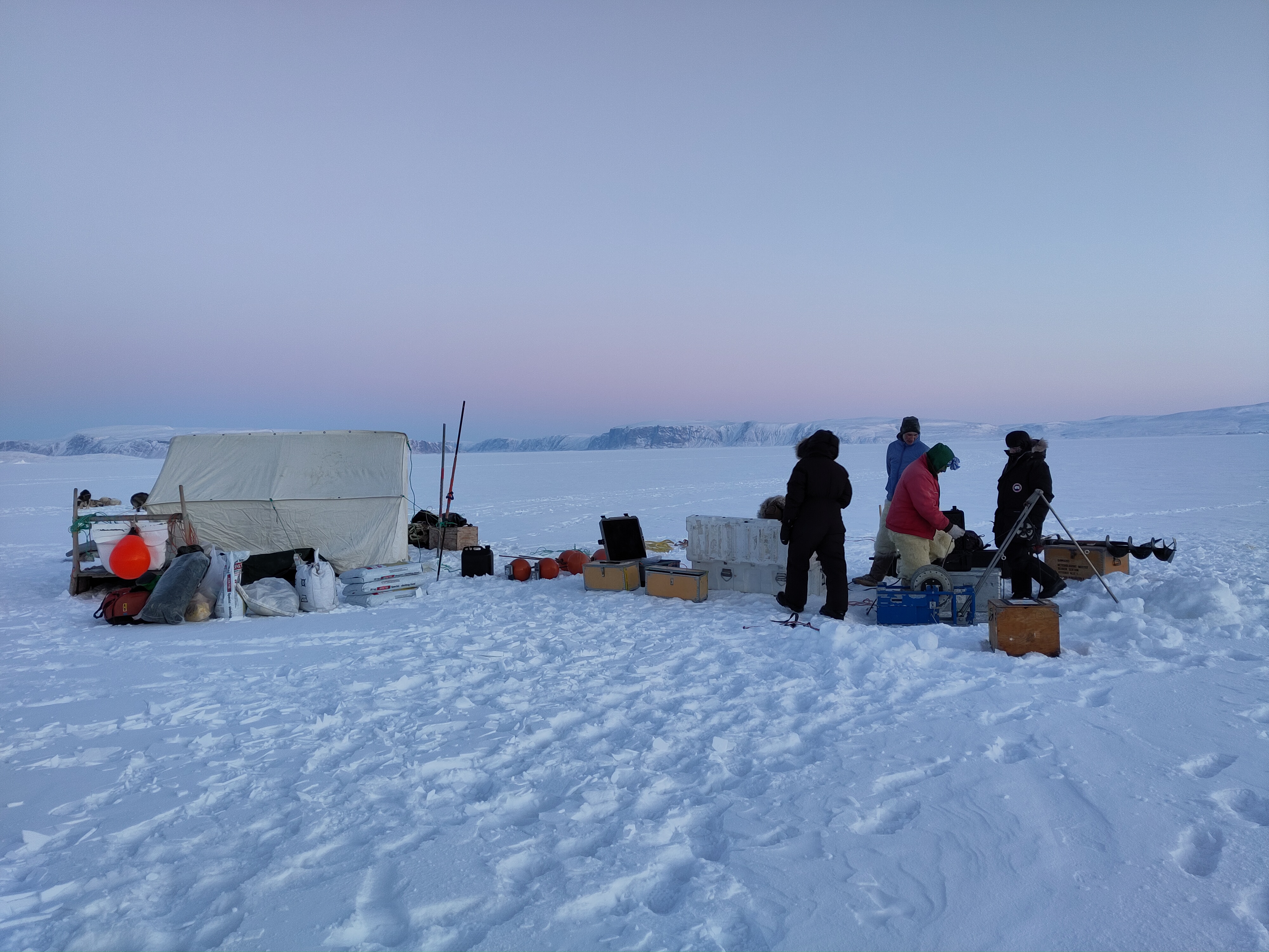
photo showing a small white tent on a snow covered sea ice surface with people dressed in thick warm clothes dropping instruments through a whole in the ice. The sky is a clear blue fading to vioet and pink at sunset
Field camp on sea ice, northern Greenland 2023, measure ocean influences on calving outlet glacier.
(Photo credit: Ruth Mottram, DMI)

A cryosphere call to action..

The International Cryosphere Climate Initiative has put together a new petition for scientists to sign. I’m a little sceptical that this kind of “clicktivism” makes much difference, but there are many many lobbyists from polluting industries at the COP28 and rather fewer scientists. And how else to draw attention to what is one of the most visible and urgent effects of climate change?

The petition is aimed at:

” all cryosphere scientists globally; as well as those working on emissions pathways: and those in the social sciences with research on adaptation, loss and damage and health impacts. This includes research and field associates, as well as doctoral students — because you are the future, and will be dealing with the impacts of climate change in the global cryosphere throughout your lives, as well as your professional careers.”

ICCI

The list of signatories so far already includes many rather senior scientists, so take this as a challenge to add your signature if you work in the cryosphere/climate space. It takes only a minute to sign and there are many familiar names on the list.

I’m not sure how else to emphasise the urgency of real action at COP 28.

Small bergy bits in the bay near Ilulissat, with Lego Ice Man for scale (and an important message)

As a coincidence though, and as I posted on mastodon the image below appears in Momentum, a plug-in on my web browser with a new photo every day. Today’s is this beautiful image of the Marmolada glacier in Italy by Vicentiu Solomon.

Marmolada Glacier by Vicentiu Solomon

It’s a gorgeous but very sad picture – this is one of the faster disappearing #glaciers in the world and to hear more about the consequences of cryosphere loss, take a look at the policy brief produced by the PROTECT project on the sea level rise contributions from glaciers and ice sheets. It also contains this eye opening graphic:

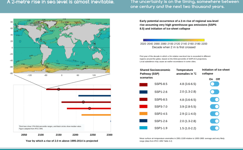
A 2 metre rise in sea level is almost inevitable. The uncertainty is on the timing which is somewhere between one century and the next 2 thousand years, depending on where you are in the world, but, more importantly given COP28, how fast fossil fuels are phased out. You can download the whole thing here.

So there you have it. Here’s a reminder of the petition from the International Cryosphere Climate Initiative.