Antarctic snows

Here’s a sentence I have been promising to write on this blog since at least March this year: Antarctica has been gaining ice since 2020. Not losing, gaining. Only 68 gigatonnes a year admittedly, actually a mere drop in the ocean, (or should that be crystal in the ice sheet?), given the vast size of the place, but an (almost) new paper that I worked on, led by the excellent Marlen Kolbe, explains why.
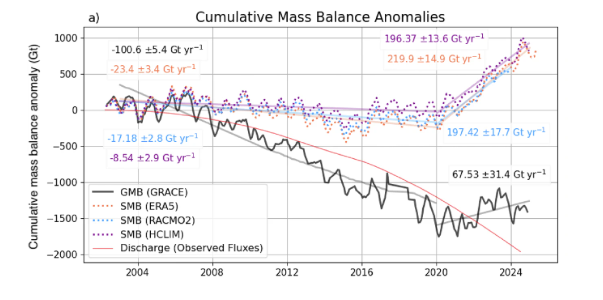
From Kolbe et al., 2026 Black: Monthly cumulative GMB anomalies from April 2002 to December 2024, based on GRACE (with respect to the mass as of 2011-01-01 before being subtracted from the GMB anomaly in April 2002 to show the changes since the mission launch). Dotted: Monthly cumulative SMB anomalies based on ERA5 from April 2002 to April 2025 (ERA5), December 2024 (HCLIM43) and December 2023 (RACMO2.4p), all with respect to the 1995-2010 mean, before subtracting their SMB from April 2002 (as for GRACE). Light straight solid lines indicate linear trend slopes from 2003 to 2019, and 2020 to 2024 (2023 for RACMO2.4p), with trends printed in the respective colour (all trend slopes are significant with p < 0.05). The small change in the grey line’s angle around 2017 reflects the 1-year GRACE – GRACE-FO gap. Red time series: Grounding line discharge from8 based on bed topography and velocity measurements from 1996 through to July 2024

First, the background. For most of this century, the Antarctic Ice Sheet has been losing mass at a pretty steady rate of around 100 Gigatonnes a year, pushing up global sea levels a small amount (About one third of a millimetre per year in fact, a little less than half the Greenland contribution for example). Antarctica is by far the biggest potential contributor to future sea level rise, so this is the number we all watch rather closely, as we also discussed the other week when the IMBIE paper came out. Then, around 2016, the satellites started telling us something odd: the losses were slowing down. And by 2020, the whole continent had swung into a small but definitely positive net gain — even though the ice flowing out to sea from West Antarctica’s glaciers kept accelerating throughout (the red curve in the figure above and the red areas in the discharge maps below).
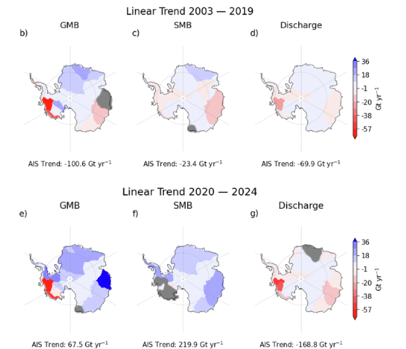
Maps show linear trends of GMB (c, f), SMB (d, g), and discharge (e, h) per basin for two time periods. Basins are greyed out where the trend is not significant (p < 0.05). 

So what was going on? The answer, it turns out, is snow. Rather a lot of it in fact, falling mostly in East Antarctica, but also in other events over the peninsula and in West Antarctica. But what was driving those enhanced snowfalls? The blue bits in the picture above show regions where there is an increase in snowfall

In what is either an incredible coincidence, or somehow a related process, at the same time the sea ice around Antarctica started to decline, big time:
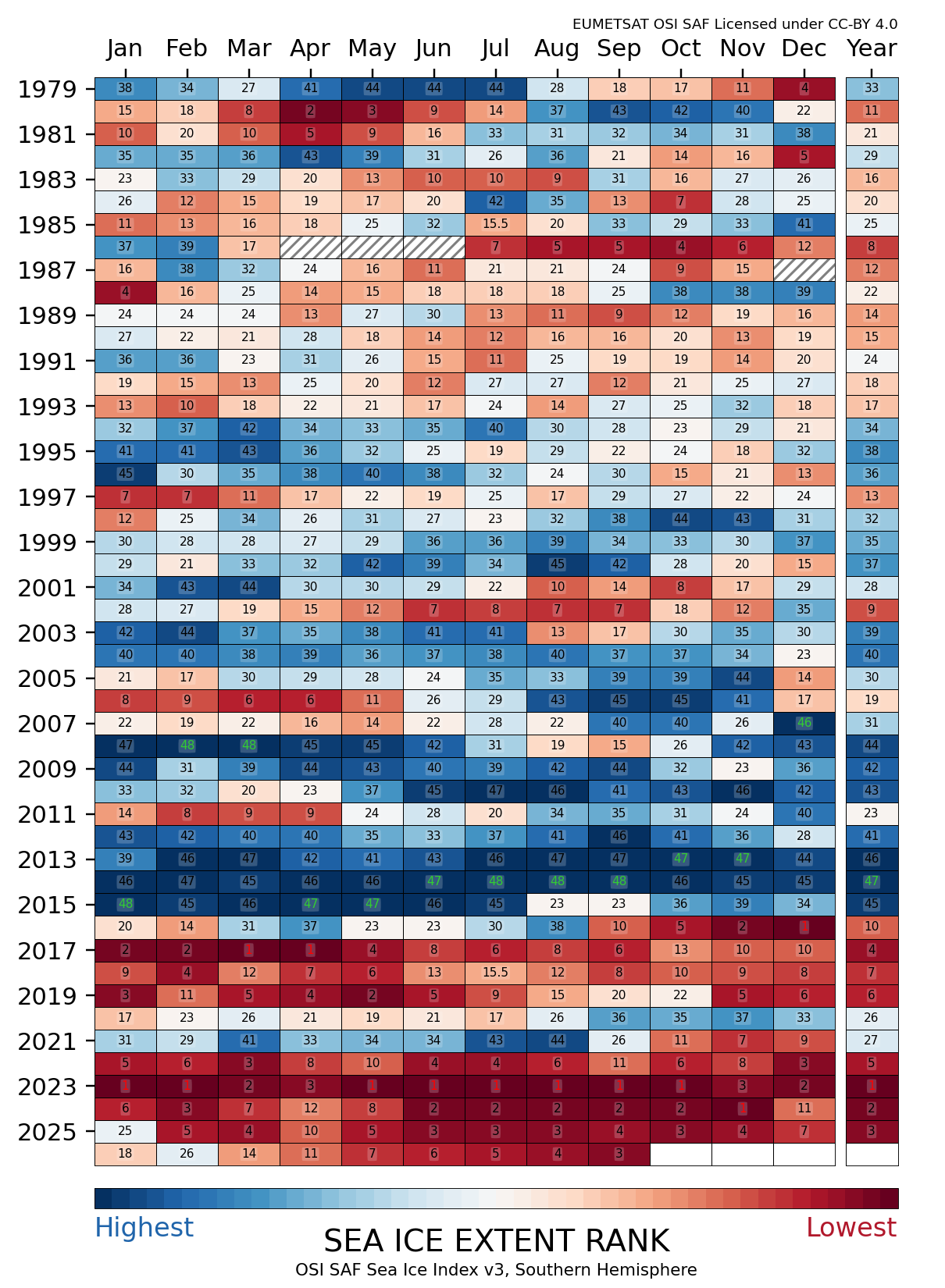
Rank of monthly sea-ice extent – Southern Hemisphere from our colleagues at EUMETSAT’s OSISAF facility

This was also an idea we explored in our Greenlandification paper, so my initial suspicion was that the loss of sea ice around the continent allowed more snow to reach the coast, both because more open water meant more evaporation from the sea, but also because less was lost over the sea ice. And a first sight of the statistics seems to support that.
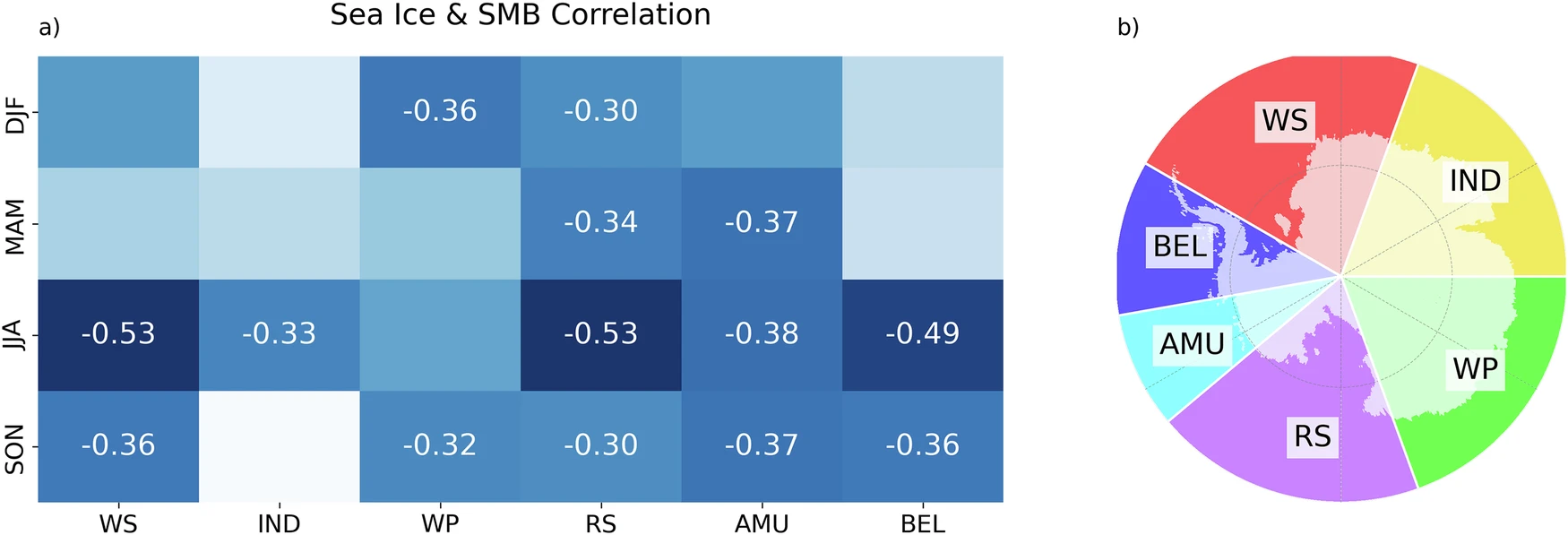
From Kolbe et al., 2026 a Seasonal correlations of basin-wide SMB and adjacent ocean-basin SIC for summer (DJF), autumn (MAM), winter (JJA), and spring (SON). The basins are shown in (b), where the transparent land areas represent the region where SMB anomalies are summed (excluding ice shelves), and correlated to the respective adjacent ocean basins. WS Weddell Sea, IND Indian Ocean, WP West Pacific, RS Ross sea, AMU Amundsen sea, BEL Bellingshausen sea. Boxes without numbers indicate insignificant correlations (p ≥ 0.05)

But it’s not very convincing – those correlation values are pretty low in most cases and of course, as we all know, correlation doesn’t really prove causality. So given we have a model, we could actually do something kind of cool, and run some experiments. In this case we added additional sea ice and we took sea ice away. And we showed that indeed there is a *small* effect of sea ice on the snow that reaches the continent.
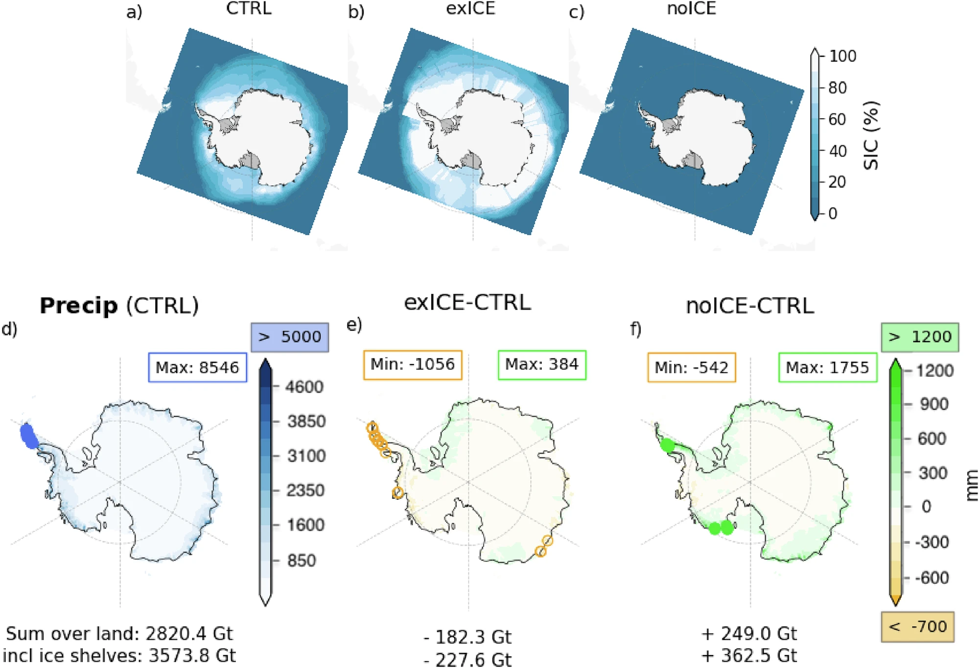
From Kolbe et al., 2026 Mean Sea ice concentration from June 2021 to July 2022 under (a) control conditions (CTRL), b enhanced sea ice (exICE), and c no sea ice (noICE) scenarios. d Total accumulated precipitation from June 2021 to July 2022 in the control simulation, and that of the noICE (e) and exICE (f) experiments minus the control run. Numbers beneath the plots give the total amount (or difference from) for the grounded ice sheet (AIS) and including ice shelves (AIS + IS). In d blue circles mark regions exceeding 6000 mm with the maximum value shown in the blue rectangle. In c, d, green circles mark regions exceeding 1500 mm and orange circles mark regions below −1000 mm with min/max values per plot are shown in the upper rectangles; 

But there is also likely another explanation..

Rivers in the sky

The snow delivery service comes in the form of atmospheric rivers. As the name indicates these aren’t rivers of water on the ground but long, narrow filaments of water vapour in the atmosphere, and they can carry astonishing amounts of moisture from the subtropics all the way to the Antarctic coast. When one of these slams into the steep edge of the ice sheet, all that moisture falls out as snow.

Think of them as the sky’s equivalent of a shower: most days the atmosphere delivers very little moisture or a relatively small even flow for a quick wash, but occasionally the power shower comes on and a single event dumps a month or even a year’s worth of snow in a day or two.
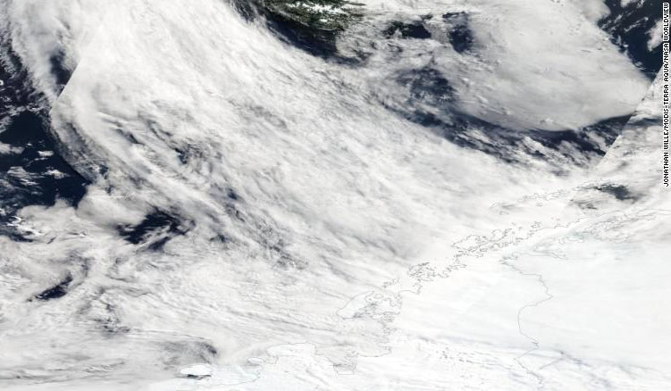
Atmospheric rivers originate from the southern Pacific Ocean and transport heat and moisture to the Antarctic Peninsula. Satellite image: Jonathan Wille/MODIS/NASA From the Polar Journal

Marlen’s analysis showed that from 2020 onwards, atmospheric rivers reaching Antarctica became both more frequent and more intense, helped along by stronger westerly winds (an effect of the southern annular mode, known as SAM to friends) and changes in the sea ice around the coast. East Antarctica got hammered with exceptional snowfall in 2022 in particular especially in Queen Maud Land and Wilkes Land and that extra snowfall more than compensated for the (still increasing!) ice loss from West Antarctica.

This is the surface mass balance doing its thing: SMB is a two-way term, with snowfall adding mass and melt and runoff removing it. In Antarctica there is very little surface melt and even less runoff so a few enormous snowfall years can push the whole continent’s ledger into the black, even while the dynamic term, what we call ice discharge in the paper, which only ever removes mass, has been accelerating.

So is this good news?

I’m afraid not, or at least, not necessarily.

We don’t know yet whether this gain is a temporary blip or a lasting feature of a warmer world. Atmospheric rivers are driven by weather patterns reaching Antarctica from the tropics and mid-latitudes, and the patterns that control them can shift as another recent paper (that came out after ours) also pointed out. A few years with fewer atmospheric rivers could easily tip the mass budget back to losses, even larger ones than before given the acceleration of ice lost in West Antarctica.

The satellite debt

None of this would be known without the GRACE satellites (and the successor, GRACE-FO), which measure changes in Earth’s gravity field and can effectively weigh an ice sheet from orbit. It never ceases to amaze me that we can now effectively put the Antarctic Ice Sheet on a bathroom scale, as a friend of mine once commented – we’re really living in the future with this stuff. The work was part-funded through ESA’s Climate Change Initiative (of which more in a later post), which has quietly built some of the most valuable long-term climate datasets we have, this study is one more reason they deserve support. Modelling was conducted in the course of our Horizon Europe OCEAN ICE project that is now sadly coming to an end (more of that anon).

The paper

Full credit to the immensely productive Marlen Kolbe, who led the work based on ideas we had while she was a visiting PhD student, and to my ace colleague Abraham Torres Alavez who ran the multiple experiments as well as to all my co-authors.

Kolbe, M., Torres Alavez, J.A., Mottram, R., et al. (2026). Atmospheric rivers and winter sea ice drive recent reversal in Antarctic ice mass loss. Communications Earth & Environment, 7, 255. doi:10.1038/s43247-026-03242-3

As always, questions, corrections and speculations welcome in the comments here, or find me on mastodon at @ruth_mottram.
Half a century of ice loss: the new IMBIE dataset

More publication news! This month I’ve actually had 3 co-authored publications come out and hot on the heels of the mélange paper, a rather different piece of work I’ve contributed to has just come out: the latest assessment from the Ice Sheet Mass Balance Inter-comparison Exercise known as IMBIE to its friends, has just been published in Scientific Data. The paper is open access here: Otosaka et al., 2026. It’s the third (at least) in a series of articles monitoring the health of the ice sheets.

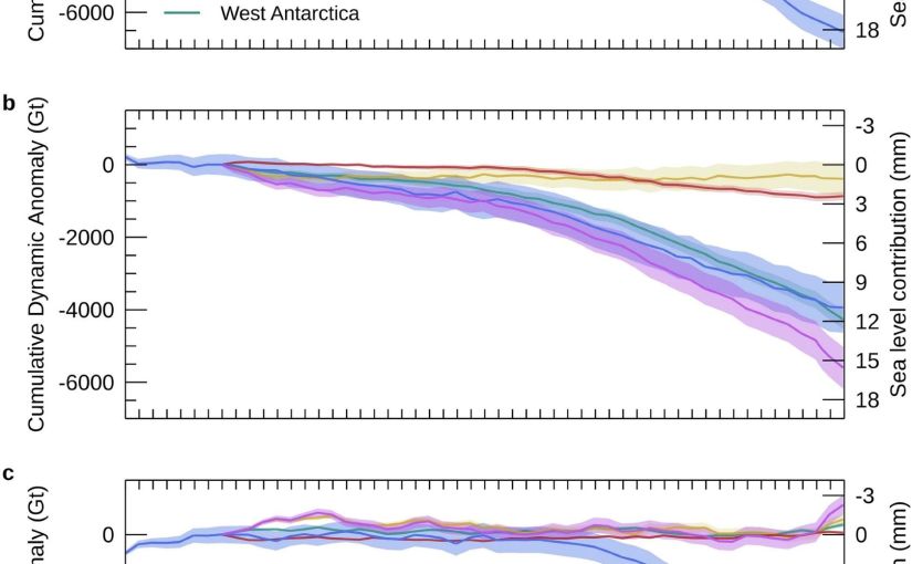
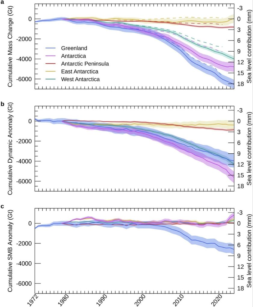
Figure 2 from the IMBIE paper is the money shot, as it were. The changes in ice sheet mass budget since the 1970s…

This one is a bit different from my usual, as it’s a data paper — the whole point is the dataset itself, which is freely available for anyone to download and use. But the numbers in it are rather striking and here is already a bit of misinformation spreading, so I thought it worth a short post.

What is IMBIE?

For readers who haven’t come across it before: IMBIE is a big international collaboration, supported by ESA and NASA, that tries to answer a seemingly simple question: how much ice are Greenland and Antarctica actually losing?

The problem is that measuring the mass of an ice sheet from space is really hard, and there are several different ways to do it — satellites that measure changes in ice sheet height (altimetry), satellites that measure changes in Earth’s gravity field (gravimetry), and the input-output method, where you compare how much snow falls on the ice sheet with how much ice flows out to sea at the glacier fronts. Each method has its strengths and weaknesses, and no single one gives the whole picture, specific choices in analysing satellite datasets can also give quite different results, not to mention model estimates of SMB can have a wide divergence.

IMBIE’s remit is to bring all the different groups together, get everyone to compute their estimates in a common framework, and then combine them. When many independent measurements agree, we can be much more confident in the answer, and that answer feeds directly into things like the IPCC reports and projections of future sea level rise. It’s community science at its best, even if it probably feels like herding cats to the fantastic coordinator Ones Otosaka, and I’ve been proud to contribute estimates from our HIRHAM5 surface mass balance modelling for both ice sheets to several of the IMBIE assessments over the years.

What’s new this time?

This latest assessment is the most comprehensive yet. The team combined 42 independent satellite surveys from 27 satellite missions — and extended the record further back than ever before, all the way to 1972 for Greenland and 1979 for Antarctica, using the early Landsat archive. That gives us a half-century view of how the ice sheets have changed. Though admittedly the recent years are much better covered than the earlier ones.

So what does half a century of satellite data tell us? (Note: just me who finds it hard to understand the 1970s as half a century ago?)

The two ice sheets have lost 11,300 billion tonnes of ice since 1979, raising global sea level by 31.4 mm — about three centimetres. Greenland accounts for the larger share, with Antarctica contributing 13.3 mm. The ice sheets are now responsible for roughly a quarter of all global sea level rise. The remainder is mostly due to thermal expansion as the oceans warms..

Three centimetres may not sound like much, but as Andrew Shepherd put it in the press release, that puts another six to nine million people at risk of coastal flooding and erosion. And the trend is very much in the wrong direction. In low-lying  Denmark this gives us more extreme storm surges and coastal flooding as even a few centimetres

A headline and a nuance: it’s the ice dynamics, not the surface melt, or is it?

There’s an important part of the paper which partitions the mass budget between dynamical losses and SMB changes. This is highlighted and the reasoning seemed obvious to me but in conversation with others is perhaps less obvious, so I want to discuss it here.

Of all that ice loss, 84% came from ice dynamics, that is outlet glaciers speeding up and discharging more ice into the ocean, from both calving icebergs and submarine melt, but “only” 16% from enhanced surface melting.

Now, I have spent a large part of my career working on surface mass balance, how much snow falls on the ice sheet and how much melts off it. We track it in near real-time on the Polar Portal, I write annual updates about it, and it’s genuinely important as it is the only way an ice sheet can maintain itself, no snowfall, no ice sheet.

Melt is also an important driver of ice dynamics, especially for Greenland. So it maybe should be with some professional humility that I report that the long-term mass loss story is apparently mostly a dynamics story: the ice sheets are responding to a warming ocean by flowing faster into the sea. Greenland’s rate of loss went from around 60 billion tonnes per year in the 1980s to 264 billion tonnes per year in the 2010s; Antarctica’s went from 48 to 202 billion tonnes per year over the same period, driven overwhelmingly by ocean melting at the outlet glaciers — with West Antarctica’s Pine Island and Thwaites glaciers leading the charge.

But there’s an important nuance in that 84/16 split, and it’s worth being clear about what it does and doesn’t mean. Surface mass balance is a two-way term: it’s positive when snow accumulates and negative when ice melts and runs off. And a warming climate pushes on both sides of the equation, more melt, certainly, but also more precipitation, at first as snow and increasingly we can measure over Greenland at least, as rain. Dynamic mass loss, by contrast, can only ever be negative: glaciers can only discharge ice into the ocean, they can’t drag it back up again. So we honestly wouldn’t expect SMB to be the biggest term in the loss budget, both sides of the SMB equation are increasing, it is in a race with itself. The genuinely worrying scenario is the one where melt and runoff together becomes bigger than snowfall. We are a very long way from that scenario fortunately, particularly in Antarctica but we’ll be in big trouble if, or perhaps when, that happens.

(Calving glaciology colleagues will note this whole discussion connects rather nicely to the question of what controls calving rates, which was the subject of my last post on melange…)

And now for a note of caution on the recent slowdown

You might have seen headlines suggesting ice loss has slowed down recently. It’s true that the most recent years in the record (2020–2023) show a temporary slowdown. A run of milder Greenland summers roughly halved its surface melting, and record snowfall over East Antarctica has offset some of the glacier losses there.

In fact we as a community have been on it as that East Antarctic snowfall is a story in itself. In a paper led by Marlen Kolbe earlier this year (Kolbe et al., 2026), (that I didn’t quite get around to talking about then, but I will rectify that), we showed that the extra snow is being delivered by atmospheric rivers — those great corridors of moisture streaming from a much warmer ocean towards the continent. Since 2020 they’ve become more frequent and more intense, dumping enough snow over East Antarctica to tip the whole ice sheet’s mass budget briefly into positive territory.

Is that reversal in mass budget temporary or permanent? Honestly, we don’t know yet but it matters because atmospheric rivers are double-edged. They bring massive snowfall, but they’re also often accompanied by a lot of melt — warm, wet air is rather good at melting ice as well as adding it. So the balance between accumulated snowfall and melt becomes more critical to understand here too, and the existing balance may well tip in the future.

The long-term picture remains one of accelerating loss, and as the climate continues to warm, we expect the losses to pick up again, especially in Greenland which is much further south than Antarctica is north, if that makes sense?

Refrozen melt layers in an Antarctic shallow ice core. We found a lot more of these than we expected based on satellites. Our all-seeing eyes in the sky don’t always see everything..

The response of the ice sheets to a warming climate is the single largest source of uncertainty in projections of future sea level rise. High-end estimates of global sea level rise by 2150 increase by a factor of 2.6 once the risk of ice sheet instability is accounted for. A continuous, half-century record of what the ice sheets are actually doing is exactly what we need to test the models and narrow those uncertainties, which is precisely why this dataset is such a valuable community resource, and why sustaining the satellite missions (CryoSat-2 and the Sentinels among them) that make it possible matters so much.

The full dataset is freely available from the UK Polar Data Centre, and you can read more about the IMBIE project at imbie.org. My thanks to Inès, Andrew, Tyler and the whole IMBIE team for pulling it all together — these assessments are an enormous amount of work, and the credit for this one belongs firmly with them.

As always, comments and questions welcome, here or on mastodon or blue sky.

Otosaka, I. N., Shepherd, A., Amory, C., et al. (2026). Mass balance of the Greenland and Antarctic ice sheets from the 1970s to 2023. Scientific Data, 13, 1301. https://doi.org/10.1038/s41597-026-08088-0

Back at Basen*

LISA is alive! Kind of. We had a really good field test of the system in this, our first week in Antarctica (though thank goodness for satellite wifi connection** to the rest of the world so LISA’s genius creator Helle Kjær could assist in troubleshooting). It was a bit of a struggle and I would say we came out partial winners, with a much deeper understanding of how the box is actually put together and more importantly some really interesting data (yay!) that Clement is busy processing already – I’m very excited to see how it turns out as it will help to direct our following field sorties.

This is the first field deployment of LISA in Antarctica, and even if she didn’t give up all the secrets of the snow, it’s still an achievement worth celebrating that we got half of it, and an interesting half too.

We chose a coring site around 60km from Wasa, so it was a long slow snow-scooter tour up Plogbreen (the plough glacier – named after our neighbouring nunatak Plogen, the plough) and on to the flat plateau of Ritscher Flya at about 1000m elevation.

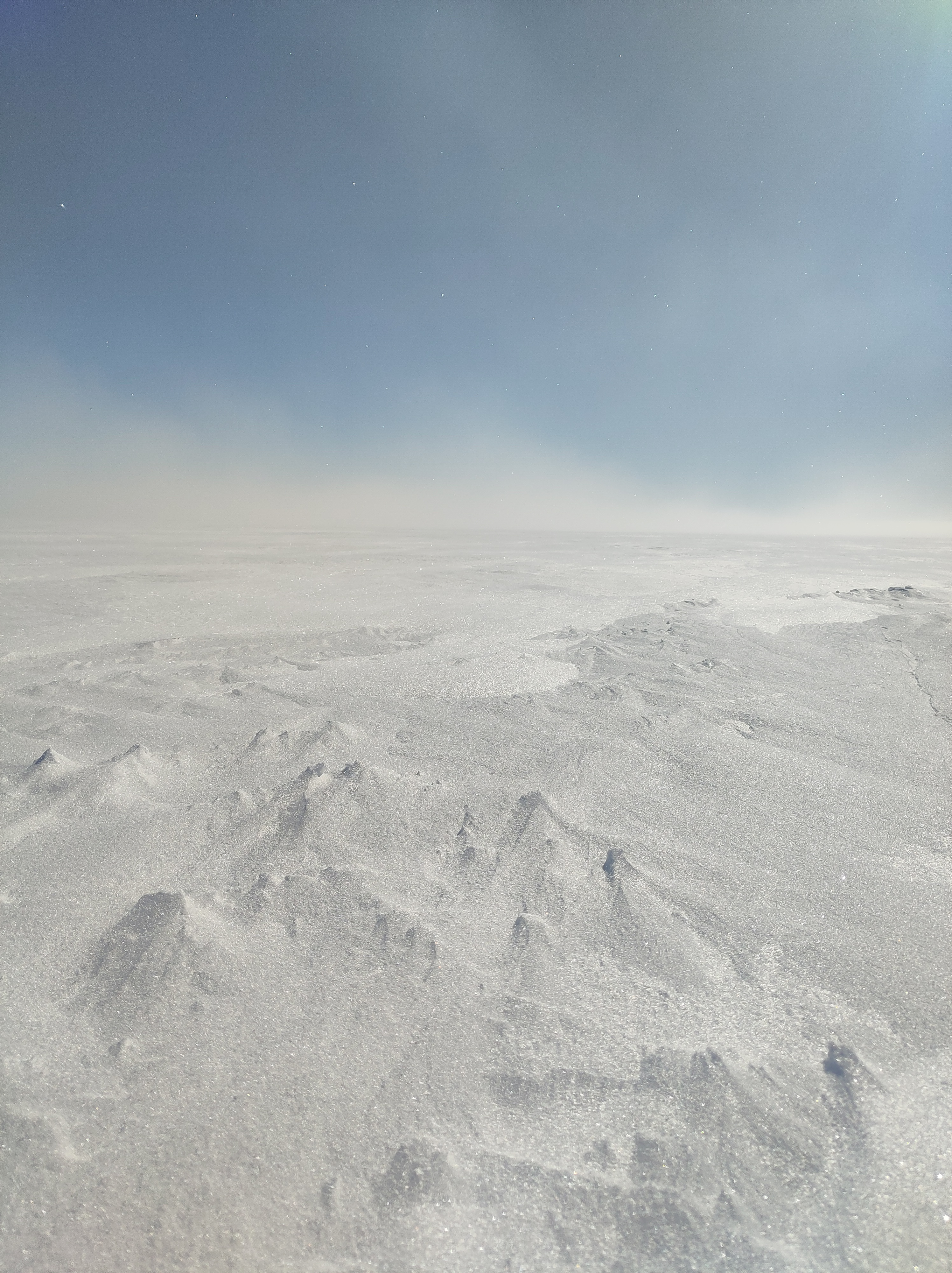
Wind sculpts snow into ridges called sastrugi. We had quite a bit of fresh snow at this site while we were there. Sometimes it’s hard to work out where the snow surface actually is.

It was a pretty wind and snowy site, in a katabatic wind zone (thankfully not too strong on this trip), which was intentional, as one of the aims of our study is the effects of strong winds on snow accumulation. As preparing to leave took most of the day (especially doing the chemistry mixes for LISA), we headed up in the afternoon and then stayed out overnight in these fantastic little cabins on skis.

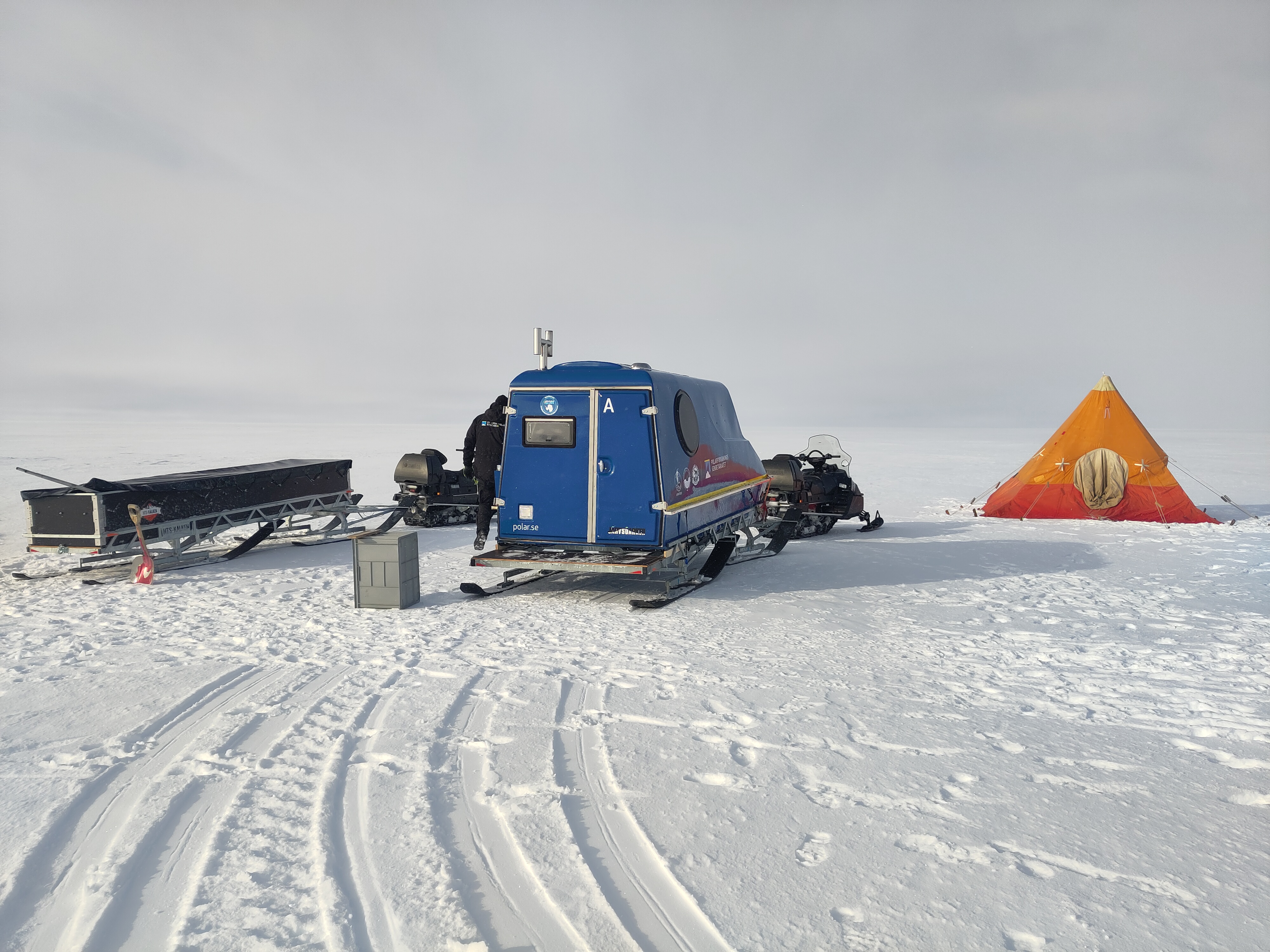
Our field camp: sledge full of equipment, the blue cabin on a sledge (an ark) is one of our living quarters and the pyramid shaped, orange Scott tent is our bathroom.

The Polar Research institute in Sweden calls them arks and they are really a very nice solution to the problem of cold and wind and trying to work in quite extreme conditions. Pulled by a snow-scooter and with a stove inside for melting snow and heating, they’re really very cosy to sleep in and it makes a big difference to be able to warm up when for example you’ve been sitting in a snow pit at -15C with a hefty wind chill on top and are covered in spin drift snow (as me how I know).

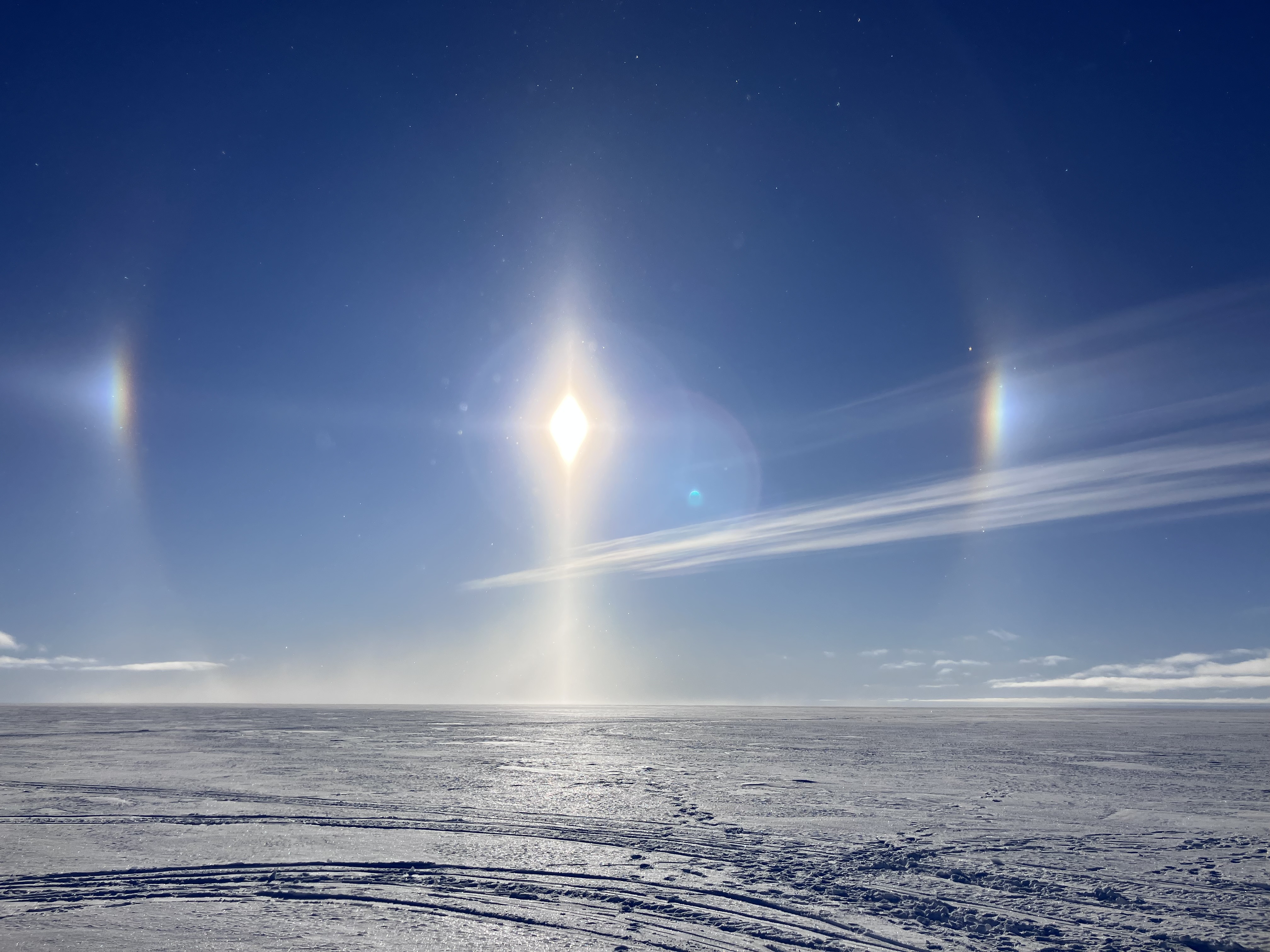
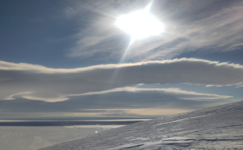
We were greeted by this beautiful halo around the sun upon waking, with sun dogs on either side, caused by the ice crystals in the sky. In fact we nick-named the site diamond dust because of the clear sky precipitation on the first morning.

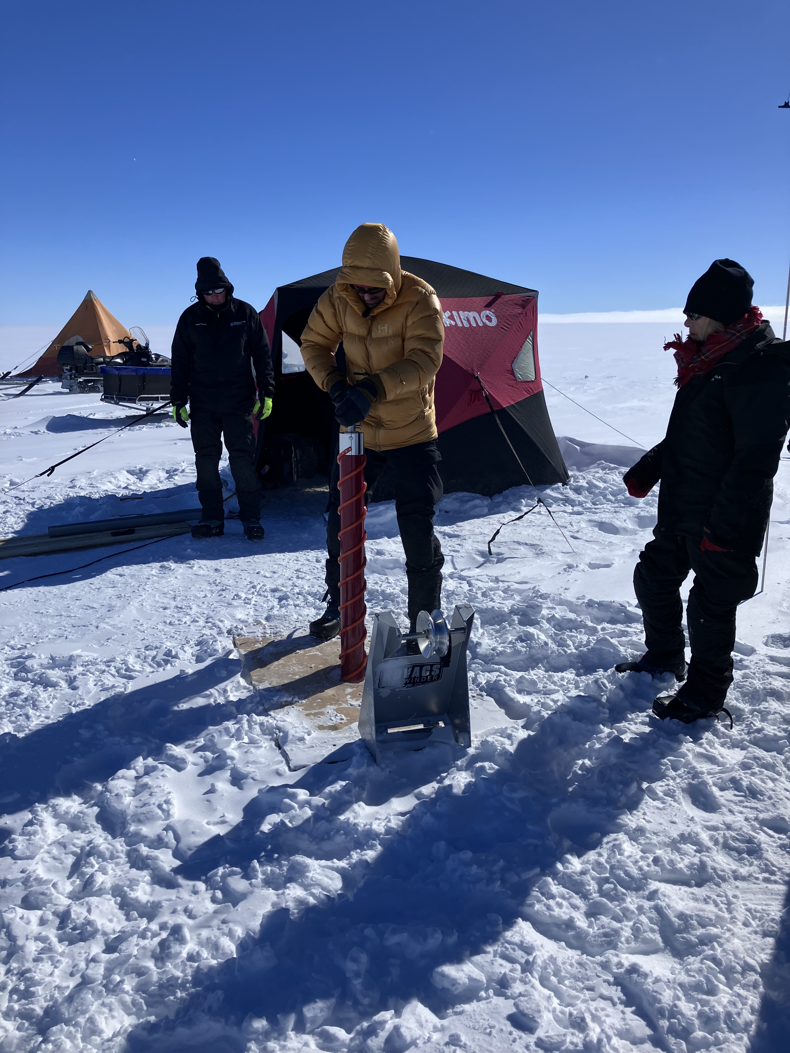
We soon got into a good rhythm with Henrik driving the coring, Clement logging and Ninis and myself assisting with the cores.

Starting the first core, (l to r the rest of the field team, Henrik, Clement and Ninis)

And then it was time to get LISA going and a very long and slightly frustrating day followed. Thankfully, by bedtime and having reconstructed quite a lot of the inner tubing of the box, we got LISA ready for work the next day.

The LISA box with melting ice core on top and computer recording the data as it appears. The pop-up fishing tent was essential for working at this site in the cold winds. Without wind chill it was around -10C outside, preventing ice crystals from forming in the chemistry lines and reagents is also a concern, but the arks also simplify things.

I dug a snow pit – always one of my favourite activities, it’s good to get your hands in the snow and really feel what is going on, and we identified some really intriguing layers. Lots more work to be done there to work out what is going on.

As added entertainment, Ninis was interviewed live from the top of the ice sheet by Swedish TV live from the fieldcamp (check out God Morgon Sverige on TV4, 23rd December if you’re interested). However, after 2 nights out it was time to pack up and head back, 3 cores worth of data richer, for a shower, laundry and a Christmas Eve day off.

On Christmas eve daytime it was my turn with a brief 2 minutes to explain our project on Danish TV2 news (at 12.15 CET in case you have an account and would like to see me looking wind swept). Juleaften, Christmas Eve, is the big day of celebration in the Nordic countries, so we took an almost day off, doing some washing, cleaning the living modules and enjoying plenty of good food courtesy of the Swedish chef Raymond who prepared a Christmas dinner feast later, perfect after a long Christmas hike over the nunatak.

Field Photos

Given the current state of the US administration I think it’s worth thinking about what services we use, to become less dependent on US tech and social media companies. Therefore, I’m sharing photos over on pixelfed while we’re out here, in case you want to see more field photos, though sharing is a bit intermittent as it depends on the internet link and due to the expense of the data, we’re trying not to use too much.

I am also posting over on blue sky, though there is much that makes me uneasy about that platform, so I will keep posting on the fediscience server on mastodon too (and indeed the quality of interaction is often better there strangely, given I feel that the platform is smaller than blue sky).

*The Swedish research station Wasa is located on a nunatak in Antarctica called Basen (it’s pronounced Baasen, like the sound a sheep makes in english)

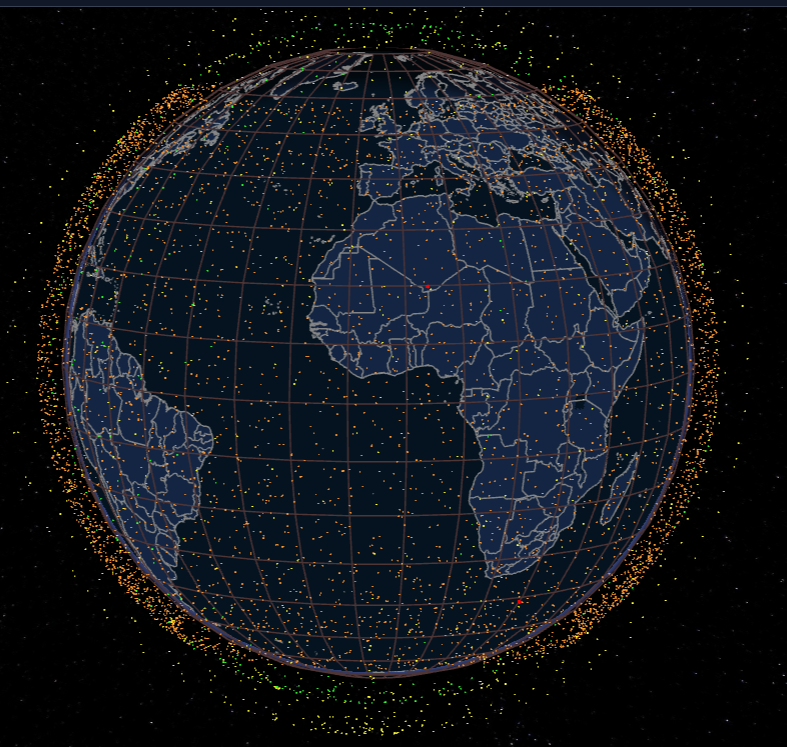
**Yes we are on starlink. It’s incredibly impressive performance wise, but I’d rather not be supporting the nazi man-child, the sooner Eutel Oneweb makes an alternative for users like us, the better, though preferably without this polluting a footprint in low earth orbit. In fact if any EUTEL folks are reading this, I’d be delighted to test out a lightweight system for polar field scientists for you 🙂

Screenshot from satellitemap.space showing the position of the tens of thousands of starlink satellites currently orbiting earth. Check out their visualiser to see other satellites!