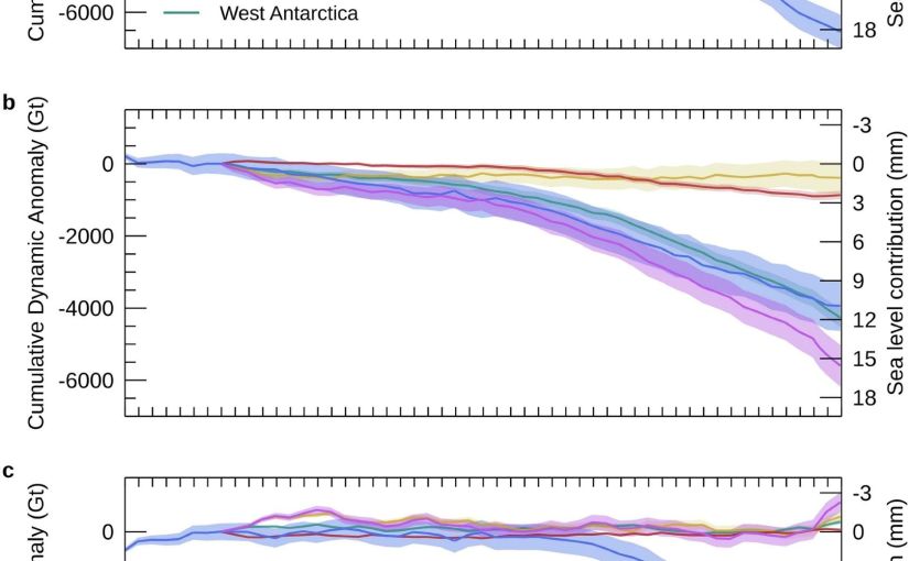
More publication news! This month I’ve actually had 3 co-authored publications come out and hot on the heels of the mélange paper, a rather different piece of work I’ve contributed to has just come out: the latest assessment from the Ice Sheet Mass Balance Inter-comparison Exercise known as IMBIE to its friends, has just been published in Scientific Data. The paper is open access here: Otosaka et al., 2026. It’s the third (at least) in a series of articles monitoring the health of the ice sheets.
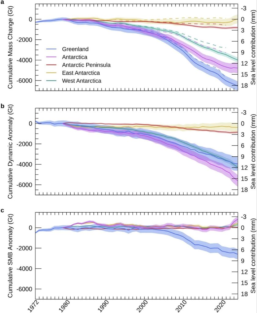
This one is a bit different from my usual, as it’s a data paper — the whole point is the dataset itself, which is freely available for anyone to download and use. But the numbers in it are rather striking and here is already a bit of misinformation spreading, so I thought it worth a short post.
What is IMBIE?
For readers who haven’t come across it before: IMBIE is a big international collaboration, supported by ESA and NASA, that tries to answer a seemingly simple question: how much ice are Greenland and Antarctica actually losing?
The problem is that measuring the mass of an ice sheet from space is really hard, and there are several different ways to do it — satellites that measure changes in ice sheet height (altimetry), satellites that measure changes in Earth’s gravity field (gravimetry), and the input-output method, where you compare how much snow falls on the ice sheet with how much ice flows out to sea at the glacier fronts. Each method has its strengths and weaknesses, and no single one gives the whole picture, specific choices in analysing satellite datasets can also give quite different results, not to mention model estimates of SMB can have a wide divergence.
IMBIE’s remit is to bring all the different groups together, get everyone to compute their estimates in a common framework, and then combine them. When many independent measurements agree, we can be much more confident in the answer, and that answer feeds directly into things like the IPCC reports and projections of future sea level rise. It’s community science at its best, even if it probably feels like herding cats to the fantastic coordinator Ones Otosaka, and I’ve been proud to contribute estimates from our HIRHAM5 surface mass balance modelling for both ice sheets to several of the IMBIE assessments over the years.
What’s new this time?
This latest assessment is the most comprehensive yet. The team combined 42 independent satellite surveys from 27 satellite missions — and extended the record further back than ever before, all the way to 1972 for Greenland and 1979 for Antarctica, using the early Landsat archive. That gives us a half-century view of how the ice sheets have changed. Though admittedly the recent years are much better covered than the earlier ones.
So what does half a century of satellite data tell us? (Note: just me who finds it hard to understand the 1970s as half a century ago?)
The two ice sheets have lost 11,300 billion tonnes of ice since 1979, raising global sea level by 31.4 mm — about three centimetres. Greenland accounts for the larger share, with Antarctica contributing 13.3 mm. The ice sheets are now responsible for roughly a quarter of all global sea level rise. The remainder is mostly due to thermal expansion as the oceans warms..
Three centimetres may not sound like much, but as Andrew Shepherd put it in the press release, that puts another six to nine million people at risk of coastal flooding and erosion. And the trend is very much in the wrong direction. In low-lying Denmark this gives us more extreme storm surges and coastal flooding as even a few centimetres
A headline and a nuance: it’s the ice dynamics, not the surface melt, or is it?
There’s an important part of the paper which partitions the mass budget between dynamical losses and SMB changes. This is highlighted and the reasoning seemed obvious to me but in conversation with others is perhaps less obvious, so I want to discuss it here.
Of all that ice loss, 84% came from ice dynamics, that is outlet glaciers speeding up and discharging more ice into the ocean, from both calving icebergs and submarine melt, but “only” 16% from enhanced surface melting.
Now, I have spent a large part of my career working on surface mass balance, how much snow falls on the ice sheet and how much melts off it. We track it in near real-time on the Polar Portal, I write annual updates about it, and it’s genuinely important as it is the only way an ice sheet can maintain itself, no snowfall, no ice sheet.
Melt is also an important driver of ice dynamics, especially for Greenland. So it maybe should be with some professional humility that I report that the long-term mass loss story is apparently mostly a dynamics story: the ice sheets are responding to a warming ocean by flowing faster into the sea. Greenland’s rate of loss went from around 60 billion tonnes per year in the 1980s to 264 billion tonnes per year in the 2010s; Antarctica’s went from 48 to 202 billion tonnes per year over the same period, driven overwhelmingly by ocean melting at the outlet glaciers — with West Antarctica’s Pine Island and Thwaites glaciers leading the charge.
But there’s an important nuance in that 84/16 split, and it’s worth being clear about what it does and doesn’t mean. Surface mass balance is a two-way term: it’s positive when snow accumulates and negative when ice melts and runs off. And a warming climate pushes on both sides of the equation, more melt, certainly, but also more precipitation, at first as snow and increasingly we can measure over Greenland at least, as rain. Dynamic mass loss, by contrast, can only ever be negative: glaciers can only discharge ice into the ocean, they can’t drag it back up again. So we honestly wouldn’t expect SMB to be the biggest term in the loss budget, both sides of the SMB equation are increasing, it is in a race with itself. The genuinely worrying scenario is the one where melt and runoff together becomes bigger than snowfall. We are a very long way from that scenario fortunately, particularly in Antarctica but we’ll be in big trouble if, or perhaps when, that happens.
(Calving glaciology colleagues will note this whole discussion connects rather nicely to the question of what controls calving rates, which was the subject of my last post on melange…)
And now for a note of caution on the recent slowdown
You might have seen headlines suggesting ice loss has slowed down recently. It’s true that the most recent years in the record (2020–2023) show a temporary slowdown. A run of milder Greenland summers roughly halved its surface melting, and record snowfall over East Antarctica has offset some of the glacier losses there.
In fact we as a community have been on it as that East Antarctic snowfall is a story in itself. In a paper led by Marlen Kolbe earlier this year (Kolbe et al., 2026), (that I didn’t quite get around to talking about then, but I will rectify that), we showed that the extra snow is being delivered by atmospheric rivers — those great corridors of moisture streaming from a much warmer ocean towards the continent. Since 2020 they’ve become more frequent and more intense, dumping enough snow over East Antarctica to tip the whole ice sheet’s mass budget briefly into positive territory.
Is that reversal in mass budget temporary or permanent? Honestly, we don’t know yet but it matters because atmospheric rivers are double-edged. They bring massive snowfall, but they’re also often accompanied by a lot of melt — warm, wet air is rather good at melting ice as well as adding it. So the balance between accumulated snowfall and melt becomes more critical to understand here too, and the existing balance may well tip in the future.
The long-term picture remains one of accelerating loss, and as the climate continues to warm, we expect the losses to pick up again, especially in Greenland which is much further south than Antarctica is north, if that makes sense?
The response of the ice sheets to a warming climate is the single largest source of uncertainty in projections of future sea level rise. High-end estimates of global sea level rise by 2150 increase by a factor of 2.6 once the risk of ice sheet instability is accounted for. A continuous, half-century record of what the ice sheets are actually doing is exactly what we need to test the models and narrow those uncertainties, which is precisely why this dataset is such a valuable community resource, and why sustaining the satellite missions (CryoSat-2 and the Sentinels among them) that make it possible matters so much.
The full dataset is freely available from the UK Polar Data Centre, and you can read more about the IMBIE project at imbie.org. My thanks to Inès, Andrew, Tyler and the whole IMBIE team for pulling it all together — these assessments are an enormous amount of work, and the credit for this one belongs firmly with them.
As always, comments and questions welcome, here or on mastodon or blue sky.
Otosaka, I. N., Shepherd, A., Amory, C., et al. (2026). Mass balance of the Greenland and Antarctic ice sheets from the 1970s to 2023. Scientific Data, 13, 1301. https://doi.org/10.1038/s41597-026-08088-0


