A question of observation?

It’s been a while since I lasted posted anything, not for want of ideas but mainly lack of time. I shall try to catch up over the next few weeks. For now I was inspired to write an ultra-quick post about a very trivial question that came up at work today. I think it really captures how observational meteorology works (or should work).

Today, a colleague, John Cappelen, (also known as Mr. Greenland observational data), happened to mention in passing that on the 15th July this year, the weather station at Summit on the Greenland ice sheet had transmitted back to us in Copenhagen, a temperature observation of 2.5°C. This was during one of the highest melt periods this summer.

Automatic weather station operating at Summit, June 2015
The automatic weather station doing it’s thing at Summit, June 2015. Photo: DMI

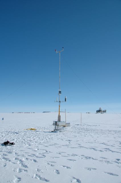
Bearing in mind that Summit Camp is at roughly 3,216m, this is a pretty high measured temperature. In fact it would be rather noteworthy, especially as it occurred on one of the highest melt days of the summer. Temperatures above 0°C at Summit are not unknown and the record, during the famous summer of 2012 when around 95% of the ice sheet surface experienced melt, the water sweeping away a bridge on the Watson River near Kangerlussuaq, was 3.6°C.

Now, my colleague is a very experienced and careful scientist. He had checked the observations and the temperatures before and after this measurement were well below zero, so, my colleague asked, was there any reason to believe this measurement or can we assume an instrument failure of some kind?

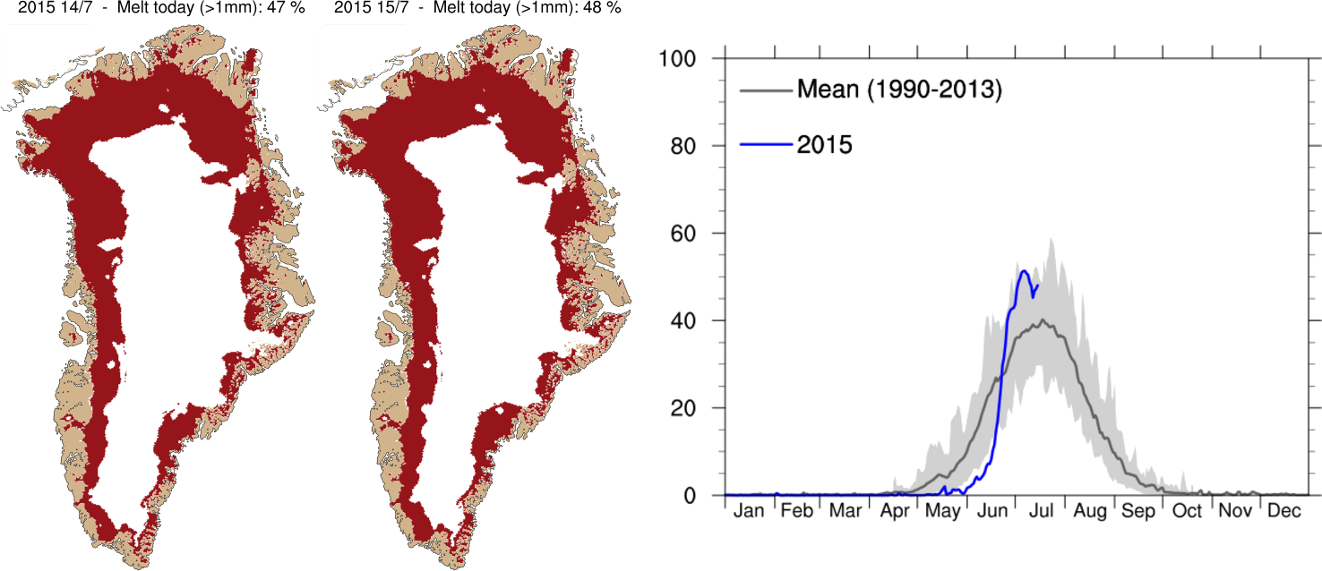
My office mate in the Arctic and Climate Research section and I obligingly had a quick look at our Polar Portal Greenland ice sheet surface plots (see below) and at the melt extent plots that are updated daily on the DMI website. We had to conclude there was no evidence of melt that high on the ice sheet and there was also no reason to believe that a sudden sharp warming had occurred at Summit on this day based on DMI’s own weather forecast. We then turned to check the weather plots, also on the polar portal and based on data from the European Centre for Medium Range Weather Forecasting (the ECMWF – probably the best weather forecast modellers in the world).

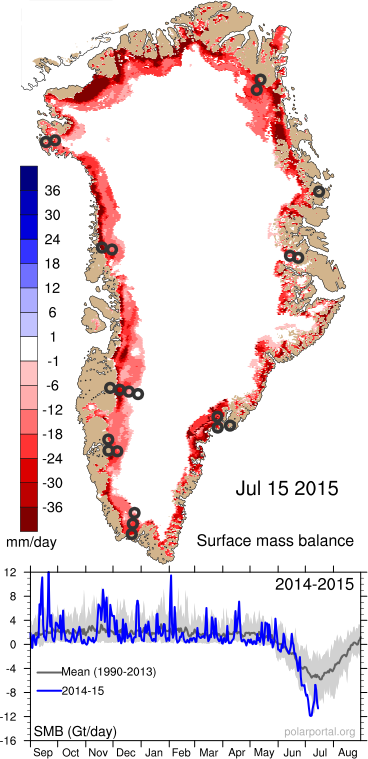
Again, the anomaly plots showed rather cold conditions prevailing over the ice sheet during this period, though at the same time very high melt and low surface mass balance from the ice sheet due to the clear skies.

Graphs showing area of the Greenland ice sheet experiencing melt conditions, compared with the average (dark grey line) and range of past summers (1990-2012), for more detail see the DMI website
Temperature record from Summit Camp for the last month.

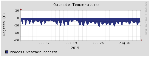
Fortunately, due to the American Summit Camp we have access to a back-up dataset very close to this location and after a quick web search John Cappelen was able to confirm that indeed this measurement was an error as the nearby station has not seen anything like that during the period in question (see right).

This kind of thing happens all the time and is therefore not at all newsworthy or interesting enough to write a publication about. However, when a recent record high temperature in the UK can lead to 2 critical articles in the Daily Telegraph and a particularly vigorous exchange on twitter for Met Office scientist Mark McCarthy, as well as this corrective piece on the Carbon Brief blog, perhaps we should be more vocal about just how careful and critical we as scientists are about observations, including the ones we decide to discard as well as the ones we keep.

Surface mass balance of the Greenland ice sheet on the 15th July 2015. Intense melting around the margins led to very negative SMB (the red colours) during this period.

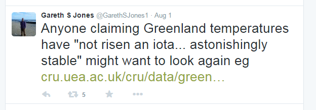
Addendum: I was alerted by this tweet from Gareth Jones, also a Met Office scientist, to some slightly strange cherry picking in the blogosphere of climate records from a couple of DMI stations in Greenland. These have apparently been used to claim no climatic warming trend in Greenland over the 20th Century (I’m not going to link to it).

Screenshot of tweet

Anyone who is really interested in the observational data could try checking these reports by Mr Greenland observations himself instead, here is a quick summary: 

Mean annual temperature in Copenhagen, Torshavn (Faeroes) and selected DMI weather stations in Greenland from 1873 - 2014. Figure from DMI
Mean annual temperature in Copenhagen, Torshavn (Faeroes) and selected DMI weather stations in Greenland from 1873 – 2014. Figure from DMI

Changes in SW Greenland ice sheet melt

A paper my colleague Peter Langen wrote together with myself and various other collaborators and colleagues has just come out in the Journal of Climate. I notice that the Climate Lab Book regularly present summaries of their papers so here I try to give a quick overview of ours. The model output used in this run is available now for download.

The climate of Greenland has been changing over the last 20 or so years, especially in the south. In this paper we showed that the amount of melt and liquid water run off from the ice sheet in the south west has increased at the same time as the equilibrium line (roughly analogous to the snow line at the end of summer on the ice sheet) has started to move up the ice sheet. Unlike previous periods when we infer the same thing happened this can be attributed to warmer summers rather than drier winters.

Map showing area around Nuuk
The area we focus on in this study is in SW Greenland close to Nuuk, the capital. White shows glaciers, blue is sea, brown is land not covered by ice.

We focused on the area close to Nuuk, the capital of Greenland, as we had access to a rather useful but unusual (in Greenland) dataset gathered by Asiaq the Greenland survey. They have been measuring the run off from a lake near the margin of the ice sheet for some years and made this available to us in order to test the model predictions. This kind of measurement is particularly useful as it integrates melt and run-off from a wider area than the usual point measurements. As our model is run at 5.5 km resolution, one grid cell has to approximate all the properties of a 5.5 km grid cell. Imagine your house and how much land varies in type, shape and use in a 5.5 km square centred on your house and you begin to appreciate the problems of using a single point observation to assess what is essentially an area simulation! This is even more difficult in mountainous areas close to the sea, like the fjords of Norway or err, around south west Greenland (see below).

Represent this in a 5.5km grid cell, include glacier, sea and mountain...  Godthåbsfjord near Nuuk in August
The beautiful fjords near Nuuk. Represent this in a 5.5km grid cell…

The HIRHAM5 model is one of very few regional climate models that are run at sufficiently high resolution to start to clearly see the climate influences of mountains, fjords etc in Greenland, which meant we didn’t need to do additional statistical downscaling to see results that matched quite closely the measured discharge from the lake.

Graph comparing modelled versus measured discharge as a daily mean from Lake Tasersuaq near Nuuk, Greenland. The model output was summed over the Tasersuaq drainage basin and smoothed by averaging over the previous 7 days. This is because the model does not have a meltwater routing scheme so we estimated how long it takes for melt and run-off fromt he ice sheet to reach this point.
Graph comparing modelled versus measured discharge as a daily mean from Lake Tasersuaq near Nuuk, Greenland. The model output was summed over the Tasersuaq drainage basin and smoothed by averaging over the previous 7 days. This is because the model does not have a meltwater routing scheme so we estimated how long it takes for melt and run-off from the ice sheet to reach this point.

We were pretty happy to see that HIRHAM5 manages to reproduce this record well. There’s tons of other interesting stuff in the paper including a nice comparison of the first decade of the simulation with the last decade of the simulation, showing that the two look quite different with much more melt, and a lower surface mass balance (the amount of snowfall minus the amount of melt and run – off) per year in recent years.

Red shows where more snow and ice melts than falls and blue shows where more snow falls than is melted on average each year.

Now, as we work at DMI, we have access to lots of climate records for Greenland. (Actually everyone does, the data is open access and can be downloaded). This means we can compare the measurements in the nearest location, Nuuk, for a bit more than a century. Statistically we can see the last few years have been particularly warm, maybe even warmer than the well known warm spell in the 1920s – 1940s  in Greenland.

Graphs comparing and extending the model simulation back in time with Nuuk observations

There is lots more to be said about this paper, we confirm for example the role of increasing incoming solar radiation (largely a consequence of large scale atmospheric flow leading to clearer skies) and we show some nice results which show how the model is able to reproduce observations at the surface, so I urge you to read it (pdf here) but hopefully this summary has given a decent overview of our model simulations and what we can use them for.

I may get to the future projections next time…

The Present Day and Future Climate of Greenland

Regional Climate Model Data from HIRHAM5 for Greenland

In this post I am linking to a dataset I have made available for the climate of Greenland. In my day job I run a Regional Climate Model (RCM) over Greenland called HIRHAM5 . I will write a simple post soon to explain what that means in less technical terms but for now I just wanted to post a link to a dataset I have prepared based on output from an earlier simulation.

Mean annual 2m  temperature over Greenland (1989 - 2012) from HIRHAM5 forced by ERA-Interim on the boundaries
Mean annual 2m temperature over Greenland at 5km resolution (1989 – 2012) from HIRHAM5 forced by ERA-Interim on the boundaries [Yes I know it’s a rainbow scale. Sorry! it’s an old image – will update soon honest…]

This tar file gives the annual means for selected variables at 0.05degrees (5.5km) resolution over the Greenland/Iceland domain.

I am currently running a newly updated version of the model but the old run gave us pretty reasonable and could be used for lots of different purposes. I am very happy for other scientists to use it as they see fit, though do please acknowledge us, and we especially like co-authorships (we also have to justify our existence to funding agencies and governments!).

This is just a sample dataset we have lots of other variables and they are available at 3 hourly, daily, monthly, annual, decadal timescales so send me an email (rum [at] dmi [dot] dk) if you would like more/a subset/different/help with analysis of data. This one is for the period 1989 – 2012. I have now updated it to cover up to the end of 2014. The new run starts in 1979 and will continue to the present and has a significantly updated surface scheme plus different SST/sea ice forcing and a better ice mask.

I have also done some simulations of future climate change in Greenland at the same high resolution of 5km using the EC-Earth GCM at the boundaries for RCP4.5 and RCP8.5 scenarios which could be fun to play with if you are interested in climate change impacts in Greenland, Iceland and Arctic Canada.

Mean annual 2m temperature change between control period (1990 - 2010) and end of the century (2081 - 2100) under RCP45 from HIRHAM5 climate model runs forced by EC-Earth GCM at the boundaries
Mean annual 2m temperature change between control period (1990 – 2010) and end of the century (2081 – 2100) under RCP45 from HIRHAM5 climate model runs forced by EC-Earth GCM at the boundaries.  This plot shows the full domain I have data for in the simulations.

This run should be referenced with this paper:

Quantifying energy and mass fluxes controlling Godthåbsfjord freshwater input in a 5 km simulation (1991-2012), Langen, P. L., Mottram, R. H., Christensen, J. H., Boberg, F., Rodehacke, C. B., Stendel, M., van As, D., Ahlstrøm, A. P., Mortensen, J., Rysgaard, S., Petersen, D., Svendsen, K. H., Aðalgeirsdóttir, G.,Cappelen, J., Journal of Climate (2015)

http://journals.ametsoc.org/doi/abs/10.1175/JCLI-D-14-00271.1 

PDF here

Finally I should acknowledge that this work has been funded by a lot of different projects:

Picture4