
A paper my colleague Peter Langen wrote together with myself and various other collaborators and colleagues has just come out in the Journal of Climate. I notice that the Climate Lab Book regularly present summaries of their papers so here I try to give a quick overview of ours. The model output used in this run is available now for download.
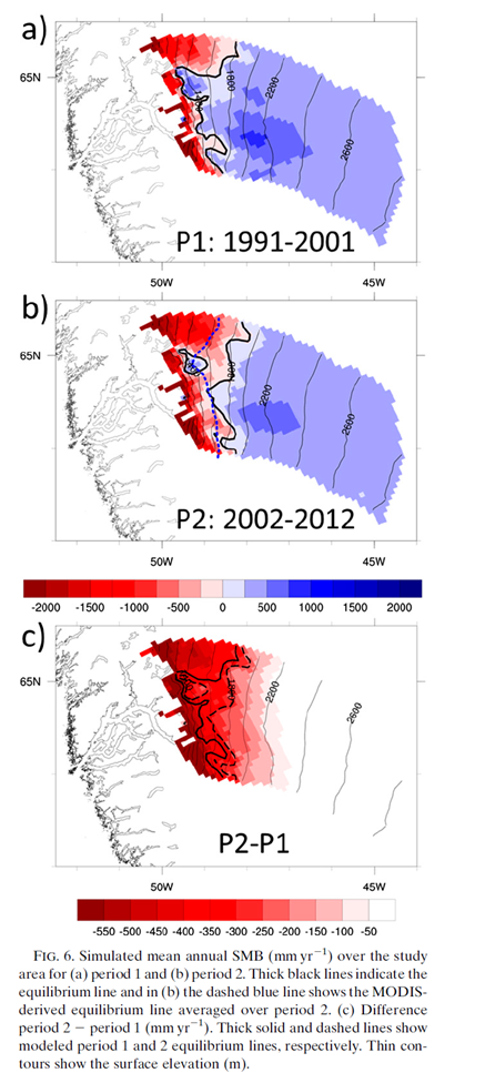
The climate of Greenland has been changing over the last 20 or so years, especially in the south. In this paper we showed that the amount of melt and liquid water run off from the ice sheet in the south west has increased at the same time as the equilibrium line (roughly analogous to the snow line at the end of summer on the ice sheet) has started to move up the ice sheet. Unlike previous periods when we infer the same thing happened this can be attributed to warmer summers rather than drier winters.
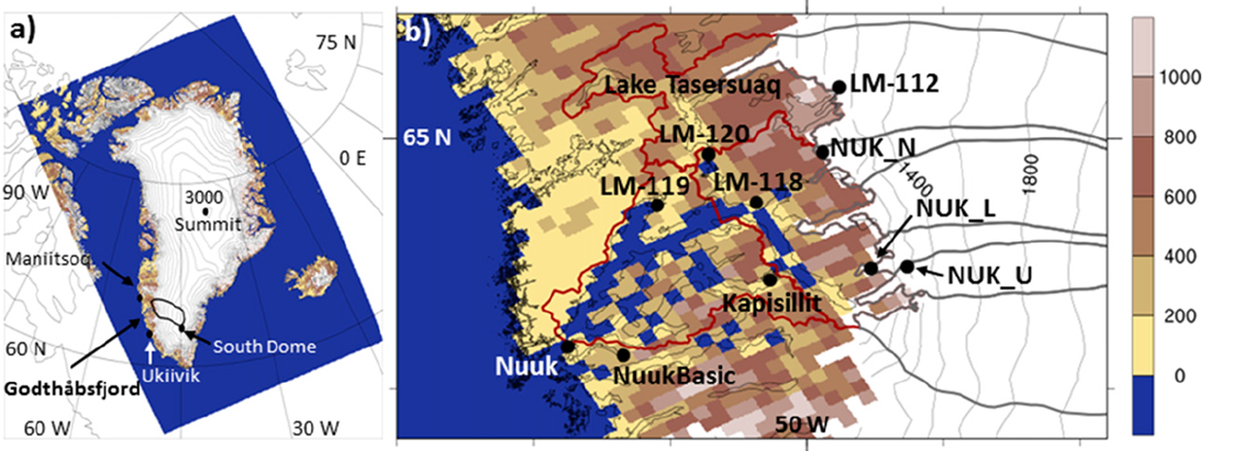
We focused on the area close to Nuuk, the capital of Greenland, as we had access to a rather useful but unusual (in Greenland) dataset gathered by Asiaq the Greenland survey. They have been measuring the run off from a lake near the margin of the ice sheet for some years and made this available to us in order to test the model predictions. This kind of measurement is particularly useful as it integrates melt and run-off from a wider area than the usual point measurements. As our model is run at 5.5 km resolution, one grid cell has to approximate all the properties of a 5.5 km grid cell. Imagine your house and how much land varies in type, shape and use in a 5.5 km square centred on your house and you begin to appreciate the problems of using a single point observation to assess what is essentially an area simulation! This is even more difficult in mountainous areas close to the sea, like the fjords of Norway or err, around south west Greenland (see below).

The HIRHAM5 model is one of very few regional climate models that are run at sufficiently high resolution to start to clearly see the climate influences of mountains, fjords etc in Greenland, which meant we didn’t need to do additional statistical downscaling to see results that matched quite closely the measured discharge from the lake.
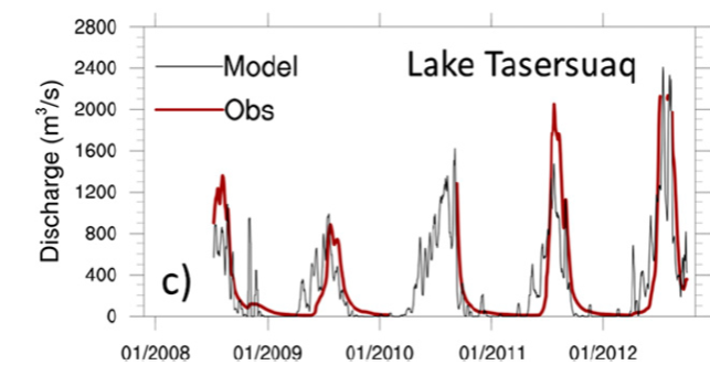
We were pretty happy to see that HIRHAM5 manages to reproduce this record well. There’s tons of other interesting stuff in the paper including a nice comparison of the first decade of the simulation with the last decade of the simulation, showing that the two look quite different with much more melt, and a lower surface mass balance (the amount of snowfall minus the amount of melt and run – off) per year in recent years.
Now, as we work at DMI, we have access to lots of climate records for Greenland. (Actually everyone does, the data is open access and can be downloaded). This means we can compare the measurements in the nearest location, Nuuk, for a bit more than a century. Statistically we can see the last few years have been particularly warm, maybe even warmer than the well known warm spell in the 1920s – 1940s in Greenland.
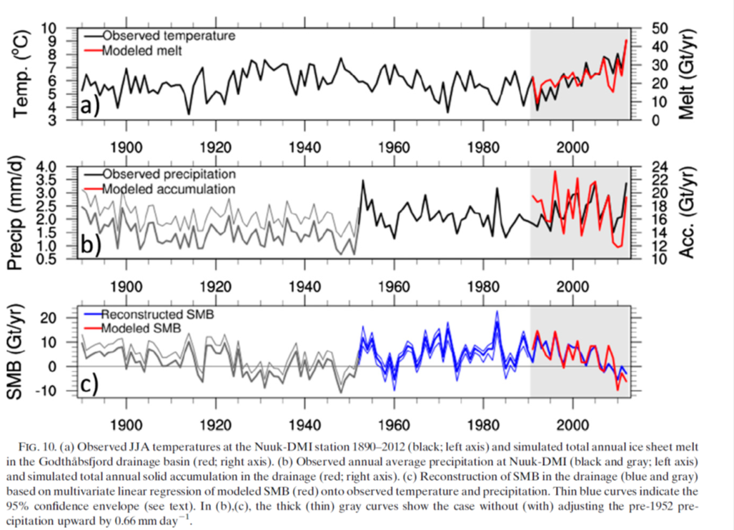
There is lots more to be said about this paper, we confirm for example the role of increasing incoming solar radiation (largely a consequence of large scale atmospheric flow leading to clearer skies) and we show some nice results which show how the model is able to reproduce observations at the surface, so I urge you to read it (pdf here) but hopefully this summary has given a decent overview of our model simulations and what we can use them for.
I may get to the future projections next time…

Hi every one, here every one is sharing such knowledge, thus it’s nice to
read this weblog, and I used to pay a quick visit this weblog daily.
LikeLike