How pristine is the Arctic?

“The Arctic is one of the last great pristine ecosystems, a safe haven for endangered species and home to Indigenous Peoples whose lifestyle has survived in harmony with nature for thousands of years.”

This quote in the wake of COP21, extracted  from a celebrity I’ve never heard of (sorry, I’m just not that interested in actors)  raised my hackles as it repeated yet again the idea that the Arctic is “pristine”.

Even without contemplating climate change, it is most certainly not, as the polar portal season report I was vaguely involved in compiling this year made clear.
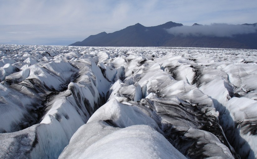
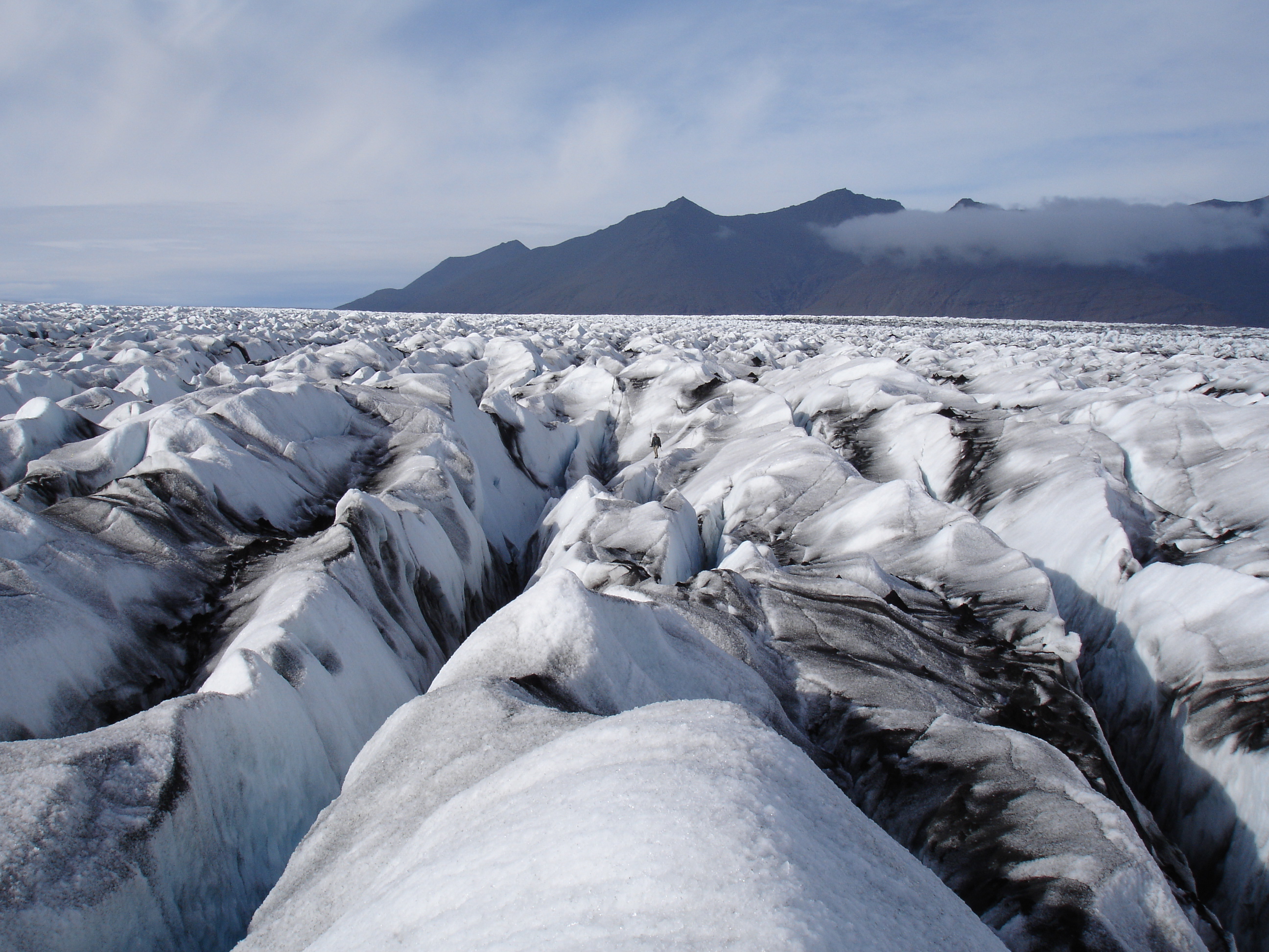
DSC02183
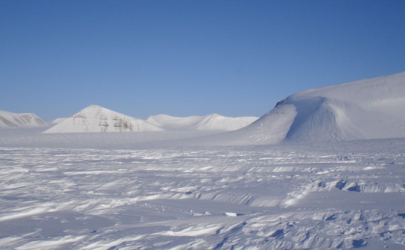
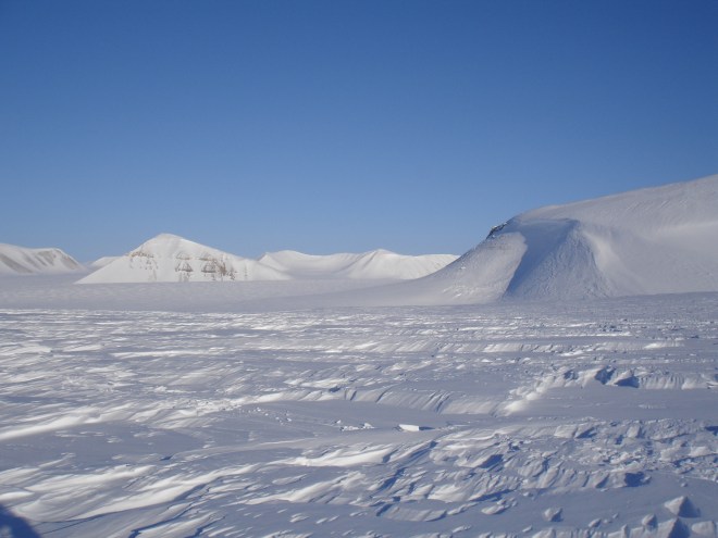
The “pristine” wilderness of Von Postbreen, Svalbard

There is a whole literature in the humanities on Orientalism and “othering”, about how we define other people and places partly to define what we are not. I’m not sure if there is a term for this narrative of a “pristine wilderness”, let us call it “pristinism ” for want of a better term. But before I list the ways in which the Arctic is not pristine, let me make very clear, I am well aware I also suffer from pristinism, to some extent. What my boss teasingly refers to as “the white disease”, the fascination with snow and ice that makes me want to leave the comforts of house and home and go and live somewhere deeply uncomfortable, and indeed dangerous in order to plumb the mysteries. I have been visiting the Arctic for well over 12 years now, though as most of my work is on  computer, I don’t get the option so often anymore. Maybe that’s a good thing, perhaps the last thing the Arctic needs is more people flying to it.

The ecosystem has been significantly degraded by the loss (hopefully now in reverse) of most of the large cetacean species by commercial whalers. Similarly, walrus and polar bears in Svalbard were almost rendered extinct before hunting was banned. It also appears there were walrus in Iceland when the vikings arrived that, like any polar bear at the present day arriving on Icelandic shores, were quickly dispatched. The Greenland vikings were certainly rich from walrus ivory as their main source of income. Not content with exterminating the walrus the early settlers sent their sheep out and very successfully deforested the 25-40% of Iceland that had been forested, leading to dust storms, soil erosion and the unfortunate inability to build boats to get anywhere else very far away. Deforestation has only recently begun to be reversed. In much the same way Musk Oxen were virtually eliminated from Eastern Greenland by hunting, but then rather too successfully introduced to the west where there has been a population explosion.

Fish stocks have at least been largely preserved in Iceland (sensible given how important fishing is to the economy), but there have been several notorious crashes in different fish species in the North Atlantic and around Greenland. Although, to be fair these latter seem to be at least partly caused by changing ocean temperatures rather than purely overfishing. Then there are the invasive species, largely limited so far to the (admittedly delicious) King crab , an omnivore that will eat everything in it’s path much to the fear of some local ecologists around the Arctic coast of Norway.

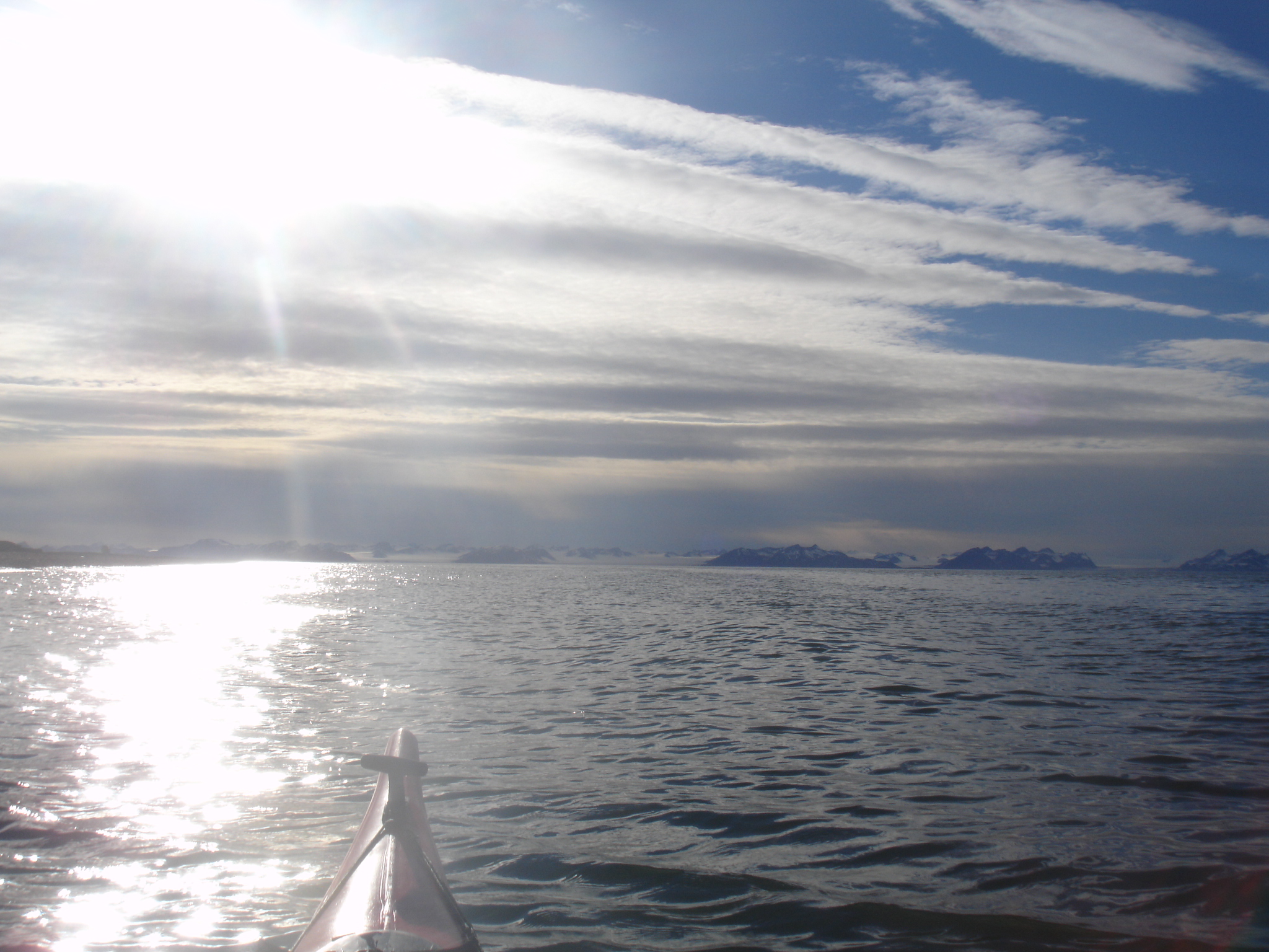
And then there are the birds. Different bird species face declining populations due both to loss of habitat outside the Arctic as well as hunting in the Arctic region. I was somewhat surprised, though in retrospect I should not have been, at the very few bird numbers that I saw while on a kayaking trip within an easy boat ride of Nuuk.
DSC03114

I would have seen many more in the Scottish islands, but if a subsistence species is within easy reach of a large town (which in themselves would have been impossible prior to colonisation), it is an inevitable tragedy of the commons waiting to happen. Similarly, seals are incredibly wary and remain as far from people as possible in Greenland, a big contrast to the rather trusting and curious creatures I have been able to paddle very close to around the British Isles. And Heaven help any polar bear that strays too close to any Greenlandic settlements, legal protection or not…

Part of the problem are the difficulties birds have in reproducing. This is at least partly down to the toxic mix of chemicals stored in their fat, which comes out in a rush when these animals and birds have to live on their body fat supplies – as they do each summer when incubating eggs. These eggs also appear to contain high levels of mercury, cadmium, PCBs, organochlorines, dieldrin to mention just a few, with an effect on the developing bird embryos inside and of course anything that eats either bird or eggs.

A report compiled by the WWF in 2006 (pdf) from the peer-reviewed literature lists dozens of such studies like this one.  There are also suggestions that environmental pollution is having a significant effect on cetaceans as well as in seal species.

And this of course is because that “pristine” Arctic has an extremely high concentration of industrial chemicals, heavy metals and other by-products of our manufacturing society. Albeit a long way from most sources of production. I was once fascinated to discover that all sorts of historic events such as the Greek and Roman production of silver (and it’s leaden by-product) could be identified in the Greenland ice cores, as could the introduction of leaded petrol and it’s later phasing out. The atmosphere acts as a kind of distillation column, concentrating these poisons at the top (and bottom) of the world, not to mention the local sources. There are coal mines in Svalbard, aluminium smelters in Iceland and Greenland, the oil + gas fields of Alaska, Newfoundland, Norway and Russia. Not to mention god only knows what hazardous (radioactive?) waste is leaching away from forgotten islands in the Russian sector of the Arctic.
DSC03285
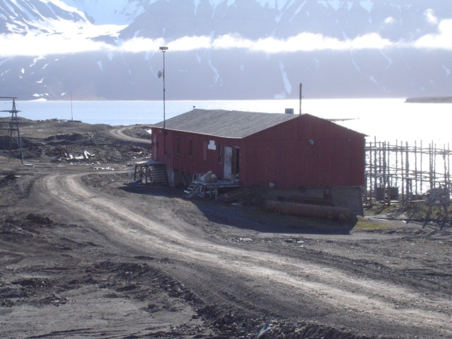
Three polar bears take over an abandoned dog shed for a sleep in the shade, Svea coal mine, Svalbard

In the food chain, the little animals get eaten by the bigger ones, which get eaten by the bigger ones, concentrating and accumulating toxic chemicals all the way to the top of the food chain.

To us.

Because humans are, in the Arctic at least, the top predator.

It is by now well known that with a diet that is high in meat, much of it derived from marine mammals and fish, Inuit peoples in the Arctic have very high levels of toxic chemicals in their bodies, and in their breast milk. Greenlandic women are in fact advised to reduce their traditional foods in pregnancy (pdf) and eat something imported instead. Then some recent research suggested the high rates of Parkinson’s disease in the Faroes may be down to a whale meat rich diet.

Yet at the same time we in the crowded, populated mid-latitudes project our fantasies of a pristine fairy-tale at the top of the world.

Sorry.

The Arctic is very very far from pristine, and if what happens in the Arctic doesn’t stay in the Arctic, the reverse is also true, the Arctic is part of this world for good or ill. There is however, no doubt that it exerts a powerful pull on our imaginations.

There is a reason poor old Ursus maritimus has become the poster children of climate change. Perhaps it’s all the bright white snow and ice, even if the Arctic Report card shows us the browning of the Arctic as snow lies for ever shorter periods at the same time as sea ice cover at the end of summer is similarly declining…
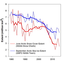
 

From the Arctic report card 2015: "Northern Hemisphere (NH) June snow cover extent and September Arctic sea ice extent. Sea ice extent data for 1979-2014 are derived from the NASA Team algorithm (Cavalieri et al., 1996); ice extent estimates for 2015 are produced from real time data (Maslanik and Stroeve 1999). Bold red and blue lines are 5-year running means of the original snow and sea ice extent records, respectively."
From the Arctic report card 2015: “Northern Hemisphere (NH) June snow cover extent and September Arctic sea ice extent. Sea ice extent data for 1979-2014 are derived from the NASA Team algorithm (Cavalieri et al., 1996); ice extent estimates for 2015 are produced from real time data (Maslanik and Stroeve 1999). Bold red and blue lines are 5-year running means of the original snow and sea ice extent records, respectively.”

I am optimistic but cautious about the Paris agreement at COP21. I hope it will come in time to preserve some remnant of the Arctic wilderness, but even if it does we still have some big challenges to face. Sweeping these under the carpet for the sake of a convenient narrative about a pristine wilderness is not helpful. I have a great affection for the Arctic, the people and the wildlife that lives there. I started this post originally some time ago but failed to finish it as it made me rather depressed to think about, but then I was put in mind of this poem from Seamus Heaney and decided it was worth finishing after all with this piece.

Clearly, the myth of “The North” and “the Arctic” has been with us for some time, but surely we owe it to the Arctic and the peoples who live there to try and see through the “pristinism” and start to fix some of these challenges?

North

BY SEAMUS HEANEY

I returned to a long strand,
the hammered curve of a bay,
and found only the secular
powers of the Atlantic thundering.
I faced the unmagical
invitations of Iceland,
the pathetic colonies
of Greenland, and suddenly
those fabulous raiders,
those lying in Orkney and Dublin
measured against
their long swords rusting,
those in the solid
belly of stone ships,
those hacked and glinting
in the gravel of thawed streams
warning me, lifted again
in violence and epiphany.
The longship’s swimming tongue
was buoyant with hindsight—
it said Thor’s hammer swung
to geography and trade,
thick-witted couplings and revenges,
the hatreds and behind-backs
of the althing, lies and women,
exhaustions nominated peace,
memory incubating the spilled blood.
It said, ‘Lie down
in the word-hoard, burrow
the coil and gleam
of your furrowed brain.
Compose in darkness.
Expect aurora borealis
in the long foray
but no cascade of light.
Keep your eye clear
as the bleb of the icicle,
trust the feel of what nubbed treasure
your hands have known.’

were ocean-deafened voices

Shameless self-promotion…

The annual AGU jamboree starts this weekend, I have never actually attended (I do way too much travelling for work as it is but I would quite like to go one day). However, I and some of my colleagues have contributed to a number of presentations and posters so I thought I’d put a wee list up of those:

https://agu-do.confex.com/agu/fm15/meetingapp.cgi/Paper/82972 this poster presented by Prof. Jason Box on Greenland ice sheet albedo uses my HIRHAM5 simulations.

https://agu.confex.com/agu/fm15/meetingapp.cgi/Paper/59874 this poster presented by Dr Liam Colgan on the life cycle and mass balance implications of crevasses on glaciers relates to this blogpost.

My colleague Christian Rodehacke is presenting some of our work on permafrost modeling (and in particular subsea permafrost on the Siberian shelf and around Greenland) in a presentation on https://agu.confex.com/agu/fm15/meetingapp.cgi/Paper/77877 related to the DEFROST project

Ice2ice work from DMI is represented by a number of posters including this particular highlight on sea ice and surface air temperatures given by my colleague Shuting Yang: https://agu.confex.com/agu/fm15/meetingapp.cgi/Paper/78776

Then there are some good statistical posters based on multimodal ensembles presented by my Research leader Jens Hesselberg Christensen https://agu.confex.com/agu/fm15/meetingapp.cgi/Paper/71989

And while I’m on the subject of ice2ice, did I mention we’re hosting a themed session at the EGU Spring symposium in 2016?

The deadline for abstract submission is 13th January but with Christmas in the way it’s best to start planning your submissions now. I am co-convening the session, titled “Interactions and feedbacks between land ice, sea ice and ocean in the Arctic “ and we’re hoping to invite a couple of keynote speakers, and there may also be an associated social event, so keep watching this space and do consider sending in an abstract to the session!


Bless the rains down in Africa #DACEA3

An ultra-quick post today. I have been spending a lot of time lately writing a grant proposal (and occasionally tweeting about it  on the #DACEA3 hashtag).  Finally it’s in and after a celebratory beer or two at the famous Mikeller last week I have managed to get around to a very brief summary of what it’s all about… 

Around 17,000 years ago, Lake Victoria more or less completely dried out. I still find this absolutely staggering. In fact, the lake has dried out and reformed at least 3 times since it first formed about 400,000 years ago.

Lake Victoria is the largest lake in Africa and indeed the tropics, containing 2.75 cubic kilometres of water (though compared to the 2,850,000 cubic kilometres of water in the Greenland ice sheet that seems small, which merely goes to prove how much of our fresh water is locked up in the ice sheets), making it the 9th largest lake by volume in the world.

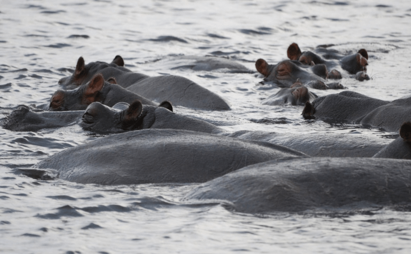
Gratuitous wildlife shot: A raft of hippos chilling out in the river. Photo: Pim Bussink
Gratuitous wildlife shot: A raft of hippos chilling out in the river.
Photo credit: Ruth Mottram

Clearly, the disappearance and later reappearance of the lake, and others in the region speaks to monumental shifts in the climate. The East African Rift Valley lakes are largely fed by the East African rains, long and short, delivered by the shifting position of the Intertropical Convergence Zone as the Earth’s seasons change bringing those life-giving rains.

This grant proposal started as idle speculation around the coffee machine (in the grand old scientific tradition) about how this was climatically possible and could it happen again? My colleague (and talented PI on the proposal) Peter Thejll had been reading a book about John Hanning Speke and Richard Burton (not that one) and their famous search for the source of the Nile and has some personal African connections, which prompted the conversation and it seemed obvious to try and find out what happens to the local circulation to allow the lake to dry out. A quick google search revealed an old friend, Dr. Sarah Davies at Aberystwyth University was researching this topic actively and it all fell into place.

Now, I can guess what you’re thinking – this is usually a glaciology or Arctic Climate blog, where on earth has all this Africa stuff come from? Well what happens in the Arctic does not necessarily stay in the Arctic.

There are a number of hypotheses as to the drivers of these changes in African rainfall, among which is the interesting observation that the periods of greater aridity correlate remarkably well with Heinrich events in the North Atlantic.

Heinrich events were first identified as layers of sediment most likely transported into the North Atlantic Ocean by icebergs, known as ice rafted debris – IRD. The southerly position of many of these layers thousands of kilometres from any ice sheets either at the present day or in the past suggests a truly extraordinary amount of icebergs and cold fresh water were discharged over a relatively short period of time, from a large ice sheet. The source of these sediments is most likely the gigantic Laurentide ice sheet of North America, but there is also some evidence of smaller contributions from the British and Fenno- Scandian ice sheets (which may or may not have been joined together across the North Sea depending on how you interpret the evidence). The physics behind this is that as the enormous amount of cold fresh water was discharged into the North Atlantic, the temperature and salinity changes were sufficient to push, or keep the ITCZ far to the south, preventing the rains one East Africa.

On the other hand, other research has linked the failure of the rains to El Niño and related phenomena such as the Indian Ocean dipole and the Walker circulation. Still other scientists have noted that these drying periods seem to correlate with orbital changes in the earth which would affect the seasonality, that is the annual cycle of seasons. It is known as orbital forcing as the Earth’s seasons are driven by changes in our orbit around the sun (have a look at the excellent Orbit documentary from the BBC for a very easy to follow and beautifully filmed introduction to the importance of our orbit around the sun if you’re not familiar with Milankovitch cycles etc).

Milankovitch cycles shown from ocean cores and an Antarctic ice core at the bottom compared with the theoretical cycles. Image: By Incredio (Own work) [CC BY 3.0 (http://creativecommons.org/licenses/by/3.0)], via Wikimedia Commons
Milankovitch cycles shown from ocean cores and an Antarctic ice core at the bottom compared with the theoretical cycles.
Image: By Incredio (Own work) [CC BY 3.0 (http://creativecommons.org/licenses/by/3.0)], via Wikimedia Commons
All of these hypotheses can be supported by correlations with palaeo evidence,  but to really disentangle the connections between different regions of the world and how they affect each other’s weather and climate, we need to use a climate model. Luckily, at DMI we have the perfect tool to hand, a global climate model including ice sheets, EC-Earth. Furthermore we also have a high resolution regional climate model, HIRHAM5, my usual tool of choice. Our friends Morten Dahl Larsen and Martin Drews at the Danish Technical University are experts in using hydrology models so the answer is obvious.

We want to use these model tools and an extensive archive of observations, helpfully curated by our project partners Sarah Davies and Henry Lamb at Aberystwyth University to test all these different ideas. As an extra spinoff from the project, the Aberystwyth group have been intensively involved with the collection and analysis of a new lake sediment core from Chew Bahir in Ethiopia, so it’s going to be pretty exciting seeing if we can get the models to replicate  these kind of records.

There is of course an extra urgency to this project. It’s not just a somewhat obscure academic question. A recent paper showed that the long rains have significantly reduced over the last decade, and about 300 million* people live in this region and rely on these rains for drinking water, hydroelectric power and agricultural production. During this period we have also seen rapid changes in the Arctic. Of course the two trends may not be connected, or may be linked via a common third factor which is why the physics of climate are so important to understand.

UPDATE 2: I had no time originally in the writing of this to add a little about our other project associate. One of the best things about doing science are the very smart and friendly people  you meet along the way. Social media has really helped here to keep in touch as it is a nomadic lifestyle. By sheer chance I noticed a familiar name in a tweet that seemed to have some direct relevance to the proposal as we were writing it.

Hycristal

John Marsham was an old friend from my student days at Edinburgh University who I had slightly lost touch with. Thanks to the efforts of facebook we were soon back in touch and he is one of the Investigators on the HyCRISTAL project, part of the hugely important Future Climates for Africa Project, funded by the Department for International Development (DFiD) and the Natural Environment Research Council (NERC) in the UK. DACIA has some really obvious parallels with this project, though where we would like to concentrate on past climates, they will be focusing on present day and future climates. We hope therefore to send our PhD student to collaborate with the HyCRISTAL and FCFA projects where our insights from palaeomodelling palaeodata can make a real difference to the way future climate change is adapted to in East Africa. It will be very nice to collaborate with John’s group at Leeds as well as the Aberystwyth group, now we just have to hope we get the money to do it..

Or, to put it another way, “bless the rains down in Africa” ** (As an aside, for years I had always heard this as “I miss the rains down in Africa”, assuming it was about someone from Africa who missed being there).

UPDATE 1: Having viewed the original pop video again, I am rather troubled by the casual racism, sexism and naked orientalism on display (yes it was the 70s but still…) so I think I prefer to post instead this particularly witty deconstruction courtesy of @spaceforpootling

*(based on a back of the envelope calculation based on population statistics from Wikipedia if you know the correct number do let me know).

**(Apologies if you now have cheesy 1970’s pop music going round your head all day… 🙂 )

The poetry of climate change

A slightly different topic today – not purely scientific but rather a purely opinion piece. Happy National Poetry Day!

Today is National Poetry Day in the UK and I stumbled across an article on the Guardian website by Britain’s Poet Laureate, Carol Ann Duffy.

In it she argues that science and information is not enough to convince people of the problem or solutions to climate change. There is, she suggests much work to be done on an emotional or aesthetic level. As part of the Guardian’s “Keep it in the ground” campaign she has therefore curated 20 poems from different writers especially commissioned on the subject.

I think it’s a very intriguing idea. I have never been a subscriber of the idea of “two cultures [pdf]”, most scientists I know are well read, musically gifted, artistically inclined, culturally engaged and often all four together.

Equally, though I know very few professional artists, those I do know are often deeply interested in the products and processes of scientific thought across a broad range of subjects. Although they may fail C.P. Snow’s criteria of understanding the Laws of Thermodynamics, this seems a rather crude measure of engagement with scientific endeavours on a par with perhaps being able to recite Hamlet’s “To be or not to be” speech (and how many people can do that by heart?)

So, if the poem a day gets people excited, engaged and somehow involved in understanding and solving the problems of climate change I am all for it, especially with the summit in Paris coming up in December.

Here is “my” contribution. Not my own poetry which I fear is excruciatingly adolescent, but by the master Seamus Heaney, who I studied in school, proof of the inspiring nature of the English literature curriculum if there was any:

Höfn

The three-tongued glacier has begun to melt.
What will we do, they ask, when boulder-milt
Comes wallowing across the delta flats
And the miles-deep shag ice makes its move?
I saw it, ridged and rock-set, from above,
Undead grey-gristed earth-pelt, aeon-scruff,
And feared its coldness that still seemed enough
To ice-block the plane window dimmed with breath,
Deepfreeze the seep of adamantine tilth
And every warm, mouthwatering word of mouth.

Seamus Heaney (2005)

From District and Circle

I used this in my PhD thesis and like to think that it is about the glacier I did my PhD work on, Breidamerkurjokull in Iceland.

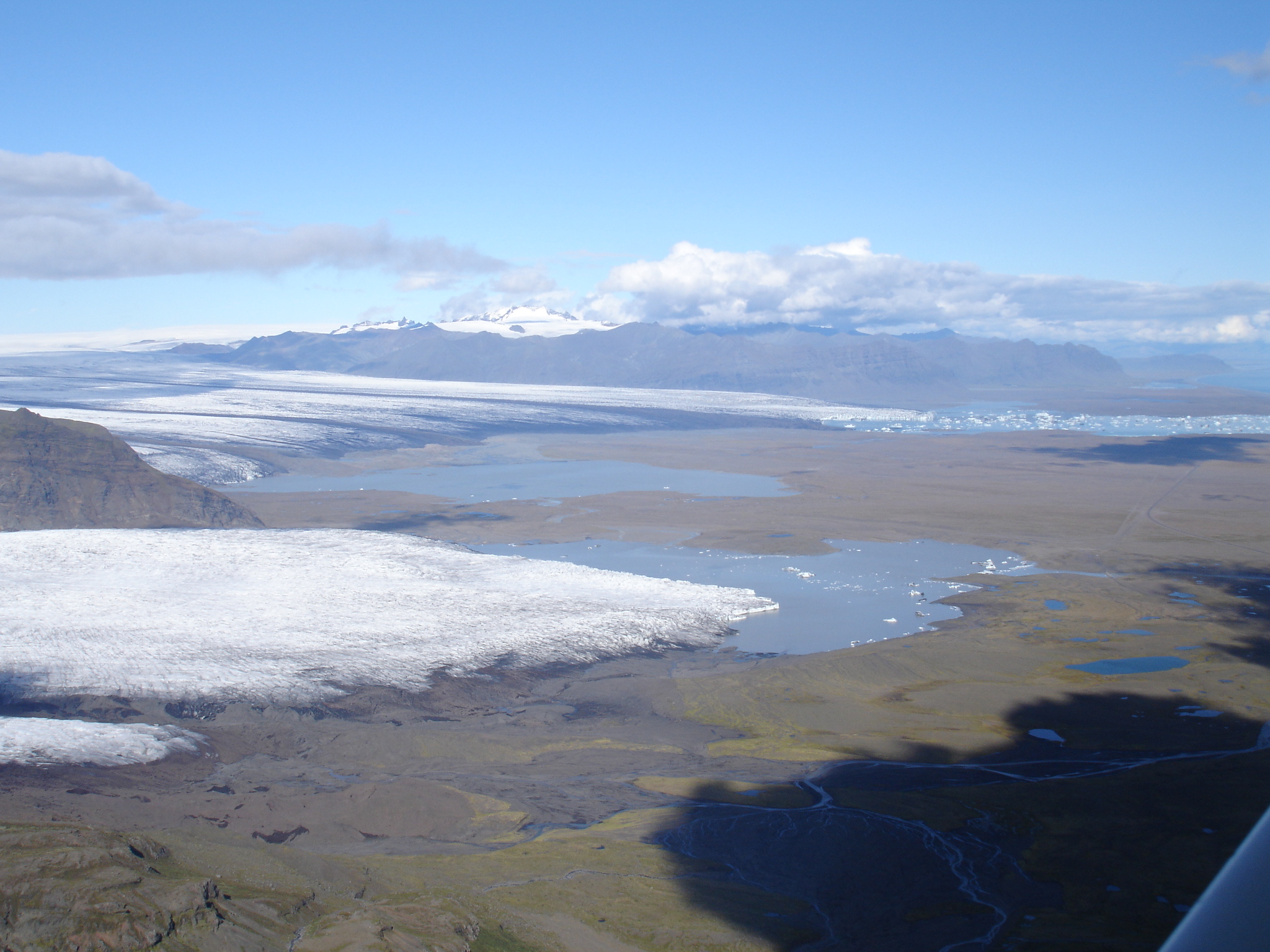
The photo below was taken in 2005 at the end of my last field season in Iceland. As a final farewell we took a plane flight over the glacier. In retrospect I wish I’d done it at the start as many processes and features we’d puzzled over became clear when viewed from above.

The 3 lobes of the glacier are clear in this picture (though the ice in the foreground is from a different glacier, Fjallsjokull), the lake with icebergs in the far background is the famous Jokulsarlon, a popular tourist site in Iceland and also, incidentally, a popular film location.

Seamus Heaney’s poem is rather grim in tone, but I think the photo shows just how sparklingly beautiful this area is on a good day

DSC00792

Rain rain go away…

My 2 kids were singing the rain rain go away rhyme during last weekend’s epic rainfall in Copenhagen and it reminded me that I have not yet put up a post about a paper I was a co-author on this summer related to late summer/autumn rainfall and the effects on the Greenland ice sheet, so here goes….

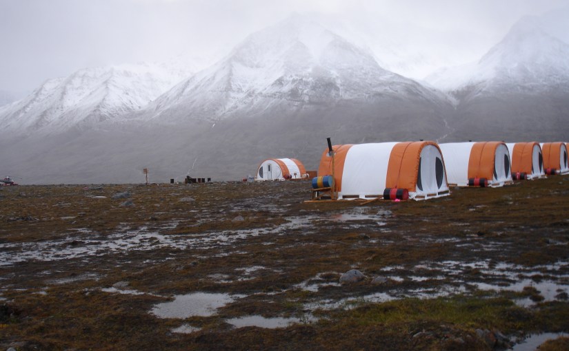
Mostly when we think of precipitation in Greenland we think of snow in the winter, but it does rain quite a lot, as I know from personal experience (see photo taken as the clouds started to clear one September field season in Eastern Greenland…). This paper in Nature Geoscience by Sam Doyle and co-authors including myself shows that when rain falls on the ice sheet at the “wrong” time of year it can have a very far-reaching effect, causing the speed up of a large area across the ice sheet.

Rain clouds over the Stauning Alps of Eastern Greenland after the third day of rain... Exploratory mining camp tents in the foreground.
Rain clouds over the Stauning Alps of Eastern Greenland after the third day of rain…
Exploratory mining camp tents in the foreground.

The important caveat is that rainfall during the main part of the melt season is more or less evacuated away quickly. Glaciers – and the Greenland ice sheet is basically a very big glacier – develop a drainage system more or less analogous to large underground sewers during the melt season. These tend to close down during the colder accumulation season and reopen by the sheer pressure of water running through them when the melt season starts. Rainfall during that crucial late summer/early autumn period when the drainage is closing down and therefore less efficient at evacuating surplus liquid water is therefore not able to move away from the glacier very easily and forces its way through any way it can find.

During this period, most of the snow will have melted off the surface, leaving vast areas of bare ice. By contrast, rain on snow in the early part of the melt season when there is a thick snow pack is more likely to refreeze inside the snow. In late summer however, there will be a relatively short period between rain falling and accumulating in the glacier drainage system.

In practice this means the water makes its way to the bed of the glacier through moulins and englacial channels, where it more or less hydraulically jacks up the glacier over a large region, allowing the ice to flow to the margins faster. There may then also be a knock-on effect with increased calving of icebergs at outlet glaciers. in 2011, the field team were able to measure both the rain fall and the following cascade of processes in a range of different datasets as shown below:

Rainfall (a,b) over the ice sheet runs off the bare ice quickly as shown by discharge stations on a number of rivers in western Greenland (c). This triggers acceleration  across a wide area, shown by GPS stations on the ice sheet at 10 different locations (d). Figure taken from the paper
Rainfall (a,b) over the ice sheet runs off the bare ice quickly as shown by discharge stations on a number of rivers in western Greenland (c). This triggers acceleration across a wide area, shown by GPS stations on the ice sheet at 10 different locations (d). Figure taken from the paper

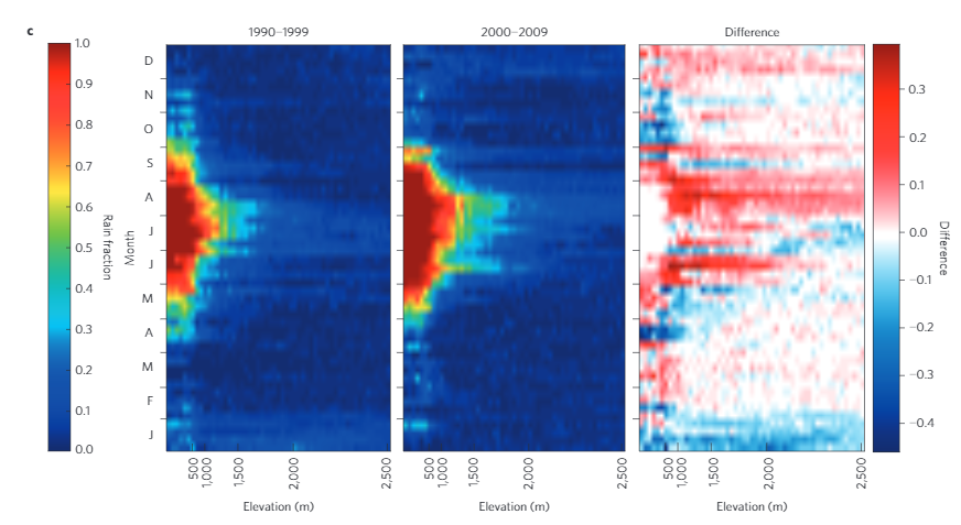
My contribution to the paper was in the form of some HIRHAM5 model runs for Greenland which show the last decade has seen a significant increase in rainfall events in the summertime compared with the previous decade. We chose as a study region the K-transect of weather stations in western Greenland. These are operated by Utrecht University and have a long time-series of data which previous work has shown our model can replicate quite nicely. The model is forced by the ERA-Interim reanalysis, a data set based on weather forecast models with real observations included in it run for the whole world so we are pretty confident the rainfall patterns are realistic. There are actually two interesting points illustrated in the picture below taken from the paper. Firstly that there is more rain falling and secondly that this rain is falling at higher elevations on the ice sheet, potentially causing a much wider area of the ice sheet to be affected by late-summer rainfall events.

The decadal change in rainfall events is partly due to a persistent North Atlantic Oscillation anomaly which has funnelled storms over the western edge of the ice sheet. There is also some evidence that the stratospheric Rossby waves have become more “wavy” over the same period, due to the increasing warming and vanishing sea ice in the Arctic. This hypothesis was articulated in a very nice paper by Francis and Vavrus but it remains a very open area of research as we just don’t have a lot of evidence right now.

We do know that the Arctic is one of the fastest warming regions on the planet and this will certainly have a knock-on effect on the Greenland ice sheet both in terms of melting and, perhaps, in the frequency of storms bringing rain over the ice sheet in the future. I am now preparing a new study to see if we see a signal along these lines in our future simulations of the Greenland domain.

Rainfall events at a weekly timestep over the K-transect in western Greenland  for two different decades and the difference between the two. The second decade has many more rainfall events that reach to a much higher elevation than the first decade.
Rainfall events at a weekly timestep over the K-transect in western Greenland for two different decades and the difference between the two. The second decade has many more rainfall events that reach to a much higher elevation than the first decade.

Conversion Factors

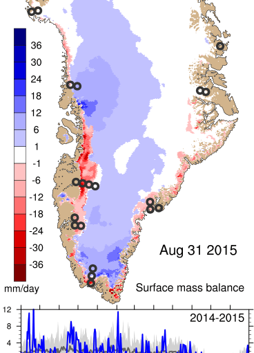
The official end of the hydrological year in Greenland (1st September to 31st August) means I am rather busy writing reports to give an overview of where the ice sheet is this year and what happened. I will try to write a quick blogpost about this in the next week or so (in case you’re curious here’s a quick plot to show the entire annual SMB, see also: http://polarportal.dk/en/groenlands-indlandsis/nbsp/isens-overflade/)

Daily and accumulated surface mass budget of the Greenland ice sheet, 31st August, 2015, last day of the hydrological year
Daily and accumulated surface mass budget of the Greenland ice sheet, 31st August, 2015
Anyway, as I find I am constantly switching between Gigatonnes (or indeed Gigatons), cubic kilometres and sea level equivalent, here is a quick and handy guide to converting different units of mass, for my own use as much as anyone else.

1 gigatonne is 1 billion metric tonnes  (or 1 milliard if you like the old British style, that is one thousand million).

However, on the Polar Portal we usually reckon everything in water equivalent. This is to save having to distinguish between snow (with a density between ~100 kg/m3 when freshly fallen and ~350 kg/m3 m when settled after a few days), firn (snow that has survived a full annual cycle with a density up to ~800 kg/m3) and glacier ice (anything from ~850 kg/m3 to 900+). Water has a density (at 4C) of 1000 kg/m3

1 gigatonne of ice will still weigh 1 gigatonne when it is melted but the volume will be lower since ice expands when it freezes.

1 metric tonne of water is 1 cubic metre and 1 billion metric tonnes is 1 km3 (a cubic kilometre of water)

A cubic kilometre of ice does not however weight 1 gigatonne but about 10% less because of the density difference.

100 gigatonnes of water is roughly 0.28mm of sea level rise (on average, note there are big regional differences in how sea level smooths itself out).

Finally, 1 mm sea level rise is 360 Gt of ice (roughly the number of days in a year) 

EDIT: – thanks to ice sheet modeler Frank Pattyn and ice core specialist Tas van Ommen on Twitter for pointing out I’d missed this last handy conversion. Interestingly and probably entirely coincidentally this is very close to the amount of mass lost by the Greenland ice sheet reported by Helm et al., 2014 for the the period January 2011 – January 2014 (pdf here) of 375 +/-24 km3 per year.

Over the last 10 years or so, Greenland has lost on average around 250 Gigatonnes of ice a year (Shepherd et al., 2012), contributing a bit less than a millimetre to global sea level every year with some big interannual variability. This year looks like it will be a comparable number but we will have to wait for the GRACE satellite results in a couple of months to fill in the dynamic component of the mass budget and come up with our final number.

Of course, gigatonnes and cubic kilometres are rather hard to visualise so we have skeptical science to thank for this post that tries. And as aside, Chris Mooney wrote a nice piece in the Washington Post on the difficulties of visualising how much ice is being lost which contains the immortal  line “Antarctica is clearly losing billions of African elephants worth of ice each year”.

A question of observation?

It’s been a while since I lasted posted anything, not for want of ideas but mainly lack of time. I shall try to catch up over the next few weeks. For now I was inspired to write an ultra-quick post about a very trivial question that came up at work today. I think it really captures how observational meteorology works (or should work).

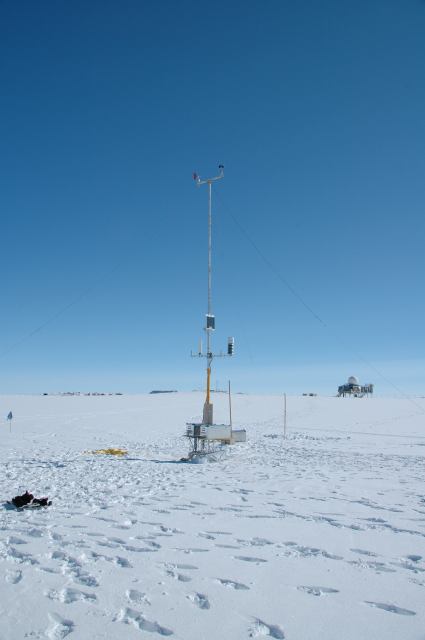
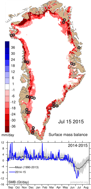
Today, a colleague, John Cappelen, (also known as Mr. Greenland observational data), happened to mention in passing that on the 15th July this year, the weather station at Summit on the Greenland ice sheet had transmitted back to us in Copenhagen, a temperature observation of 2.5°C. This was during one of the highest melt periods this summer.

Automatic weather station operating at Summit, June 2015
The automatic weather station doing it’s thing at Summit, June 2015. Photo: DMI

Bearing in mind that Summit Camp is at roughly 3,216m, this is a pretty high measured temperature. In fact it would be rather noteworthy, especially as it occurred on one of the highest melt days of the summer. Temperatures above 0°C at Summit are not unknown and the record, during the famous summer of 2012 when around 95% of the ice sheet surface experienced melt, the water sweeping away a bridge on the Watson River near Kangerlussuaq, was 3.6°C.

Now, my colleague is a very experienced and careful scientist. He had checked the observations and the temperatures before and after this measurement were well below zero, so, my colleague asked, was there any reason to believe this measurement or can we assume an instrument failure of some kind?

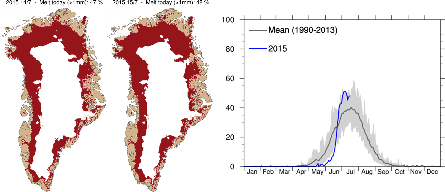
My office mate in the Arctic and Climate Research section and I obligingly had a quick look at our Polar Portal Greenland ice sheet surface plots (see below) and at the melt extent plots that are updated daily on the DMI website. We had to conclude there was no evidence of melt that high on the ice sheet and there was also no reason to believe that a sudden sharp warming had occurred at Summit on this day based on DMI’s own weather forecast. We then turned to check the weather plots, also on the polar portal and based on data from the European Centre for Medium Range Weather Forecasting (the ECMWF – probably the best weather forecast modellers in the world).

Again, the anomaly plots showed rather cold conditions prevailing over the ice sheet during this period, though at the same time very high melt and low surface mass balance from the ice sheet due to the clear skies.

Graphs showing area of the Greenland ice sheet experiencing melt conditions, compared with the average (dark grey line) and range of past summers (1990-2012), for more detail see the DMI website
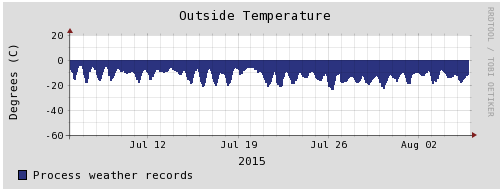
Temperature record from Summit Camp for the last month.

Fortunately, due to the American Summit Camp we have access to a back-up dataset very close to this location and after a quick web search John Cappelen was able to confirm that indeed this measurement was an error as the nearby station has not seen anything like that during the period in question (see right).

This kind of thing happens all the time and is therefore not at all newsworthy or interesting enough to write a publication about. However, when a recent record high temperature in the UK can lead to 2 critical articles in the Daily Telegraph and a particularly vigorous exchange on twitter for Met Office scientist Mark McCarthy, as well as this corrective piece on the Carbon Brief blog, perhaps we should be more vocal about just how careful and critical we as scientists are about observations, including the ones we decide to discard as well as the ones we keep.

Surface mass balance of the Greenland ice sheet on the 15th July 2015. Intense melting around the margins led to very negative SMB (the red colours) during this period.

Addendum: I was alerted by this tweet from Gareth Jones, also a Met Office scientist, to some slightly strange cherry picking in the blogosphere of climate records from a couple of DMI stations in Greenland. These have apparently been used to claim no climatic warming trend in Greenland over the 20th Century (I’m not going to link to it).

Screenshot of tweet

Anyone who is really interested in the observational data could try checking these reports by Mr Greenland observations himself instead, here is a quick summary: 

Mean annual temperature in Copenhagen, Torshavn (Faeroes) and selected DMI weather stations in Greenland from 1873 - 2014. Figure from DMI
Mean annual temperature in Copenhagen, Torshavn (Faeroes) and selected DMI weather stations in Greenland from 1873 – 2014. Figure from DMI

A brief introduction to crevasses

As an impressionable seven year old I learnt what a crevasse was; namely a large split in a glacier of great hazard to glacier travellers. This knowledge was imparted by a venture scout in my parents group who, on a climbing trip to the Alps, managed to end up in one, breaking several bones in the process. Years later this did not discourage me from my own forays into alpine mountaineering, so it was probably inevitable that I would have my own brush with mortality in a crevasse while researching them as part of my PhD work (see photo).

Some injuries, 3 days after falling into a crevasse (thankfully to be rescued by quick-thinking field assistants).  Not recommended
Some injuries, 3 days after falling into a crevasse (thankfully to be rescued by quick-thinking field assistants).
Not a recommended “experience”.

The research was interesting and made more so by being carried out in such a spectacular environment. Breiðamerkurjökull is a southern outlet glacier of the Vatnajökull ice cap in Iceland. It’s actually one of the more popular tourist destinations in Iceland thanks to the boats that run on the lagoon in front of the glacier, getting people up close and personal with icebergs. The icebergs are one of the reasons we chose to work there, as the rationale of my Phd project was can a crevasse depth relation be used as a parameterisation for calving in ice sheet models?

I was moved to revisit this work recently when a friend (and ace glacier/climate blogger) Liam Colgan posted about crevasse factoids.

Crevasses on Breidamerkurjokull, note figure for scale

Crevasses are extremely beautiful features to observe and they are interesting scientifically since they indicate all sorts of information about what is going on in a glacier. As they are aligned more or less with the principal stresses in a particular location we can see where a glacier is accelerating or decelerating, that is stretching or compressing respectively, based on the shape and alignment. They can also be used as a feature to track glacier velocity between two successive images taken from aircraft or satellites. Crevasses are also significant in other ways, since they are a plane of weakness that can be exploited by meltwater, channelling it away from the surface of the glacier to the bed changing the velocity of the glacier. And as proved in the case of my Phd work, when they extend deep enough in the right place, they cause large chunks of ice, namely icebergs, to fall off the front of glaciers.

Given all these interesting habits it is probably surprising to learn that the large computer models of ice sheets and glaciers don’t usually include crevasses in them, though there are some more recent honourable exceptions, mostly working with single outlets or small glaciers such as Sue Cook’s work with the Elmer model. This is because an individual crevasse is not only too small for the resolution of a model, it’s also a discontinuity, and the approximations of the physics of ice sheets do not easily allow discontinuities. To put it another way, when we model glaciers we usually assume they are really large and thick fluid bodies, and as everyone knows, fluids don’t crack. This is just another bizarre property of water, and if I get chance I’ll discuss that again in further detail in another entry. But back to crevasses.

Now I mostly work with a climate model, HIRHAM5, using it to calculate surface mass balance, that is accumulation of snow and the melt and run-off from the surface of glaciers and ice sheet. However, I am finally (loosely) involved in a project that sets out to finish in some way the work I started as a young PhD student.

At DMI we run the PISM ice sheet model, fully coupled with a global climate model EC-Earth as I wrote about in this post. We will also soon be running HIRHAM5 coupled to PISM in order to study feedbacks between ice sheet dynamics and surface climate forcing (mainly in terms of how topography and elevation of the ice sheet affects the surface mass balance). We also intend to participate in the ISMIP6 model comparison project which will compare the results of several different global climate models that also include ice sheets in a realistic fashion.


One of the key challenges in getting these running is how to deal with the ocean interface with the ice sheet, both in terms of submarine melt of outlet glaciers (likely a far more important process than earlier recognised) and in terms of calving icebergs. One of our main (and in my opinion most interesting) projects right now, ice2ice has allowed us to employ a PhD student to work on this specific issue. She will be using a similar idea to Faezeh Nick’s model of outlet glacier calving, which in turn was based on a long ago work (pdf) I was part of as a lowly PhD student.

By comparing the measured crevasse depths with numerical models I was able to show that simple models can be used as approximations of crevasse depth. That study is still one of the very very few where actual empirical measurements of crevasse depth, strain rate, spacing and other variables were made and compared with model output.

In my current incarnation as modeller I will be keeping very carefully away from all sharp fractures in the ice and concentrating instead on the model part. Expect updates here…


Mining for (data) gold

UPDATE: I don’t really touch on the issue of availability of data in this post but a post by Victor Venema has just come to my attention urging the WMO to agree a free data convention to free up climate data archives for science purposes. I urge you to read it and support. In Greenland at least we are lucky most of the data is open access, but we also rely on other data sources that are not…

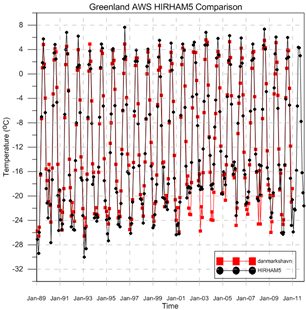
One of the problems all modellers face, but particularly in remote regions of the earth like Greenland, is the lack of available independent observational data which can be used to compare with model output to see how well the model simulates reality.

Compariosn between modelled and observed monthly mean temperatures for Danmarkshavn using DMI automatic weather station data and HIRHAM5 model output
Comparison between modelled and observed monthly mean temperatures for Danmarkshavn using DMI automatic weather station data and HIRHAM5 model output
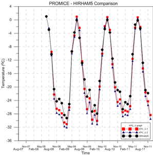
Comparison with Promice KPC_U station observations and HIRHAM5 modelled monthly mean temperatures

I actually spend much more time trying to model the recent past (say the last 35 years or so, almost my whole lifetime), rather than the future. We can compare the model output with specific metrics to assess if the model is representing any particular processes well or poorly. If the latter then clearly we need to do a bit of work to improve it, or alternatively we can gain an insight into how a particular process or system works. This is a gigantic topic to explore and I recommend the blogs Variable Variability from Victor Venema and the Climate Lab Book from Ed Hawkins and Doug McNeall if you really want to get into it.

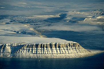
(As an aside and related to my previous post, I generate model output faster than I can look at it, so any students who are interested in a project looking at observations and model output for any/all of various locations in the Arctic do get in touch. I have some particularly interesting results from Devon Island I don’t really have time to get into right now…)

Image of Devon Island from the Canadian Encyclopedia

At a recent meeting in Sheffield we had much discussion on using data from Greenland to evaluate how well the different climate models are performing over Greenland. This is complicated by the generally short records and limited geographical coverage of meteorological observations. Often those observations are made in easy to get to places rather than the places we really need them such as the South East of Greenland where most of the precipitation falls. So here is a quick run down of the met observations I do have access to.

The gold standard of met observations, following guidelines set by the WMO, are the DMI weather stations (pdf ) which are largely confined to the coast of Greenland, plus Summit station at the top of the ice sheet, but have records going back, in some cases, to the 18th century. This data is all publically available and can be downloaded in a zip file from DMI.

Henrik Krøyer Holm weather station in Northern Greenland. It's very expensive to maintain so it is visited only once every 3 years or so. Like most instruments in Greenland, it is built to be tough. Picture from DMI archive
Henrik Krøyer Holm weather station in Northern Greenland. It’s very expensive to maintain so it is visited only once every 3 years or so. Like most instruments in Greenland, it is built to be tough. Picture from DMI archive

On the ice sheet itself the GC-Net project has set up automatic weather stations on the ice sheet. This data is also pretty freely available, but it does have some quality problems as with any dataset from instruments operating in incredibly tough environments. These instruments are high up on the ice sheet in the accumulation zone, more recently the Danish funded PROMICE project, with whom I work quite closely, have been putting automatic instruments out in the ablation zone. Although these instruments are lower the conditions are also quite tough as the snow and ice under the stations melts out each summer and in some locations the piteraq is also very challenging with 150km/h wind speeds measured during one storm in 2013.

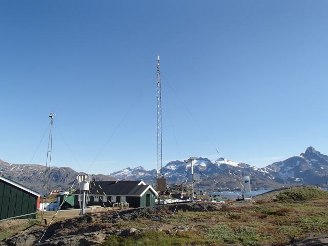
Weather station in Tasiilaq, one of the longest records in Greenland and in one of the most data sparse regions. Image from DMI archive

The data from Promice goes back only to 2008 but has been quality checked and homogenised so it is much easier for modellers like me to work with and it comes from a zone that is particularly important to understand. As the climate changes we expect the ablation zone to get bigger and melt to increase with some important but difficult to model processes such as retention and refreezing and albedo changes playing a big role in how quickly the Greenland ice sheet will contribute mass to the oceans.

There are of course also a number of other automatic weather stations operated by other projects and agencies, including the K-transect instruments, operated by University of Utrecht IMAU which are also associated with a long time series of mass balance measurements based on stakes drilled into the ice sheet.

For precipitation measurements, which are notoriously difficult to make especially with blowing snow, we tend to rely on shallow cores and snow pits, though again these are only available in the accumulation zone. This open access paper by our friends at the University of Copenhagen‘s Niels Bohr Institute is a very nice summary of all the measurements available. Unfortunately there are very few shallow cores taken after 2000 and even fewer taken where we need them in the south east.

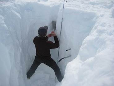
Promice scientist measuring snow density in a snow pit in southern Greenland
Promice scientist measuring snow density in a snow pit in southern Greenland taken from this piece on fieldwork on the polarportal

I will end with a plea: all of these measurements are made possible only with budgets that have a continuous downward pressure on them. We rely on them for the weather forecast and for climate research, if you use any of this data do remember to acknowledge it. A lot of time effort and money has gone in to making those measurements, once a station is removed it’s pretty hard to get it back again. When the DMI stations were set up no-one was really thinking of climate change, they were more concerned with shipping and later on aviation and yet we now find them some of the most valuable datasets we have making measurements in a very data-poor region, the Arctic. That is true data gold.

Calling all students…

I’m off to the UK next week for a workshop at Sheffield University where we will discuss the Surface Mass Balance of the Greenland Ice Sheet. The ISMASS workshop includes all the main modelling groups and observation groups who are involved in assessing surface mass balance in Greenland. I will be representing DMI’s Greenland SMB work there (not an easy task condensing it down to a 20 minute talk!).

In the course of preparing my presentation I have been making plots and figures and really investigating some exciting results. Sadly, I very rarely get the chance to spend time on this these days and I am keen to recruit students to assist in this work. Should any potentially interested students want to discuss this at Sheffield do let me know.

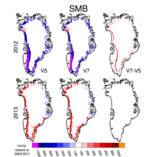
At the risk of spoilers in my presentation, here for example is one showing how different ways of characterising the surface snow pack affects our estimates for surface mass balance, and how the effects of the specific changes can be very different in different years.

Surface mass balance map plots of Greenland
Surface mass balance for the hydrological year (Sep -Aug) ending in 2012 and 2013 calculated using HIRHAM5 with 2 different surface schemes. The maps on the right show the difference between the 2.

As I mentioned I rarely get enough time to analyse the output from our runs and I would be very happy to hear from any students who are interested in doing a project on our simulations. We have lots of MSc and Bachelors projects already listed on our website at DMI but we are always happy to hear new ideas from students on related topics. I have terabytes of data from simulations I would like to be properly analysed and this could be very interesting given we are talking about Greenland and the Arctic in the present day and in the future. It’s a really nice opportunity to work with some cutting edge research. I am also happy to hear from students who would like to do a summer project and for the right candidate I would be able to look into a paid “studentmedarbejderhjælper” position for a few months, especially if you are already a trained computer science candidate….

If you are an undergraduate looking into an MSc, I urge you to consider Denmark. EU citizens usually qualify for generous support grants (rare these days!) as we have a shortage of candidates wanting to study in the sciences in Copenhagen. The research and teaching are world class and done in English at MSc level. The possibilities for projects in Greenland are literally endless.

If you want any more details or to talk about any of the possibilities, do get in touch!