How to survive in research…
Over on Blue sky I found a link to this piece by Daniel Nettle – a reflection on life as a researcher, the race for the glittering prizes of high profile publications and how to “succeed” in academia, where succeed has the simple metric of ‘in ten years.. to have remained alive, and ideally continued doing some research.’

I found myself very much nodding along with the sentiments of the piece, the conceit that
“Our seduction was by the primary research process: the idea that you could find a question; hit on your own approach; perform and manufacture the work; and finally, see it there in print, with your name attached, a thread woven in to the tapestry of human knowledge. A thread of memory.”
that also motivates me and apparently others in the research world. I still think that idea of building something bigger, no matter how tiny the contribution, the sum total of knowledge is a motivating factor. As Daniel writes, it’s a seduction, but it is also one that resonates and lasts, even through those years when the grind gets you down…
This part also made me laugh in recognition about what makes people persevere in research:
“If she [a student interviewing professors about success in academia] knew how narrowly I have hung on, I thought, she might have chosen someone else for her assignment.”
It’s not always easy keeping going, much of our work requires intrinsic motivation and it too often dissolves into something self-destructive. Famously, science and research in general is prone to mental health problems and I rather liked the characterisation here:
“Periodic demoralization and depression are not rare amongst researchers. It’s not not caring any more, or not being able to be bothered, as depression is often and erroneously characterized. It is caring so much, being so bothered, that one cannot advance on any front. One drowns in one’s own disorganized and gradually souring passion. This feeling is probably near-ubiquitous too.”
But persevere we do and persevere we must and where I thought this piece gets really interesting is where he points to the techniques and lessons that lead us to surviving the academic environment. As the essay is rather long, and a pdf, I thought I would summarise his main lessons here. The first one is I think the most important and while he calls it every day has to count for something (where every day means every *working* day, time off is still essential). I prefer to summarise it as just one thing.
Lesson 1. Every day has to count for something
“I try to start each working day with a period of uninterrupted work. Work, for me, is: collecting data, analysing data, writing code, drafting a paper, writing ideas in a notebook, or just thinking. Things that do not qualify as work are: background reading, literature searches, answering correspondence, marking students’ assignments, peer-reviewing a paper, sorting out my website, correcting proofs, filling in forms, tidying datasheets, having meetings, and so on.”
This goes back to paying yourself first. I’m not always very good at doing it, but I also try to do something meaningful and deep work like each day. Part of the reason I have found the last few months quite hard at work is a surfeit of meetings, workshops and travels, which have been in general quite destructive and distracting from the main work of the day, which could probably be summed up as, learn how the icy bits of the world work. My #AcWriMo efforts as well as #30dayMapChallenge in November were in effect just the kick start I needed to get back into the real scientific work of research, because as Daniel Nettle so eloquently put it:
Daily deep work keeps the black dog away, for there is nothing worse for mood than the sense that one is not progressing. And it can spiral in a bad way: the more you feel you are not progressing, the worse you feel; the worse you feel the more your hours become non-deep junk; and the more
exhausted you are by non-deep junk hours, the less you progress.

Lesson 2. Cultivate modest expectations
This was a curiously freeing part to read and I absolutely agree with it. Too often what John Kennedy calls Natureorscience papers are seen as the gold standard. And yet as Daniel Nettle eloquently points out:
the glittering prizes we academics strive for are positional goods kept deliberately scarce by bureaucratic or commercial interests, and allocated in ways whose relationship to long-term value is probably quite weak. For example, Nature is a for-profit enterprise that rejects nearly everything in
order to defend its exclusive market position. If we all send everything there, the rejection rate goes up. If we all increase the quality of our science, it still nearly all gets rejected, by the very design of the institution. The idea that all good papers can be in Nature or Science is as ludicrous as the idea that all Olympic athletes can get gold medals, but without the strong link between actual ability and finishing position that obtains in the Olympics.
It’s absolutely true that a natureorscience paper on the CV is seen as a big thing, the ultimate to strive far. And it is. Getting through the review process is in itself an achievement. But it’s also worth bearing in mind that many natureorscience landmark studies don’t stand the test of time. They rarely shift paradigms, though they can focus attention on new subjects, and sometimes that’s a new and important field. And sometimes it’s a distraction. I can think of several notable examples published since I started working in glaciology (but no, I’m not going to call them out here). The text in these journals is often far too compressed to get important details in, I recall an old mentor suggesting that the natureorscience paper is the advert, the starter that reels you in. The good stuff, the actual filler that makes you look at the world anew with its insights, new methodologies and the rest, is very often in a very different journal. So go for natureorscience if you get the opportunity, and if you have the results, but aiming for there from the start is not necessarily the right way to position your research career. Though as this post is now veering dangerously towards giving advice rather than simply expressing my usual slightly scrambled thoughts, take this one with a dollop of Atlantic brine..
For what it’s worth though, I do believe this:
Great art often begins on the fringe. Similarly, valuable future paradigms and innovative ideas start life in obscure places. Journal editors cannot yet see their potential, and the authors themselves are tentatively feeling their way into something new. So by focussing on capturing the established indicators of prestige, you distort the process away from answering the question that interests you in an authentic way, and into a kind of grubby strategizing.
Or so I tell myself, admittedly through clenched teeth at times.
Lesson 3. Publish steadily
Is back to just one thing in a way.
the mistake a lot of people make is focussing too much on getting the big shot, the single career-establishing paper in a top journal, and therefore not quietly building up a solid, progressive portfolio of sound work.
Doing the work is the best advice I can give and the advice I would give myself back in the early days of what has become (almost by accident) a research career. Now, I would hesitate to say publish something every year. I know scientists who insist on one first author paper a year, and some who strive for 3. Both seem arbitrary and potentially dangerous in terms of motivation, particularly for a young ECR just making their first steps and unsure of how to do it. Nevertheless it’s certainly true that, regardless of publish or perish, just the feeling of making forward progress, however incremental, is so important. Keep the momentum going. It’s part of what makes the traditional british PhD ending with a big book so hard, there’s no feedback on the way. Just an hour a day (or even an hour a week in busy times) is enough to keep me moving forward, and it’s often enough to produce a decent paper, eventually. And don’t worry, science is highly collaborative, I wouldn’t be able to do it without all my colleagues to remind me on, nudge me to get on with something and keep the wheels turning. I love you all for it too…
So if you are worrying about staying the game, rather than planning your next Science publication, I would ask yourself where your 1-2 solid papers each year are going to come from. Just as you should not go a single day without proper work, you should not go a single year without publishing anything, as one year rapidly becomes three.
Lesson 4: Get your hands dirty
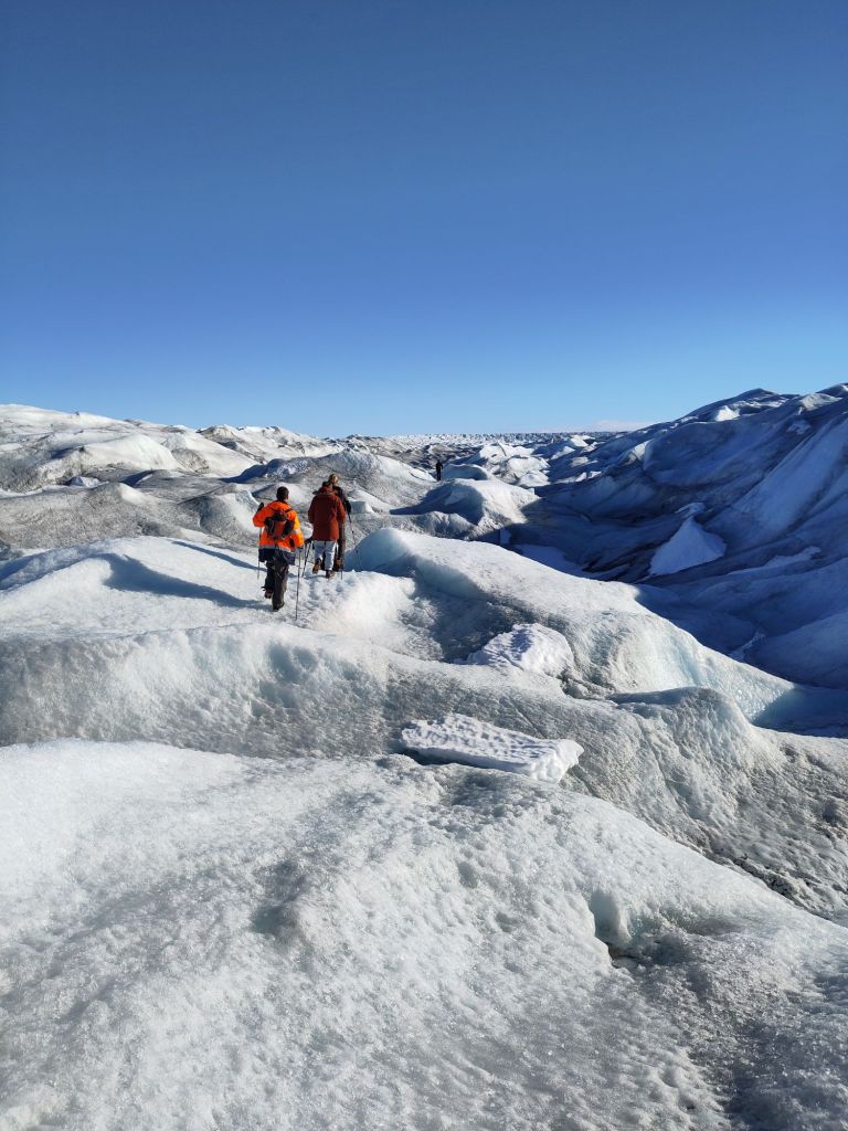
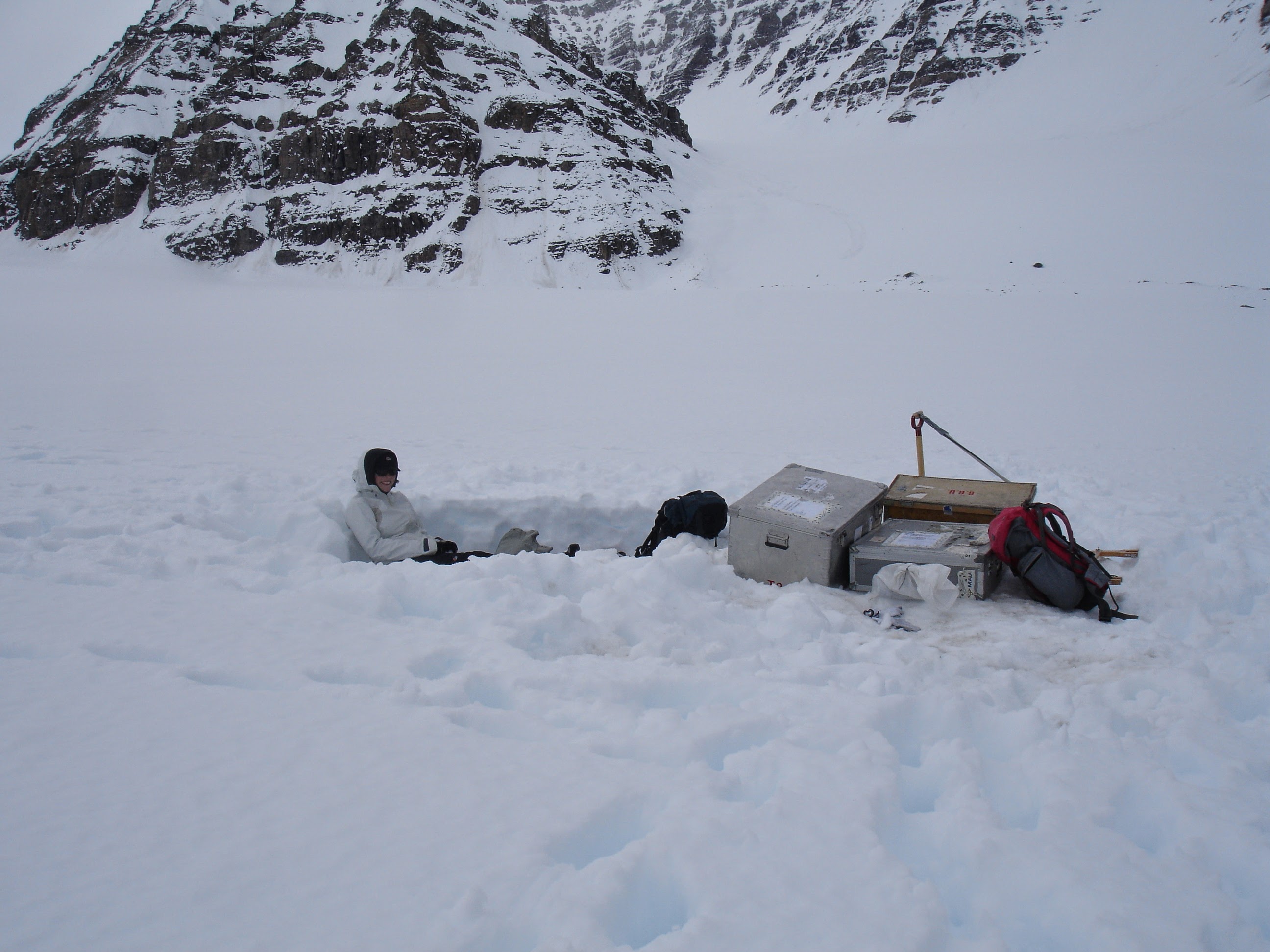
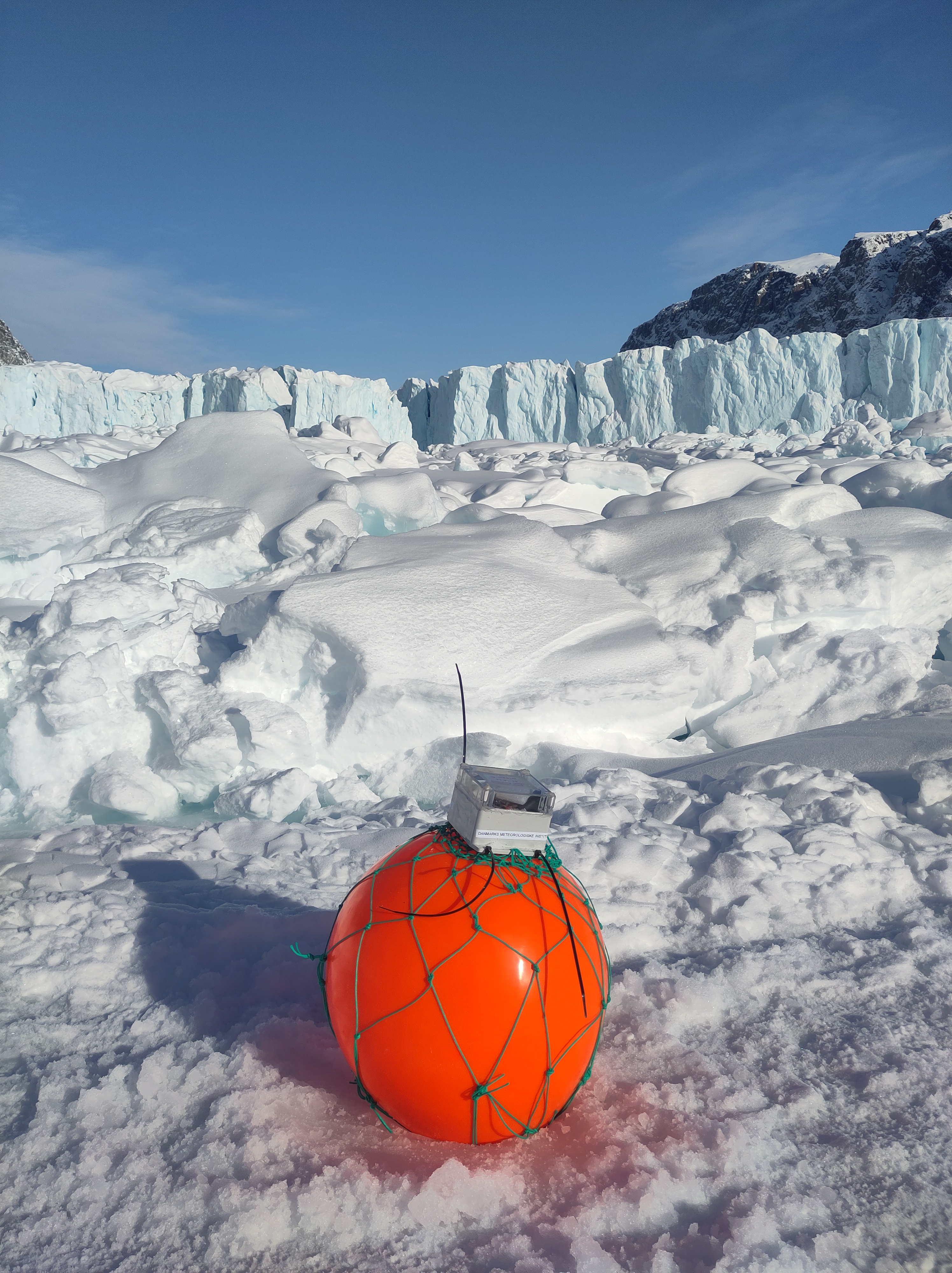
This is why I do field work. But it’s also why I’ve embraced the opportunity to learn more about deep learning and AI/ML methods. Learning new stuff is exciting, it keeps you fresh and helps make new connections. It’s when disciplines cross-connect that the exciting stuff happens and the sparks fly in the brain.
“Keeping your hands dirty also means learning how to do new things. And this is a good thing: the skills I picked up in graduate school could not possibly have sustained me this long. Learning new skills has always paid dividends of one kind or another; and stepping back from doing primary research myself has always been the point at which things have started to go less well.”
I have written one too many white paper style articles recently, it’s time to go back to the field, and back to the code to see if we can make things better by integrating the data and the models.

A note of caution though, it’s always easier to start something new than finish an old project. The best colleagues will help you stay on track and make sure you finish what you started!
I’m going to add one more point, which isn’t expressly mentioned in the original piece that started this ramble:
Lesson 5: Cultivate outside interests.
Far too many of us put families, friends, sports, hobbies and anything else that doesn’t taste of work to one side, in pursuit of the all-consuming. It’s not only not healthy, it’s also limiting. The brain needs time off to churn away by itself. You can’t force that unconscious process. Better to take a long walk to admire the flowers than try to twist your brain in knots when you hit a wall. A good night’s sleep is an amazingly effective part of the research process too.
So there we have it, some thoughts on being a (mid-career) scientist and how I have managed to stay in the game. YMMV as the Americans say.
Finally, all that I have said relies on having a supportive employer and good colleagues. The sometimes horrifying stories (take for example this one) of people being pushed out by bullying colleagues, or structural discrimination is a whole other story. And not one I’m going to take on here, but I would point out that without organisation, labour inevitably gets crushed by capital, so organise, join a union, find out what your rights are and make sure that you have a supportive hinterland to help you get through the bad times.
And everyday, do just one thing to help you advance.