On the 16th may 1619 two ships, the Unicorn and the Lamprey, set sail from Copenhagen searching for the fabled North West Passage. On board there were 65 men, led by their captain, the Danish explorer Jens Munk. A year and a half later, the Lamprey limped back into Bergen (Norway) with just 3 men, including Munk, on board.
Almost all of the other crew members had died of scurvy in Hudson Bay .
The story of this terrible voyage, their sailing round Iceland, Greenland, Baffin Bay and into Hudson Bay is outlined in this wonderful atmospheric podcast from DR.
A Map, hand-drawn by Jens Munk in 1624 of the area between Cape Farewell and Hudson Bay, seen from the north; (Source: Tromsø University library)
The UK has similarly many tales of Arctic and Antarctic suffering, listening to the podcast I was put in mind of Coleridge’s famous “Rime of the Ancient Mariner”, but we rarely hear of the similar stories from other nations, a clear benefit of learning other languages is being able to access these archives and stories*.
The podcast contains a wonderful description by a Greenland pilot of the sea ice and how tricky navigating it can be along with interviews and inputs from many others. If you are at all familiar with Danish – I really recommend the series.
However, the description by a nutritionist of the terrible effects of scurvy had me wondering. I learn (via Dutch family and confirmed by the OED) that the name of the disease, caused of course by a lack of vitamin C in the diet, is probably from the Dutch Scheurbuik – rip belly – an eloquent description of one of the notable later stages of the disease.
Rip here is less a description of enhanced musculature and much more a description of what it feels like when your internal organs start to bleed and your muscles and bones are weak from lack of nutrition.
Photo of chest cage with pectus excavatum and scorbutic rosaries – from this paper
Upon looking it up (Thankyou Wikipedia), I learn that the causes of scurvy had been repeatedly identified, forgotten and mistaken since at least the middle Ages. There is an estimate that around 2 million sailors died as a result of scurvy between 1500 and 1800.
2 Million almost entirely preventable deaths and 2 million men who died in appalling agony.
And this happened in spite of what appears to be the first recorded medical trial by James Lind in the 1750s, it still took the Royal Navy 40 years to start giving out fresh citrus fruits as a standard on their ships. Vitamin C itself was only finally recognised and extracted in 1932.
This story is an outrage in many ways, but a clear example also of how science and medicine, properly conducted, can help to improve and save lives. It is also a clear warning to conduct thoughtful experiments with care and to listen to those warnings when they have been issued.
It might also be a recommendation that learning foreign languages is not only fun and useful but can be it’s own reward.
*I should also mention here that the rather awesome Danish Arctic Institute are currently producing a very well written series on Danish exploration in the Arctic in English, based on their own very comprehensive podcast series. These are published online in the Arctic Journal. Both the series of historical accounts and the newspaper in general are absolute top recommends for those interested in the subject of the Arctic environmentally , socially and politically.
The lure of the poles (Svalbard in Spring, the coldest time of year)
Extract from “Rime of the Ancient Mariner” by Samuel Taylor Coleridge
UPDATE: The Arctic Sea ice Outlook I mention in the post below has just been published for 2016. We will follow this up in September when the final results will be known, but here are the 30 entries using a rage of different techniques including sophisticated computer models, statistical estimates and what is kindly called “Heuristics” but which may be characterised as an educated guess by people who have been studying this field for a while…
Professor Wadhams has not contributed an estimate this year but it can easily be seen that none of the estimates reach as low as the putative 1 million square kilometres. Nonetheless the view of 27 expert climate scientists put forward by Kay, Bailey and Holland (pdf), not to mention the very sophisticated RASM model (one of the most sophisticated in this area, run by the US Naval Postgraduate school), put the September extent at a very low 3-4 million km2, in the same range as the record low of 2012.
It will be interesting to see how low it does go. The latest results from the polar portal show that Arctic sea ice is currently still on the record low 2012 line but a careful look shows also that the 2012 and 2013 curves diverge around mid to late June. The year 2013 is pretty representative of a “new normal” over the last 4 years or so, it is therefore difficult to tell based on simply extrapolating along the curves which path 2016 is likely to follow.
The area covered by at least 15% sea ice in the Arctic from 1981 to present, the black and red curve shows the year 2016 and is updated daily on the Polar Portal
The Polar Portal has become part of our daily life at DMI where I work in the last few years, it combines detailed observations and models from the Greenland ice sheet, the Arctic sea ice and, soon hopefully, permafrost. I am particularly involved in the Greenland pages where we daily calculate the amount of snowfall and snow melt which gives us a surface mass budget and which we sum up over the year to work out what it means for the health of the Greenland ice sheet. This year has been especially interesting with an extraordinarily early start to melting driven by warm Arctic temperatures. Many records in Greenland have been broken in April, May and June. Spectacularly, last week Nuuk set a new temperature record for June that managed to last only 24 hours, before it was broken again.
Crossing the sea ice in front of Paulabreen, a surge type glacier with a calving front in Svalbard
I trained as a glaciologist originally, but even then I came across sea ice and was first of all unnerved by it, crossing on scooters to visit glaciers in Svalbard, and then fascinated by it. Recently I have been working pretty closely with my colleagues in DMI who are sea ice scientists and I have learnt quite a lot. We even published a paper together in the journal Polarforschung earlier this year. Not only that, I am now part of a big ERC Synergy project known as ice2ice with scientists at four institutions in Bergen and Copenhagen working on the complex connections between sea ice, ocean, atmosphere and ice sheet in the Arctic. More on that another time, but suffice to say it’s fascinating work and I know a hell of a lot more about sea ice than I did even three years ago.
So when this news story crossed my email this evening courtesy a BBC researcher and journalist I knew pretty well straight away what it was about. Basically the scientist Professor Peter Wadhams had made some statements about the extent of Arctic sea ice which might be considered somewhat eyecatching.
Professor Wadhams is a well-known scientist who did some incredibly valuable and indeed ground-breaking early work on sea ice. More recently he has also done some very valuable work reconstructing thickness based on submarine observations during the Cold War (see below on why this is important). I well remember seeing him talk about this as a young graduate student, he is an excellent speaker and gave a very interesting and compelling talk. In the last few years he has made several statements that have been widely reported and perhaps misinterpreted, with regard to the future fortunes of the Arctic sea ice.
Now, I need and want to be clear about this. Most of the global climate models we use are not very good at reproducing the observed historical sea ice extent. They have improved significantly in the last few years but still struggle to reproduce the actual observed decline in sea ice area from satellites. And there are actually very good reasons why this should be. There are some very good stand alone sea ice models which have done a very good job and the key difference between these models is our clue. Sea ice models are generally partly forced with actual observations, or climate reanalyses which assimilate observations, so the atmosphere and the ocean are close to reality. Basically sea ice responds to weather, and if you have a more accurate weather driving your sea ice model you will get a better fit to the observations.
So, is Professor Wadhams correct? Will the sea ice “disappear” this year.
Well, it is pretty clear that given the changes we have already observed in the Arctic, as well as what we know about Arctic amplification and the general direction that anthropogenic emissions are heading in, that unless something changes pretty soon, we will likely see an end to a significant cover of sea ice in the Arctic at some point in the next few decades. But was does that actually mean?
Reading his actual comments in the article he appears to define 1 million km2 as “no sea ice” and that partly reflects how we define sea ice extent. Since most of the data sets use a cut-off figure (typically 15%) to define when a grid square or pixel is or is not a sea ice point. This is known as sea ice concentration and is really something of a hangover from the days when sea ice was observed from ships and an attempt was made to estimate how much sea ice in the area was around the vessel.
There are however lots of things that can affect sea ice extent, including winds and currents and melt ponds. The latter also affects how different algorithms assess the area that is or is not covered by sea ice. As there are a number of different sensors in use and a number of different algorithms processing that data, it is not entirely surprising that there actually a number of different estimates (I will use OSISAF) for how much of the Arctic is covered in sea ice. And this number will vary in years with more winds for example, or stronger ocean currents, sea ice will disperse faster. It is quite likely that much of the variability in sea ice area in recent years is at least partly attributable to different winds, as well as, for example in 2012, big storms that have arrived at just the right moment (or wrong one depending on how you look at it), to break up the sea ice into smaller, more easily transportable pieces.
As an aside, a better measure for how much Arctic sea ice there is actually present is sea ice volume. Unfortunately this is very difficult to measure, especially outside the winter freeze up season, though a research group at the UCL, centre for Polar Observation and Monitoring have developed a way to do so. Here for example is the most recent plot, which as you can see has not been updated since May 2016 due to the presence of melt ponds on the surface of the sea ice which the Cryosat radar cannot penetrate.
So 1 million km2 is probably a reasonable cut off for assuming an “ice-free” Arctic in the sense that it indicates that there will still be some sea ice drifting around (it always forms surprisingly quickly when the winter begins) in summer, even if it is dispersed.
Over the last 40 or so years (we have good observations going back to 1979, it gets patchy after that), in September, when the area covered by sea ice is at it’s lowest, that extent has been between about 7 and 9 million km2, more recently that has dropped and 2012, the lowest on record had an extent of about 4 million km2, which you can see on the latest polarportal sea ice chart below.
I well remember 2012, we had a large melt event over Greenland that year also, but it was still quite a long way from the 1 million km2 quoted by Professor Wadhams. Again, let me be clear, we are pretty sure that at some point on a time scale of a few years to a few decades, the Arctic will become “ice-free” in the summer time. We can predict this, even if we don’t know exactly when, since, as I hope is clear now, sea ice conditions are very dependent on the weather. The weather this year so far, at least this Spring has been very warm and congenial to sea ice melt. The big dive shown on the graph above is no mystery when considering some of the temperature anomalies in the Arctic, as shown also on the Polar Portal.
Nevertheless, the recent plots seem to show that the 2 metre air temperature in the Arctic is returning to close to normal and there is little reason to suppose that will change significantly anytime soon.
Having said that, weather forecasting has improved massively in the last few decades, a true quiet revolution, but we still do not know how the weather will pan out over the whole of this melt season. I am sure that at some point Professor Wadhams will be proved correct, but we do not know when and it is even possible or rather likely that we will have a few years where we switch back and forth between ice free and not ice free conditions. So, the answer to the question I pose above is probably no. But don’t bet on it remaining so for too long.
UPDATE: I recalled this morning on my way in to work that I had somehow failed to mention the Sea Ice Prediction network. This group of people under the auspices of ARCUS, gather predictions on y´the end-of-season sea ice extent ever year. The call for predictions for the 2016 season is now open. Many different research groups as well as one or two enthusiastic amateurs will post their predictions over the next few weeks. It is an interesting exercise, as you can see based on last year’s report (see also figure below), it is not the first time that Profgessor Wadhams has predicted a 1 million km2 extent in September, and his is the lowest (and least accurate) in the rankings.
Endnote: There has been quite an absence of posts from this blog recently. I have been too busy with work, family, travel and more recently the EU Referendum (for which I have been threatening a post for quite some time and may yet get around to before polling day). However, a question about Arctic sea ice has been flickering on the edges of my consciousness for a while now so this was a quick (EDIT: not so quick!) blogpost to try and address it when I should actually be writing something else…
“The Arctic is one of the last great pristine ecosystems, a safe haven for endangered species and home to Indigenous Peoples whose lifestyle has survived in harmony with nature for thousands of years.”
This quote in the wake of COP21, extracted from a celebrity I’ve never heard of (sorry, I’m just not that interested in actors) raised my hackles as it repeated yet again the idea that the Arctic is “pristine”.
Even without contemplating climate change, it is most certainly not, as the polar portal season report I was vaguely involved in compiling this year made clear.
The “pristine” wilderness of Von Postbreen, Svalbard
There is a whole literature in the humanities on Orientalism and “othering”, about how we define other people and places partly to define what we are not. I’m not sure if there is a term for this narrative of a “pristine wilderness”, let us call it “pristinism ” for want of a better term. But before I list the ways in which the Arctic is not pristine, let me make very clear, I am well aware I also suffer from pristinism, to some extent. What my boss teasingly refers to as “the white disease”, the fascination with snow and ice that makes me want to leave the comforts of house and home and go and live somewhere deeply uncomfortable, and indeed dangerous in order to plumb the mysteries. I have been visiting the Arctic for well over 12 years now, though as most of my work is on computer, I don’t get the option so often anymore. Maybe that’s a good thing, perhaps the last thing the Arctic needs is more people flying to it.
The ecosystem has been significantly degraded by the loss (hopefully now in reverse) of most of the large cetacean species by commercial whalers. Similarly, walrus and polar bears in Svalbard were almost rendered extinct before hunting was banned. It also appears there were walrus in Iceland when the vikings arrived that, like any polar bear at the present day arriving on Icelandic shores, were quickly dispatched. The Greenland vikings were certainly rich from walrus ivory as their main source of income. Not content with exterminating the walrus the early settlers sent their sheep out and very successfully deforested the 25-40% of Iceland that had been forested, leading to dust storms, soil erosion and the unfortunate inability to build boats to get anywhere else very far away. Deforestation has only recently begun to be reversed. In much the same way Musk Oxen were virtually eliminated from Eastern Greenland by hunting, but then rather too successfully introduced to the west where there has been a population explosion.
Fish stocks have at least been largely preserved in Iceland (sensible given how important fishing is to the economy), but there have been several notorious crashes in different fish species in the North Atlantic and around Greenland. Although, to be fair these latter seem to be at least partly caused by changing ocean temperatures rather than purely overfishing. Then there are the invasive species, largely limited so far to the (admittedly delicious) King crab , an omnivore that will eat everything in it’s path much to the fear of some local ecologists around the Arctic coast of Norway.
And then there are the birds. Different bird species face declining populations due both to loss of habitat outside the Arctic as well as hunting in the Arctic region. I was somewhat surprised, though in retrospect I should not have been, at the very few bird numbers that I saw while on a kayaking trip within an easy boat ride of Nuuk.
I would have seen many more in the Scottish islands, but if a subsistence species is within easy reach of a large town (which in themselves would have been impossible prior to colonisation), it is an inevitable tragedy of the commons waiting to happen. Similarly, seals are incredibly wary and remain as far from people as possible in Greenland, a big contrast to the rather trusting and curious creatures I have been able to paddle very close to around the British Isles. And Heaven help any polar bear that strays too close to any Greenlandic settlements, legal protection or not…
Part of the problem are the difficulties birds have in reproducing. This is at least partly down to the toxic mix of chemicals stored in their fat, which comes out in a rush when these animals and birds have to live on their body fat supplies – as they do each summer when incubating eggs. These eggs also appear to contain high levels of mercury, cadmium, PCBs, organochlorines, dieldrin to mention just a few, with an effect on the developing bird embryos inside and of course anything that eats either bird or eggs.
And this of course is because that “pristine” Arctic has an extremely high concentration of industrial chemicals, heavy metals and other by-products of our manufacturing society. Albeit a long way from most sources of production. I was once fascinated to discover that all sorts of historic events such as the Greek and Roman production of silver (and it’s leaden by-product) could be identified in the Greenland ice cores, as could the introduction of leaded petrol and it’s later phasing out. The atmosphere acts as a kind of distillation column, concentrating these poisons at the top (and bottom) of the world, not to mention the local sources. There are coal mines in Svalbard, aluminium smelters in Iceland and Greenland, the oil + gas fields of Alaska, Newfoundland, Norway and Russia. Not to mention god only knows what hazardous (radioactive?) waste is leaching away from forgotten islands in the Russian sector of the Arctic.
Three polar bears take over an abandoned dog shed for a sleep in the shade, Svea coal mine, Svalbard
In the food chain, the little animals get eaten by the bigger ones, which get eaten by the bigger ones, concentrating and accumulating toxic chemicals all the way to the top of the food chain.
To us.
Because humans are, in the Arctic at least, the top predator.
Yet at the same time we in the crowded, populated mid-latitudes project our fantasies of a pristine fairy-tale at the top of the world.
Sorry.
The Arctic is very very far from pristine, and if what happens in the Arctic doesn’t stay in the Arctic, the reverse is also true, the Arctic is part of this world for good or ill. There is however, no doubt that it exerts a powerful pull on our imaginations.
There is a reason poor old Ursus maritimus has become the poster children of climate change. Perhaps it’s all the bright white snow and ice, even if the Arctic Report card shows us the browning of the Arctic as snow lies for ever shorter periods at the same time as sea ice cover at the end of summer is similarly declining…
From the Arctic report card 2015: “Northern Hemisphere (NH) June snow cover extent and September Arctic sea ice extent. Sea ice extent data for 1979-2014 are derived from the NASA Team algorithm (Cavalieri et al., 1996); ice extent estimates for 2015 are produced from real time data (Maslanik and Stroeve 1999). Bold red and blue lines are 5-year running means of the original snow and sea ice extent records, respectively.”
I am optimistic but cautious about the Paris agreement at COP21. I hope it will come in time to preserve some remnant of the Arctic wilderness, but even if it does we still have some big challenges to face. Sweeping these under the carpet for the sake of a convenient narrative about a pristine wilderness is not helpful. I have a great affection for the Arctic, the people and the wildlife that lives there. I started this post originally some time ago but failed to finish it as it made me rather depressed to think about, but then I was put in mind of this poem from Seamus Heaney and decided it was worth finishing after all with this piece.
Clearly, the myth of “The North” and “the Arctic” has been with us for some time, but surely we owe it to the Arctic and the peoples who live there to try and see through the “pristinism” and start to fix some of these challenges?
It’s been a while since I lasted posted anything, not for want of ideas but mainly lack of time. I shall try to catch up over the next few weeks. For now I was inspired to write an ultra-quick post about a very trivial question that came up at work today. I think it really captures how observational meteorology works (or should work).
Today, a colleague, John Cappelen, (also known as Mr. Greenland observational data), happened to mention in passing that on the 15th July this year, the weather station at Summit on the Greenland ice sheet had transmitted back to us in Copenhagen, a temperature observation of 2.5°C. This was during one of the highest melt periods this summer.
The automatic weather station doing it’s thing at Summit, June 2015. Photo: DMI
Bearing in mind that Summit Camp is at roughly 3,216m, this is a pretty high measured temperature. In fact it would be rather noteworthy, especially as it occurred on one of the highest melt days of the summer. Temperatures above 0°C at Summit are not unknown and the record, during the famous summer of 2012 when around 95% of the ice sheet surface experienced melt, the water sweeping away a bridge on the Watson River near Kangerlussuaq, was 3.6°C.
Now, my colleague is a very experienced and careful scientist. He had checked the observations and the temperatures before and after this measurement were well below zero, so, my colleague asked, was there any reason to believe this measurement or can we assume an instrument failure of some kind?
My office mate in the Arctic and Climate Research section and I obligingly had a quick look at our Polar Portal Greenland ice sheet surface plots (see below) and at the melt extent plots that are updated daily on the DMI website. We had to conclude there was no evidence of melt that high on the ice sheet and there was also no reason to believe that a sudden sharp warming had occurred at Summit on this day based on DMI’s own weather forecast. We then turned to check the weather plots, also on the polar portal and based on data from the European Centre for Medium Range Weather Forecasting (the ECMWF – probably the best weather forecast modellers in the world).
Again, the anomaly plots showed rather cold conditions prevailing over the ice sheet during this period, though at the same time very high melt and low surface mass balance from the ice sheet due to the clear skies.
Graphs showing area of the Greenland ice sheet experiencing melt conditions, compared with the average (dark grey line) and range of past summers (1990-2012), for more detail see the DMI websiteTemperature record from Summit Camp for the last month.
Fortunately, due to the American Summit Camp we have access to a back-up dataset very close to this location and after a quick web search John Cappelen was able to confirm that indeed this measurement was an error as the nearby station has not seen anything like that during the period in question (see right).
This kind of thing happens all the time and is therefore not at all newsworthy or interesting enough to write a publication about. However, when a recent record high temperature in the UK can lead to 2 critical articles in the Daily Telegraph and a particularly vigorous exchange on twitter for Met Office scientist Mark McCarthy, as well as this corrective piece on the Carbon Brief blog, perhaps we should be more vocal about just how careful and critical we as scientists are about observations, including the ones we decide to discard as well as the ones we keep.
Surface mass balance of the Greenland ice sheet on the 15th July 2015. Intense melting around the margins led to very negative SMB (the red colours) during this period.
Addendum: I was alerted by this tweet from Gareth Jones, also a Met Office scientist, to some slightly strange cherry picking in the blogosphere of climate records from a couple of DMI stations in Greenland.These have apparently been used to claim no climatic warming trend in Greenland over the 20th Century (I’m not going to link to it).
Anyone who is really interested in the observational data could try checking these reports by Mr Greenland observations himself instead, here is a quick summary:
Mean annual temperature in Copenhagen, Torshavn (Faeroes) and selected DMI weather stations in Greenland from 1873 – 2014. Figure from DMI
As an impressionable seven year old I learnt what a crevasse was; namely a large split in a glacier of great hazard to glacier travellers. This knowledge was imparted by a venture scout in my parents group who, on a climbing trip to the Alps, managed to end up in one, breaking several bones in the process. Years later this did not discourage me from my own forays into alpine mountaineering, so it was probably inevitable that I would have my own brush with mortality in a crevasse while researching them as part of my PhD work (see photo).
Some injuries, 3 days after falling into a crevasse (thankfully to be rescued by quick-thinking field assistants). Not a recommended “experience”.
The research was interesting and made more so by being carried out in such a spectacular environment. Breiðamerkurjökull is a southern outlet glacier of the Vatnajökull ice cap in Iceland. It’s actually one of the more popular tourist destinations in Iceland thanks to the boats that run on the lagoon in front of the glacier, getting people up close and personal with icebergs. The icebergs are one of the reasons we chose to work there, as the rationale of my Phd project was can a crevasse depth relation be used as a parameterisation for calving in ice sheet models?
Crevasses on Breidamerkurjokull, note figure for scale
Crevasses are extremely beautiful features to observe and they are interesting scientifically since they indicate all sorts of information about what is going on in a glacier. As they are aligned more or less with the principal stresses in a particular location we can see where a glacier is accelerating or decelerating, that is stretching or compressing respectively, based on the shape and alignment. They can also be used as a feature to track glacier velocity between two successive images taken from aircraft or satellites. Crevasses are also significant in other ways, since they are a plane of weakness that can be exploited by meltwater, channelling it away from the surface of the glacier to the bed changing the velocity of the glacier. And as proved in the case of my Phd work, when they extend deep enough in the right place, they cause large chunks of ice, namely icebergs, to fall off the front of glaciers.
Given all these interesting habits it is probably surprising to learn that the large computer models of ice sheets and glaciers don’t usually include crevasses in them, though there are some more recent honourable exceptions, mostly working with single outlets or small glaciers such as Sue Cook’s work with the Elmer model. This is because an individual crevasse is not only too small for the resolution of a model, it’s also a discontinuity, and the approximations of the physics of ice sheets do not easily allow discontinuities. To put it another way, when we model glaciers we usually assume they are really large and thick fluid bodies, and as everyone knows, fluids don’t crack. This is just another bizarre property of water, and if I get chance I’ll discuss that again in further detail in another entry. But back to crevasses.
Now I mostly work with a climate model, HIRHAM5, using it to calculate surface mass balance, that is accumulation of snow and the melt and run-off from the surface of glaciers and ice sheet. However, I am finally (loosely) involved in a project that sets out to finish in some way the work I started as a young PhD student.
At DMI we run the PISM ice sheet model, fully coupled with a global climate model EC-Earth as I wrote about in this post. We will also soon be running HIRHAM5 coupled to PISM in order to study feedbacks between ice sheet dynamics and surface climate forcing (mainly in terms of how topography and elevation of the ice sheet affects the surface mass balance). We also intend to participate in the ISMIP6 model comparison project which will compare the results of several different global climate models that also include ice sheets in a realistic fashion.
One of the key challenges in getting these running is how to deal with the ocean interface with the ice sheet, both in terms of submarine melt of outlet glaciers (likely a far more important process than earlier recognised) and in terms of calving icebergs. One of our main (and in my opinion most interesting) projects right now, ice2ice has allowed us to employ a PhD student to work on this specific issue. She will be using a similar idea to Faezeh Nick’s model of outlet glacier calving, which in turn was based on a long ago work (pdf) I was part of as a lowly PhD student.
By comparing the measured crevasse depths with numerical models I was able to show that simple models can be used as approximations of crevasse depth. That study is still one of the very very few where actual empirical measurements of crevasse depth, strain rate, spacing and other variables were made and compared with model output.
In my current incarnation as modeller I will be keeping very carefully away from all sharp fractures in the ice and concentrating instead on the model part. Expect updates here…
The climate of Greenland has been changing over the last 20 or so years, especially in the south. In this paper we showed that the amount of melt and liquid water run off from the ice sheet in the south west has increased at the same time as the equilibrium line (roughly analogous to the snow line at the end of summer on the ice sheet) has started to move up the ice sheet. Unlike previous periods when we infer the same thing happened this can be attributed to warmer summers rather than drier winters.
The area we focus on in this study is in SW Greenland close to Nuuk, the capital. White shows glaciers, blue is sea, brown is land not covered by ice.
We focused on the area close to Nuuk, the capital of Greenland, as we had access to a rather useful but unusual (in Greenland) dataset gathered by Asiaq the Greenland survey. They have been measuring the run off from a lake near the margin of the ice sheet for some years and made this available to us in order to test the model predictions. This kind of measurement is particularly useful as it integrates melt and run-off from a wider area than the usual point measurements. As our model is run at 5.5 km resolution, one grid cell has to approximate all the properties of a 5.5 km grid cell. Imagine your house and how much land varies in type, shape and use in a 5.5 km square centred on your house and you begin to appreciate the problems of using a single point observation to assess what is essentially an area simulation! This is even more difficult in mountainous areas close to the sea, like the fjords of Norway or err, around south west Greenland (see below).
The beautiful fjords near Nuuk. Represent this in a 5.5km grid cell…
The HIRHAM5 model is one of very few regional climate models that are run at sufficiently high resolution to start to clearly see the climate influences of mountains, fjords etc in Greenland, which meant we didn’t need to do additional statistical downscaling to see results that matched quite closely the measured discharge from the lake.
Graph comparing modelled versus measured discharge as a daily mean from Lake Tasersuaq near Nuuk, Greenland. The model output was summed over the Tasersuaq drainage basin and smoothed by averaging over the previous 7 days. This is because the model does not have a meltwater routing scheme so we estimated how long it takes for melt and run-off from the ice sheet to reach this point.
We were pretty happy to see that HIRHAM5 manages to reproduce this record well. There’s tons of other interesting stuff in the paper including a nice comparison of the first decade of the simulation with the last decade of the simulation, showing that the two look quite different with much more melt, and a lower surface mass balance (the amount of snowfall minus the amount of melt and run – off) per year in recent years.
Red shows where more snow and ice melts than falls and blue shows where more snow falls than is melted on average each year.
Now, as we work at DMI, we have access to lots of climate records for Greenland. (Actually everyone does, the data is open access and can be downloaded). This means we can compare the measurements in the nearest location, Nuuk, for a bit more than a century. Statistically we can see the last few years have been particularly warm, maybe even warmer than the well known warm spell in the 1920s – 1940s in Greenland.
Graphs comparing and extending the model simulation back in time with Nuuk observations
There is lots more to be said about this paper, we confirm for example the role of increasing incoming solar radiation (largely a consequence of large scale atmospheric flow leading to clearer skies) and we show some nice results which show how the model is able to reproduce observations at the surface, so I urge you to read it (pdf here) but hopefully this summary has given a decent overview of our model simulations and what we can use them for.
Regional Climate Model Data from HIRHAM5 for Greenland
In this post I am linking to a dataset I have made available for the climate of Greenland. In my day job I run a Regional Climate Model (RCM) over Greenland called HIRHAM5 . I will write a simple post soon to explain what that means in less technical terms but for now I just wanted to post a link to a dataset I have prepared based on output from an earlier simulation.
Mean annual 2m temperature over Greenland at 5km resolution (1989 – 2012) from HIRHAM5 forced by ERA-Interim on the boundaries [Yes I know it’s a rainbow scale. Sorry! it’s an old image – will update soon honest…]
This tar file gives the annual means for selected variables at 0.05degrees (5.5km) resolution over the Greenland/Iceland domain.
I am currently running a newly updated version of the model but the old run gave us pretty reasonable and could be used for lots of different purposes. I am very happy for other scientists to use it as they see fit, though do please acknowledge us, and we especially like co-authorships (we also have to justify our existence to funding agencies and governments!).
This is just a sample dataset we have lots of other variables and they are available at 3 hourly, daily, monthly, annual, decadal timescales so send me an email (rum [at] dmi [dot] dk) if you would like more/a subset/different/help with analysis of data. This one is for the period 1989 – 2012. I have now updated it to cover up to the end of 2014. The new run starts in 1979 and will continue to the present and has a significantly updated surface scheme plus different SST/sea ice forcing and a better ice mask.
I have also done some simulations of future climate change in Greenland at the same high resolution of 5km using the EC-Earth GCM at the boundaries for RCP4.5 and RCP8.5 scenarios which could be fun to play with if you are interested in climate change impacts in Greenland, Iceland and Arctic Canada.
Mean annual 2m temperature change between control period (1990 – 2010) and end of the century (2081 – 2100) under RCP45 from HIRHAM5 climate model runs forced by EC-Earth GCM at the boundaries. This plot shows the full domain I have data for in the simulations.
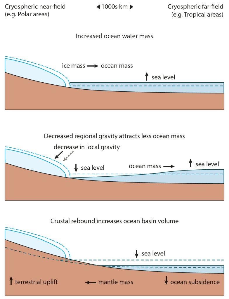
In the presentation I try to explain why we are interested in climate and ice sheets and then give a brief overview of our model systems and the projects we are currently working on. We are mainly interested in the Greenland ice sheet from the perspective of sea level rise. If we are to climate change we need to know how fast and how much of Greenland will melt and how this will change local and regional sea level. There are also studies showing that increased run-off from the ice sheet may change ocean circulation patterns and sea ice. There is lots more stuff to look at so feel free to download it.
I end up with a very brief overview of our biggest project at the moment, ice2ice. This is a large ERC funded project with the Niels Bohr Institute and partners in Bergen at the Bjerknes Climate Research Centre. I may write a brief post on ice2ice soon if I get chance. It’s a really interesting piece of work being focused on past glacial-interglacial climate change rather than present day or the future and I think we have potential to do some great science with it.
At the risk of seeming like I’m blowing the DMI trumpet (something rarely done or even really seen as socially acceptable in Denmark!), I think we at DMI have a lot to be proud of. We are a small group from a small country with limited resources but my colleagues have pioneered high resolution regional climate modelling of the Greenland ice sheet and the development of coupled climate and ice sheet models at both regional and global scales. I was brought in as a glaciologist to work on the interface between ice sheet and atmosphere, needless to say I have learnt a hell of lot here. It’s been an exhilarating few years.
If you have any questions, I will enable comments for this thread (but with moderation so it may take a while for you to see it).
Finally, here is a little movie of calving icebergs
shot by Jason Amundson, University of Alaska Fairbanks at Jakobshavn Isbrae in West Greenland.