PROTECT: The Sea Level Rise Question

There is currently some discussion in the Danish media about sea level rise hazards and the risk of rapid changes that may or may not be on the horizon. Some of the discussion is about IPCC estimates. That’s a little unfortunate and in fact a bit unfair as the IPCC report has not been updated since 2021, nor was it intended to have been. In the mean time there has been a lot of additional science to clear up some of the ambiguities and questions left from the last report.

I’ve been working quite a bit on the cryosphere part of the sea level question of late, so thought I’d share some insights from the latest research into the debate at this point. And I have a pretty specific viewpoint here, because I’ve been working with the datasets, models, climate outputs etc that will likely go into the next IPCC report as part of a couple of EU funded projects. As part of that, we have prepared a policy briefing that will be presented to the European Parliament in June this year, but it’s already online now and will no doubt cross your socials later this week. I’m going to put in some highlights into this post too.

Now, I want to be really clear that everything I say in this post can be backed up with peer reviewed science, most of which has been published in the last 2 to 3 years. Let’s start with the summary:.:

  • The sea is rising. And the rate of rise is currently accelerating.
  • The sea will continue to rise long into the future. The rate of that sea level rise is largely in our society’s hands, given that it is strongly related to greenhouse gas emissions.
  • We have already committed to at least 2m of sea level rise by 2300.
  • By the end of 2100 most small glaciers and ice caps will be gone, mountain glaciers will contribute 20-24% of total sea-level rise under varying emission scenarios.
  • Antarctic and Greenland ice sheet mass loss will contribute significantly to sea-level rise for centuries, even under low emissions scenarios
  • Abrupt sea level rise on the order of metres in a few decades is not credible given new understanding of key ice fracture and iceberg calving processes.
  • By the end of this century we expect on the order of a half to one metre of sea level rise around Denmark, depending on emissions pathway. (If you want to get really specific: the low-likelihood high impact sea level rise scenario corresponds to about 0.9 m (on average), or at the 83rd percentile, about 1.6 m of sea level rise).
  • Your local sea level rise is not the same as the global average and some areas, primarily those at lower latitudes will experience higher total sea level rise and earlier than in regions at higher latitudes.
  • We have created a local sea level rise tool. You should still check your local coastal services provider, they will certainly have something tailor made for your local coastline (or they *should*!), but for something more updated than the IPCC, with latest SLR data, this is the one to check.

Sea level rise now is ~5mm per year averaged over the last 5 years, 10 years ago it was about 3 mm per year). Much of that sea level rise comes from melting ice, particularly the small glaciers and ice caps that are melting very fast indeed right now. Even under lower levels of emissions, those losses will increase. There won’t be many left by the end of this century.

Greenland is the largest single contributor and adds just less than a millimetre of sea level rise per year, with Antarctica contributing around a third of Greenland, primarily from the Amundsen Sea sector. The remaining sea level rise comes from thermal expansion of the oceans. Our work shows very clearly that the emissions pathway we follow as a human society will determine the ultimate sea level rise, but also how fast that will be achieved. The less we burn, the lower and slower the rise. But even under a low-end Paris scenario, we expect around 1 metre of sea level by 2300.
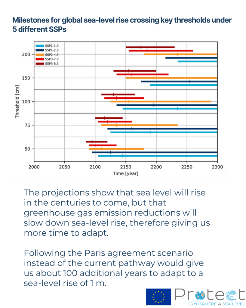
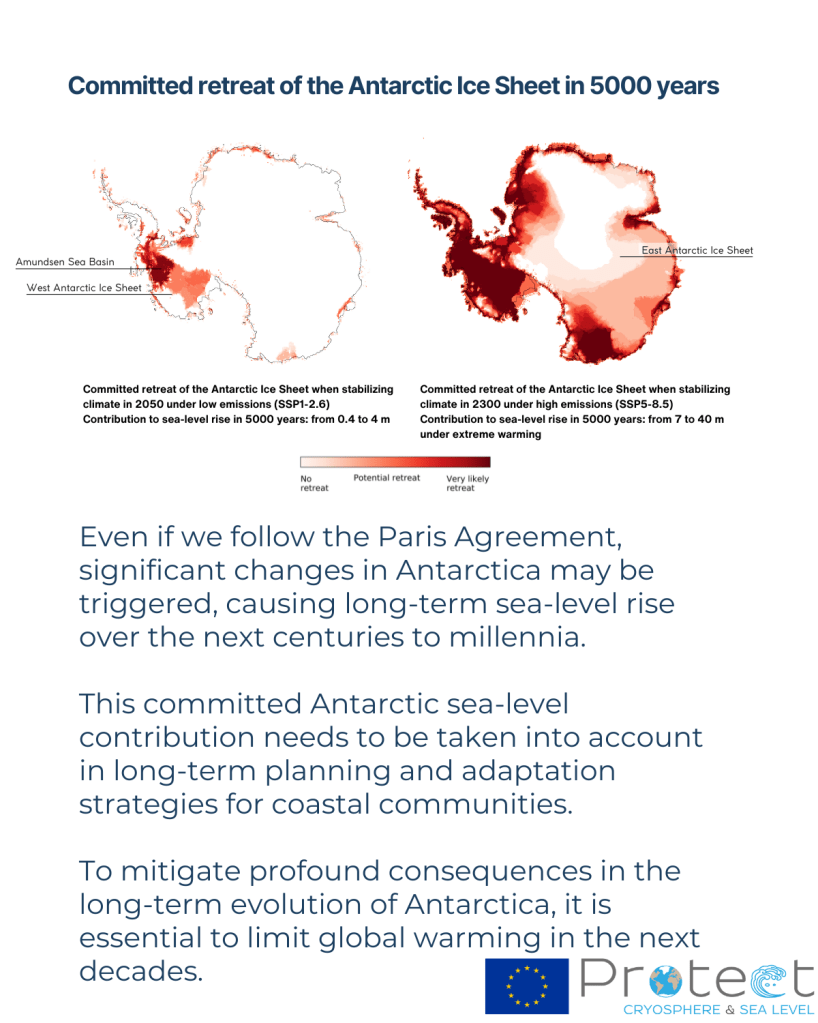
The long tail of sea level rise will come from Antarctica, where the ocean is accelerating melt of, in particular, West Antarctica. However, our recent work and that of other ice sheet groups shows that the risk of multi-metre sea level rise within a few decades is unrealistic. Again, to be very clear: We can’t rule out multiple metres of sea level rise, but it will happen on a timescale of centuries rather than years. High emissions pathways make multiple metres of sea level rise more likely. In fact, our results show that even under low emissions pathways, we may still be committed to losing some parts of especially West Antarctica, but it will still take a long-time for the Antarctic ice sheet to disintegrate. We have time to prepare our coastlines.
Greenland is losing ice much faster than Antarctica, and here atmospheric processes and firn and snow are more important than the ocean and these are also where the læarge uncertainties are. As I’ve written about before, that protective layer of compressed snow and ice will determine how quickly Greenland melts, as it is lost, the ice sheet will accelerate it’s contribution to sea level. This is a process that is included in our estimates.

There’s so much more I could write, but that’s supposed to be the high level summary. Feel free to shoot me questions in the comment feeds. I’ll do my best to answer them.

Five years ago, a small group of European scientists got together to do something really ambitious: work out how quickly and how far the sea will rise, both locally and on average worldwide, from the melting of glaciers and ice sheets. The PROTECT project was the first EU funded project in 10 years to really grapple with the state-of-the-art in ice sheet and glacier melt and the implications for sea level rise and to really seek to understand what is the problem, what are the uncertainties, what can we do about it.

We were and are a group of climate scientists, glaciologists, remote sensors, ice sheet modellers, atmospheric and ocean physicists, professors, statisticians, students, coastal adaptation specialists, social scientists and geodesists, stakeholders and policymakers. We’ve produced more than 155 scientific papers in the last 5 years (with more on the way) and now our findings are summarised in our new policy briefing for the European Parliament.

It’s been a formative, exhilarating and occasionally tough experience doing big science in the Horizon 2020 framework, but we’ve genuinely made some big steps forward, including new estimates of rates of ice sheet and glacier loss, a better understanding of some key processes, particularly calving and the influence of the ocean on the loss of ice shelves. More importantly for human societies, by integrating the social scientists into the project, we have had a very clear focus on how to consider sea level rise, not just as a scientific ice sheet process problem, but also how to integrate the findings into usable and workable information. In Denmark, we will start to use these inputs already in updating the Danish Climate Atlas. If you are elsewhere in the world, you may want to check out our sea level rise tool, that shows how the emissions pathway we follow, will affect your local sea level rise.

Our final recommendations?

  1. Accelerate emission reductions to follow the lower emission scenario to limit
    cryosphere loss and associated sea-level rise
  2. Enhance monitoring of glaciers and ice sheets to refine models and predictions
  3. Support the long-term development of ice sheet models, their integration into
    climate models, and the coupling of glacier models with hydrological models, while
    promoting education and training to build expertise in these areas
  4. Invest in flexible and localized coastal management that incorporates
    uncertainty and long-term projections
  5. Foster international collaboration to share knowledge, resources, and strategies
    for mitigating and adapting to global impacts
Small differences that make a really big difference.

I’m a co-author on a new paper that has just come out in GRL. It’s based on simulations we did with our collaborators in the PROTECT project on sea level contributions from the cryosphere.  What Glaude et al shows is that, to quote the first of the 3 key points:

“With identical forcing, Greenland Ice Sheet surface mass balance from 3 regional climate models shows a two-fold difference by 2100”

In perhaps more familiar terms, if you run 3 regional climate models (that is a climate model run only over a small part of the world, in this case Greenland) with identical data feeding in from the same global climate model around the edges, you will get 3 quite different futures. Below you can see how the 3 different models think the ice sheet will look on average between 2080 and 2100. The model on the right, HIRHAM5 is our old and now retired RCM. It has a much smaller accumulation area left by the end of the century than the other two, which have much more intense melt going on in the margins.

Greenland Ice Sheet annual surface mass balance (a, b, c, 2080–2099 average) and annual surface mass balance anomaly (d, e, f, 2080–2099 average relative to 1980–1999) [mm WE/yr]. From left to right, RACMO (a and d), MAR (b and e), and HIRHAM (c and f). The equilibrium line (SMB = 0) is displayed as a solid black line in (d-f). Glaude et al., 2024, GRL.

In fact, by the end of the century, although the maps above seem to show HIRHAM having much more melt, there is in fact more runoff from the MAR model, because of this intense melt.

Spatially aggregated annual GrIS SMB anomalies (a), total precipitation (PP, b), and runoff (RU, c) [Gt/yr]. The solid lines represent the anomalies using a 5-year moving average, while the transparent lines display the unfiltered model output.

The surface mass balance (SMB) at the present day is in fact positive. This often surprises people, but SMB as the name suggests, only describes surface processes. Ice sheets can (and do) also lose a lot of ice by calving and subglacial and submarine melt. As SMB should balance everything if a glacier is to remain stable or even grow, present day SMB is usually 300 to 400 GT positive at the end of each year, and even so the Greenland ice sheet loses, net around 270Gt per year.

Our work here shows that, at least under this pathway, not only does SMB become net negative in itself by the middle of this century, there are significant differences in SMB projections between the estimates of how negative it will be, between the three RCMs. The global model we used, CESM2 under the high-end SSP5-8.5 scenario, is famously a warm scenario, but our estimated end of the century SMBs are extraordinary : (−964, −1735, and −1698 Gt per year, respectively, for 2080–2099). As I’ve discussed previously, one gigatonne is a cubic kilometre of water, 360Gt is roughly 1mm global mean sea level rise. (Though note your local sea level rise is *definitely* not the same as global average!) Even the lowest estimate here the  is giving around 3 mm of global average sea level rise from surface melt and runoff *alone* by the end of this century each year. That’s pretty close to the modern day observed sea level rise from all sources.

And this is in spite of the fact that at the present day, the 3 models are rather similar in their estimates of SMB. The Devil is as usual in the details.

We attribute these startling divergences in the end of the century results to small differences in 1) the way melt water is generated, due to the albedo scheme (that is how the ice sheet surface reflects incoming energy); 2) but also due to the cloud parameters that control long-wave radiation at the surface, which again can promote or suppress melting. (We really need to know how much liquid water or ice there are in clouds, as this paper also emphasises in Antarctica); and 3) mainly down to the way liquid water that percolates down from the surface is handled in the snow pack. That is, how much air there is in the snowpack, how warm the snow is and how much refreezing can occur to buffer that melt.

The problem is that all of these processes happen at very small scales, from the mm (snow grains and air content), to the micron scale (cloud microphysics). That means that even in high (~5km) resolution regional models, we need to use parameterisations (approximations that generalise small scale processes over larger spatial and/or time scales). Small differences between these parameterisations add up over many decades.  Essentially,  much like the famous butterfly flapping its wings in Panama and causing a hurricane in Florida, the way mixed phase clouds produce a mix of water vapour and ice over an ice surface might ultimately determine how fast Miami will sink beneath the waves.

More data would certainly help to refine these parameterisations. The main scheme to work out how much liquid can percolate into snow was originally based on work by the US Army engineers in the 1970s. More field data with different types of snow would surely help refine these. Satellite data will be massively helpful, if we can smoothe out some wrinkles in how clouds (there they are again) affect surface reflectivity.

These 3 different types of processes also interact with each other in quite complex ways and ultimately affect how much runoff is generated as well as the size of the runoff zone in each model. So integration of many different types of observations is crucial.

“Different runoff projections stem from substantial discrepancies in projected ablation zone expansion, and reciprocally” as we put it in Glaude et al., 2024.

The timing and magnitude of the expansion of the runoff zone is quite different between the models, but all of them show a very consistent increase in melt and runoff over the next 80 years.

It’s probably also important to understand a couple of key points:

Firstly we ran a very high emissions pathway: SSP5-85 is probably not representative of the path we will follow in emissions (at least I hope not), but in this study we wanted to address the spread on different model estimates. And this is a way to get a good check on the sensitivity.

Secondly, the ice sheet mask and topography in these runs is kept fixed all the way through the century. This means we do not account for any elevation feedbacks (as the ice sheet gets lower because of melt, a larger area becomes vulnerable to melt because it’s lower and thus warmer), but we also don’t account for ice that has basically melted away no longer contributing to calculated runoff later in the century. Ice sheet dynamics are also not factored in.

Finally, we ran different resolution models, and that can have an impact particularly on precipitation and is one of the reasons why the new models we developed and have run in PolarRES (and which are now being analysed), have used a much more consistent set-up.

The 3 models we used, MAR, RACMO and HIRHAM have all been used in many different studies over both Greenland and Antarctica, but we haven’t really done a systematic comparison of future projections before. I think this work shows we need to get better at doing this to capture the uncertainty in the spread, especially when you consider that we’re now looking at using these models as training datasets for AI applications: training on each one of these models would give quite different results long-term. We need to think about how to both improve numerical models and capture that spread better. But ultimately, it’s how fast we can reduce greenhouse gas emissions and bend the carbon dioxide curve down that will determine how much of Greenland we will lose, and how quickly.

All data and model output from these simulations is available to download on our servers (we’re transitioning to a new one download.dmi.dk, not everything has been moved there yet). We also of course have data over land points and the surrounding seas, and we’ve run many more global climate models through the regional system to get high resolution (5km!) climate data also looking at different emissions pathways, if you’re interested in looking at, analysing or using any of this data – get in touch!

My warmest thanks to Quentin Glaude who led this analysis and special thanks to our colleagues in the Netherlands, France and Belgium for running these models and contributing to the paper analysis. Clearly, we have much work to do to get better at this ahead of CMIP7.

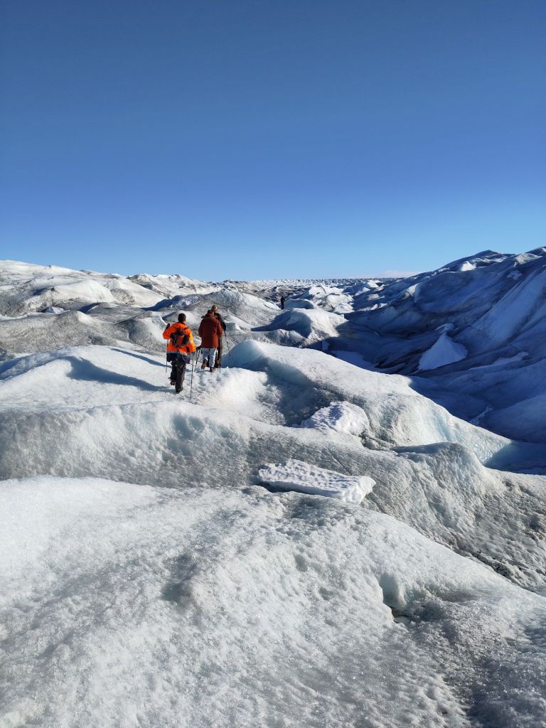
Group field trip the Greenland ice sheet: it’s important to see what you’re modelling actually looks like….

Local sea level rise: A question of gravity

I’ve explained several times in the course of media comments that, when it comes to the sea level rise that you experience, it really matters where the water comes from. This point still seems to cause confusion so I’ve written a super fast post on it.

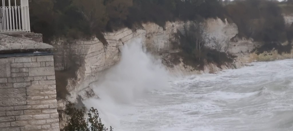
Waves from the Storm Surge that hit Denmark in October 2023 credit: Sebastian Pelt

We very often talk about a metre or two of sea level rise by the end of the century, but in general that refers to global average sea level. And much like a global mean temperature rise doesn’t tell you very much about the kind of temperature changes you will experience in your location due to weather or climate, global mean sea level is also not very informative when talking about preparing your local community for sea level rise. There are other local factors that are important, (see below), but here I’m going to mostly focus on gravity.

Imagine that sea level is more or less stable around the earth (which it was, more or less, before the start of the twentieth century). Just like the moon causes tides because its gravity exerts a pull on the oceans, the ice sheets are large masses and their gravity also attracts ocean water, so the average sea level is higher closer to Greenland and to Antarctica. But there is only a finite volume of water in the oceans, so a higher sea level close to the ice sheets means lower sea levels further away in the tropics for example.

As the ice sheet melts and gets smaller, its gravitational pull becomes smaller so the average height of the sea around Greenland and Antarctica is lower than it was before, but the water gets redistributed around the earth until it is in equilibrium with the gravitational pull of the ice sheets again. The sea level in other places is therefore much higher than it would have been without that gravitational effect.

And in general, the further away from an ice mass you are, the more these gravitational processes affect your local sea level change. In Northern Europe, it often surprises people (also here in Denmark) to learn that while Greenland has a small influence on our local sea level, it’s not very much because we live relatively close to it, however the loss of ice from Antarctica is much more important in affecting our local sea level rise.

Currently, most of the ice contributing to sea level is from the small glaciers around the world, and here too there is an effect. The melt of Alaska and the Andes are more important to our sea level than the Alps or Norwegian glaciers because we are far from the American glaciers but close to the European ones.

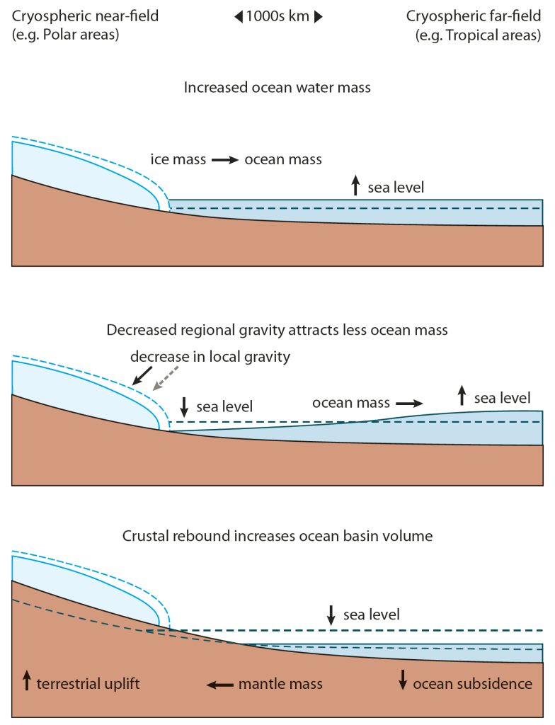
This figure below illustrates the processes:

Processes important for local sea level include changes in land height as ice melts but also the redistribution of water as the gravitational attraction of the ice sheets is reduced. The schematic representation is from the Arctic assessment SWIPA report Figure 9.1 from SWIPA 2017

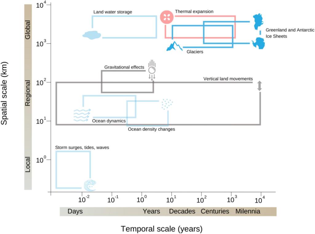
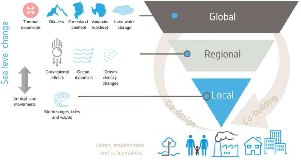
This is partly why the EU funded PROTECT project on cryosphere contributions to sea level rise, which I am currently working on, has an emphasis on the science to policymakers pipeline. We describe the whole project in this Frontiers paper, which includes a graphic explaining what affects your local sea level.

As you can see, it very much depends on what time and spatial scale you’re looking at, with the two ice sheets affecting sea level on the longest time scales.

Figure 1 from Durand et al., 2021 Illustration of the processes that contribute to sea level change with respect to their temporal and spatial scales. These cover local and short term effects like storm surges, waves and tides to global and long-term changes due to the melting of ice sheets.

In the course of the project some of the partners have produced this excellent policy briefing, which should really be compulsory for anyone interested in coastal developments over the next decades to centuries. The most important points are worth highlighting here:

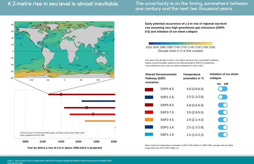
We expect that 2m of global mean sea level rise is more or less baked in, it will be very difficult to avoid this, even with dramatic reductions in greenhouse gas emissions. But the timescale, as in when that figure will be reached, could be anything from the next hundred years to the next thousand.

Figure from PROTECT policy briefing showing how the time when average global sea level reaches 2m is strongly dependend on emissions pathway – but also that different parts of the world will reach 2m of sea level rise at very different times, with the tropics and low latitudes in general getting there first.

What the map shows is that the timing at which any individual place on earth reaches 2 m is strongly dependent on where on earth it is. In general lower latitudes close to the equator will get to 2m before higher latitudes, and while there are ocean circulation and other processes that are important here – to a large extent your local sea level is controlled by how close to the ice sheets you are and how quickly those ice sheets will lose their ice.

There are other processes that are important – especially locally, including how much the land you are on is rising or sinking, as well as changes in ocean and atmosphere circulation. I may write about these a bit more later.

Feel free to comment or ask questions in the comments below or you can catch me on mastodon:

Building the Next Generation…

Hands-up who is looking for a new and very cool job in ice sheet and climate modelling and developing new machine learning tools?

REMINDER: 4 days left to apply for this PhD position with me at DMI looking at Antarctic Ice Sheet mass budget processes and developing new Machine Learning models and processes.

UPDATE 2: The PhD position on Antarctica is now live here. Deadline for Applications 18th February!

UPDATE: It’s not technically a PRECISE job, but if you’re a student in Copenhagen and are looking for a part-time study job (Note that this is a specific limited hours job-type for students in higher education in Dnmark) , DMI have got 2 positions open right now, at least one of which will be dedicated to very related work – namely working out how well climate and ice sheet models work when compared with satellite data. It’s part of a European Space Agency funded project that I and my ace colleague Shuting Yang, PI on the new TipESM project, are running. Apply. Apply. Apply…

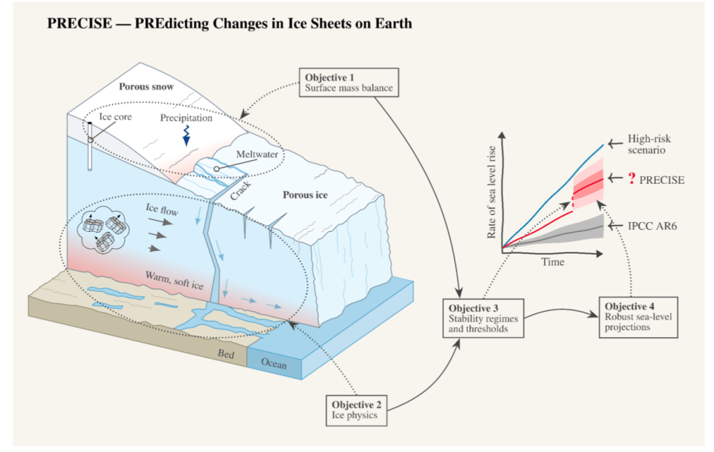
I’ve written about the PRECISE project before, our new Novo Nordisk funded project looking at ice sheets and sea level rise.

This is a quick post to announce that our recruitment drive is now open. We’re split across three institutes. We are two in Copenhagen, ourselves at DMI and the Niels Bohr Institute at the University of Copenhagen, and then the University of Northumbria in Newcastle, UK.

The PI at the Niels Bohr Institute is the supremely talented Professor Christine Hvidberg, aided by material scientist and head of the institute, Joachim Mathiesen. I am leading for DMI, and the Northumbria work is led by Professor Hilmar Gudmundsson. We are also very fortunate to have the talents of Aslak Grindsted, Helle Schmidt, Nicolas Rathmann and Nicolaj Hansen already on board.

The project is already very cohesive between institutes, we’ve been working together for some time already and know each other well.

We have a good budget for travel and exchanges between groups, workshops, symposia, summer schools and the like, but perhaps more importantly, all the positions are focused at the very cutting edge (apologies for the cliche) of climate and ice sheet modelling. We are developing not just existing models and new ways to parameterise physical processes, but we also want to focus on machine learning to incorporate new processes, speed-up the production of projections for sea level rise, not forgetting an active interface with the primary stakeholders who will need to use the outcomes of the project to prepare society for the coming changes.

There’s also a healthy fieldwork component (particularly in Greenland, I don’t rule out Antarctica either), and if you’re that way inclined, some ice core isotope work too. So, if you’re looking for a new direction, feel free to give me a shout. I’m happy to talk further.

Links to all the openings, will be updated as they come out, these are currently open and have deadlines at the end of January:

Newcastle: A three-year postdoctoral research position in machine learning emulators of ice-ocean processes

Newcastle: A two-year postdoctoral researcher (PDRA) position in subglacial modeling of the Antarctic Ice Sheet

Copenhagen (NBI) PhD Project in Greenland ice sheet climate and precipitation variability

Copenhagen (DMI) PhD Project in Antarctic ice sheet surface mass budget (also keep an eye here, where there are also some other interesting jobs announced)

photo showing a small white tent on a snow covered sea ice surface with people dressed in thick warm clothes dropping instruments through a whole in the ice. The sky is a clear blue fading to vioet and pink at sunset
Field camp on sea ice, northern Greenland 2023, measure ocean influences on calving outlet glacier.
(Photo credit: Ruth Mottram, DMI)

A cryosphere call to action..

The International Cryosphere Climate Initiative has put together a new petition for scientists to sign. I’m a little sceptical that this kind of “clicktivism” makes much difference, but there are many many lobbyists from polluting industries at the COP28 and rather fewer scientists. And how else to draw attention to what is one of the most visible and urgent effects of climate change?

The petition is aimed at:

” all cryosphere scientists globally; as well as those working on emissions pathways: and those in the social sciences with research on adaptation, loss and damage and health impacts. This includes research and field associates, as well as doctoral students — because you are the future, and will be dealing with the impacts of climate change in the global cryosphere throughout your lives, as well as your professional careers.”

ICCI

The list of signatories so far already includes many rather senior scientists, so take this as a challenge to add your signature if you work in the cryosphere/climate space. It takes only a minute to sign and there are many familiar names on the list.

I’m not sure how else to emphasise the urgency of real action at COP 28.

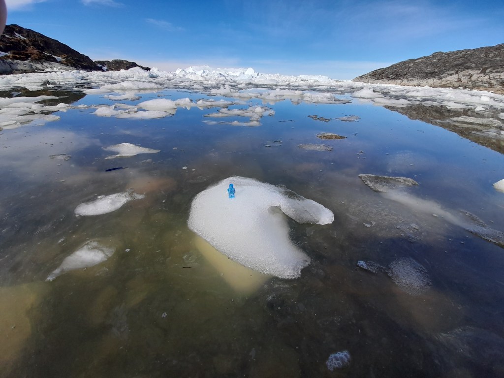
Small bergy bits in the bay near Ilulissat, with Lego Ice Man for scale (and an important message)

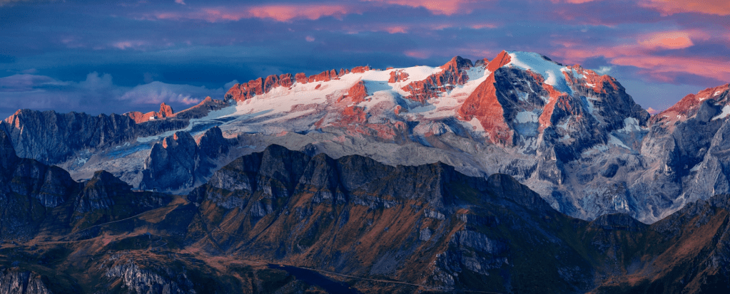
As a coincidence though, and as I posted on mastodon the image below appears in Momentum, a plug-in on my web browser with a new photo every day. Today’s is this beautiful image of the Marmolada glacier in Italy by Vicentiu Solomon.

Marmolada Glacier by Vicentiu Solomon

It’s a gorgeous but very sad picture – this is one of the faster disappearing #glaciers in the world and to hear more about the consequences of cryosphere loss, take a look at the policy brief produced by the PROTECT project on the sea level rise contributions from glaciers and ice sheets. It also contains this eye opening graphic:

A 2 metre rise in sea level is almost inevitable. The uncertainty is on the timing which is somewhere between one century and the next 2 thousand years, depending on where you are in the world, but, more importantly given COP28, how fast fossil fuels are phased out. You can download the whole thing here.

So there you have it. Here’s a reminder of the petition from the International Cryosphere Climate Initiative.

Musings in summer 2023: impacts + adaptation

I was talking to some friends today about climate change – in the light of the latest #AMOC paper, suggesting a tipping point. I’m far from an expert on AMOC so if you’re here for that I suggest this comprehensive piece on real climate from Stefan Rahmstorf.

Or the TL;Dr version in thread form compiled by Eleanor Frajka-Williams, PI of OCEAN:ICE sister project EPOC.

Anyway, the conversation turned to what’s going on this summer.

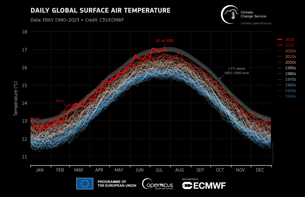
It’s hot, but don’t just take my word for it. Here is the authoritative Copernicus Climate Change Service stating it..

It’s been hot, in short and even if July has been cooler and rainy in Denmark, May and June were hot and record dry..

And it’s fair to say that, as when I’m asked why, or similar questions by journalists, there is an almost overwhelming temptation to say “we told you so”. I think that’s what Antonio Guttieres is getting at here too.

There’s of global boiling is upon us. Apparently. It certainly felt like it on my summer holiday this year…

However, that’s not what I was mostly musing on. Given the apocalyptic heatwaves, strange patterns of warming in the ocean and the Antarctic sea ice loss, it feels a little like end of days.

But pretty much all of these were projected pretty accurately by scientists, even if the timing was a bit off and we’re not entirely sure what is driving that extraordinary downturn in Antarctic sea ice (but do read Zack’s piece linked here, it’s very good).

In many ways, we’re fortunate in Denmark and the rest of rich northern Europe. The worst direct impacts, at least in the near and short term, we can probably adapt to, though it will be expensive. They are mostly engineering challenges with a dollop of social science mixed in. And, we should remember that even in wealthy and well-educated Europe, how heavily climate change impacts us is very much determined by our social class.

However, in the long-term (and I do mean really long-term – on the century to millennia scale), we’re facing something more existential. We’re going to lose a lot of Danish land to sea level rise. Exactly how much will largely be determined over the next 20 to 50 years as there’s a pretty clear relationship between greenhouse gases and melting ice.

But we do have time to prepare for it- and most importantly to have some grown up conversations about our priorities as a society. This is going to require a good bit more social and behavioural science. In the medium term, we will need to prepare for ever more storm surges, but adaptation to coastal flooding also falls into the engineering category.

Of course, these local to regional risks still need dealing with and that is largely why my employer has created the awesome Danish climate atlas – to give accurate but also useful climate information to those who need to plan for the future. I suspect an ever greater part of my job will be focused on producing usable projections and climate service information. This is certainly also something we will focus on in the PRECISE project. Being able to make useful sea level rise projections is about more than identifying if an ice sheet is stable* or not, it’s also about how quickly, how likely and how much it is likely to retreat. As we have also focused on at a regional level in the PROTECT project

Figure from our paper in Frontiers describing co-production of useful climate information

So that’s ice sheets and sea level. The tl;dr is, we know they’re melting, we still don’t know by how much and how fast they’ll ultimately melt but we still have time to deal with it, at least in wealthy well educated societies like Denmark,.

There is a whole nother discussion to be had about the global south and less equal societies which I don’t feel confident enough to discuss here.

Where I do think we’re more vulnerable in the shorter and medium term is perhaps surprisingly, food production – and that goes for much of Europe too. It turns out that concentrating large amounts of food production in a few key places might be a big mistake. Especially where those places are vulnerable to drought, heatwaves, over extraction of water, not to mention appalling labour conditions, an over-reliance on groundwater, artificial fertilisers and pesticides.

And then there is some evidence that multiple heatwaves could occur concurrently, threatening food production in compound events across several key regions. Perhaps working out how to make the global food chain less vulnerable to disruption at key points should be more of a focus than it is?

And that’s after the latest banditry from Russia, destroying perfectly good foodstocks and the means to distribute them, has given us a clear wake-up call on the interdependence of human society.

(Anders Puck Nielsen a military commentator has an interesting take on that from a strategic point of view here: https://youtu.be/fvPcPZP-6os which is very interesting for Ukraine watchers)

If I were a wise and concerned government I think I’d be thinking about how exactly we’re going to be feeding our population over the next 5-20 years. Where will be able to produce like Spain and Italy today? Or will diets have to change? How do we persuade people to eat more healthily and ensure that food is equitably spread through society?

This is of course also a part of the job of the other working groups, 2 and 3 of the IPCC – and it’s possibly not just an accident or indeed good lobbying that the new IPCC chair, Jim Skea, is a former WG3 coordinator. Perhaps the IPCC also sees that we have now moved into a new world.

So, these are just some of the things I’m thinking about as I prepare to go back to the office after the summer break next week.

As I observed on Mastodon after the IUGG meeting, and online with this excellent heatmap article. Climate science is entering a new phase. It’s the end of the beginning and it’s time to prepare.

*On the subject of ice sheet stability, Jeremy Bassis has an excellent thread on what this does and does not mean over on Mastodon. Worth checking out

Sea Level Rise: How far, how fast?

A paper appeared in Science this week about sea level rise in the last interglacial (about 129-116,000 years ago). It has sparked the usual predictable headlines as it points out that during that period, sea level rose by about 6-9 metres but that that the ocean temperature as far as it can be reconstructed, is about what we see now, that is about 0.5C warmer than the preindustrial.

sealevelguardian
Guardian reports on latest study

In a sense this isn’t that “new” – we’ve known about higher sea levels during the last interglacial for ages and that the global mean temperature was roughly 2C above the pre-industrial global mean. This is in fact one of the reasons for the Paris target (though some scientists speculate that it’s also pretty much already out of reach).

However, the sea surface temperature stuff makes it extra interesting as the ocean is a pretty big source of uncertainty in global climate models and mot models do not manage to reproduce modern day ocean temperatures all that well.

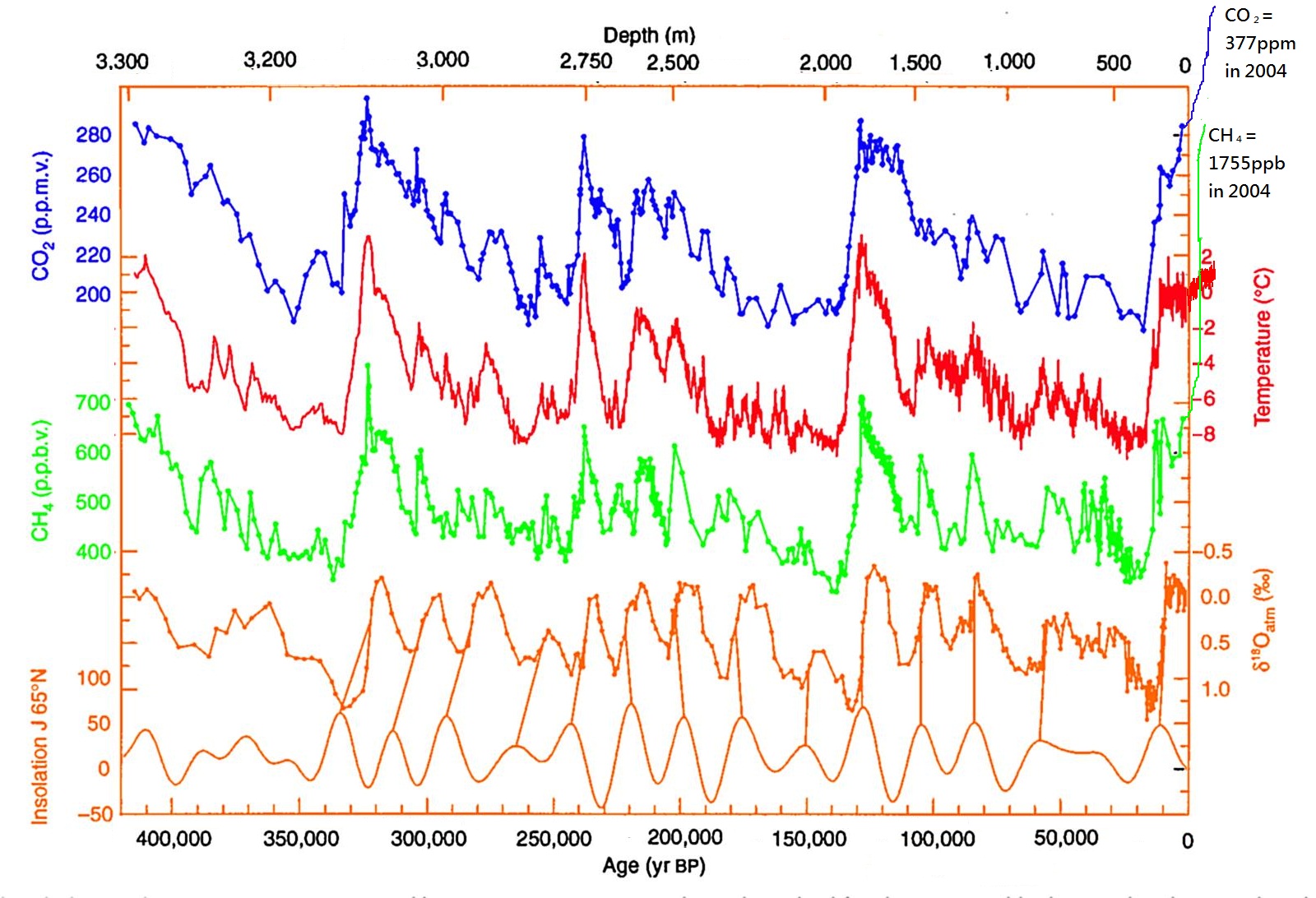
It should also be said that the last interglacial is only a good analogue for 2C world up to a point – it was warm because of enhanced solar input, not because of greenhouse gases as this plot from an Antarctic ice core, edited by the awesome Bethan Davies at the Antarctic Glaciers blog shows:

vostok_420ky_4curves_insolation_to_2004
Carbon dioxide (CO2), Methane (CH4) with reconstructed temperature from the Vostok Ice Core, taken in Eastern Antarctica. Enhanced with modern methane, CO2 and temperature measurements by Bethan Davies. Note that the “modern” value of CO2 here is from 2004. In 2017 it is currently measuring 403 ppm.

It’s also interesting to speculate where the water came from – the Greenland ice sheet was much smaller than today but it was still there and now “only” contains 7m of sea level rise today. So the complete disappearance of Greenland cannot explain the rise in global sea level. The small glaciers and ice caps of the world can’t contribute more than half a metre or so either. Therefore it has to be Antarctica contributing the most – East or West is the question and it really is a very very longstanding question.

The progress in the international polar year (IPY) in mapping the bedrock of Antarctic in the BEDMAP2 brought quite a few surprises, including the discovery of several very deep marine basins in the East that could potentially contribute a lot of water to sea level.

More recently, channels under the floating ice shelves of west Antartica, along with various modelling studies have proposed that the west could be much more unstable than thought. Actually this has been a very very longstanding problem in Antarctic science since at least the late 1970s when John Mercer first proposed the marine ice sheet instability hypothesis.

In any case, events in both Denmark and the UK have brought this problem home more sharply.

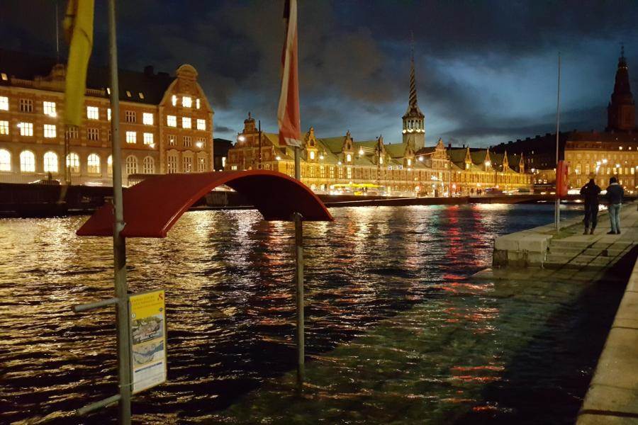
stillstormflod
The silent storm surge – coastal flooding in Copenhagen on the 5th January – the water in the harbour is not normally this high! Source: Brian Dehli, shared by DR 

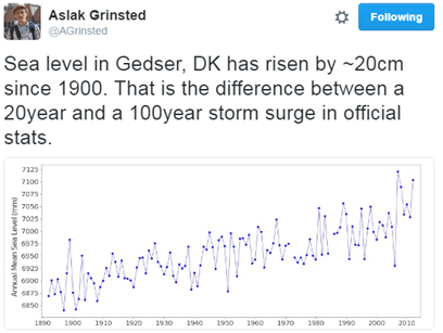
aslaktweet

The “silent storm surge” in January 2017 around the coast of Denmark was  a hundred year event in many places, but as Aslak Grinsted points out, sea level rise makes a hundred year event a 20 year event with only a small rise.

Sea level will not rise equally everywhere, the fingerprint of Greenland ice sheet loss is felt largely in the Pacific, Antarctic ice melt will be felt in Europe. It matters where the water comes from. A point not generally appreciated.

So this new paper is also important, but it only underlines that we need to be able to make much much better estimates of how fast and how far the ice sheets will retreat, which is the justification for much of my own scientific research.

Finally, I think it’s probably necessary to point out that sea level is already rising. This was asked by a listener to Inside science, one of my favourite BBC radio 4 programmes/podcasts. I was a little surprised that an apparently scientifically literate and interested member of the public was not aware that we can measure sea level rise pretty well – in fact to an extent, the global warming signal is more easily detected in the ocean than in the global temperature record. This is because the ocean expands as it warms and there is ocean pretty much everywhere, whereas temperature observations are patchy and mostly on land. Clearly, scientists like myself are *still* not doing a very good job of communicating our science more widely. So here is the global mean sea level record to date, it’s updated pretty regularly here and on average, sea level is rising at about 3mm per year or 3cm per decade.


sealevel
Sea level variation measured by satellite since 1993 from NASA

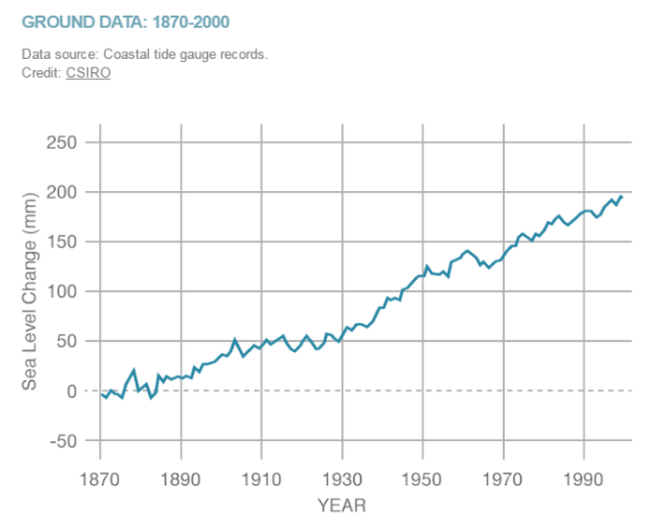
When we look at tidal gauges,sea level rose about 20cm in the 2oth century

20crsealevel
Sea level rise in the 20th century measured by tide gauges, plot by NASA, data from CSIRO

The big uncertainties we have on whether or not this will accelerate in years to come is largely down to missing processes in ice sheet models that we don’t yet understand or model well – mostly calving by glaciers and ice shelves. I promised Steve Bloom a blog post on that at some point – I have a paper to finish and new simulations to run, but hopefully I’ll get round to that next.

UPDATE: I was made aware this morning of a new report from the European Environment Agency about climate change impacts and adaptation in Europe. In the report they state (correctly) that while the IPCC 5th Assessment Report suggested that in the 21st century the likely sea level rise will be on the order of half a metre, some national and expert assessments (I took part in a couple of these) had suggested an upper bound of 1.5 – 2m this century, for high emissions scenarios.

This is a big difference and would be pretty challenging to adapt to in low-lying countries like the Netherlands and Denmark, not to mention big coastal cities like London or Hamburg. It’s laso important to emphasise that it doesn’t jsut stop at the end of the century, in fact our simulations of the retreat of Greenland ice sheet suggest it’s only just getting going at the end of this century and the next century the rate of ice loss will really start to accelerate.

All of which is to say, there’s really a very good reason to act now to reduce our emissions. The EEA has also produced this very nice map of observed sea level rise in Europe over the last two decades based on  Copernicus environmental data.

Obs_slr_Europe.png
Check out how much the sea level is rising where you live… Source: European Environment Agency, data from Copernicus Marine Environment Monitoring Service

With the prospect of American federal funding for environmental observations being reduced or strongly constrained in the future, it’s really important we start to identify and support the European datasets which are the only other sources of environmental monitoring out there right now.