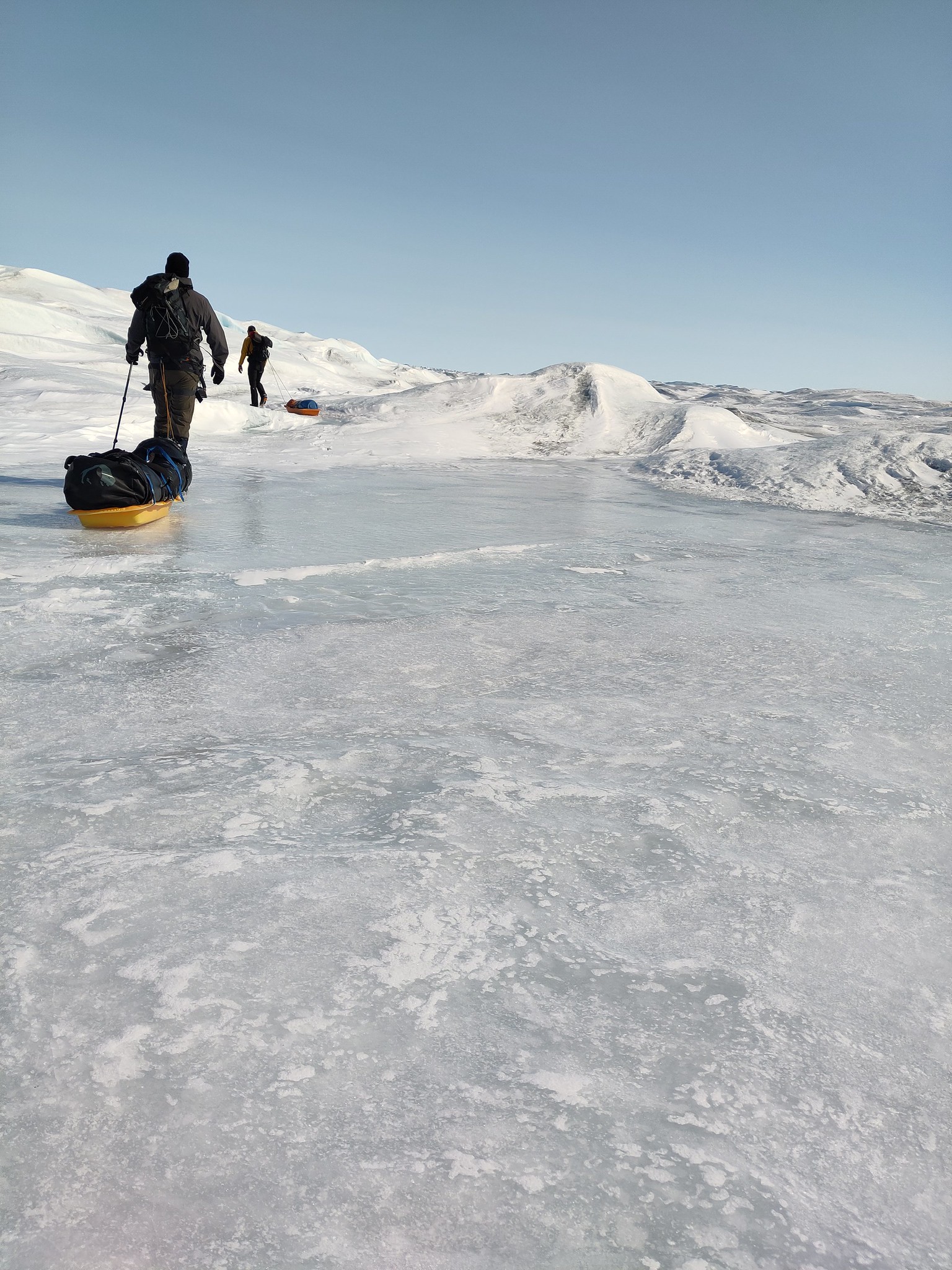
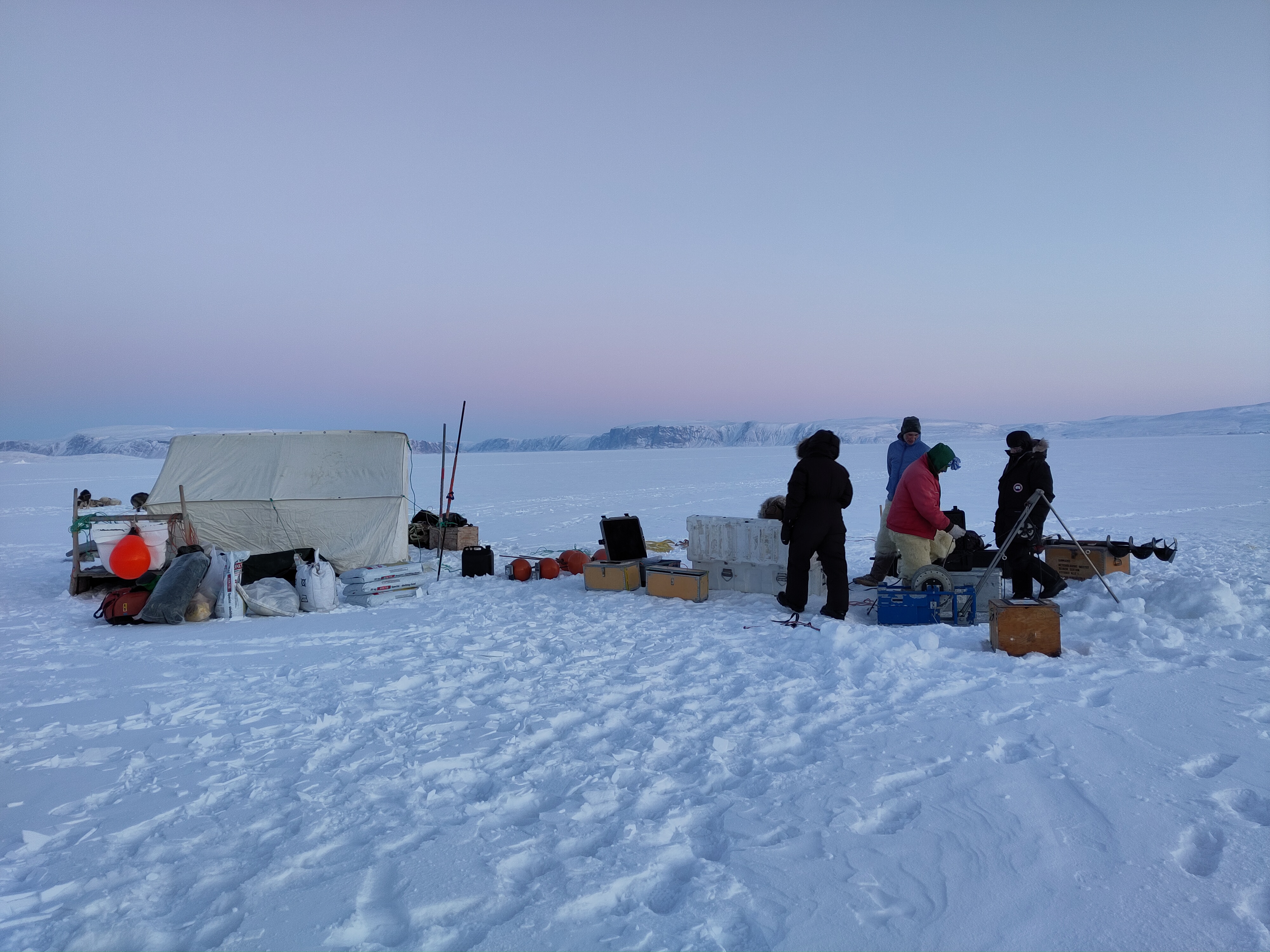
Way back in the mists of time, that is, early April, I and colleagues deployed some instruments on the sea ice in front of a number of glaciers in Northern Greenland, which I wrote a little bit about here.

Since then I’ve mostly been letting them get on with reporting their data back and occasionally checking on the satellite imagery to see how it’s looking in their surroundings.
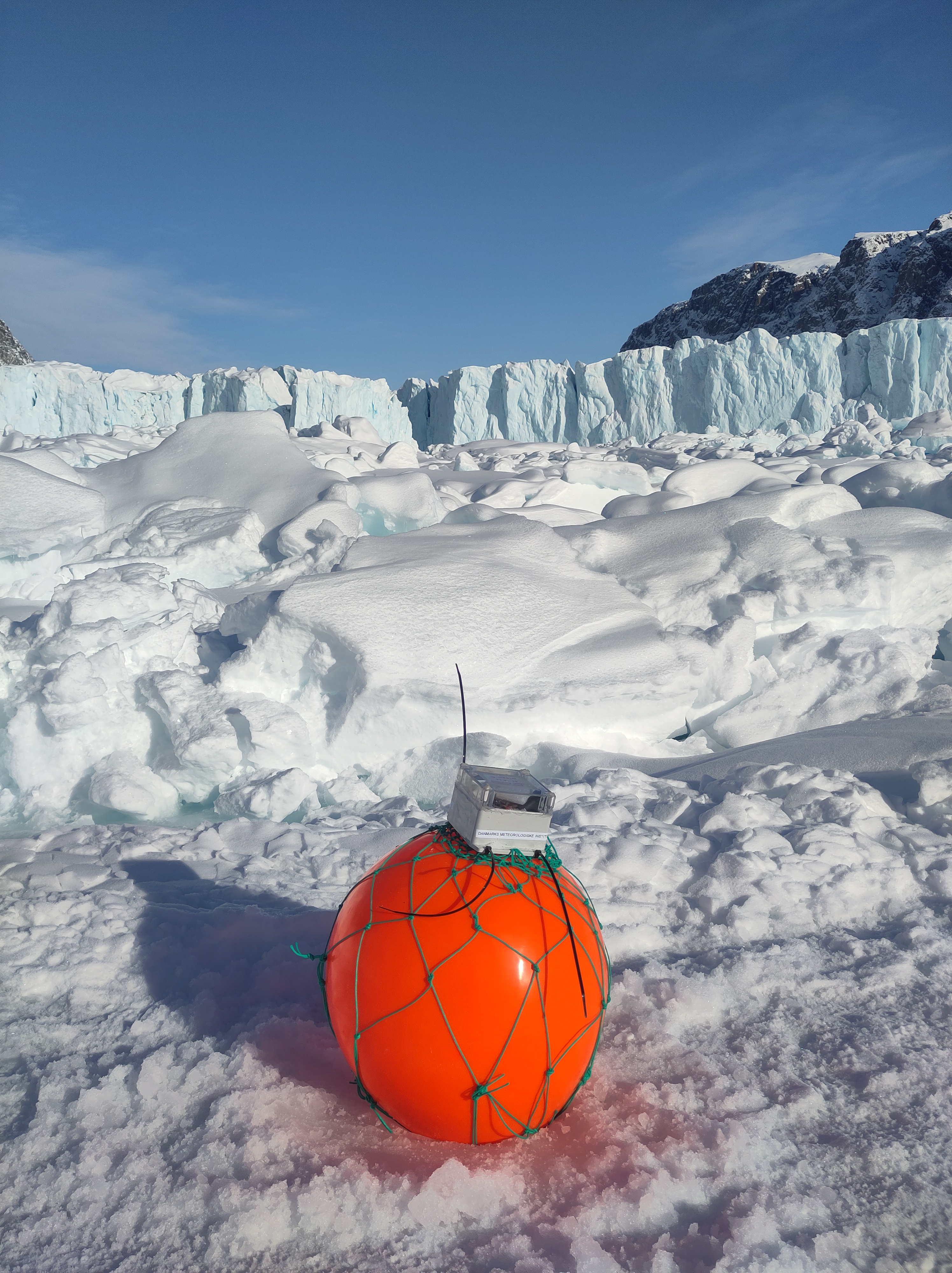
It was about -30C and very cold when I left them out, so it’s sometimes quite hard to visualise just how much things will change over only a few months and to remember that at some point, they’ll need collecting
After a fairly melty start (yes, that is actually a technical term) to July, particularly in the northern part of the ice sheet (which you can see on the polarportal, see also below right) it’s time to start anticipating their collection.

We have a lot of advantages when it comes to coordinating this kind of project now, compared to the bad old days when imagery and communication were both scarce and expensive
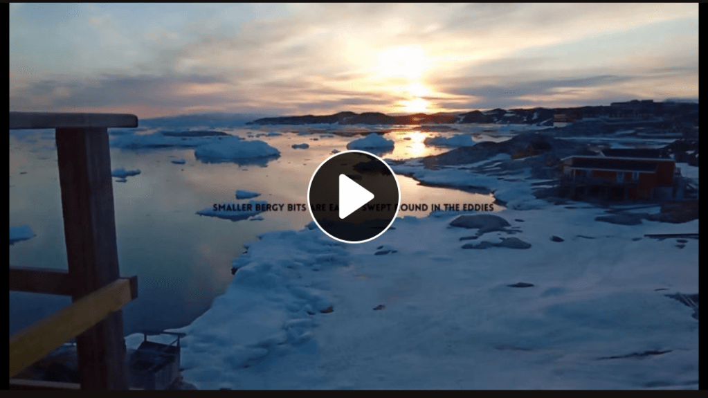
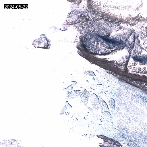
For starters, there is Sentinel Hub’s EO browser, a course in which should be a requirement for every earth science adjacent subject in my opinion. EO Browser produces superb pre-processed imagery for free, such as this one, from the European Space Agency’s Sentinel-2 satellite yesterday
As you can see, the sea ice is still there but fracturing and patches of open water (in blue green) are now becoming visible.

Sentinel 2 satellite image processed on EO browser showing sea ice and ice bergs in front of Tracy and Farquhar glaciers.
If you’re out and about and only have your phone, there is also the excellent snapplanet.io app on your smartphone, with which you can create instagram ready snapshots of the planet or even animated gifs, with high resolution imagery a link away…
Now that’s what I call a fun social media* application…
Animated gif of satellite images showing the front of Heilprin glacier with icebergs and landfast sea ice.
Anyway, back to the break up. Every year, the sea ice forms in the fjord from October/November onwards, by December it’s often thick enough to travel on and then from April it starts to thin and melt and by late June large cracks are starting to form, allowing the surface meltwater to drain through. For a look at what happens if you get a large amount of melt from, say, a foehn wind, before the cracks start to open up, see this iconic photo taken by my colleague Steffen Olsen in 2019.

The other advantage we have working in this fjord is our collaboration with the local hunters and fishers. In winter they use dog sleds for hunting and accessing fishing sites, and to take us and our equipment out on to the ice. In summer, they are primarily using boats for fishing, hunting narwhal and, hopefully, collecting our equipment! Our brilliant DMI colleague Aksel who lives and works in the local settlement is also a huge help in assisting with communication and generally being able to get hold of things and people when asked.

We offer a reward for each buoy that is found and brought back to our base in Qaanaaq, so many of them in fact make their own way home. But we also work with our friends on a kind of remote treasure hunt, challenge Anneka style, with someone at home watching their positions come in via the satellite transmissions and sending updated information via sms to an iridium phone to the hunters on the boat…
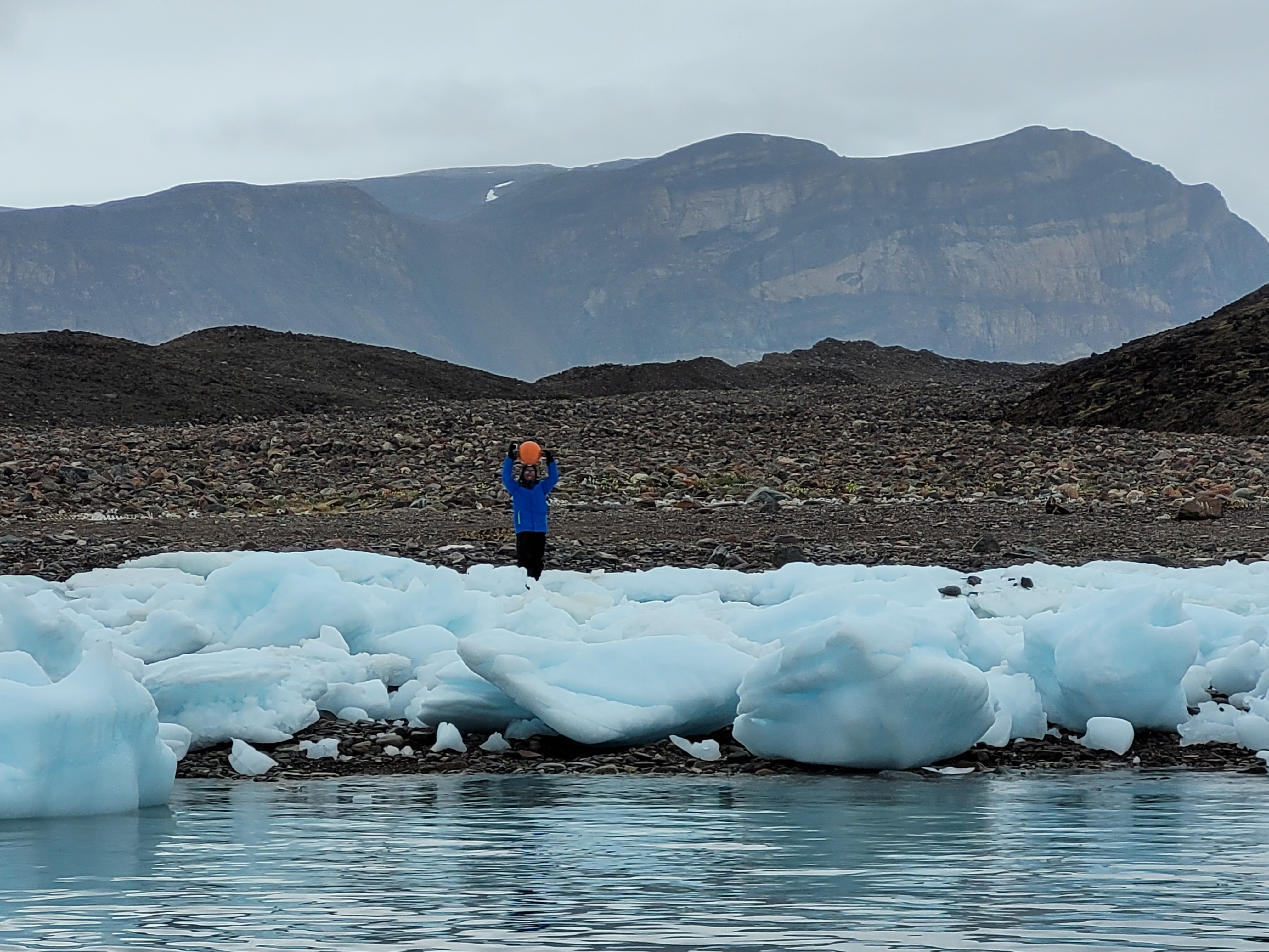
I’m told it’s tremendous fun, with sharp eyes required, as even a bright orange plastic globe can be challenging to spot.
A floating trusted buoy in 2022.
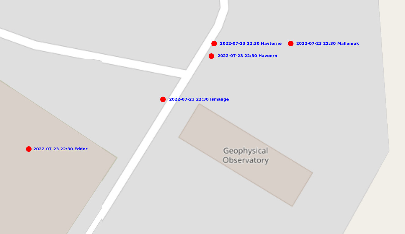
I’ve never participated in this treasure hunt myself sadly, on land we generally see something like a spaghetti of arrows and spots via the Trusted global web api:

GPS positions from a trusted buoy.
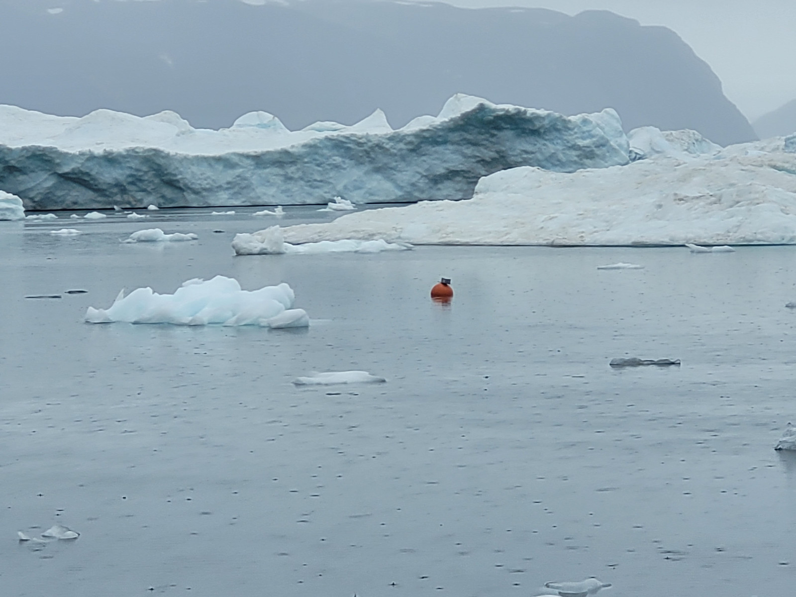
We then have to try and superimpose these movements on the latest satellite images to work out if the buoy is floating or not, and then check to see if there is sufficient open water for a collection. Naturally working with local knowledge for this part is also absolutely vital.
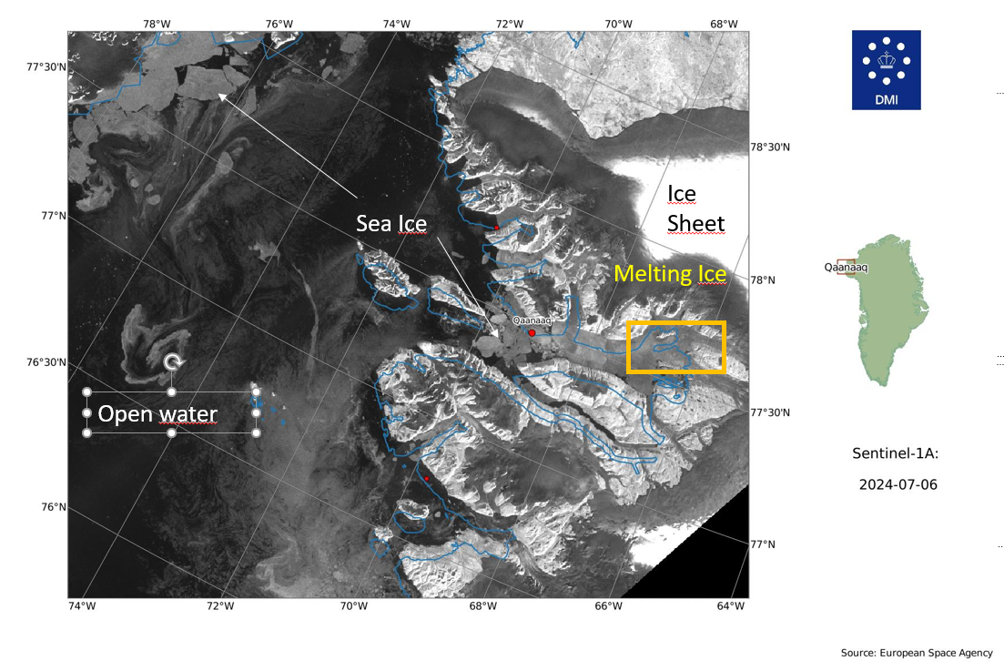
The latest satellite images look like the ice has already broken up into large flakes close to Qaanaaq. I’ve annotated the Sentinel-1 image below as it is from a radar satellite that can see through clouds and the images can be a bit confusing if you’re not used to looking at them.
The scale of the massive melt on the ice sheet from the last few days is clearly visible in the dark grey rim on the glaciers. The open sea water is black and the sea ice shows up as geometric greys. This one is downloaded from the automatic archive my colleagues at DMI maintain around the whole coast of Greenland. It can be a handy quick check too.
So, although the ice is starting to break up it’s at the tricky stage where it’s far from navigable by dog sled and certainly too difficult for boats, so it’s not quite the time to send out hunting parties for GNSS buoys.
It also means that when I go on holiday next week, I will not be quite leaving all this behind. I and my colleague in this project will be monitoring the movements of the buoys and the satellite pictures, as well as relying on our friends in the local community to let us know how the ice is looking and if they can get out to rescue our brave little sensors.
In the mean time I have plenty of data to start analysing and writing up. As ever massive thanks to the people of Qaanaaq and my cool colleagues for putting up with me and our GPS buoys. We hope to submit our first paper pretty soon..
*Yes, I’m probably a nerd. I’m a lot of fun** at parties too though.
**For a given value of “fun”.