It’s a really thorough introduction to the climate system and all the natural sources of climate variability and cycles of change, including links to sources. Well worth taking your time over with a morning cup of tea and probably I’ll assign it as an introduction text for BSc students (and management) on the big picture of climate change.
I also love it for the introduction where multiple eminent and respected scientists are asked what they’d buy with all the dollars they’d have if they were given one dollar every time someone asked them about “natural climate cycles”. As you might expect, the answers range from heat pumps and solar panels to new bicycles and a time machine.
Not sure what I’d use it to pay for, possibly a new postdoc position to work on snow and ice processes?
*as an aside: I haven’t read Ars Technica in ages. And it’s funny because I remember that when I first started on twitter way back in 2010 there were *a lot* of good articles shared from there on the bird site. Somehow they either were not shared or got suppressed and I stopped seeing them. I’m not sure if that was due to the algorithm or different people I was following. One of the nice things about mastodon is that without an algorithm (and crucially, by following *a lot* of people!) there is a chance to see a much greater diversity of different media. It feels a bit like seeing a different internet, outside the standard walled garden.
Currently, I’m very busy getting ready with colleagues to travel to Greenland next week. We have an extremely full programme of fieldwork activities covering oceanography, biology, sea ice, snow and glacier processes as part of our NCKF work. More on these no doubt in a future post…
Yesterday, one of my ace DMI colleagues (without whom most of the work we plan would definitely not happen) shared the first optical satellite image of the area this year – taken by ESA’s Sentinel 2 (a truly astonishing source of free imagery and everone should know about it). Because the area is very far north, it has been in the Polar night until now so we have been reliant on the ESA Sentinel 1 imagery based on radar.
First Sentinel-2 optical satellite image of the year downloaded from Sentinel Hub’s EO Browser today. Processing with Sentinel Hubs optimised natural colour filter has introduced some artefacts, notable the brigh white patches which probably represent areas of shadow due to the low solar angle. The area is blanketed in thin cloud and only parts of the glaciers, sea ice and icebergs are clearly visibe.
Where biology is clearly showing us earlier springs due to climate change, the date of the first optical image is unlikely to change any time soon due to climate change.
I’ve been on holiday this last week and I’m combining the trip to the UK with a visit to colleagues and collaborators at the University of Leeds. I’ve also been nabbed while I’m in Leeds to give a wider interest talk at the Royal Meteorological Society Yorkshire branch in Leeds.
I’ll be discussing ice sheets, their contribution to sea level rise and how the future is looking. There may also be some nice photos from our fieldwork in Northern Greenland for those who like dogs, icebergs and snow…
If you’re in Leeds and fancy joining you’re most welcome to register and attend at this link.
In general, I’m trying to reduce my travel this year, last year, with all the rolled over meetings from the COVID times was disruptively busy with work travel, it makes it challenging to actually get the work done. So I think combining work and holidays and rolling up meetings into a block is the way forward.
Although I very much appreciate the opportunity to present online at various meetings, I’m less convinced about hybrid meetings where the purpose is mostly scientific discussions, that is something that works much better either all online or all in person in my opinion, but I think they work well when the aim is to present new and ongoing work (like EGU).
For those who are interested but can’t attend I will see if the talk tomorrow will be recorded and can be uploaded somewhere. Here’s the abstract:
Frozen Threats: Understanding the Role of Ice Sheets in Sea Level Rise
In this talk, we will delve into the world’s ice sheets and explore their importance in the climate system. Ice sheets are the largest stores of freshwater on the planet, their size and location means they influence our climate but their interactions with the atmosphere and ocean are complex. As the world warms, they will inevitable have an impact on sea level. Adapting to sea level rise will be one of our civilisations biggest and longest challenges, so understanding ice sheets is now of critical importance. They are also beautiful and fascinating environments in their own right. In this talk I will discuss some of the scientific challenges, but also show how far we have come in understanding ice sheets and glaciers.
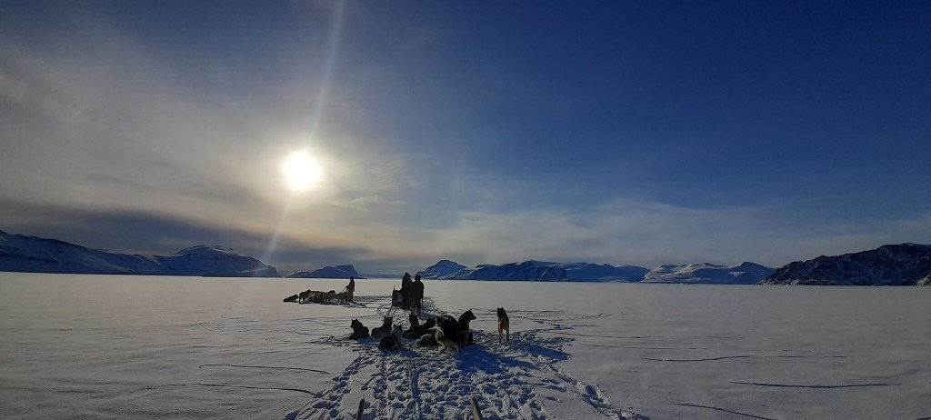
The Inughuit cliffs near Qaanaaq in Northern Greenland rising up above the sea ice. In the far distance a dog-sled is a small black speck.
One of the advantages of being part of a research institute are the fascinating conversations that happen over lunch between colleagues working in different areas. Today was a classic with conversation ranging from the stratospheric effects of the Hunga-Tonga eruption to the different types of snow crystals that form in snow packs and their impacts on sea ice. However, the conversation started with a request to me for some rules of thumb on sea level rise, so here they are:
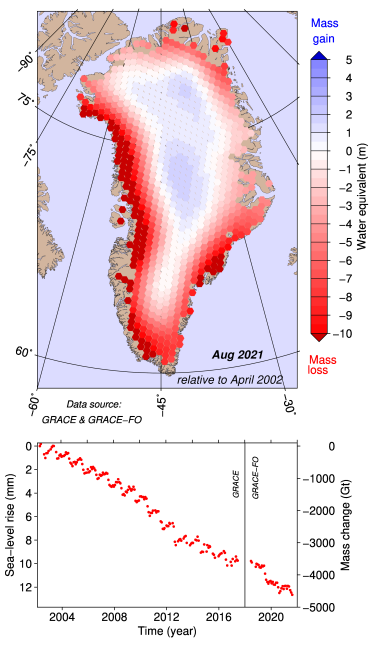
The Greenland ice sheet loses on average around 250 to 280 Gigatonnes of ice each year – that’s from all processes including melt and surface runoff, iceberg calving, basal melting and submarine melting.
The small glaciers and ice caps around the world contribute a bit more to sea level rise in total each year than each of the big ice sheets currently, but they will be quickly exhausted. As there are thousands of small glaciers, most of which are not well monitored, we have to estimate how these are changing using models. It appears that on avergae they add around 0.7 to 1 mm of global sea level rise each year.
The thermal expansion of the oceans is still the largest part of currently observed sea level rise but on an annual basis, the cryosphere now often contributes more.
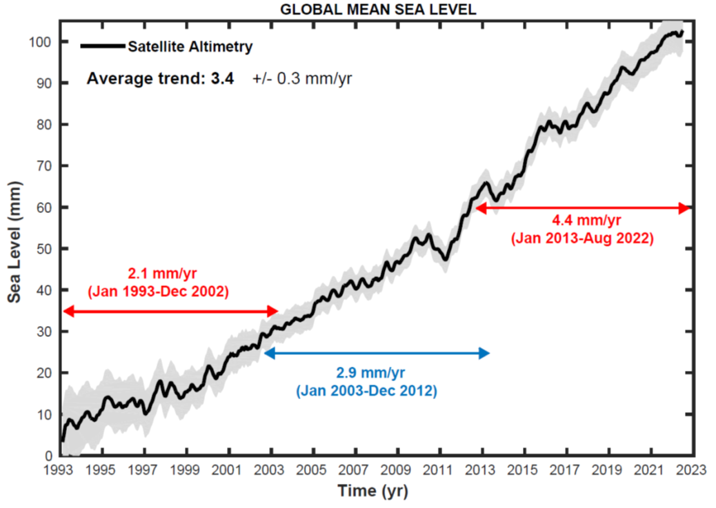
Since the early 1990s sea level rises about 3mm every year, but over the last 5 years it has been closer to 4.5mm per year. The curve over the last 2 decades has followed a quadratic shape rather than a linear shape – put simply, this means sea level is accelerating. The sea rose 10mm from January 2020 to August 2021.
An El Nino, which some are warning could occur this year, may cause a temporary pause or at least slow down in sea level rise, even as global air temperatures increase, mostly due to the large amounts of rain that are associated with it, but this will only be temporary.
While the rate (3-4 mm per year) doesn’t sound like very much, every mm counts, increasing the risk of coastal flooding and storm surges affecting coastal communities.
Finally, global sea level rise is not distributed evenly, broadly speaking, the further away from an ice mass you are, the more likely it is to affect your local sea level, so Greenland matters less than Antarctica in Northern Europe.
NOAA’s visualisation of observed sea level rise from satellites in the background and at tide gauge locations (the round dots) since 1993, note the uneven pattern which reflects processes like ocean currents, atmospheric circulation and winds, local relative land movements and gravitational changes due to changing ice masses.
I hope these little rules of thumb help. Feel free to add more (or disagree) in the comments..
I was recently asked to comment on this interesting new paper by David Rounce and co-authors for AP by Seth Borenstein called “Global glacier change in the 21st century: Every increase in temperature matters”. You can read his resulting summary here . I’m posting here the slightly expanded and lightly edited response I sent to Seth in response to his (very good) questions.
The authors only look at the small glaciers and ice caps in this study, not the big polar ice sheets, though they do also cover small peripheral glaciers in Greenland and Antarctica that are not part of the main ice sheets. Of course, this means that sea level rise from all the other important processes like thermal expansion and ice sheet met also have to be taken into account on top of the numbers given here.
Their main findings were that at 1.5 °C above preindustrial, we can expect total glacial mass loss between 2015 and 2100 would be 26% with 90 mm of sea level rise and 49% of the small glaciers and ice caps lost globally. The paper only deals with these small glaciers and does not count the big ice sheets!
At 4°C, we’re looking at 41% mass loss with ~154 mm of sea level rise and 83% of glaciers lost. At 2.7 °C, where the world is now heading, 32% mass loss, 115 mm of sea level rise and 68% of glaciers lost.
I’m sad to say that the results aren’t exactly a surprise – the community has known for some time that the loss of glaciers is basically linear with temperature, so the title of the paper is really spot on, every tenth of a degree really does matter. This earlier paper by my Horizon 2020 PROTECT project collaborator Ben Marzeion shows something very similar But it’s a nice new result with the latest generation of glacier model and updated with the latest CMIP (IPCC) scenarios and they included some new processes that weren’t very well accounted for in previous work.
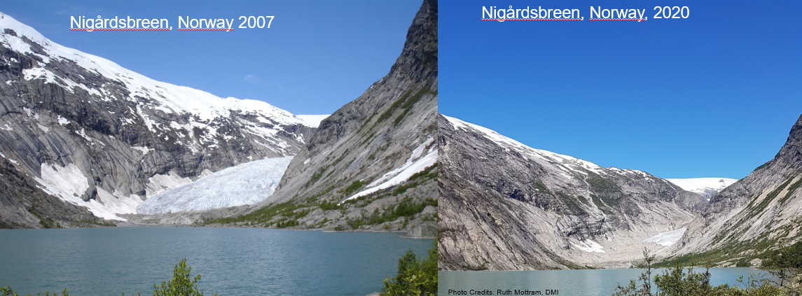
My first thought was that these latest estimates were actually a little lower than I expected, but the baseline in the paper is 2015 – we should remember that many of these glaciers have already lost quite a lot of ice (see my two photos of Nigårdsbreen in Norway, taken only 13 years apart) – so the new estimates are basically in line with what I would have expected given earlier work. I’d also expect that they will continue to lose ice beyond 2100 so it’s definitely not an end state that they are giving here. As they state in the article there will be widespread deglaciation of some pretty iconic parts of the world, even under the present planned emissions reductions..
In many ways part of the problem has been the previous studies have not always accounted for all the processes: frontal ablation (melt and calving of vertical ice cliffs, mostly in contact with water), the effect of debris cover and so forth (the latter will likely reduce the rate of loss, the former probably increases it). Given what we know about these processes and how to represent them in models, I still consider this work to be a more realistic estimate. Then we also need to account for the climate models and the scenarios used to force them – there are some important differences between CMIP5 and CMIP6 which might also account for some of this shift. We have actually seen something somewhat similar for the projected changes in the big ice sheets.
It’s probably important to remember though that this study still needs to make simplifications, especially when looking at so many glaciers in so many different regions, so there will always be new updates to come with improved computing power and computational techniques and better representation of processes. Having said that, I do not think the picture will substantially change in future, though I can always be proved wrong, and the glaciers community are now at the stage of refining estimates for rates of mass loss.
Globally the loss of glaciers means sea level rise. Regionally and locally the biggest consequences will be for for water resources and we’re likely to see a local increase in natural hazards like outburst floods and avalanches that will need to be carefully managed. There have been a couple of instances already in the last year or two that probably demonstrate this well (e.g. the Marmolada glacier in Italy last year).
Sea level budget divided into components, from Legeais et al. 2018 ESSD The steric component is the expansion of sea water as it warms.
I include myself in the group who has to get used to the cultural shift. I have worked on glaciers in the Alps and Norway which are really rapidly disappearing. It’s kind of devastating to see, but it’s not actually surprising. We have known it was coming and in many cases (including the authors of this paper), measured the massive losses (last year, 2022 was a disaster for the Alps and both Fabien Maussion and Matthias Huss who are co-authors on the paper are running very comprehensive programmes that show in real time how much of a disaster) and predicted it with some accuracy. But we’re now at the point where it’s really undeniable that these glaciers are going fast.
#Glacier ice melt in 2022 was impressive! See the incredible speed of ice loss at the snout of Rhonegletscher (@VAW_glaciology time lapse by A. Cremona)…
The Rhonegletscher in the timelapse above is a really iconic glacier in the Alps, I have my own favourites, mostly places I’ve worked, like Norway, Iceland and Greenland, which are all to a greater or lesser extent retreating fast now. The glaciers that people consider iconic or at least well-known tend to be accessible and depend very much where you are and they will be the glaciers we mourn over in the next decades. In the French Alps, it’s probably the Mer de Glace, in Switzerland perhaps Rhone glacier or Plaine Morte (both have monitoring programmes), in Canada perhaps the Malaspina or Athabasca glaciers. There are still (just) glaciers on Kilimanjaro and Mount Kenya, the Ruwenzoris are basically gone, as are the Papuan glaciers.
Though they show in the study that ice loss is basically linear with temperature, at some point the glaciers become so small that the remianing melt is highly non-linear. And these won’t grow back under any sensible “overshoot” scenario (never mind that we don’t really have technology to remove carbon from the atmosphere at scale). Once they’re gone, they’re basically gone forever on human timescales Finally, I’d like to add a bit of anlaysis by Ben Marzeion and co-authors , it’s possible to basically put a number on the amount of melted glacier ice each kg of CO₂ leads to.
We find that under present-day climate conditions, every emitted kg of CO2 will eventually be responsible for a glacier mass loss of 15.8 (5.9–20.5) kg. Again, since the global glacier mass is decreasing with increasing temperatures, this number is greater for lower temperatures and smaller for higher temperatures.
I have been meaning to write about my return to field science (after 10 years mostly working on climate models) for the last 2 years, but prompted by this beautifully written piece in the Danish Newspaper information, I decided Christmas Day was the day (it for sure beats the washing up)…
“For at forstå, hvad der er ved at ske ved kloden, rejste vi mod isens ende” “To understand what is happening to the earth, we travelled to the end of the ice”
Martin Bahn og Anders Rye Skjoldjensen (foto) in Information 23rd December 2022
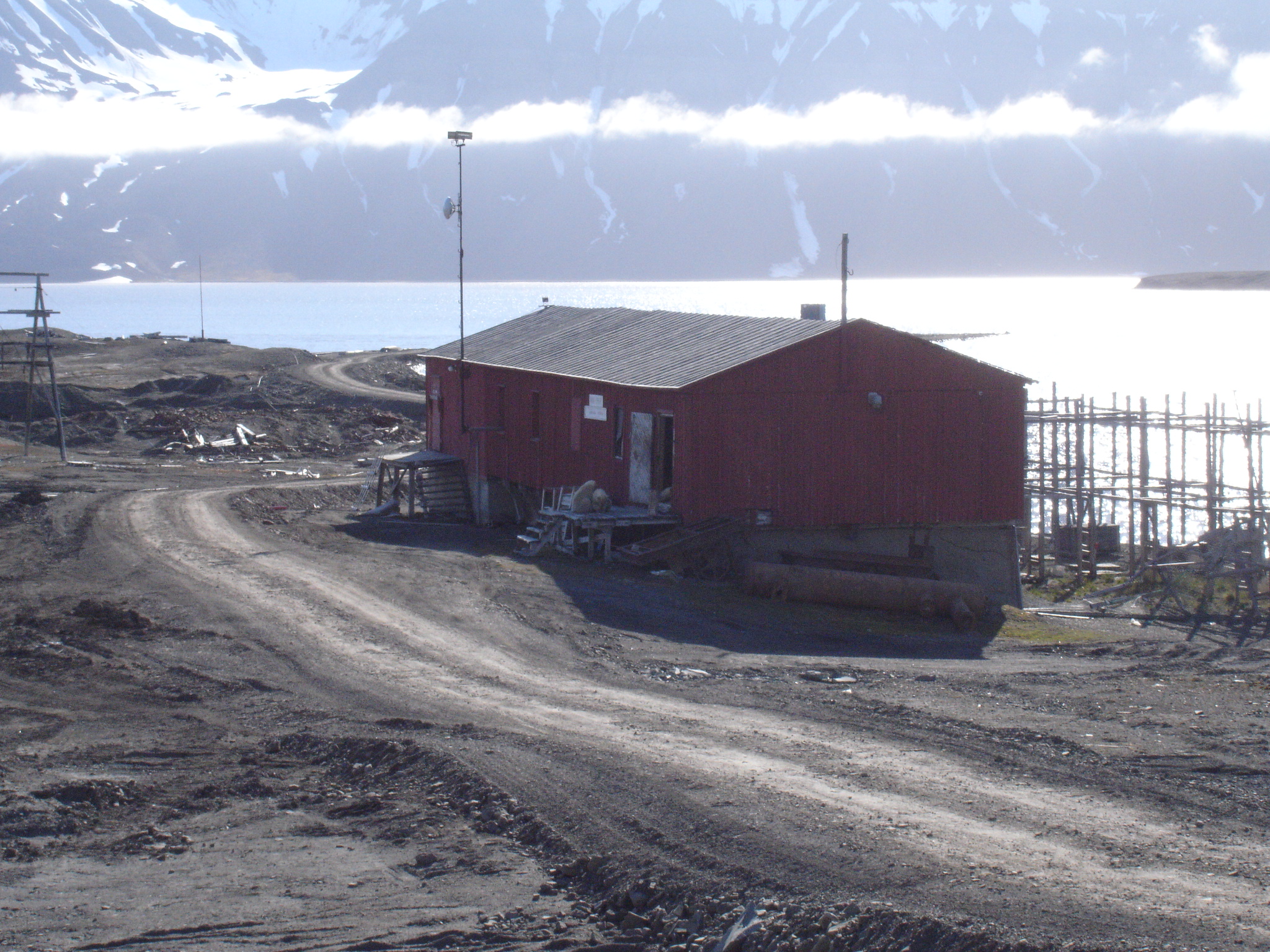
To make one thing very clear straight away, and as the newspaper article also makes very clear, my colleague Steffen Malskær Olsen has established and maintained a very long-running programme of observations in the fjord near Qaanaaq. This town in northern Greenland on the edge of a large fjord, and close to the North Water polynya has a uniquely interesting location to study and understand Arctic processes. The DMI facility there is long established and part of the INTERACT network of Arctic field stations. The 15-year record collected by Steffen is more or less unbroken and uniquely valuable. None of the science I’m planning to do or to work on would be possible without his dedication, hard work, insight and bridge building within the community in Qaanaaq. He and my other DMI colleagues involved in this programme are brilliant scientists and great field companions and I feel privileged to be able to work with them in this incredible place.
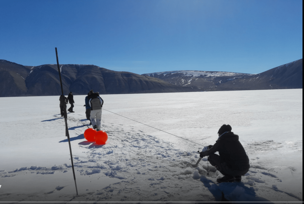
In the field: Steffen and team retrieving an oceanographic mooring with instruments on it after a winter out in the fjord in 2021.
Secondly, as the article also makes clear, scientists are not individualistic heroes who beat the odds, it’s a team sport. And it’s especially true in Greenland where the true heroes of this story are probably not scientists but the local hunters and fishers who guide and transport us and whose knowledge and experience is unmatched. I include also on this category our DMI colleague Aksel Ascanius who lives and works in Qaanaaq has been an essential part of the programme since the earliest days, as well as keeping other long-term observations in the network running in this part of the world.
Collaboration with the people who live in the Arctic has been essential for success in Arctic science since since the days of Franklin and Rae (for British readers) or Suersaq, aka Hans Hendrik, (after whom Hans Island is named) for Danes..
Anyway, back to the science of the present-day. DMI has progressively added more and more elements to the field laboratory in Qaanaaq in addition to the longer running observations. A non-exhaustive list would include an infrasound monitoring station that is part of the CTBTO, weather observations (of course), surface emissivity measurements by drone, fjord salinity, temperature and photosynthetically available radiation measurements plus snow and sea ice measurements as well as work with satellites and biology. One glaring omission, up to this year at least, was the glaciology of the region. How does the ice sheet affect the regional climate, how does the ocean affect the glaciers that calve into the fjord? Can we learn about some important but poorly understood processes like calving and melange dynamics using this area as a test bed? What about surface mass budget and snowfall and snow melt?
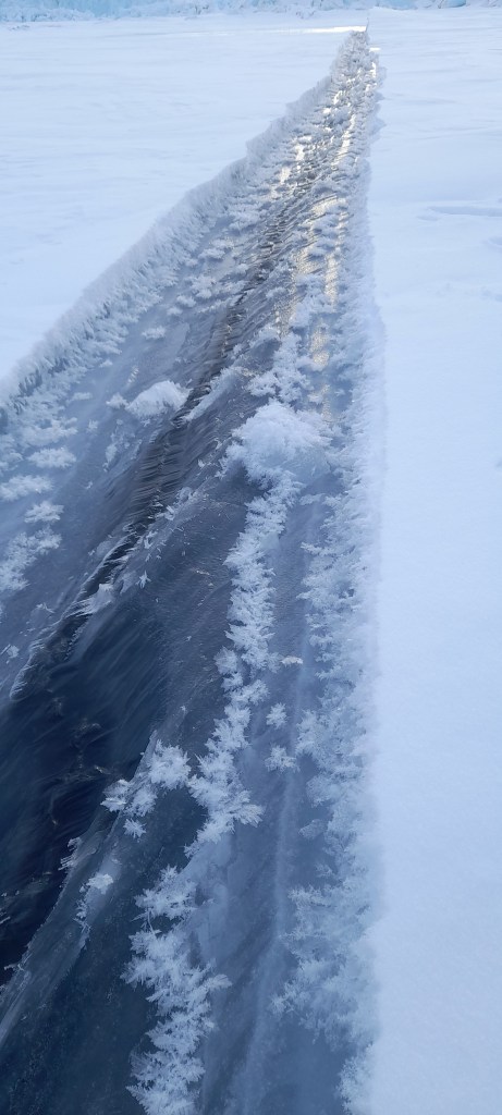
A lead in the sea ice – these fractures in the ice have sea water (the black) welling up between two thick plates of sea ice. The conditions were perfect for frost flowers to grow on the surface. Sea ice turns out to be a lot more interesting – and complex- than I’d ever imagined…
Now, as a glaciologist, I’ve mostly worked with the interface between atmosphere and ice sheet (at least the last 14 years or so, but I am also still (after my PhD topic on ice fracture and crevasses) interested in calving glaciers and the processes that control how fast icebergs form. And the fjord, Inglefield Bredning has *a lot* of calving glaciers in it. It is a natural laboratory for glaciology and for developing numerical models. Calving is actually a surprisingly difficult thing to model with computer models of glaciers.
Or perhaps it’s not that surprising?
Observations are difficult to get (to put it mildly). There are a number of (possibly wild) theories of “calving laws” that remain poorly constrained by observations as a result. Common parameterizations of ice flow makes it hard to deal with fast flowing glaciers where calving is common. Dealing with grounding lines, where glaciers meet the sea and start to come close to flotation can give notorious numerical errors and retreat requires the remaking of ocean grids in fully coupled climate models.
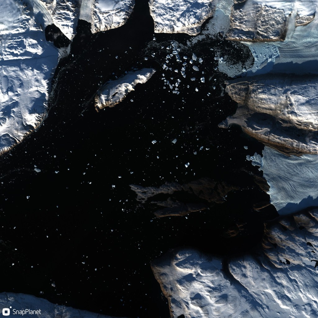
Satellite image from ESA’s Sentinel-2 satellite showing glaciers calving icebergs into the head of the Ingle field Bredning fjord. The black is open water, icebergs show up as blueish dots, the land is carpeted in snow. Low winter sun (in late September 2022) casts deep shadows.
These are not easy or computationally cheap problems to solve. And where there are at least thousands (maybe even tens of thousands?) of scientists working on atmospheric weather and climate modelling, the community working on ice sheet dynamic models is probably only in the low hundreds.
And of course, we really lack long time series of measurements – essential in a system that changes only s l o w l y, but likely irreversibly and which we are, only now as the system is changing rapidly, starting to understand.
This of course is why the fjord observation record of Steffen is so valuable – these are reliable, repeated measurements of ocean properties that are known to affect the outlet glaciers that meet them. It is indeed a natural laboratory.
What we are now also working on is a field lab to study these calving processes in-situ. I have already found the return to the field scientifically valuable. There is really no replacement for going to observe the earth system you want to understand. (My PhD supervisor used to call it “nurturing your inner glacier”). Observations taken in spring/summer 2022 have already changed how I think about some processes and hopefully the follow-up we have planned in 2023 will confirm our new theoretical framework.
Heading home from the deployment of instruments out near calving glaciers at the head of the fjord.
I am fortunate indeed in that at the same research department, we also have colleagues collecting and analyzing satellite data and developing the numerical models we want to use to understand how ice sheets fit into the earth system. All three of these elements – field, satellite and numerical model- are essential.
In this project we are using the satellite observations to extend the time series of field data and we can use both sets of observations together to develop and test a numerical model of this fjord and the glaciers that calve into it. The numerical model we can then extend to other glaciers in Greenland. Hopefully, we can also use this work to understand how Antarctic glaciers might also respond to a warming ocean. Ultimately, the aim of all this work is to understand the contribution of these glaciers to sea level rise both now and in the future.
This is not a frivolous question. In fact, if large (more than a couple of metres).of sea level rise is expected, it is a question that is basically existential for Denmark.
I will add more on the specifics and science in coming months, this is already long enough. However, I’d like to mention a couple of other points:
Firstly, DMI is by no means alone operating up here. Many of the key articles, particularly on glaciology in this region, have been written by the Japanese group at Hokkaido University and their collaborators at the Meteorological Research Institute, the national institute for polar research and others. We at DMI are also working directly with the Greenland institute of natural resources, Asiaq, GEUS, KU, DTU, AU, SDU, ESA, Eumetsat and many others in this research programme.
Finally, this work is currently being carried out under the auspices of the Danish National Centre for Climate Research (NCKF), funded by the Danish Government though with contributions also from other research projects mostly funded by the EU’s Horizon 2020 and Horizon Europe frameworks as well as ESA’s climate change initiative for the Greenland ice sheet.
In a sense this isn’t that “new” – we’ve known about higher sea levels during the last interglacial for ages and that the global mean temperature was roughly 2C above the pre-industrial global mean. This is in fact one of the reasons for the Paris target (though some scientists speculate that it’s also pretty much already out of reach).
However, the sea surface temperature stuff makes it extra interesting as the ocean is a pretty big source of uncertainty in global climate models and mot models do not manage to reproduce modern day ocean temperatures all that well.
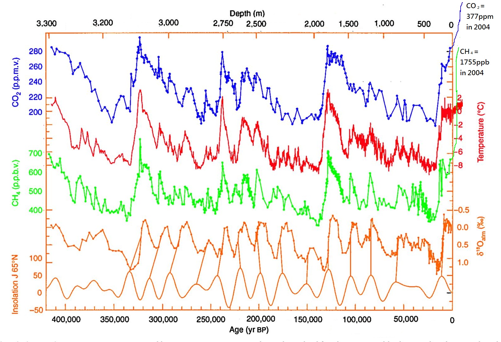
It should also be said that the last interglacial is only a good analogue for 2C world up to a point – it was warm because of enhanced solar input, not because of greenhouse gases as this plot from an Antarctic ice core, edited by the awesome Bethan Davies at the Antarctic Glaciers blog shows:
Carbon dioxide (CO2), Methane (CH4) with reconstructed temperature from the Vostok Ice Core, taken in Eastern Antarctica. Enhanced with modern methane, CO2 and temperature measurements by Bethan Davies. Note that the “modern” value of CO2 here is from 2004. In 2017 it is currently measuring 403 ppm.
It’s also interesting to speculate where the water came from – the Greenland ice sheet was much smaller than today but it was still there and now “only” contains 7m of sea level rise today. So the complete disappearance of Greenland cannot explain the rise in global sea level. The small glaciers and ice caps of the world can’t contribute more than half a metre or so either. Therefore it has to be Antarctica contributing the most – East or West is the question and it really is a very very longstanding question.
The progress in the international polar year (IPY) in mapping the bedrock of Antarctic in the BEDMAP2 brought quite a few surprises, including the discovery of several very deep marine basins in the East that could potentially contribute a lot of water to sea level.
More recently, channels under the floating ice shelves of west Antartica, along with various modelling studies have proposed that the west could be much more unstable than thought. Actually this has been a very very longstanding problem in Antarctic science since at least the late 1970s when John Mercer first proposed the marine ice sheet instability hypothesis.
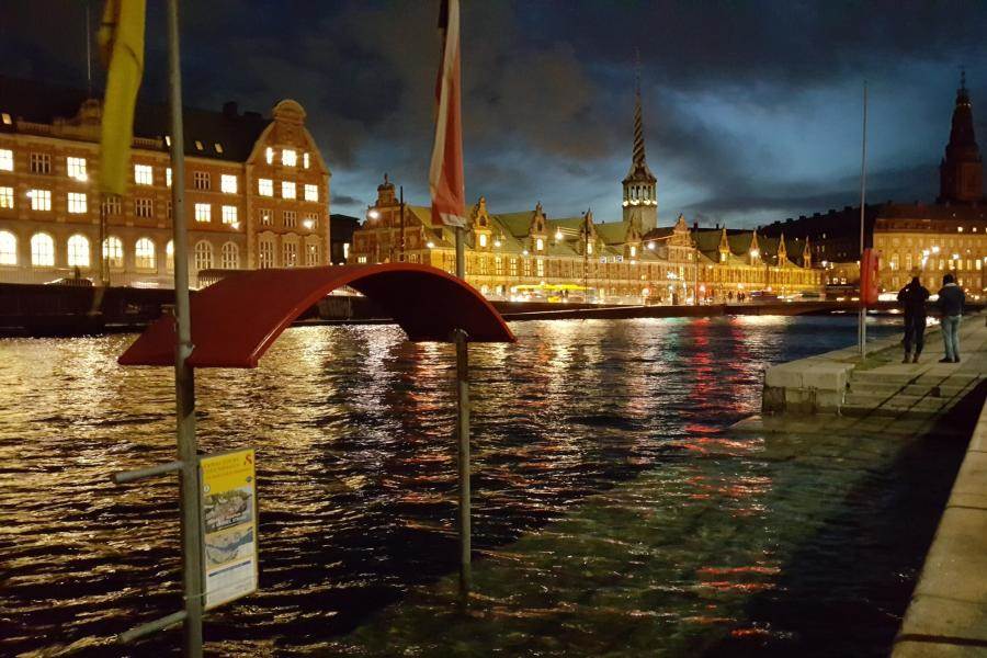
The silent storm surge – coastal flooding in Copenhagen on the 5th January – the water in the harbour is not normally this high! Source: Brian Dehli, shared by DR
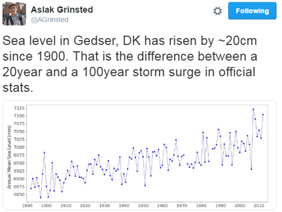
The “silent storm surge” in January 2017 around the coast of Denmark was a hundred year event in many places, but as Aslak Grinsted points out, sea level rise makes a hundred year event a 20 year event with only a small rise.
Sea level will not rise equally everywhere, the fingerprint of Greenland ice sheet loss is felt largely in the Pacific, Antarctic ice melt will be felt in Europe. It matters where the water comes from. A point not generally appreciated.
So this new paper is also important, but it only underlines that we need to be able to make much much better estimates of how fast and how far the ice sheets will retreat, which is the justification for much of my own scientific research.
Finally, I think it’s probably necessary to point out that sea level is already rising. This was asked by a listener to Inside science, one of my favourite BBC radio 4 programmes/podcasts. I was a little surprised that an apparently scientifically literate and interested member of the public was not aware that we can measure sea level rise pretty well – in fact to an extent, the global warming signal is more easily detected in the ocean than in the global temperature record. This is because the ocean expands as it warms and there is ocean pretty much everywhere, whereas temperature observations are patchy and mostly on land. Clearly, scientists like myself are *still* not doing a very good job of communicating our science more widely. So here is the global mean sea level record to date, it’s updated pretty regularly here and on average, sea level is rising at about 3mm per year or 3cm per decade.
Sea level variation measured by satellite since 1993 from NASA
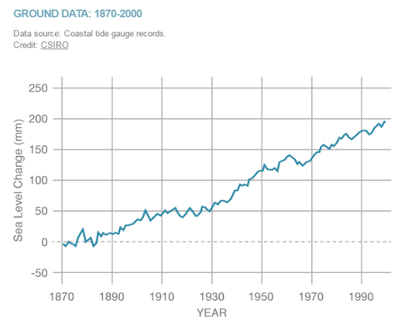
When we look at tidal gauges,sea level rose about 20cm in the 2oth century
Sea level rise in the 20th century measured by tide gauges, plot by NASA, data from CSIRO
The big uncertainties we have on whether or not this will accelerate in years to come is largely down to missing processes in ice sheet models that we don’t yet understand or model well – mostly calving by glaciers and ice shelves. I promised Steve Bloom a blog post on that at some point – I have a paper to finish and new simulations to run, but hopefully I’ll get round to that next.
UPDATE: I was made aware this morning of a new report from the European Environment Agency about climate change impacts and adaptation in Europe. In the report they state (correctly) that while the IPCC 5th Assessment Report suggested that in the 21st century the likely sea level rise will be on the order of half a metre, some national and expert assessments (I took part in a couple of these) had suggested an upper bound of 1.5 – 2m this century, for high emissions scenarios.
This is a big difference and would be pretty challenging to adapt to in low-lying countries like the Netherlands and Denmark, not to mention big coastal cities like London or Hamburg. It’s laso important to emphasise that it doesn’t jsut stop at the end of the century, in fact our simulations of the retreat of Greenland ice sheet suggest it’s only just getting going at the end of this century and the next century the rate of ice loss will really start to accelerate.
All of which is to say, there’s really a very good reason to act now to reduce our emissions. The EEA has also produced this very nice map of observed sea level rise in Europe over the last two decades based on Copernicus environmental data.
With the prospect of American federal funding for environmental observations being reduced or strongly constrained in the future, it’s really important we start to identify and support the European datasets which are the only other sources of environmental monitoring out there right now.
“The Arctic is one of the last great pristine ecosystems, a safe haven for endangered species and home to Indigenous Peoples whose lifestyle has survived in harmony with nature for thousands of years.”
This quote in the wake of COP21, extracted from a celebrity I’ve never heard of (sorry, I’m just not that interested in actors) raised my hackles as it repeated yet again the idea that the Arctic is “pristine”.
Even without contemplating climate change, it is most certainly not, as the polar portal season report I was vaguely involved in compiling this year made clear.
The “pristine” wilderness of Von Postbreen, Svalbard
There is a whole literature in the humanities on Orientalism and “othering”, about how we define other people and places partly to define what we are not. I’m not sure if there is a term for this narrative of a “pristine wilderness”, let us call it “pristinism ” for want of a better term. But before I list the ways in which the Arctic is not pristine, let me make very clear, I am well aware I also suffer from pristinism, to some extent. What my boss teasingly refers to as “the white disease”, the fascination with snow and ice that makes me want to leave the comforts of house and home and go and live somewhere deeply uncomfortable, and indeed dangerous in order to plumb the mysteries. I have been visiting the Arctic for well over 12 years now, though as most of my work is on computer, I don’t get the option so often anymore. Maybe that’s a good thing, perhaps the last thing the Arctic needs is more people flying to it.
The ecosystem has been significantly degraded by the loss (hopefully now in reverse) of most of the large cetacean species by commercial whalers. Similarly, walrus and polar bears in Svalbard were almost rendered extinct before hunting was banned. It also appears there were walrus in Iceland when the vikings arrived that, like any polar bear at the present day arriving on Icelandic shores, were quickly dispatched. The Greenland vikings were certainly rich from walrus ivory as their main source of income. Not content with exterminating the walrus the early settlers sent their sheep out and very successfully deforested the 25-40% of Iceland that had been forested, leading to dust storms, soil erosion and the unfortunate inability to build boats to get anywhere else very far away. Deforestation has only recently begun to be reversed. In much the same way Musk Oxen were virtually eliminated from Eastern Greenland by hunting, but then rather too successfully introduced to the west where there has been a population explosion.
Fish stocks have at least been largely preserved in Iceland (sensible given how important fishing is to the economy), but there have been several notorious crashes in different fish species in the North Atlantic and around Greenland. Although, to be fair these latter seem to be at least partly caused by changing ocean temperatures rather than purely overfishing. Then there are the invasive species, largely limited so far to the (admittedly delicious) King crab , an omnivore that will eat everything in it’s path much to the fear of some local ecologists around the Arctic coast of Norway.
And then there are the birds. Different bird species face declining populations due both to loss of habitat outside the Arctic as well as hunting in the Arctic region. I was somewhat surprised, though in retrospect I should not have been, at the very few bird numbers that I saw while on a kayaking trip within an easy boat ride of Nuuk.
I would have seen many more in the Scottish islands, but if a subsistence species is within easy reach of a large town (which in themselves would have been impossible prior to colonisation), it is an inevitable tragedy of the commons waiting to happen. Similarly, seals are incredibly wary and remain as far from people as possible in Greenland, a big contrast to the rather trusting and curious creatures I have been able to paddle very close to around the British Isles. And Heaven help any polar bear that strays too close to any Greenlandic settlements, legal protection or not…
Part of the problem are the difficulties birds have in reproducing. This is at least partly down to the toxic mix of chemicals stored in their fat, which comes out in a rush when these animals and birds have to live on their body fat supplies – as they do each summer when incubating eggs. These eggs also appear to contain high levels of mercury, cadmium, PCBs, organochlorines, dieldrin to mention just a few, with an effect on the developing bird embryos inside and of course anything that eats either bird or eggs.
And this of course is because that “pristine” Arctic has an extremely high concentration of industrial chemicals, heavy metals and other by-products of our manufacturing society. Albeit a long way from most sources of production. I was once fascinated to discover that all sorts of historic events such as the Greek and Roman production of silver (and it’s leaden by-product) could be identified in the Greenland ice cores, as could the introduction of leaded petrol and it’s later phasing out. The atmosphere acts as a kind of distillation column, concentrating these poisons at the top (and bottom) of the world, not to mention the local sources. There are coal mines in Svalbard, aluminium smelters in Iceland and Greenland, the oil + gas fields of Alaska, Newfoundland, Norway and Russia. Not to mention god only knows what hazardous (radioactive?) waste is leaching away from forgotten islands in the Russian sector of the Arctic.
Three polar bears take over an abandoned dog shed for a sleep in the shade, Svea coal mine, Svalbard
In the food chain, the little animals get eaten by the bigger ones, which get eaten by the bigger ones, concentrating and accumulating toxic chemicals all the way to the top of the food chain.
To us.
Because humans are, in the Arctic at least, the top predator.
Yet at the same time we in the crowded, populated mid-latitudes project our fantasies of a pristine fairy-tale at the top of the world.
Sorry.
The Arctic is very very far from pristine, and if what happens in the Arctic doesn’t stay in the Arctic, the reverse is also true, the Arctic is part of this world for good or ill. There is however, no doubt that it exerts a powerful pull on our imaginations.
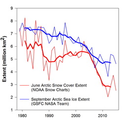
There is a reason poor old Ursus maritimus has become the poster children of climate change. Perhaps it’s all the bright white snow and ice, even if the Arctic Report card shows us the browning of the Arctic as snow lies for ever shorter periods at the same time as sea ice cover at the end of summer is similarly declining…
From the Arctic report card 2015: “Northern Hemisphere (NH) June snow cover extent and September Arctic sea ice extent. Sea ice extent data for 1979-2014 are derived from the NASA Team algorithm (Cavalieri et al., 1996); ice extent estimates for 2015 are produced from real time data (Maslanik and Stroeve 1999). Bold red and blue lines are 5-year running means of the original snow and sea ice extent records, respectively.”
I am optimistic but cautious about the Paris agreement at COP21. I hope it will come in time to preserve some remnant of the Arctic wilderness, but even if it does we still have some big challenges to face. Sweeping these under the carpet for the sake of a convenient narrative about a pristine wilderness is not helpful. I have a great affection for the Arctic, the people and the wildlife that lives there. I started this post originally some time ago but failed to finish it as it made me rather depressed to think about, but then I was put in mind of this poem from Seamus Heaney and decided it was worth finishing after all with this piece.
Clearly, the myth of “The North” and “the Arctic” has been with us for some time, but surely we owe it to the Arctic and the peoples who live there to try and see through the “pristinism” and start to fix some of these challenges?
It’s been a while since I lasted posted anything, not for want of ideas but mainly lack of time. I shall try to catch up over the next few weeks. For now I was inspired to write an ultra-quick post about a very trivial question that came up at work today. I think it really captures how observational meteorology works (or should work).
Today, a colleague, John Cappelen, (also known as Mr. Greenland observational data), happened to mention in passing that on the 15th July this year, the weather station at Summit on the Greenland ice sheet had transmitted back to us in Copenhagen, a temperature observation of 2.5°C. This was during one of the highest melt periods this summer.
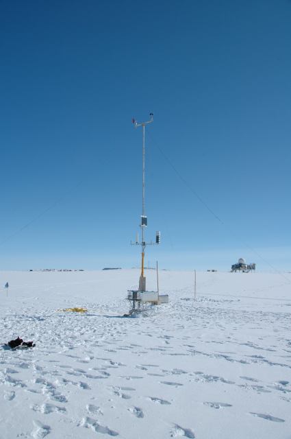
The automatic weather station doing it’s thing at Summit, June 2015. Photo: DMI
Bearing in mind that Summit Camp is at roughly 3,216m, this is a pretty high measured temperature. In fact it would be rather noteworthy, especially as it occurred on one of the highest melt days of the summer. Temperatures above 0°C at Summit are not unknown and the record, during the famous summer of 2012 when around 95% of the ice sheet surface experienced melt, the water sweeping away a bridge on the Watson River near Kangerlussuaq, was 3.6°C.
Now, my colleague is a very experienced and careful scientist. He had checked the observations and the temperatures before and after this measurement were well below zero, so, my colleague asked, was there any reason to believe this measurement or can we assume an instrument failure of some kind?
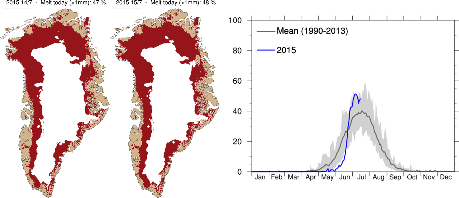
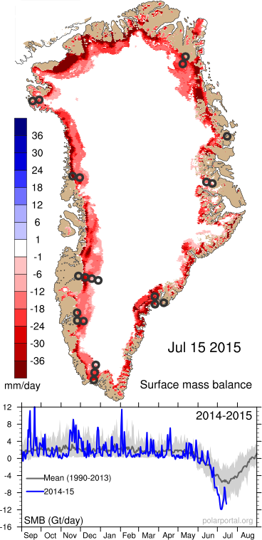
My office mate in the Arctic and Climate Research section and I obligingly had a quick look at our Polar Portal Greenland ice sheet surface plots (see below) and at the melt extent plots that are updated daily on the DMI website. We had to conclude there was no evidence of melt that high on the ice sheet and there was also no reason to believe that a sudden sharp warming had occurred at Summit on this day based on DMI’s own weather forecast. We then turned to check the weather plots, also on the polar portal and based on data from the European Centre for Medium Range Weather Forecasting (the ECMWF – probably the best weather forecast modellers in the world).
Again, the anomaly plots showed rather cold conditions prevailing over the ice sheet during this period, though at the same time very high melt and low surface mass balance from the ice sheet due to the clear skies.
Graphs showing area of the Greenland ice sheet experiencing melt conditions, compared with the average (dark grey line) and range of past summers (1990-2012), for more detail see the DMI website
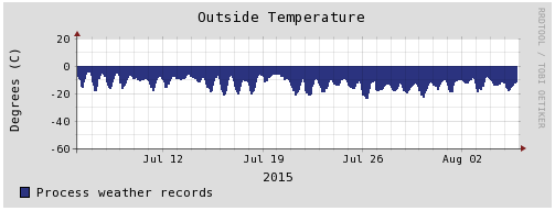
Temperature record from Summit Camp for the last month.
Fortunately, due to the American Summit Camp we have access to a back-up dataset very close to this location and after a quick web search John Cappelen was able to confirm that indeed this measurement was an error as the nearby station has not seen anything like that during the period in question (see right).
This kind of thing happens all the time and is therefore not at all newsworthy or interesting enough to write a publication about. However, when a recent record high temperature in the UK can lead to 2 critical articles in the Daily Telegraph and a particularly vigorous exchange on twitter for Met Office scientist Mark McCarthy, as well as this corrective piece on the Carbon Brief blog, perhaps we should be more vocal about just how careful and critical we as scientists are about observations, including the ones we decide to discard as well as the ones we keep.
Surface mass balance of the Greenland ice sheet on the 15th July 2015. Intense melting around the margins led to very negative SMB (the red colours) during this period.
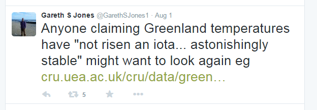
Addendum: I was alerted by this tweet from Gareth Jones, also a Met Office scientist, to some slightly strange cherry picking in the blogosphere of climate records from a couple of DMI stations in Greenland.These have apparently been used to claim no climatic warming trend in Greenland over the 20th Century (I’m not going to link to it).
Anyone who is really interested in the observational data could try checking these reports by Mr Greenland observations himself instead, here is a quick summary:
Mean annual temperature in Copenhagen, Torshavn (Faeroes) and selected DMI weather stations in Greenland from 1873 – 2014. Figure from DMI
The climate of Greenland has been changing over the last 20 or so years, especially in the south. In this paper we showed that the amount of melt and liquid water run off from the ice sheet in the south west has increased at the same time as the equilibrium line (roughly analogous to the snow line at the end of summer on the ice sheet) has started to move up the ice sheet. Unlike previous periods when we infer the same thing happened this can be attributed to warmer summers rather than drier winters.
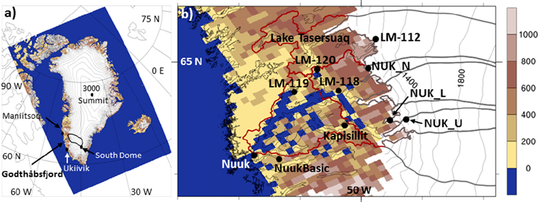
The area we focus on in this study is in SW Greenland close to Nuuk, the capital. White shows glaciers, blue is sea, brown is land not covered by ice.
We focused on the area close to Nuuk, the capital of Greenland, as we had access to a rather useful but unusual (in Greenland) dataset gathered by Asiaq the Greenland survey. They have been measuring the run off from a lake near the margin of the ice sheet for some years and made this available to us in order to test the model predictions. This kind of measurement is particularly useful as it integrates melt and run-off from a wider area than the usual point measurements. As our model is run at 5.5 km resolution, one grid cell has to approximate all the properties of a 5.5 km grid cell. Imagine your house and how much land varies in type, shape and use in a 5.5 km square centred on your house and you begin to appreciate the problems of using a single point observation to assess what is essentially an area simulation! This is even more difficult in mountainous areas close to the sea, like the fjords of Norway or err, around south west Greenland (see below).
The beautiful fjords near Nuuk. Represent this in a 5.5km grid cell…
The HIRHAM5 model is one of very few regional climate models that are run at sufficiently high resolution to start to clearly see the climate influences of mountains, fjords etc in Greenland, which meant we didn’t need to do additional statistical downscaling to see results that matched quite closely the measured discharge from the lake.
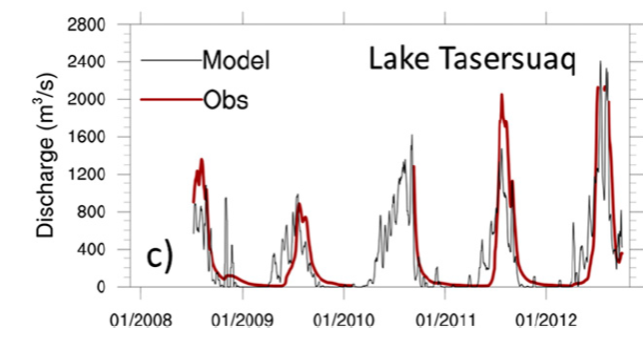
Graph comparing modelled versus measured discharge as a daily mean from Lake Tasersuaq near Nuuk, Greenland. The model output was summed over the Tasersuaq drainage basin and smoothed by averaging over the previous 7 days. This is because the model does not have a meltwater routing scheme so we estimated how long it takes for melt and run-off from the ice sheet to reach this point.
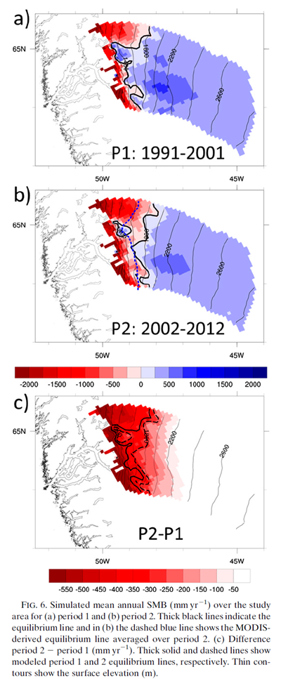
We were pretty happy to see that HIRHAM5 manages to reproduce this record well. There’s tons of other interesting stuff in the paper including a nice comparison of the first decade of the simulation with the last decade of the simulation, showing that the two look quite different with much more melt, and a lower surface mass balance (the amount of snowfall minus the amount of melt and run – off) per year in recent years.
Red shows where more snow and ice melts than falls and blue shows where more snow falls than is melted on average each year.
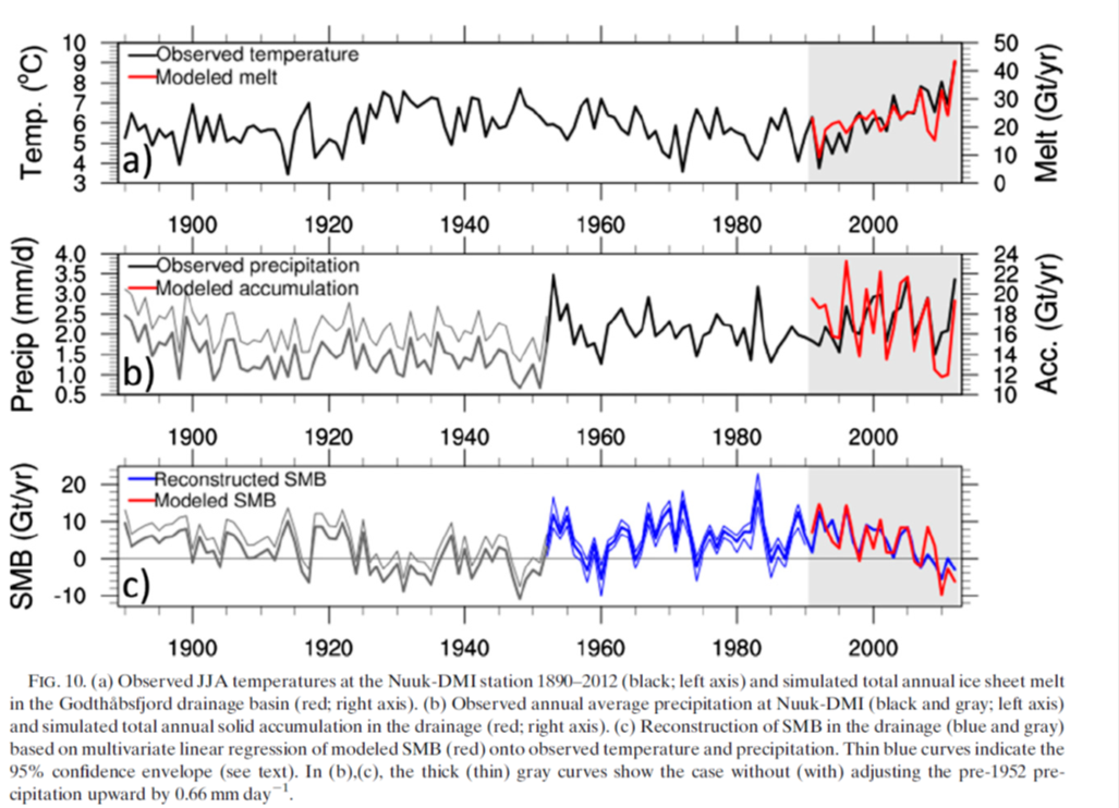
Now, as we work at DMI, we have access to lots of climate records for Greenland. (Actually everyone does, the data is open access and can be downloaded). This means we can compare the measurements in the nearest location, Nuuk, for a bit more than a century. Statistically we can see the last few years have been particularly warm, maybe even warmer than the well known warm spell in the 1920s – 1940s in Greenland.
Graphs comparing and extending the model simulation back in time with Nuuk observations
There is lots more to be said about this paper, we confirm for example the role of increasing incoming solar radiation (largely a consequence of large scale atmospheric flow leading to clearer skies) and we show some nice results which show how the model is able to reproduce observations at the surface, so I urge you to read it (pdf here) but hopefully this summary has given a decent overview of our model simulations and what we can use them for.


